Reading evidence
Use 'Print preview' to check the number of pages and printer settings.
Print functionality varies between browsers.
Printable page generated Monday, 25 May 2026, 5:21 PM
Reading evidence
Introduction
Social scientists collect evidence to support their claims and theories in different ways. Such evidence is crucial to the practice of social science and to the production of social scientific knowledge.
You may be aware of the idea of active reading, which is about reading with the aim of understanding and grasping something: a definition, an argument, a piece of evidence. What that suggests is that active reading is about reading and thinking at the same time. In this course we will concentrate on reading and thinking at the same time about evidence in the form of numbers and in the form of text.
The summary 'Evidence in the social sciences: finding it, using it', is a useful place to start:
Summary
Handling evidence
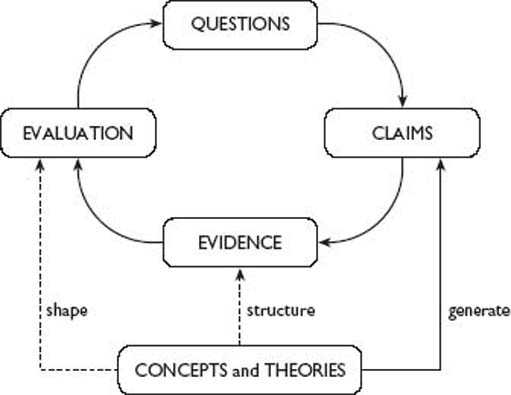
The evidence social scientists gather is shaped by the questions they ask, the claims they make and the theories they use.
Evidence can be described in two main ways, as quantitative and qualitative.
There are a variety of methods for obtaining evidence, there are important choices to be made about who and where you collect evidence from.
There are a variety of methods for presenting and organising evidence.
Once presented, evidence does not speak for itself. It needs to be interpreted and is open to many interpretations.
The quality, reliability and authenticity of evidence always needs to be probed for potential bias, limits and blind spots.
In this course we will be focusing mostly on the variety of methods for presenting and organising qualitative and quantitative evidence. So, we will focus on how to understand the ways in which evidence is presented, how to read it actively and with purpose.
This OpenLearn course provides a sample of Level 1 study in Sociology.
Learning outcomes
After studying this course, you should be able to:
identify that social scientists can collect evidence to support their claims and theories in different ways
give examples of quantitative and qualitative evidence
recognise a variety of methods for obtaining evidence
understand the ways in which evidence can be presented; how to read it actively and with purpose.
1 Overview
1 The importance of evidence
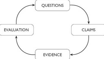
The gathering, presentation and assessment of evidence are crucial and indeed inescapable parts of the practice of social science, hence the crucial role of evidence in the circuit of knowledge (see Figure 1).
Social science and the circuit of knowledge – Box 1
We need to think about the practical nuts and bolts of constructing an argument:
-
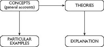
Clearly defined general concepts help us organise and think about particular examples of a phenomenon.
-
Concepts can be combined together to generate theories which are general frameworks for providing explanations of phenomena.
But how do we begin to examine and evaluate the quality of those concepts, theories and explanations?
From a discussion of this question it follows that:
-
Social science enquiry starts with questions.
-
Evaluating answers to these questions requires us to sharpen up our argument. We need to generate specific claims, descriptive or explanatory, that are fit for rigorous exploration.
-
Social scientists reach for evidence when examining these kinds of claims.
-
Evidence does not speak for itself – but must be carefully handled, siftedand interpreted.
-
This process is broadly what we call evaluation – a process which often generates new questions to be resolved as well as confirming or contradicting the original claims.
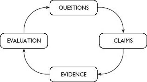
In this course we have linked these processes of enquiry together in what we call the circuit of knowledge, see Figure 2(a).
You will find later in the course how concepts, theories and the arguments one can construct out of them also shape the way we use evidence and do our evaluation. But for the moment just think about concepts and theories as a way of generating descriptive and explanatory claims, see Figure 2b).
Let us see how the circuit works in a bit more detail.
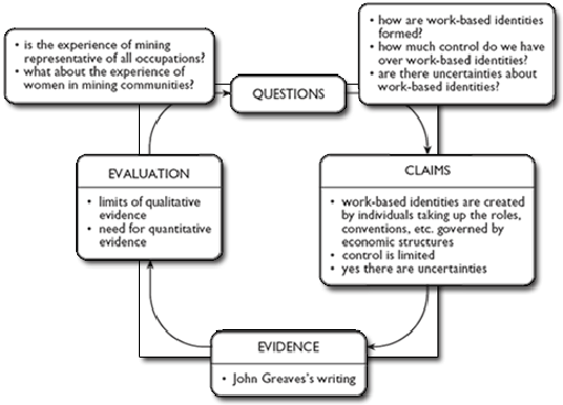
Questions
Consider three questions.
-
How are identities formed?
-
How much control do we have in shaping our own identities?
-
Are there particular uncertainties about identity in the contemporary UK?
In order to begin answering these questions it is necessary to focus on more specific and manageable claims, that is areas of identity which might be particularly important. Here we will focus on issues of work and work-based identities.
So we can rephrase our questions as:
-
How are work-based identities formed?
-
How much control do we have over work-based identities?
-
Are there uncertainties about work-based identities in the contemporary UK?
What are the claims made in response to these questions and how do concepts and theories of identities help us generate those claims?
Claims
Drawing specifically on the arguments of Mead, Goffman and the accounts of social structures, we picked out these claims.
-
Work-based identities are formed by the interaction of individuals with economic structures which generate a repertoire of roles, symbols and conventions that individuals take up and identify with.
Individual control over work-based identities are structured, patterned and constrained by the pre-existing conditions of work and distribution of economic opportunity.
-
Individuals may have more choice over whether they choose to identify with work-based identities than other identities such as gender or place.
-
For men who have worked in traditional industrial sectors, work-based identities have become more uncertain.
Evidence
The next step involves looking for some information against which these kinds of claims can be tested.
John Greaves's autobiographical account offers one type of evidence about the importance of work and identity. This piece suggests that structural changes in the economy can have significant impacts upon identities. [Please read the autobiography by clicking on the “View document” link below.]
Click to view the John Greaves extract
Activity 1
-
What does John Greaves's writing tell us about how identities are formed?
-
How much control did he have in shaping his work-based identity?
-
Does his account suggest that there is greater uncertainty about work identities in the late 1990s?
Discussion
-
John's account suggests that paid work, especially in work like coal mining, is a very important dimension of identity. Miners lived in a community dominated socially and economically by the coal industry. There is a strong connection between personal experience and the social factors related to paid work, and a strong sense of belonging – of being the same as others within the community.
-
Within coal mining communities there was little room for the expression of alternative identities to work-based ones – for men at any rate, so all-encompassing was the place of coal mining in the life of the community. External social forces that brought about the collapse of the mining industry clearly had, and still have, significant impact on the identity of John and those who live in his community.
-
This account does suggest there are greater uncertainties about identity, especially work-based identities in the coal industry (and other heavy manufacturing industries) in the UK. This is illustrated by the irony of the old Coal Board slogan ‘A Job for Life’. For many people like John, who had expected that to be the case, they were left not only without a particular job, but without any job, in a community which had been prosperous and was, by the late 1990s, impoverished.
Social science and the circuit of knowledge – Box 2
The activity above begins to explore the relationships between asking questions and making claims and using evidence. However, you are probably already thinking of some more questions which we could be asking about our example of the link between work and identity. In particular, one person's account might not be representative of the UK as a whole, or even coal miners in general. We need more quantitative evidence; especially to address the question about greater uncertainty in relation to changing social structures.
The evidence we have looked at so far is qualitative and provides significant insights into the personal side of the identity equation. It takes on board personal feelings as well as conveying the sense of community at two different moments in time, but it would be useful to know more about the scale of pit closures and of alternative employment which might have become available, for example. Is this story only about men? The community John describes is one peopled by women, men and children. What might be missing from this account?
Evaluation
How far have we gone around the circuit of knowledge? We started by focusing our general framing questions into more specific work-identity related questions. We drew on theories of identity to generate specific, sharper claims and looked at one piece of autobiographical evidence.
However, as we evaluate the original claim, in the light of evidence available to us, we might need to consider some more questions. What else do we need to know? What would more quantitative evidence about economic change and employment add? John Greaves's story is an account of a changing work-based identity but it is also a gendered account. It would also be interesting and useful to find out about the experiences of women in the community and whether a changing work identity had an impact on gender identity too. By comparing the work, paid and unpaid, and home experiences of women and men we might come up with a different set of claims about identity. We started with questions and the investigation has led to the addition of more questions as we complete our circuit of knowledge (see Figure 3).
It is a respect for evidence which allows us as social scientists to be satisfied that our claims about society make more than common sense. When faced with the descriptive claim that ‘Nobody needed to lock their doors in the 1950s’, or the explanatory claim that ‘It's the permissive 1960s that we have to blame for all this crime’, we can simply agree with the claim, or we can deny it just because we feel like it or on the limited basis only of personal experience. As social scientists, though, we should ask, ‘How do you know that?’ and begin to explore the evidence which would either confirm or deny the claim. Of course, we need to be able to understand the evidence to be able to make use of it, so, in this course, we want to help you get the most out of various forms of numerical and textual evidence.
Before we do that it's worth noting that there is a distinction to be made between quantitative and qualitative evidence.
Quantitative evidence is concerned with the quantity of things; for example, how many crimes are committed and how often. Quantitative evidence tends to be about numbers, percentages and statistics and is often presented in the form of graphs and tables.
Qualitative evidence is about the quality of things, like what it feels like to be a victim of crime. Qualitative evidence is usually concerned with words and images and is presented in the form of reports, analysis of interviews, autobiographical accounts, or documentary photographs. Qualitative researchers often focus on everyday life itself.
Neither of these forms of evidence is better or more useful than the other, indeed they often complement one another, but they need to be used appropriately in terms of the question being asked and the claim being made.
So let's look now at both quantitative and qualitative evidence in turn, demonstrating how each can be read and understood.
1.2 Quantitative evidence
1.2.1 What evidence are we reading?
Although we live in a society where a huge amount of information is available in the form of numbers, some of us still feel a mental fog descend when we are asked to deal with them. This is because numerical information is information in a very condensed and abstract form. A number on its own means very little. You have to learn to read it. Numeracy (the ability to work with numbers) is a skill that we can learn. It is a very useful skill, because it allows us to understand very quickly the scale of an issue or a problem.
Of course, even those of us with a fear of numbers use them all the time in our daily lives (for instance, to tell the time, to pay for our shopping, while watching a game of tennis, etc.), and some people develop quite remarkable numerical skill in particular settings. Experienced darts players often seem able to subtract, say, 47 from 73 almost instantly in their heads and will have thrown their next dart at Double 13 before most of us have had time to blink. This is a lot to do with practice, of course, but it is also to do with convention, knowing what the rules are. Most of us, asked to subtract 47 from 73 would, after a fairly mechanical process, produce the answer 26. For darts players, the subtraction is quicker because they've done it so often in the past, but, interestingly, it also results in a slightly different answer – Double 13, because of the rules of the game. What is the difference between 26 and Double 13 in darts? The difference between 26 and Double 13 may not appear much to someone unused to the conventions of darts, but it is absolutely crucial because it signifies one way of reaching 26 rather than the many others available. For experienced darts players, 26 and Double 13 are entirely different numbers, because you can score 26 in lots of ways, but Double 13 in only one.
Numbers come in many different forms, such as fractions, percentages, and averages. Most quantitative evidence is expressed as one or other of these basic forms of number, but it is important to recognise which is being used, to be able to convert one into another, and to recognise how they relate to each other. Return to the box below when in doubt.
Fractions are measures of proportion, like ‘a half’ (often written as ½) or ‘a quarter’ (¼) of any total.
Percentages are also measures of proportion, measuring the number out of a total of a hundred. So 65 per cent is 65 out of a hundred.
To express one number as a percentage of another when the total is more than or less than a hundred, divide the first number by the second and multiply by 100. So 92 as a percentage of 128 is ![]() , which is 71.875 per cent, or, roughly 72 per cent.
, which is 71.875 per cent, or, roughly 72 per cent.
To find the average of a group of numbers, add up all the numbers and divide the result by the total number of numbers. So the average of 6, 22, 35 and 29 is 92 (6 + 22 + 35 + 29) divided by 4, which is 23.
In social science, numbers are most often seen in the form of statistics, and these can be presented as tables, charts, diagrams or graphs, making them more readable.
Originally, ‘statistics’ meant the collecting of facts about the state. We now use the term to describe the techniques for working with large sets of numerical evidence and the presentation of summaries of their main features. For example, the bar chart is one of the most popular ways of presenting numbers. What, though, are the differences between this and some alternative representation of numbers, and why do we use one method rather than another? Let's take as an example some statistics on deaths in police custody, and ethnicity, taken from an article in The Runnymede Bulletin. There are four pieces of quantitative evidence in the article: the first is a simple line graph showing the increase in the number of deaths in police custody investigated by the Police Complaints Authority since 1995–96 (see Figure 4).
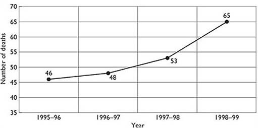
Line graphs are very useful for demonstrating the scale of change; this graph demonstrates a steady increase over the period covered (these statistics have been gathered since 1986, and to gain a bigger picture we would need to extend the time period covered). The graph doesn't tell us if the rate of increase has been the same for different ethnic groups (or for that matter different genders and ages), but it would be possible to show this using more lines on the graph if we had the statistics. (Statistics on the ethnic origin of people dying in police custody have been gathered only since 1996.)
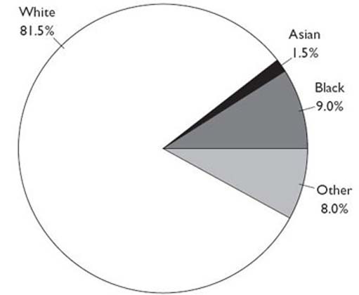
The relationship between deaths in police custody and ethnicity is explored in the article using three pieces of evidence. First, the ethnic origin of those recorded as dying in police custody in 1998–99 is shown in a pie chart (see Figure 5).
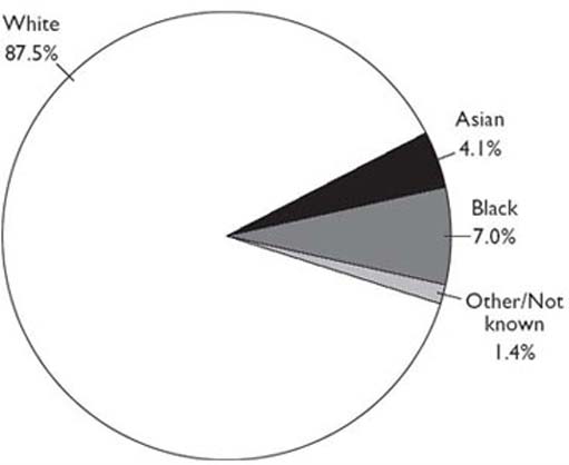
This gives us a pretty clear picture of the proportion of different ethnic groups dying in police custody. Pie charts are a good way of demonstrating the relative size of a small number of categories. Next, another pie chart shows total arrests by ethnicity in 1997–98 (see Figure 6).
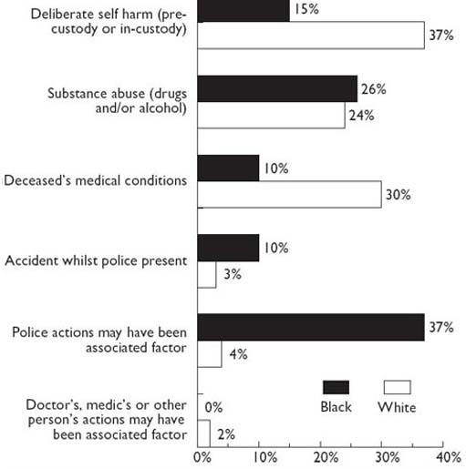
Again, this clearly demonstrates the proportion of people of different ethnic groups involved. A more complex picture is presented in the next piece of evidence, a bar chart where ethnicity and cause of death are linked together (see Figure 7).
This clearly shows that there is a marked difference in cause of death between two of the ethnic groups covered in the previous figures. Bar charts are good at making relatively complex information accessible in a single ‘picture’.
Warning: the ‘facts’ never speak for themselves
However quantitative evidence is presented, it always needs interpretation. A good example of this is the last piece of evidence in Figure 7, where the evidence shows that a much higher percentage of black people than white die in custody as a result of ‘police actions’ and ‘accidents whilst police are present’. This could be explained in radically different ways. Some might argue that the statistics are the result of black people being inherently more aggressive and difficult to arrest, hence requiring more ‘physical’ policing resulting in higher risk of fatality or injury. Others might argue that the statistics are a result of racism. To decide between the two we need all of the elements on the circuit of knowledge, not just the evidence.
1.2.2 Stages in reading numbers and diagrams
Having established roughly what we are looking at when we see a table of numbers or a diagram, how do we read it systematically? It may be best to think of this as a process with several stages.
1.2.3 Stage 1: Preparation
Numbers and diagrams are highly abstract and condensed summaries of the world. They require a degree of mental effort to bridge the gap between them and the aspects of the ‘real’ world they stand for. Approach them slowly and with care, allowing yourself time to get the feel of what you are looking at. Don't assume you already know what you are looking at.
1.2.4 Stage 2: Find a way in
It's easy to be distracted by the surface appearance of a diagram, but we are really interested in the underlying message. This is rather like the distinction made between the content and context reading of photographs. Once you are sure that you know what the main heading means, focus on a particular element and think it through. If it is a bar chart, for instance, pick on one of the bars and tell yourself what it represents, what it is telling you. Is it showing a percentage or a total? What time period does it cover? Check whether it makes a rough sort of sense in terms of the context of what you already know about the world.
1.2.5 Stage 3: Details
Examine in more detail the explanations surrounding the numbers or diagram. Check the small print to make sure you aren't drawing the wrong conclusions. Are the axes of diagrams clearly labelled, and do you understand what they mean? (Axes, pronounced ‘axease’ is the plural of axis. Axes are the vertical and horizontal lines against which lines on a graph or bars on a chart are plotted. They must be labelled to tell you what courses you are counting in.) If there is shading on the diagram, as with many bar charts, is it explained and do you know what it means?
1.2.6 Stage 4: Extracting the information
When you are absolutely sure that you know what the diagram or table is all about, start to look for patterns, for discrepancies, for peaks and troughs, for anything unusual. Diagrams and tables are highly patterned information, and they often tell a relatively simple story underneath. Don't get bogged down in the relationship between individual numbers, but look to see whether one relationship is like another, or whether one set of numbers stands out significantly from the rest.
Warning: statistics can lie
One of the main advantages of using numbers and diagrams as evidence is that they can give us a very clear idea of the scale of social issues, and they can give us a lot of information very quickly. However, they can also mislead us, usually accidentally, but occasionally with the full knowledge of those who produce them.
Let's take an example of a small village in a poor country where 100 workers earn just £100 each per year, 10 managers earn £1,000 per year, and the major landowner earns £10,000 per year. The total income of the village is therefore £30,000. Now, suppose we were asked to provide evidence of the income distribution in the village, and for reasons of our own we wanted to paint a rosy picture. We could say that the average income of this village is £270 (£30,000 divided by 111, the number of earners). This might make people believe that most inhabitants of the village earn around about this figure, but as we know it is almost three times as much as most villagers' income, so it doesn't really give a fair picture. Alternatively, we could give the median income, which is the income at the point where 50 per cent of the people are above it, or the mode, which is the most common income. Both of these are £100. But this ignores the fact that some people earn a great deal more. Does this give a fair picture? To give a fairer picture of income distribution in the village, we could give the upper and lower deciles (the average income of the lowest-earning 10 per cent and highest-earning 10 per cent of the villagers), which would be £100 (£1,100 divided by 11) and £1818 (£20,000 divided by 11), but this would still miss the fact that one person earns a lot more than everybody else. We need to be on our guard when we read numbers. They may only tell a partial story. (A similar example appears in Sardar et al., 1999, p.52.)
Activity 2
Let's try looking at an example of reading statistical evidence. There has been a great deal of discussion in recent years about changes in our patterns of travel, because of concern about car use and its impact upon the environment.
What does the table reproduced below tell us about car use?
Can you detect any patterns or trends over time?
| Miles per person per year | |||||||
|---|---|---|---|---|---|---|---|
| 1975/76 | 1985/86 | 1989/91 | 1992/94 | 1995/97 | 1998/00 | Percentage change from 1989/91 to 1998/00 | |
| Walking (including short walks) | 255 | 244 | 237 | 199 | 195 | 186 | −21 |
| Bicycle | 51 | 44 | 41 | 38 | 39 | 38 | −8 |
| Private hire bus | 150 | 131 | 123 | 110 | 105 | 109 | −12 |
| Car | 3,199 | 3,796 | 4,806 | 4,954 | 5,187 | 5,355 | 11 |
| Motorcycle/moped | 47 | 51 | 37 | 32 | 30 | 30 | −19 |
| Van/lorry | 183 | 228 | 301 | 281 | 262 | 218 | −28 |
| Other private (inc. invalid carriages, Dormobiles, etc.) | 16 | 33 | 34 | 43 | 40 | 26 | −21 |
| Buses in London | 57 | 39 | 36 | 40 | 50 | 47 | 30 |
| Other local bus | 372 | 258 | 238 | 219 | 202 | 199 | −17 |
| Non-local bus | 54 | 109 | 124 | 96 | 93 | 100 | −19 |
| LT underground | 36 | 44 | 49 | 50 | 51 | 57 | 16 |
| Surface rail | 289 | 292 | 366 | 298 | 294 | 371 | 1 |
| Taxi/minicab | 13 | 27 | 42 | 38 | 43 | 62 | 47 |
| Other public (including air, ferries, light rail, etc.) | 18 | 22 | 40 | 41 | 75 | 45 | 13 |
| All modes | 4,740 | 5,317 | 6,475 | 6,439 | 6,666 | 6,843 | 6 |
| Percentage of mileage accounted for by car (inc. van/lorry) | 71 | 76 | 79 | 81 | 82 | 81 | — |
| Average trip length | 5.1 | 5.2 | 5.9 | 6.1 | 6.3 | 6.6 | 12 |
All figures have been rounded to the nearest whole number. This gives rise to rounding differences in the percentage change and total figures.
Discussion
We noted that the number of miles travelled in a car per year is steadily rising (11% increase from 1989/91 to 1998/00). Car use is one of the few modes of transport (other than London bus and underground) to show a significant increase over the period. Taxi and mini cab travel has risen sharply over the whole period. The percentage of mileage accounted for by private car travel has risen consistently to around 81% of all travel and average trip length has risen consistently and grown by 12% from 1989/91 to 1998/00. Such data do not tell us the reasons, nor the outcomes but they do offer evidence of trends in patterns of transport use.
Gender differences in educational achievement: working with numbers
Social scientists have constructed gender categories and have examined in particular how children learn to use these categories. The question of how far these gendered identities influence children's behaviour in schools and, specifically, their achievement in examinations is one that is posed during such an examination. Until recently the dominant political concerns in this field were about girls' under-achievement in school. Recently the issue of boys' under-achievement has hit the headlines and boys' GCSE results have helped trigger these concerns.
Figure 8 below is a bar chart which shows the GCSE results of girls and boys in different subjects. Bar charts are a very useful way to display information, so let's pause here a moment and work through the skills involved in reading this one.
The bar chart shows results in percentages so there are two skills involved. One is understanding percentages, the other is reading bar charts displaying them. Let us start with percentages.
Percentages
Percentages are a very common and useful way to describe exact parts of something. The most common way to describe a part of something is to use forms like ‘a half’ or ‘a quarter’, but when you want to describe a part which is not a half, a quarter or a third, or you want to be very precise, then percentages are very convenient. They are used frequently in newspapers – and in social science courses.
This section of the course aims to ensure you really understand this useful idea. If you are sure you do, proceed to the activities below to check, but for many people percentages are a bit of a mystery; so here is a short introduction.
You recognise a percentage by the symbol %. It is read as ‘per cent’ and it means ‘out of a hundred’. So, if out of 100 children in a room, 5 are girls and 95 are boys you can say that 5% of those in the room are girls and 95% are boys.
Things are not quite so straightforward if there are fewer or more than 100 children in the room. Then, in order to work out the percentages of girls and boys, we need to do some calculations. The calculations are worth doing because in the social sciences they offer an easy way to compare proportions when you need to do so. Let us see how this works.
Activity 3
Suppose there are only 50 children in the room. 5 of them are girls and 45 are boys.
What percentage of the children are girls? Try to work it out for yourself first. If you do not know how, just read on.
Discussion
10% of the children are girls. Here are a couple of ways of working that answer out. See which is clearer to you.
Out of 50 children, 5 are girls. To calculate the girls as a percentage of the total, we have to treat the whole group of 50 as if they were 100. We need to multiply by 2 to turn 50 into 100. Then we multiply the number of girls by 2 as well. 5 out of 50 is the same as 10 out of 100 or 10%.
Alternatively, we can state the proportion of girls as

Then to turn the fraction into a percentage, you just multiply by 100

You can work out the answer to that by hand or on a calculator. We advise a calculator! On a calculator, you first divide 5 by 50, then multiply the answer by 100. Try it now, and check that you get the answer 10.
By hand, you need to ‘cancel’ the fraction like this: first divide top and bottom of the first fraction by 5
then multiply the result by 100
You do not need to understand that calculation to work happily with percentages. The calculator method is just fine.
We can now turn that calculation into a rule:
Rule 1: Calculating a percentage. To express one number as a percentage of another, divide the first number by the second and multiply by 100.
Activity 4
Check your understanding of this rule by using a calculator to answer the following:
-
You get 42 marks out of 70 for an assignment. What is your mark as a percentage?
-
In an (imaginary) UK opinion poll in 1999, 2,500 people were asked who Gordon Brown was. 425 did not know. What percentage had never heard of the Chancellor of the Exchequer?
-
In a group of 325 people, 65 own a computer and 52 have access to one at work. Express that statement in percentages.
Discussion
-
60%
-
17%
-
20% own a computer and 16% have access to one at work.
Reading bar charts
Now let us return to the bar chart and have a careful look at this way of displaying information. Bar charts are really good at showing quantitative data in ways which allow the reader to absorb and understand them. They are worth a bit of effort to get used to them. We are not going to worry here about drawing them, just reading them.
Figure 8 represents the results for English and Maths, for girls and for boys. Start by reading the title: it says these are results for 16-year-olds showing the percentage of girls and the percentage of boys achieving GCSE results A*–C.

Now look at the axes, that is, the horizontal line across the bottom and the vertical line up the left-hand side. Read the labels on these axes carefully. The vertical one shows the percentages defined in the title, from 0 up to 60%. The horizontal axis reads ‘92’, ‘93’ … ‘97’, so this shows a series of years. The chart is going to show percentages for each year, so we can look at changes over time. Finally there is a key or legend: this tells us which of the bars for each year refers to girls, and which to boys.
Murphy and Elwood: constructing a social science argument
Having identified some key differences in boys' and girls' GCSE results in the 1990s, what are possible explanations? To answer this question, researchers look at biological and cognitive factors and a range of social factors. They focus on the arguments of Murphy and Elwood: that children's gendered identities lead them, in general, to tackle school-work differently and to perform differently in exams. Murphy and Elwood aim to provide an explanation of the different performances of girls and boys by building up an argument about the links between gendered identities and school performance. We now want you to use Murphy and Elwood's argument to help you think further about how social science arguments are constructed.
Three claims form the core of Murphy and Elwood's work, listed below.
-
Claim 1: Boys and girls foster different interests, attitudes, and behaviours prior to attending school, which are then perpetuated within school.
-
Claim 2: Feminine and masculine identities are perceived in particular ways by teachers, with consequences that may impinge on achievement.
-
Claim 3: In their school-work, girls and boys draw upon the different interests and skills that they have developed through their gendered experiences.
How are these claims put together? How is the argument constructed? Look back at your notes and think about what is involved in the first claim.
Claim 1
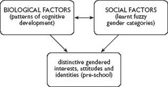
This claim draws upon biological, cognitive and social arguments. The interaction between these different components in early childhood development are seen as maintained in the school context. What constitutes typically gendered behaviour draws upon stereotypical gendered characteristics.
Claim 2
This claim argues that those pre-school attitudes and identities are reinforced by teachers, and lead to distinct gendered patterns of behaviour in skills with direct consequences for school performance and achievement.
Claim 3
This claim focuses on the cognitive skills which girls and boys have developed through their early childhood development. These skills directly impact on performance, though in different ways in different subjects.
The three claims combine to produce an argument which seeks to explain gendered behaviour and differential educational achievement in terms of an interaction between individual girls and boys and the social world which they inhabit. Typical gendered attitudes and attributes are reinforced and rewarded in the school setting so that children and young people develop and reinforce particular skills. Cognitive skills are developed and reinforced through social and educational experience. What is typical draws on gendered categories. There is scope for reconstruction of categories here, and not everyone conforms, but the process is cumulative and interactive. It develops to include more factors and shows how gender identities are reinforced through an interaction between different interrelated factors, biological and social.
Thus the argument is both developed and expanded to include a range of evidence which supports the claims that are being made. The argument uses this evidence to show that biological factors, such as patterns of cognitive development, are closely linked to social factors, such as learned gender categories. These cognitive skills are developed both pre-school and subsequently at school, supported by the responses of teachers to children's pre-school development, creating a reinforcement of patterns of gendered performance.
Activity 5
Look first at the English GCSE part of the bar chart. Explain in words what it shows.
Discussion
It shows that girls have consistently done better than boys, and that this has not changed a great deal. Around 60% of girls achieved A*–C grades each year from 1993 to 1997, and a slightly lower percentage in 1992. Only about 40% of boys managed the same grades in 1992 and from 1995 to 1997, and somewhat more than 40% in 1993 and 1994. There is no trend: that is, the percentages are not consistently rising or falling over the six years.
Activity 6
Now Maths: what does it show, and how does it compare with English?
Discussion
In Maths, the performance of boys and girls is very similar. And there is a trend: results have been getting somewhat better over the six years. Comparing Maths and English, we see that boys produce very similar results in the two subjects – hovering around 40% obtaining A*–C grades in both. However, a higher percentage of girls do well in English than in Maths.
1.2.7 Summary
-
What we must do to understand numbers as they are used as evidence in social science is to practise and so become familiar with them, and to understand the conventions which determine how they are used.
-
Sets of numerical data can be presented in many ways, as tables, bar charts, pie charts or line graphs. These are just different ways of trying to represent or make a picture of numbers. Which is used is largely a matter of which best shows the features the person presenting the information is most interested in.
-
When reading numbers or diagrams:
-
Get a feel for the overall picture.
-
Pick out one or two points and make sure they make sense.
-
Read the words on the axes and any other explanations.
-
Look for patterns.
-
However careful we are when using and reading quantitative evidence, there are some things it will never tell us. It can never, for instance, give us evidence of how people really feel about their lives. Certainly, evidence from surveys like the British Social Attitudes Survey can tell us how many people feel a certain way about something, but even here we miss the real sense of the power of people's emotions and beliefs, and their complexity. Sometimes numbers are just too abstract, and to understand the situation we need to get closer to the reality of people's lives. For this we turn to a different kind of evidence in Section 3, which seems closer to people's lived experience.
1.3 Qualitative evidence
1.3.1 What evidence are we reading?
Social scientists use particular methods to gather qualitative evidence, from observation to interview, but they also use autobiographical accounts, journalism, and other documentary material to flesh out and add meaning to statistics.
As with reading numbers, reading textual evidence requires us to practise, to set time aside to learn how to do it, and to understand the conventions of writing which operate in the different forms of writing we encounter. One of the main problems with reading textual evidence, though, is that, unlike the relationship most of us have with numbers where we may use them at a pretty basic level, most of us are, if anything, over-familiar with words. When we want to understand their value as social science evidence we need to forget how familiar we are with first person accounts and everyday speech – for example, in newspapers, magazines, and books – and learn a different approach to them. When we watch as social scientists we are watching in a different way with a different purpose, and the same is true of reading words.
Activity 7
Qualitative research in the social sciences often involves the analysis of interview material that has been produced by the social scientist conducting a series of interviews with a selected sample of people. One such example is offered here, where Gail Lewis quotes material from her own research in the area of social work. How can we read this kind of evidence?
The social worker is describing some of the assumptions about ‘race’ and ethnicity made by one of the managers:
[There] was a white woman who had been a manager … and she had very racist opinions which she covered up, or tried to cover up … I can remember one case in particular, where there was a young child whose mother was suffering from domestic violence. The parents weren't married, and she assumed that the child was black, which was an on-going thing with her. … and she made some remark about … ‘Oh it's what they do … it's just normal …’ I asked her what do you mean, what do you mean! … [She said] ‘Well you know West Indian families, you know it's not too unusual …’ That kind of remark! Well I just flipped a lid and I said what are you talking about! Abuse and violence are not normal patterns of life … [And anyway] she has got blonde hair and blue eyes, just like you’ … and the shock that came onto her face …
(Lewis and Phoenix, 2004, Section 2.3)
Discussion
This short piece of text cannot tell us anything about the scale of what the interviewee describes quite explicitly as racism. However, it does provide us with useful information on how it works, on what Gail Lewis and Anne Phoenix call racialisation. The interviewee uses graphic descriptions to draw attention to the prejudices of the manager whose assumptions she is outlining. Such material can help social scientists to unpack everyday exchanges and the routine experience of racialisation and ethnicisation. However, the interview has to be interpreted and understood in its social context. It has to be interpreted in relation to other social phenomena and does not represent a simple reflection of truth. Social scientists often use such qualitative evidence alongside quantitative evidence, such as data on ethnicity in relation to employment and education, for example.
Social scientists use observation, interviews and even print journalism as evidence for the claims they make. Social scientists may collect evidence through questionnaires with pre-set questions and by open-ended interviews which allow respondents to speak for themselves. They may observe social relations explicitly as social scientists or may participate themselves in a particular community to gain ‘inside’ information as participant observers.
Social scientists also draw on print journalism on occasion and may use the same sources, for example official statistics, and the work of other social scientists to support their claims.
We need to remember, though, that journalism has its own conventions. Journalists do not need to present the same rigorous referencing and support for their claims as social scientists are required to do. Most importantly, newspaper and magazine articles are written under commercial pressures:
-
they must help to sell the newspaper by being, for instance, deliberately provocative, or by reflecting the dominant views of its readers;
-
they must try not to upset regular advertisers;
-
they must, in general, be short and pithy, with short sentences and frequent paragraphs to persuade the reader that reading the article is a pleasure rather than a duty;
-
they must try to make complex debates simple and break down the complexity into a single, headline-grabbing issue.
1.3.2 Stages in reading qualitative evidence
As with numbers, we need to approach qualitative evidence systematically and with purpose, and not just assume we know what it means.
1.3.3 Stage 1: Preparation
The task here is very different from our task when faced with numbers, where we need to deal with a high level of abstraction. Writing is often dense and multi-layered, and usually gives us, if anything, too much surface information about our subject. We need to make a mental effort this time in selecting and abstracting information ourselves. In order to do this effectively we need to be aware of the context of the writing. We need to check if we can, for instance, the political and social intentions of the researcher, author and publisher, and the conventions of the genre of writing. (Different sorts of fiction are written according to different conventions, so soap-opera and psychological drama are different not just in content but in form. Genre describes this mix of form and content, as in ‘the genre of tabloid journalism’.) We also need to consider the size and scope of the sample from which qualitative evidence is drawn. How representative is the sample? We also need to ask ourselves what our own instant reaction to the piece is, and what preconceptions and political beliefs we bring to the topic which might influence our understanding of what the piece is about. Is it a topic on which you hold strong opinions? Do you assume that it's more likely to be true if it's a report in The Times than if its from the Sun, and would this necessarily make it less useful as evidence?
1.3.4 Stage 2: Find a way in
Bearing in mind your analysis of the overt purpose of the piece of writing, whether it is explicitly social science or art, politics, entertainment etc., try to establish its basic point, its most obvious message. What is the title or headline; is it clear and ‘factual’, does it refer to some previous debate or require some sort of previous knowledge? Are there sub-headings and can you get an idea of how the ‘story’ goes from them? Skim read the introduction and the conclusion. Can you get an idea of the main ‘story’ from these? Now skim read the rest of the piece, looking again for the basic argument rather than any details. Don't go on to the next stage until you can write a sentence or two about ‘the big picture’. With interview material we need a way of locating the interviewee, for example in their social context.
1.3.5 Stage 3: Details
Now examine the piece in more detail. Read it again slowly making sure that you are able to follow its logic from sentence to sentence. Are there any obvious gaps in the argument or any unsubstantiated statements or assertions? Do you agree with its argument or are you attracted by its message? Is its appeal principally emotional or analytical, or both? Analyse the piece in terms of what it doesn't say as well as what it does, and look for its hidden message. What is the scope of the sample of respondents cited? How selective is it?
1.3.6 Stage 4: Extracting the information
You probably feel that you now have all the information the piece of writing contains or that you need, but now we need to categorise the information it contains and to look for connections with our own social scientific concerns. This is the difficult bit, and we don't expect you to be expert at it yet.
1.3.7 Summary
-
We can learn to use writing of all sorts as evidence by practising how to interpret it and by becoming aware of the conventions attached to its primary purpose for example as personal testimony, journalism, commercially produced material, such as market research and academic writing as well as material produced specifically through research such as interview data.
-
When approaching a piece of writing:
-
Get a feel for the context of the writing.
-
Read it, re-read it, and read it again.
-
Ask questions, categorise information and find your own uses for the piece.
-
1.4 Conclusion
The aim of this course has been to try to draw together work on numbers and text, and to try to be helpful to those who, like me, find numbers and statistics rather unapproachable. Evidence is used in social science to convince us of the value of a claim, and is a crucial element in our evaluation of theoretical perspectives.
Key points
-
Reading evidence is a skill, which we already use in our daily lives.
-
There are two main elements to acquiring this skill: practice, and learning the conventions associated with how different sorts of evidence are presented.
-
Reading evidence requires time and effort.
-
We need to take care when reading evidence, particularly more abstract forms of evidence like statistics.
-
Quantitative evidence helps show the scale and dimension of social phenomena.
-
Statistics are useful because they can provide lots of evidence quickly, and help us to see and remember patterns.
-
Qualitative evidence is useful because it adds depth and richness to our understanding of social phenomena by personalising and humanising them.
-
There is useful evidence in even the most subjective account.
Take the next step

If you enjoyed this course, why not explore the subject further with our paid-for short course, Media, politics and society?
References
Acknowledgements
The content acknowledged below is Proprietary (see terms and conditions) and is used under licence.
Grateful acknowledgement is made to the following sources for permission to reproduce material in this course:
Course image: Sebastien Wiertz in Flickr made available under Creative Commons Attribution 2.0 Licence.
Table 1: Source: Transport Statistics Great Britain, 2001, Department for Transport. Crown copyright material is reproduced under Class Licence Number C01W0000065 with the permission of the Controller if HMSO and the Queen’s Printer for Scotland.
Figure 2: The Runnymede Bulletin, 319, September 1999, The Runnymede Trust. Data from The Police Complaints Authority, Annual Report 1998/99;
Figure 3: The Runnymede Bulletin, 319, September 1999, The Runnymede Trust. Data from The Police Complaints Authority, Annual Report 1998/99;
Figure 4: The Runnymede Bulletin, 319, September 1999, The Runnymede Trust. Data from Home Office (1998), Statistics on Race and the Criminal Justice System. Crown copyright material is reproduced under Class Licence Number C01W0000065 with the permission of the Controller if HMSO and the Queen’s Printer for Scotland;
Figure 5: The Runnymede Bulletin, 319, September 1999, The Runnymede Trust. Data from Leigh, Johnson and Ingram (1998), Deaths in Police Custody: Learning the Lessons, Police Research Group at the Home Office Public Policy Directorate. Crown copyright material is reproduced under Class Licence Number C01W0000065 with the permission of the Controller if HMSO and the Queen’s Printer for Scotland;
© John Greaves
Figure 1.4 © Martin Jenkinson
Figure 1.5 (top) Courtesy of Sheffield Wednesday Football Club. Kindly donated by W.E.A., South Yorkshire District;
Figure 1.5 (bottom) National Coal Board advertisement by kind permission of W.E.A., South Yorkshire District;
Figure 1.6 © Martin Jenkinson;
Every effort has been made to contact copyright owners. If any have been inadvertently overlooked, the publishers will be pleased to make the necessary arrangements at the first opportunity.
Don't miss out:
If reading this text has inspired you to learn more, you may be interested in joining the millions of people who discover our free learning resources and qualifications by visiting The Open University - www.open.edu/ openlearn/ free-courses