Building number confidence: Graphical data
4. Charts and graphs
4.1. Pie chart
A pie chart is a circular chart, cut into segments, or slices. Each segment represents a proportion of the whole and can quickly demonstrate where there are wide differences between values.
For example, in the pie chart below, we can instantly see that Americanos accounted for nearly half of all sales on Monday.
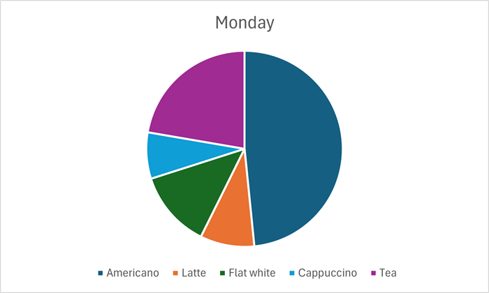
Data from: Daily sales table.
| Americano | Latte | Flat white | Cappuccino | Tea | |
|---|---|---|---|---|---|
| Monday | 76 | 14 | 20 | 12 | 35 |
| Tuesday | 60 | 30 | 14 | 25 | 17 |
| Wednesday | 57 | 28 | 30 | 22 | 25 |
| Thursday | 37 | 32 | 12 | 27 | 14 |
| Friday | 70 | 36 | 18 | 32 | 28 |
| Saturday | 72 | 35 | 27 | 16 | 32 |
| Sunday | 55 | 25 | 23 | 27 | 40 |
Although the visual impact of the different sized segments is perhaps the main reason you might choose a pie chart, data labels can also be included. In this example the data labels provide actual quantities sold for each category.

A pie chart provides visual impact for a snapshop of data. Another chart type would be more appropriate where access to multiple sets of data is required. For example, a pie chart could not show the breakdown of tea and coffee sales, for each day of the week, as we could do with a bar chart.
Data check
This chart shows the total numbers of each category sold during one week, with Americano being the clear favourite. Which category had the smallest number of sales?
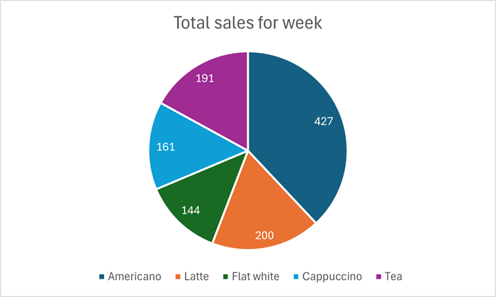
Flat whites were the least requested drink during this week: the number sold was 144.
Data check
This pie chart shows the different travel to work methods used by staff working for a local business.
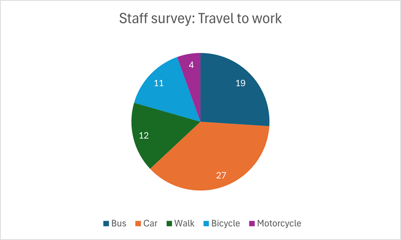
Data from: Staff travel table.
| Bus | Car | Walk | Bicycle | Motorcycle |
|---|---|---|---|---|
| 19 | 27 | 12 | 11 | 4 |
- What is the method of travel used by most staff?
- How many staff walk to work?
- How many staff in total were surveyed?
- Most of the staff (27) use a car to get to work.
- Twelve (12) members of staff walk to work.
- The total number of staff surveyed was 73. This is the sum of all the segment data labels.