Building number confidence: Graphical data
4. Charts and graphs
4.3. Line graph
A line graph, or line chart, uses straight lines to connect data points, to show trends and relationships in data over time or categories.
This example shows data collected over a week, but a similar chart could be used to show trends over months or years.
A legend below the chart names the category represented by each colour.

Data from: Daily sales table.
| Americano | Latte | Flat white | Cappuccino | Tea | |
|---|---|---|---|---|---|
| Monday | 76 | 14 | 20 | 12 | 35 |
| Tuesday | 60 | 30 | 14 | 25 | 17 |
| Wednesday | 57 | 28 | 30 | 22 | 25 |
| Thursday | 37 | 32 | 12 | 27 | 14 |
| Friday | 70 | 36 | 18 | 32 | 28 |
| Saturday | 72 | 35 | 27 | 16 | 32 |
| Sunday | 55 | 25 | 23 | 27 | 40 |
Markers can be included to show the data values used to create the chart.
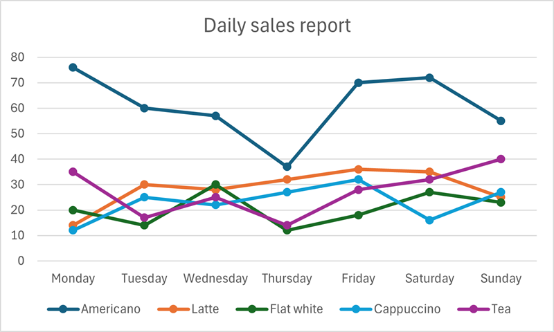
Multiple data series can appear very busy, making the trend information less of a focus. Line charts are most powerful, visually, when only one or two data sets are plotted.

Data check
Looking at the line chart (above) comparing sales of teas and Americanos, which day has the lowest sales of both?
Thursday has the lowest sales in both categories. For Americano, sales dip below 40, and tea sales are less than 20.