Building number confidence: Graphical data
2. Common data units
When you look at a graph or chart, it's important to check what is being measured. The numbers shown are often linked to a unit of measurement. This tells you how much or what type of data the chart is showing.
Here are some common data units you might encounter:
| Unit type | Example units | Used for showing... |
|---|---|---|
| People | Number of people, pupils, customers | How many people were counted or surveyed |
| Money | Pounds (£), Pence (p) | Sales, income, prices, spending |
| Time | Hours, minutes, days | Time spent, opening hours, durations |
| Distance | Metres (m), kilometres (km), miles | Travel, races, or delivery routes |
| Weight/mass | Grams (g), kilograms (Kg), tonnes | Food, parcels, recycling |
| Size | Metres (m), centimetres (cm), millimetres (mm) | Length, height, depth |
| Volume | Litres (L), millilitres (ml) | Drinks, fuel, water use |
| Percentages | % (percent) | Survey results, discounts, pass rates |
| Scores | Test scores, ratings out of 10 or 100 | Exams, reviews, competitions |
| Temperature | Celsius (°C), Fahrenheit (°F), Kelvin (K) | Weather, climate, environmental conditions |
| Energy | Kilowatt-hours (kWh) | Electricity and gas usage |
Data check
Look at the chart title below and choose the most likely unit being used in the data.
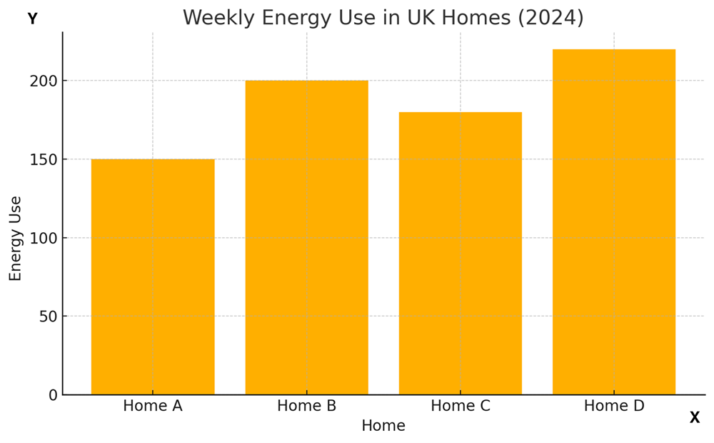
Data from: Weekly energy use table
| Home | Weekly energy use |
|---|---|
| A | 150 |
| B | 200 |
| C | 180 |
| D | 220 |
Which of these is the most likely unit on the vertical (y) axis?
- Pounds (£)
- Litres
- Kilowatt-hours (kWh)
- People
The correct answer is C Kilowatt-hours (kWh).
The chart is about energy use, and energy at home is commonly measured in kilowatt-hours (kWh).
Pounds would show cost, litres are used for liquids like water or fuel, and people wouldn’t be a measurement of energy.