Use 'Print preview' to check the number of pages and printer settings.
Print functionality varies between browsers.
Printable page generated Sunday, 5 May 2024, 8:52 PM
Summarising and presenting AMR data
Introduction
This module introduces common ways of summarising
This module is part of a series related to AMR data. It is recommended that you first complete the modules Fundamentals of data for AMR and Processing and analysing AMR data to understand AMR data and data analysis principles.
By the end of this module, you should be able to:
- describe the different ways to represent data visually
- explain why visual summaries of data are an essential part of AMR data analysis
- review the strengths and limitations of each visual presentation
- make a simple graph and map using AMR data.
Activity 1: Assessing your skills and knowledge
Rate these statements below on how confident you feel about them. This is for you to reflect on the knowledge and skills you already have.
- 5 Very confident
- 4 Confident
- 3 Somewhat confident
- 2 Slightly confident
- 1 Not at all confident
1 Recap: AMR data and analysis
In the previous modules Fundamentals of data for AMR and Processing and analysing AMR data, you learnt how AMR data is transformed into information and the methods used to analyse data to answer important questions about AMR. This section briefly reviews key concepts from these modules to help you critically interpret visual data summaries and communicate key findings to different audiences.
1.1 Review of data types
Table 1 below reminds you of the definitions of data types previously described in the module Fundamentals of data for AMR.
| Term | Definition |
|---|---|
| Variable | A variable is an attribute used to characterise a data unit. They are called variables because their values vary from one data unit to another and may change over time. Commonly used variables for AMR data may include date of admission, sex, species, production type, sample type and Variables can be classified into numeric (quantitative) and categorical (qualitative) variables. The classification of variables as numeric or categorical has implications for how data is analysed and visualised. |
| Numeric variables | Numeric variables contain only numbers and have meaning as a measurement or a count. Numeric data can be represented as integers (1, 2, 3), fractions (½, ¼), decimals (377, 39.134) or percentages (20%, 50%). Numeric data can be further defined as either discrete or continuous. Numeric data can be split into categories by applying one or more |
| Categorical variables | Categorical variables represent characteristics of distinct groups. Categorical data is represented by a name, a string of alphanumeric characters or numeric values. A numerical code may be given to a categorical variable for analysis purposes (e.g. 1 for female and 0 for male), but these numbers have no mathematical meaning. Categorical data can be further defined as nominal or ordinal. |
You need to first understand the types of data you have (i.e. discrete, continuous, nominal or ordinal) before preparing to present it in visual formats. This is because the data type will determine the formats you can use to summarise and display findings.
To understand your dataset, first begin by examining individual records and summarising the data in tables. You may find that summary tables are sufficient for presenting the data, especially if the dataset is small. If the data are more complex, then graphs or maps can help highlight important findings, trends or errors that need to be corrected (such as data entry errors).
Activity 2: Reviewing data types used in AMR analysis
1.2 Review of different approaches to data analysis
Data analysis is about identifying and summarising meaningful patterns in data. In the module Processing and analysing AMR data, you were introduced to the basics of
Here, we will briefly recap data analysis concepts relevant to visualising data.
1.2.1 Basic descriptive statistics
Descriptive analysis is the process of summarising data and generally involves characterising and visualising your dataset. Depending on the nature of the data, you may only need to undertake a descriptive analysis before reporting your findings. The approach to descriptive analysis varies depending on whether the data is categorical or numerical.
1.2.1.1 Categorical variables
Descriptive statistics for categorical variables include counts (frequencies) and
AMR data is often presented as basic descriptive statistics in sentences in a report, in a frequency table, or in a visual format using a pie chart or a bar chart. An example of using text is in reporting the percentage of isolates that were resistant:
‘A large number of MRSA isolates showed resistance to levofloxacin (83.9%), ciprofloxacin (83%), erythromycin (77.7%), and clindamycin (72.3%).’
Activity 3: Approaches to presenting information
Figure 1 and Table 3 displays data from the Third Australian Report on Antimicrobial Use and Resistance in Human Health (AURA), 2019. Table 3 is a
| Antimicrobial class | Percentage (%) |
|---|---|
| Cefalexin | 20.1 |
| Amoxicillin | 19.7 |
| Amoxicillin-clavulanic acid | 17.5 |
| Doxycycline | 8.0 |
| Roxithromycin | 5.1 |
| Trimethoprim | 3.4 |
| Flucloxacillin | 2.9 |
| Clarithromycin | 2.9 |
| Metronidazole | 2.5 |
| Erythromycin | 2.1 |
| Total | 100 |
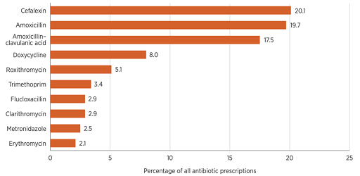
Which type of data display (Table 3 or Figure 1) do you think most effectively conveys information about the most and least commonly dispensed antibiotics in Australia in 2017?
Answer
While tables can summarise and display data to great effect, in this example, the bar chart (Figure 1) demonstrates a superior approach to presenting the data. When looking at the bar chart, it can be rapidly determined that there is a pronounced difference between the most commonly prescribed and least prescribed antimicrobials.
Do you agree that your brain needs to work harder to get the same information from the table?
1.2.1.2 Quantitative variables
Descriptive statistics for quantitative (numerical) variables (continuous or discrete) include measures of
Descriptive statistics for quantitative variables can be reported as text, as a summary table, or using a
1.2.2 Plotting variability in data
Data obtained from a sample should be representative of the population of interest. Since it is rarely possible to include the entire population in a sample, there is always some degree of uncertainty or variability in how well the data represent the population (see the Sampling modules and Processing and analysing AMR data module for more information). It is good practice to indicate uncertainty in data either in text, tables or graphs. For graphs, uncertainty in the data is represented by
Error bars can be used to display the
Error bars are markers drawn over data points on a graph and either extend from the centre of a data point or the top edge of a column (such as a bar chart). You can get a sense of how precise the measurements are (which reflects the level of uncertainty in the data collected) by looking at the error bar's length: short error bars indicate less variability in the data, and in contrast, long error bars indicate more variability, that is, the values are more spread out.
You can also use error bars to gauge if there might be a significant difference between groups. Overlapping error bars may suggest there is not a significance difference between groups, while no overlap between error bars may suggest there may be a significance difference. You cannot conclude statistical significance by looking at the graphs alone, so always perform a statistical test when drawing conclusions. (For a recap on methods of testing statistical significance, revisit the module Processing and analysing AMR data.)
You often see error bars plotted on line graphs and bar charts, such as the one in Figure 2.
Activity 4: Plotting variability in data
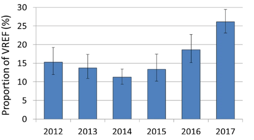
Figure 2 shows confidence intervals for each year that the proportion of vancomycin-resistant Enterococcus faecium isolates were reported. What can you say about the confidence intervals?
Answer
The confidence intervals appear to be wider in some years than others. For example, 2012, 2015 and 2016 appear to have wider confidence intervals than 2014. This may indicate that the data collected on clinical E. faecium in 2012, 2015 and 2016 was more variable than in 2014. Also, the confidence intervals for some years overlap, while for other years they do not. This may indicate a statistically significant increase in the proportion of vancomycin-resistant E. faecium between some years where the confidence interval bars do not overlap. This is most apparent between the years 2014 and 2017.
2 Summarising AMR data visually
Research has shown that our brains understand complex information more easily when it is presented in a visual format (Ware, 2012). That is why data are often best communicated visually, using graphs and maps rather than tables or spreadsheets. Visual summaries can be a great way of communicating your findings, particularly to people who may be unfamiliar with the data.
When choosing the most appropriate visual display, ask yourself the following:
- What is the primary aim of my visual analysis? For example, do I want to demonstrate a difference in prevalence of resistant pathogens by geographic area or between two groups? Do I want to highlight a change in antimicrobial use trends over time?
- What do I want to communicate, and with whom am I communicating? Graphs and maps can help you share public health information to people who may not be familiar with the topic.
- What type of data do I have? What is the data’s measurement scale (nominal, ordinal, discrete or continuous)? The data type will influence the kind of visual representation you can use.
Table 4 summarises the different analysis aims and gives examples of the best visual displays for presenting the analysis, described in more detail as we work through this module.
| Analysis aim | What do you want to explore/present | Example | Visual presentation |
|---|---|---|---|
| Distribution | The range of values, central tendency and outliers in your data | Frequency distribution for categorical variable, mean and range of age for male and female patients | Table Histogram Bar chart |
| Composition of a variable | The composition of a set of variables and how different values sets make up a whole of that variable | Percentage of patients that are either inpatients or outpatients Percentage of countries participating in the World Health Organization (WHO) supported | Stacked bar chart Maps |
| Compare value sets/categories | Direct comparison between two or more sets of variables or categories of variables | Percentage of inpatients that are infected with E. coli compared with the percentage of outpatients that are infected with E. coli Percentage of Campylobacter isolates which are ciprofloxacin resistant between regions in a country | Bar chart |
| Trends over time | How variable(s) values are changing over time | Percentage of inpatients who are infected with E. coli each quarter over the last two years Percentage change in ceftriaxone resistance in non-typhoidal Salmonella from chicken sources over ten-year period | Table Line graph |
| Relationships and associations | Any relationships and/or associations between variables | Association between the levels of antibiotic consumption (AMC) and antibiotic resistance in | Line graph |
2.1 Graphs of ‘AMR data’
Graphs display data in a visual form to tell a story. They can be used to display patterns, trends, comparisons and differences in data that may not be otherwise evident. The goal of graphs should be to help people to understand patterns and relationships in data quickly.
2.1.1 Designing good graphs
Graphs are only as good as they are clear and understandable. A checklist of best practice to ensure a graph is conveying your message most effectively is given in Table 5 below:
| 1 | Decide on type of graph e.g. histogram, bar chart, box-and-whiskers plot, line graph, etc. |
| 2 | Keep it simple while providing all the information needed to convey the key messages |
| 3 | Avoid using styles that distract from the key messages, such as too many colours, symbols and 3D images |
| 4 | Where possible, include error bars or confidence intervals to represent uncertainty in the data |
| 5 | Label the x-axis (horizontal) and y-axis (vertical) and include the units of measurement. The x-axis usually represents the independent (or exposure) variable (e.g. time, group), and the y-axis plots the dependent (or outcome) variable, such as measures of frequency (e.g. proportion resistant, number of diseased animals) |
| 6 | The scale for each axis must be appropriate for the data being presented and evenly spaced |
| 7 | The title should be clear and concise. It should describe the what, where and when of the data in the table |
| 8 | Use a legend/key to describe the various colouring, shading or line styles (solid, dashed) used in the graph to distinguish different variables. The legend should be placed in an unused space next to the graph |
| 9 | Identify missing or unknown data in a footnote below the graph |
| 10 | Explain any codes, acronyms, abbreviations or symbols in a footnote |
| 11 | Note the source of the data in a footnote if the data is from secondary or tertiary sources |
In the following sections, you will learn about common graph types: histograms, boxplots, scatter plots, bar charts and line graphs. Not all of these graphs will be appropriate for the data and message that you want to convey. Understanding the strengths and limitations of each graph will help guide your decision on which graph to choose.
2.1.2 Histograms
Histograms show the distribution of values for a quantitative (continuous) variable. Histograms are useful when there are many observations and you want to understand the overall shape and spread of your data.
The x-axis is marked in the units of measurement for the independent variable (e.g. age, time, MIC, zone diameter). The y-axis is the scale that shows you the number of times (frequency, proportion) the value in an interval occurred.
To create a histogram, you need to first group data from the independent variable into
Example
In this example, a series of observations have been recorded in a variable called ‘Age’. To construct the histogram, ‘Age’ is split into five class intervals. Each interval contains the count of occurrences.
| 39 | 41 | 22 | 38 | 46 | 55 | 65 | 78 | 83 | 18 |
| 28 | 54 | 53 | 61 | 10 | 16 | 29 | 58 | 55 | 66 |
| Class interval | Class frequency | Observations |
|---|---|---|
| 0–20 | 3 | 10, 16, 18 |
| 20.1–40 | 5 | 22, 28, 29, 38, 39 |
| 40.1–60 | 7 | 41, 46, 53, 54, 55, 55, 58 |
| 60.1–80 | 4 | 61, 65, 66, 78 |
| 80.1–100 | 1 | 83 |
The histogram is then constructed based on the number of class intervals which are plotted on the x-axis with the y-axis showing the frequency (number) of occurrences in each class interval.
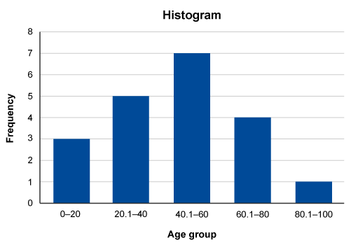
Traditionally, a histogram is drawn with no space between classes to indicate all values of the variable are represented. (This is different from a bar chart, which has space between the classes.) However, sometimes histograms may be drawn with spaces between the classes for greater visual impact. You can see this in Figure 4.
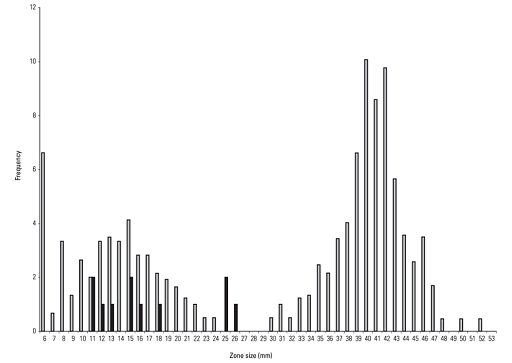
The purpose of the histogram (or, indeed, of any graph) is to help understand the data. When viewing a histogram, look for important features, including the shape and spread of the data and whether there are any deviations (
A histogram can have different shapes: it can be
AMR data often has a bimodal shape because there are often two separate populations of isolates – those that are susceptible and those resistant. Also, AMR data is often skewed. Depending on the population of interest, there might be more isolates that are susceptible than resistant, or vice versa. For example, in secondary care, there may be more isolates tested that are resistant to an antimicrobial agent than isolates that are susceptible because the people who are sampled are more likely to have been treated with antimicrobials and suffered treatment failure. Figure 4 demonstrates a bimodal distribution of zone diameter measurements obtained by testing the susceptibility of Aeromonas salmoncida to oxolinic acid. (Note, the purpose of including Figure 4 in this module is to demonstrate a typical distribution of AMR data. Therefore, it is not necessary to interpret the breakpoints depicted on the graph.)
The strengths and limitations of histograms are listed below:
| Strengths | Limitations |
|---|---|
| Summarise large datasets | Cannot read exact values of each data point from histograms as the data is collapsed into categories |
| Show the relative frequency of occurrences of different data values | Difficult to compare two datasets |
| Demonstrate visually the variation and distribution shape of data, which is useful when determining the statistical approach you may take to explore associations with your data | Can only be used with continuous data |
2.1.3 Box-and-whisker plot
Another way of displaying information about the spread of data is the
- a central box that spans the quartiles Q1 (lower quartile, 25th percentile) and Q3 (upper quartile, 75th percentile) – (note that the range from Q1 to Q3 is known as the interquartile range (IQR))
- a line in the box that marks the median (50th percentile)
- lines (whiskers) that extend from the box out to either the smallest (minimum) and largest (maximum) observations, excluding outliers, or 1.5 times the interquartile range on each side, also excluding outliers (if it is ambiguous which method is used, it is normally mentioned in the Figure’s legend)
- outliers, which are data values that are far away from other data values. On a boxplot, outliers are identified by a symbol such as a dot or an asterisk.
Boxplots are most beneficial when used for a side-by-side comparison of more than one distribution.
Activity 5: Understanding box-and-whisker plots
Look at the box plot in Figure 5. Can you annotate one of the boxplots to show the five-number summary for a distribution?
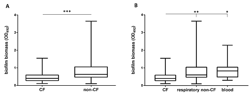
Answer
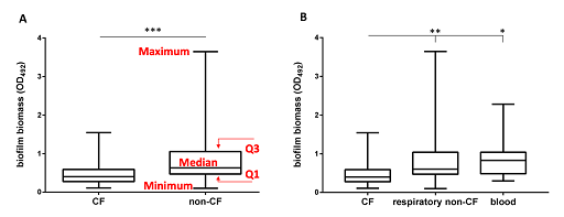
The box extends from the first (Q1) and third (Q3) quartiles. The line in the middle of the box is plotted at the median, while the ends of the whiskers represent the minima and the maxima of all the data. The lines extending from the interquartile range are called
The strengths and limitations of boxplots are listed below:
| Strengths | Limitations |
|---|---|
| Summarise large datasets | Cannot read exact values |
| Summarises the distribution of the data, the symmetry and skewness | Emphasises the tails of the distribution, which are the least certain points in a data set |
| Shows outliers, unlike many other graphs | Doesn’t show many details of the distribution, so need to use in combination with a histogram |
| Compare the distribution of other data sets | |
| Important tool for exploratory data analysis |
2.1.4 Scatter plots
Scatter plots are used when we are interested in the relationship between two different variables. Each point on the graph represents the values of a pair of variables. The value of one variable is plotted on the x-axis, and the value of the other variable is plotted on the y-axis. The variables generally have to be numeric and are commonly continuous, although they may also be discrete.
A scatter plot gives us a good idea of the
The scatter plot in Figure 7 shows the relationship between country-level antimicrobial consumption (x-axis) and resistance to aminopenicillins (y-axis) in European countries in 2015.
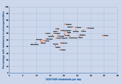
The relationship between two numeric variables is called
No correlation: there is no apparent relationship between the variables. For example, some studies have found that patient age is not correlated with AMR for specific antimicrobial classes and/or bacterial species.
The strengths and limitations of scatter plots are listed below:
| Strengths | Limitations |
|---|---|
| Helps to identify trends in the data by showing correlations (positive, negative or none) or relationships between two values | For very large datasets, individual data points can overlap. This may make the scatterplot complex and challenging to understand because there may be many data points clustered together. |
| Plot actual values compared to other graph options and identify outliers in the data | Can only be used with continuous variables |
In summary, scatter plots should be used when there are many different data points and you want to highlight similarities in the dataset. This is useful when looking for outliers or for understanding the distribution of your data.
2.1.5 Bar charts
Bar charts show relationships between different data series that are independent of each other. The most common data displayed in bar charts includes nominal, ordinal, discrete data or variables that can be treated as discrete.
The difference between histograms and bar charts is that histograms show the frequency of a continuous variable, whereas bar charts show the frequency of categorical or discrete data.
There are many bar charts: column (vertical), horizontal (left to right), grouped and stacked.
2.1.5.1 Horizontal and column bar charts
Horizontal and column bar charts are usually interchangeable. However, there are some reasons to choose one over the other. Horizontal charts work better when the labels are long and for data that needs to show ranking from largest to smallest. An example of a horizontal graph can be seen in Figure 8.
Column charts work better for grouped data and time-series data. Simple column charts compare categories of one variable, while grouped (or clustered) column charts compare categories of two or more variables as shown in Figure 9. The bars within a group adjoin, but there is a space between groups. It is important that the bars are distinctive and described in the legend.
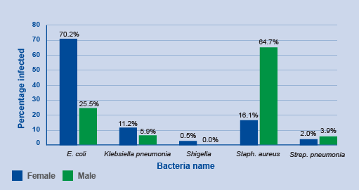
Activity 6: Interpreting bar charts
Review Figure 10 and describe what you see, what you think are the key findings and how might you improve the graph.
Answer
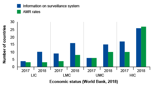
In Figure 10, groups of countries are categorised by economic status (low, low-middle, upper-middle, high – this wasn’t made clear in the caption) and year (2017, 2018) on the x-axis, and the number of countries in each category participating in GLASS on the y-axis. Within each group, there are two bars. One bar represents the frequency of countries that report information on their surveillance system, and the other bar represents the frequency of countries that report information on AMR rates in bacteria of interest to GLASS.
The graph shows that, overall, more high-income countries participate in GLASS compared to lower-income countries. Reporting to GLASS increased from 2017 to 2018 for all types of countries. When looking at the bar lengths, it appears there is an approximate doubling in reporting on surveillance systems from 2017 to 2018 for most categories. While the number of countries reporting AMR rates also increased, the increase was not as large when compared to countries reporting on their surveillance systems, other than in high-income countries.
The graph could be improved by reporting the exact frequencies in each bar so that the actual change in reporting rates in each category can be determined. The graph could also be improved by defining the country group acronyms (LIC, LMC, UMC, HIC). Another way to present the data is demonstrate proportional representation in each economic category which can be done by plotting percent on the y-axis rather than the count.
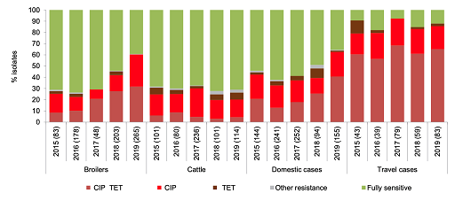
2.1.5.2 Stacked bar chart
In a stacked bar chart, each bar represents a total amount broken down into subsections. The same colour is used for the equivalent subsection in each bar. This allows you to compare both the whole picture and the components of each bar. A 100% component bar chart is a variation of the stacked bar chart, and shows all of the bars at the same height (100%) and the components as percentages of the total. This type of chart is useful for comparing the contribution made by different subgroups within the categories of the main variable.
Figure 11 consolidates data into one stacked bar chart making it much clearer to compare the distribution of resistance of Campylobacter jejuni found in chickens, cattle and people in Denmark between 2016 and 2019. The subsections have been ordered so that the largest changes are first and last. This choice of order highlights changes that may be of specific interest when interpreting the graph. The most noticeable feature to compare between different hosts’ susceptibility is the proportion of C. jejuni isolates with resistance to both ciprofloxacin and tetracycline from people returning from travel overseas compared to domestic cases in people, chickens and cattle. Also, unlike what was observed in cattle, resistance to ciprofloxacin and tetracycline in C. jejuni isolated from poultry and from local cases of campylobacteriosis in people appears to have risen over time. However, statistical significance should be tested before making any firm conclusions from this graph.
The strengths and limitations of bar charts are listed below:
| Strengths | Limitations |
|---|---|
| Represent three or more variables on a single chart (unlike a histogram or scatterplot) | May require an additional explanation in text if many groups are compared or using stacked graphs |
| Understood by a wide audience, commonly used, and the scales and bars are easily read | Data can be manipulated or misrepresented – care must be taken when presenting data. For example, if the scale is exaggerated or minimised it can change the impression of the magnitude of differences between categories |
| Useful for showing time trends | Doesn’t show relationships between variables |
2.1.6 Line graphs
Line graphs show trends in data and help explore relationships with time-related variables (such as age or calendar year). They help to determine the relationship between two sets of values, with one variable dependent on the other. The independent time-related variable is plotted on the x-axis and the dependent variable on the y-axis. Several dependent variables can be plotted against one independent variable on the same graph if they have the same units and range.
Line graphs are particularly useful when there are many data points and when you want to compare several trend lines on a single graph.
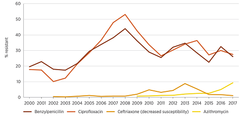
Figure 12 shows data from Australia which reports on trends in resistance and multi-drug resistance patterns to four first-line antimicrobials in Neisseria gonorrhoeae between 2000 and 2017. The graph shows that resistance rates to these antimicrobials have changed in different ways over this time period. Resistance to most antimicrobials was lower in 2017 compared to previous years, except for resistance to azithromycin, which has increased since 2015. This graph raises several questions, one of which is what explains the decrease in benzylpenicillin and ciprofloxacin resistance levels to around 30% after peaking at 45–50% in 2008? Time series data presented in line graphs prompts important questions about the data that allow you to undertake exploratory analyses to look for associations in the data.
The strengths and limitations of line graphs are listed below:
| Strengths | Limitations |
|---|---|
| Simple to read | |
| Show clear patterns in data (visibly show how one variable is affected by another as it changes) | Cannot use a line graph to compare different categories of data (use a bar chart instead) |
| Compare multiple continuous data sets | The scale can change the appearance of the data which can be misleading. Always use the most appropriate scale for both axes when plotting line graphs |
2.2 Mapping AMR data
Maps are used extensively in disease surveillance because they can be used to display information on the spread of diseases across different geographic regions. For example, Figure 13 is a map where different colours are used to represent different categories of the indicator of interest (in this case, the number of countries enrolled in GLASS).
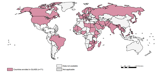
Because maps are so effective at telling a story, they are used by governments, NGOs, non-profits, public health departments, the media and at local levels to understand the situation in different areas.
Maps answer spatial questions about your data and can help you understand trends or patterns. It is a good idea to ask yourself whether a map is the best way to display data. If the answer is yes, then you need to ensure your map represents your data accurately, in sufficient detail and attractively.
The strengths and limitations of maps are listed below:
| Strengths | Limitations |
|---|---|
| Visually appealing and compelling | Can be hard to interpret if the geographic relationship to your variables of interest is unclear |
| Used to highlight important patterns if geography or location, and resource needs by location | Challenges ensuring privacy and availability of data for all regions being displayed |
| Effective for tracking the spread of diseases |
3 Creating data visualisations using common software
3.1 Basic software tools
Many statistical software packages are available where you can quickly and easily construct different types of graphs to explore the data and determine which type best conveys your key messages. These software packages are especially helpful when larger data sets are involved or complex analyses are required.
The most basic and widely used programme for summarising and presenting data is Microsoft Excel. Advantages of MS Excel include:
- flexible storage, modelling and manipulation of datasets
- a range of automated functions, including data analysis and chart functions
- users can select from a range of automated charts to display the data graphically. This process requires minimal amount of user input.
While MS Excel is familiar to many and easy to use, the programme has several limitations, including:
- fewer functions for data analysis and graphic displays than dedicated statistical programmes
- a limited number of total cells compared to these programmes.
While MS Excel is convenient for data entry, it is generally recommended that MS Excel spreadsheets be exported to a dedicated statistical software programme for more than basic analysis.
Google Maps is an open-source service that provides information about geographical sites around the world. It offers conventional road maps, aerial and satellite views of many places. It can be customised to visualise geographic statistical data, such as economic and population statistics, and can be used to create disease prevalence maps. Google Maps is an obvious tool to use to visualise geospatial data as many people are familiar with the platform.
3.2 Specialist software tools
There are now several freely downloadable statistical programs for conducting more complex analyses. Even for simple analyses, there are many advantages to using statistical software, including the ability to reproduce graphs and maps if data is updated, or if another user needs to conduct analyses. Some software programs have steep learning curves but are very powerful once mastered.
R is an example of a free statistical software programme that can be used to summarise and present data in interesting ways, including producing a range of graphs and maps. You can download R by visiting the R project website.
QGIS is an open-source Geographical Information System (GIS) platform that can be run on all operating systems and can support a number of database formats and functionalities. It allows users to analyse and edit spatial information as well as creating and exporting graphical maps.
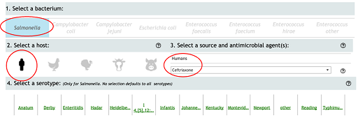
Activity 7: Interactive graphing and mapping of AMR data
Box 1: Steps for generating a graph from the NARMS interactive website
Step 1: From the NARMS website, click on the icon ‘Antimicrobial Resistance by Year’ (there is also a tab at the top of the interactive display).

Step 2: On the ‘Antimicrobial Resistance by Year’ page, make the following selections:
- Select a Bacterium – select ‘Salmonella’.
- Select a host species – select the icon of a person.
- Select a source and antimicrobial agent(s) – from the drop-down menu select ‘Ceftriaxone’ and click on ‘Apply’.
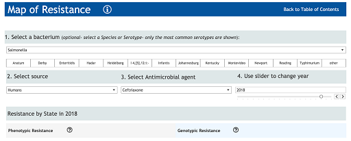
Box 2: Steps for generating a map from the NARMS interactive website
Step 1: From the NARMS website, click on the icon ‘Map of Resistance’ (there is also a tab at the top of the interactive display).

Step 2: On the ‘Map of resistance’ page, make the following selections:
- Select a Bacterium – select ‘Salmonella’.
- Select a source – select ‘humans’.
- Select an antimicrobial agent – from the drop-down menu select ‘Ceftriaxone’ and click on ‘Apply’.
- Use the slider to select the year – ‘2018’.
4 End-of-module quiz
Well done – you have reached the end of this module and can now do the quiz to test your learning.
This quiz is an opportunity for you to reflect on what you have learned rather than a test, and you can revisit it as many times as you like.
Open the quiz in a new tab or window by holding down ‘Ctrl’ (or ‘Cmd’ on a Mac) when you click on the link.
5 Summary
In this module, you have learnt about the most common visual ways to display data. You reviewed the strengths and limitations of each and looked at examples of when a particular visual display is better than another. If you are trying to decide whether to use a table or a graph (and the type of graph), ask yourself how the data will be used, consider your target audience and decide the best way to map out your information. Think about the utility of your visual and let that help drive your decision-making.
You should now be able to:
- describe the different ways to visually represent data
- explain why visual summaries of data are an important part of AMR data analysis
- review the strengths and limitations of each visual presentation
- make a simple graph and map using AMR data.
Now that you have completed this module, consider the following questions:
- What is the single most important lesson that you have taken away from this module?
- How relevant is it to your work?
- Can you suggest ways in which this new knowledge can benefit your practice?
When you have reflected on these, go to your reflective blog and note down your thoughts.
Activity 8: Assessing your skills and knowledge
Rate each statement below on how confident you feel about it now that you have completed the module.
- 5 Very confident
- 4 Confident
- 3 Somewhat confident
- 2 Slightly confident
- 1 Not at all confident
When you have reflected on your answers and your progress on this module, go to your reflective blog and note down your thoughts.
6 Your experience of this module
Now that you have completed this module, take a few moments to reflect on your experience of working through it. Please complete a survey to tell us about your reflections. Your responses will allow us to gauge how useful you have found this module and how effectively you have engaged with the content. We will also use your feedback on this pathway to better inform the design of future online experiences for our learners.
Many thanks for your help.
References
Acknowledgements
This free course was collaboratively written by Melanie Bannister-Tyrrell, Skye Badger and Clare Sansom, and reviewed by Siddharth Mookerjee, Claire Gordon, Natalie Moyen, Peter Taylor and Hilary MacQueen.
Except for third party materials and otherwise stated (see terms and conditions), this content is made available under a Creative Commons Attribution-NonCommercial-ShareAlike 4.0 Licence.
The material acknowledged below is Proprietary and used under licence (not subject to Creative Commons Licence). Grateful acknowledgement is made to the following sources for permission to reproduce material in this free course:
Images
Course Image: NosorogUA/Shutterstock
Figure 1: Australian Commission on Safety and Quality in Health Care (ACSQHC). AURA 2019: third Australian report on antimicrobial use and resistance in human health. Sydney: ACSQHC; 2019.
Figure 2: Markwart, R., Willrich, N., Haller, S. et al. (2019) The rise in vancomycin-resistant Enterococcus faecium in Germany: data from the German Antimicrobial Resistance Surveillance (ARS). Antimicrob Resist Infect Control 8, 147 (2019) https://doi.org/ 10.1186/ s13756-019-0594-3. This file is licensed under the Creative Commons Attribution 4.0 International (CC BY 4.0), https://creativecommons.org/ licenses/ by/ 4.0/
Figure 3: Ausvet Pty Ltd
Figure 4: Smith, P. (2008) Antimicrobial resistance in aquaculture, Revue Scientifique et Technique, 2008, 27 (1), 243-264
Figure 5: Pompilio, A., Savini, V., Fiscarelli, E., Gherardi, G., Di Bonaventura, G. (2020) Clonal Diversity, Biofilm Formation, and Antimicrobial Resistance among Stenotrophomonas maltophilia Strains from Cystic Fibrosis and Non-Cystic Fibrosis Patients. Antibiotics 2020, 9, 15. https://doi.org/ 10.3390/ antibiotics9010015 . An open access article distributed under the terms of the Creative Commons Attribution (CC BY) license, http://creativecommons.org/ licenses/ by/ 4.0/
Figure 6: Pompilio, A., Savini, V., Fiscarelli, E., Gherardi, G., Di Bonaventura, G. (2020) Clonal Diversity, Biofilm Formation, and Antimicrobial Resistance among Stenotrophomonas maltophilia Strains from Cystic Fibrosis and Non-Cystic Fibrosis Patients. Antibiotics 2020, 9, 15. https://doi.org/ 10.3390/ antibiotics9010015 . An open access article distributed under the terms of the Creative Commons Attribution (CC BY) license, http://creativecommons.org/ licenses/ by/ 4.0/
Figure 10: Global antimicrobial resistance surveillance system (GLASS) report: early implementation 2017-2018. Geneva: World Health Organization; 2018. This file is licensed under a Creative Commons Attribution-NonCommercial-ShareAlike 3.0 IGO (CC BY-NC-SA 3.0 IGO) license, https://creativecommons.org/ licenses/ by-nc-sa/ 3.0/ igo/
Figure 11: DANMAP 2019 - Use of antimicrobial agents and occurrence of antimicrobial resistance in bacteria from food animals, food and humans in Denmark. ISSN 1600-2032
Figure 12: Ausvet Pty Ltd
Figure 13: Global antimicrobial resistance surveillance system (GLASS) report: early implementation 2017-2018. Geneva: World Health Organization; 2018. This file is licensed under a Creative Commons Attribution-NonCommercial-ShareAlike 3.0 IGO (CC BY-NC-SA 3.0 IGO) license, https://creativecommons.org/ licenses/ by-nc-sa/ 3.0/ igo/
Figures 14–16: Food and Drug Administration (FDA). NARMS Now. Rockville, MD: U.S. Department of Health and Human Services. Available from URL: https://www.fda.gov/ animal-veterinary/ national-antimicrobial-resistance-monitoring-system/ narms-now-integrated-data. Accessed 05/11/2021.
Figure 17: © 2021 Mapbox © OpenStreetMap
Figures 18–21: Food and Drug Administration (FDA). NARMS Now. Rockville, MD: U.S. Department of Health and Human Services. Available from URL: https://www.fda.gov/ animal-veterinary/ national-antimicrobial-resistance-monitoring-system/ narms-now-integrated-data. Accessed 05/11/2021.
Quiz Question 4: Food and Drug Administration (FDA). NARMS Now. Rockville, MD: U.S. Department of Health and Human Services. Available from URL: https://www.fda.gov/ animal-veterinary/ national-antimicrobial-resistance-monitoring-system/ narms-now-integrated-data. Accessed 05/19/2021.
Tables
Table 1: Ausvet Pty Ltd
Table 2: Ausvet Pty Ltd
Table 3: Data source: Gadzhanova S, Roughead E. Analysis of 2013–2017 Pharmaceutical Benefits Scheme (PBS) data for the National Report on Antimicrobial Use and Resistance
Tables 5–13: Ausvet Pty Ltd
Every effort has been made to contact copyright owners. If any have been inadvertently overlooked, the publishers will be pleased to make the necessary arrangements at the first opportunity.