Introducing engineering
Use 'Print preview' to check the number of pages and printer settings.
Print functionality varies between browsers.
Printable page generated Sunday, 26 July 2026, 5:44 AM
Introducing engineering
Introduction
Today's engineering society has developed step by step. Engineers have always worked within a context of scientific knowledge, available skills and tools, and set rules that govern their behaviour. The purpose of this course is to introduce you to some of the basics of engineering and to explore how engineering is done. Of course, you will first need to understand what engineering is.
You probably have your own ideas regarding what is meant by the term 'engineering', depending on your interests and background. Your ideas may be shaped by experiences you have had in the workplace or maybe by the different ways engineering is represented in the media. As you progress through this course, you will start to get a fuller understanding of exactly what is meant by the term 'engineering'.
For the moment, it is sufficient to consider engineering as being about problem solving. If you have ever put up some shelves, or exercised your DIY skills to make something useful from scratch, then you have probably done some engineering along with some element of design. If you tackled the problem yourself from scratch, without being provided with a starting point, then in general terms you have had to create a design to meet your purpose, organise your resources and fabricate your product. This type of approach is essentially the same as that taken by professional engineers; that is why we would consider shelf assembly to be engineering. However, professional engineers have to be able to handle projects of greater scale and complexity. To do this efficiently and effectively requires a wider range of skills, developed through education, training and experience.
Skills such as management, financial planning, mathematical aptitude and business strategy all fall within the scope of the professional engineer. This course does not attempt to teach these skills, but within it you will find pointers towards them and their significance in the engineering context.
This OpenLearn course provides a sample of level 1 study in Engineering http://www.open.ac.uk/ courses/ find/ engineering.
Learning outcomes
After studying this course, you should be able to:
understand the characteristics of ‘engineering’ and the role engineers have played in shaping engineering up to the present and into the future
understand a range of principles in science, mathematics and engineering in order to make well-founded decisions as part of a design process
have an appreciation of the design decision-making process when developing new products
recognise the effects on the conduct of engineering relating to issues such as patents, standards and risk
understand the use of appropriate candidate/potential materials and processes for the manufacture of a given artefact.
1 Engineering beginnings
1.1 What is engineering?
At seven o'clock this morning my manufactured alarm radio awoke me in my manufactured bed. I went to my bathroom, with its manufactured fittings, showered with manufactured shower gel, dressed in my manufactured clothes and came down the constructed stairs to eat my manufactured breakfast. My selectively bred (but otherwise unmanufactured) cat greeted me, and I opened a manufactured can of manufactured food for her. Outside, in the old tree in my garden (all organised, hybridised and fertilised by human intervention) a blackbird called his territory: the first wild thing of the day.
Look around yourself. Recognise just how much the material environment we live in is of our own making; it has been engineered. Even to provide a simple container of shower gel has required, if you think about it, interactions among lots of people engaged in an enormous range of activities.
Activity 1 (exploratory)
The soap used in a shower gel is usually made by reacting a fat (often a vegetable oil) with an alkali (a generic name for a type of chemical).
In three minutes, write down as many things/people/activities as you can think of that are involved in getting a shower gel from raw materials to the container in your bathroom.
Answer
- supply of vegetable oil, which requires farmers to grow oil seed
- oil processing plant
- harvester for crop
- plough to cultivate land
- fertiliser and pesticides
- roads to transport to and from farm
- bricks/cement to build factory
- people to make all these things
- fuel for tractors, trucks, etc.
- steel industry, which implies mining
- alkali industry
- soap-making plant
- shower gel production plant
- plastic container for shower gel
- printing for container – inks, dyes
- cardboard boxes to pack shower gel containers for transport to shops
- forestry for wood pulp for packaging
- electricity supplies for factory machines.
My three minutes are up and I've not got the shower gel to my home yet!
That simple example is sufficient to remind you of the great breadth of 'economic activity' that supports our modern industrialised lifestyle. Perhaps because we have been born into this 'civilisation', rather than chosen it, the depth of our dependence on its intricate, interlocking systems of supply is not so obvious. We expect our food to appear in shops, water to be on tap, sewage to disappear without thought or effort, power to come from a socket in the wall, communication to need but the touch of a few buttons. We expect to be provided with shelter from the weather, to be entertained, transported, kept in health and defended.
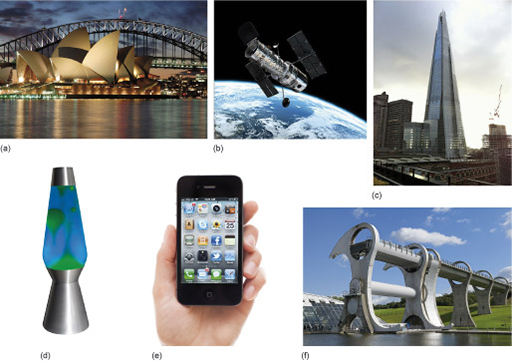
It is engineering that puts all this in place. All the material things – from containers of shower gel to satellites – that enable us to live our everyday life are the products of engineering (Figure 1).
People have recognised a need for some function to be achieved (e.g. de-greased and cleansed skin), thought out or discovered how it can be done (soap in the form of a shower gel), designed, set up and run the means for making the thing (raw materials, process equipment, energy source, labour and finance) and delivered it to the consumer. You can see that this nutshell description of what engineering involves already identifies or implies quite complex interactions: many different people could be engaged in different bits of the scheme. There are so many things to be decided, such as the following.
- How is the function or 'need' identified?
- Who invents solutions?
- How is the decision made to accept a particular solution?
- How is it decided to set up a production facility?
- Who designs that production facility; what production level; what resources?
- Who builds it, runs it, pays for it?
- How is the product costed; will it succeed in the market?
Different societies at different times have different answers to these questions. In a capitalist society you'll find a host of professions getting in on the act: market researchers, bankers, lawyers, steel erectors, bricklayers and joiners, machinery sales people … and engineers. So who or what are engineers and what do they do?
Ask this question of people in the street and you are likely to get many different answers. Some may think of building things, such as bridges or skyscrapers; some may think of repairing things like cars or televisions. Others may relate the word to common phrases or job titles, such as genetic engineering , software engineering or civil engineering. Yet another may tell you that engineers run factories.
If you ask 'What is engineering?' of professional engineers you'll also get many different answers. Their responses will depend on their particular backgrounds, experiences and jobs of the moment. Some will say that engineering is about making things, or developing things. Others will answer in more general terms, saying that it is about generating profit for a company or wealth for a country, or about improving the quality of life.
Clearly engineers are responsible in several ways for making some of those decisions we listed for the would-be shower gel manufacturer. Engineers handle the material aspects of the business. They will know (or be able to work out) how to design a factory suited to making the shower gel, what plant (industrial-scale equipment and its housings) is required, which raw materials to buy, how to work out what power supplies will be needed, and so on. They may be able to calculate how much all this will cost, but they probably will not control the decision of whether to invest that much in the venture. Nor will they be asked to plan the advertising campaign.
The Oxford English Dictionary defines engineering as:
The branch of science and technology concerned with the development and modification of engines (in various senses), machines, structures, or other complicated systems and processes using specialized knowledge or skills, typically for public or commercial use; the profession of an engineer. Frequently with distinguishing word: chemical, civil, electrical, mechanical, military engineering, etc.
There is a lot wrapped up in this dictionary definition, reflecting the fact that engineering draws on many different skills and covers a large variety of specialisms. The following section explores the definition through some real examples of engineering.
1.2 Some case studies
The dictionary definition of engineering given in the previous section can carry us quite a distance in seeing what engineers do. Some examples will illustrate the point. But which to choose? Anything out of our whole history of manipulating the environment to fit our needs will do. For a fuller discussion I have picked four examples: the Pont du Gard, a beautiful Roman bridge in the south of France; a disposable ballpoint pen; muskets; and the plant for making the chemical ammonia. This set will enlighten us concerning varied aspects of engineers' practice. Apart from their intrinsic interest, the four case studies demonstrate the distinction between one-off engineering solutions and mass-produced solutions.
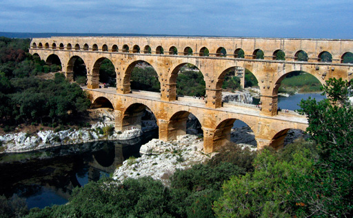
1.2.1 The Pont du Gard: one of a kind
Bridging ditches, dips in the land, streams, rivers and roads is one obvious engineering task. Many of us will cross several bridges during a normal day, and there's sure to be one not far from where you live. You will be aware that there are many different designs of bridge, from little more than a beam across a gap to elegant suspension bridges.
For the makers of early bridges, such as the Pont du Gard, constructed around two millennia ago (Figure 2), the problem was that they were limited to materials like wood and stone. Metals, although in use for tools, armour and weapons, couldn't be produced in sufficient quantity or quality for bridge building until the nineteenth century.
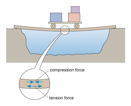
Wood doesn't last too well, so let's turn our attention to stone. One of the problems with stone is that it is brittle : it is easily broken by an impact, and will tend to break rather than just deform. Stone is an example of a ceramic material (see Ceramics below). The pottery mugs you have at home are also ceramic, and they break easily if dropped onto a hard surface; a metal saucepan, on the other hand, would not break, though it might end up with a dent – metals tend to be tough.
When using stone, the trick is to ensure that it is used so that it is being compressed (see Compression and tension below). Think about the bricks used to make a house: they are stacked one on the other, so that each brick is compressed by those above it. This works fine. However, building a bridge is different from building a wall. It's impossible to make a stone bridge that is entirely compressed. So a way is required to minimise the areas that are in tension. The solution in the case of the Pont du Gard was to use arches: curved columns of stone which are compressed by the span of the bridge above them.
Ceramics
The term 'ceramic' covers a wide range of materials that are typically strong, hard and brittle. The minerals that make up rocks such as granite, sandstone and slate come into this category, as well as traditional pottery made from clay (the word ceramic comes from the Greek keramikos , meaning 'pottery') and manufactured rock-like construction materials including brick, cement and concrete.
Most ceramics have crystalline structures: they can withstand high temperatures and are resistant to chemical attack, which makes them useful for a wide range of applications. Glass, which also comes into this category, is unusual in having a relatively low melting point and a more random structure, but this gives it advantages in ease of processing and transparency. More recently a large number of advanced ceramics have been developed for a variety of specialist engineering applications.
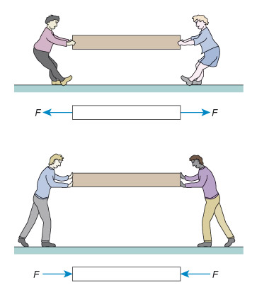
Compression and tension
In construction particularly, and many other areas of engineering, the forces acting on the materials are critical to whether or not a structure will be safe. Materials have limits of strength which must not be exceeded.
Forces are either compressive or tensile. You can think of compression as a 'squeezing' force, and tension as a 'pulling' force (see Figure 3). Modern structural materials (mainly metals) can withstand both tensile and compressive forces. Stone and similar ceramics are fine in compression, but their strength in tension is much lower.
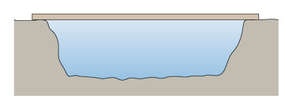
The simplest sort of bridge would be a slab over a ditch (Figure 4). When there is something on the bridge, it will bend – even if only very slightly. Bending puts tension onto the bottom of the slab, and compresses the top (Figure 5). So in building stone bridges, this tensile force must be minimised to below the level at which the slab would crack. This can be done either by making the slab shorter between its supports, or thicker thereby reducing the bending. Look how the design for the Pont du Gard has plenty of supports along its length, so that none of the stones will bend unduly. Forces due to bending crop up a lot in engineering: the simple act of walking across a room will bend the floorboards that support you.
Unlike most bridges, the Pont du Gard was not designed to carry people or animals, although tourists with a good head for heights can walk across it. It was built under the patronage of the Roman Emperor Agrippa in 18 BC to carry water to Nîmes in southern France. The water channel is nearly 50 m above the river, and traverses a distance of 270 m. The channel is nearly 2 m 2 in cross-sectional area and was lined with cement to make it waterproof. The arches, however, were all constructed of accurately cut stones using no cement at all.
With the Emperor backing the construction of the bridge, the financial side of the enterprise was presumably not a concern. But consider the necessary organisation of materials and labour. First it had to be decided exactly what was to be built. The design had to be worked out in meticulous detail so that the water channel would be at the correct height with the correct fall, so that the bridge would fit the site, and so that the stones could be cut to fit together to form the arches. The very existence of the bridge is proof that the Roman engineers had accurate methods of measuring and could transfer their calculations in instructions to the artisans (see Measuring sizes – length below). A quarry had to be established and means of bringing stone to the site provided: appropriate roads and carts. Workshops for preparing the stones to prescribed measures would most likely have been on site so that flexibility could be maintained during construction. Then there was a need for plenty of timber and skilled carpenters. Arches are built on a 'centring', which is a timber scaffold in the shape of the arch. Only when all the stones are in place for the whole curve of the arch can the centring be removed; the stones drop slightly and the arch becomes stable under its own weight. You will also realise that some heavy weights, both stones and timber, had to be shifted – which called for ropes, pulleys, levers …. And day by day the project had to be supervised, or kept on track, by an engineer who understood both what to do and how to do it. Evidently this engineer did it rather well: the result is still standing over 2000 years later.
Measuring sizes – length
The metric system was defined in France in the 1790s, following the French Revolution, to bring order to a confusion of vague and inaccurate standards. In fact the existing units were well defined – officially – but petty corruption and fraudulent trade made a new standard necessary.
The SI unit of length is the metre. The original intention was for it to be simply related to the size of the Earth. The distance from the North Pole to the equator along the meridian through Paris was to be ten million metres. This distance could be measured by astronomical methods using the official standards of the existing units. The result of this measurement was transferred onto a bar, made of an alloy which does not corrode and is very stable, as two scribed lines, now defined as one metre apart. The bar became the standard from which copies could be made for distribution.
To give you a rough idea of a metre, it is a big walking step – actually quite an exaggeratedly big step unless you are tall. Of course you can measure it more accurately using a ruler or a tape measure.
In practice we have need of both bigger and smaller units of length for measurement, so the metre is multiplied or divided by factors of ten. There are special names for these, and a selection is shown in Tables 1 and 2.
| Factor | Symbol | |
|---|---|---|
| deca metre | × 10 | |
| hecta metre | × 100 | |
| kilo metre | × 1000 | km |
| mega metre | × 1 000 000 | Mm |
| giga metre | × 1 000 000 000 | Gm |
Of these only the kilometre is in common use.
The prefixes shown in italic in the left column are common to all metric units to describe the multiplying factor to be applied to the base unit. By agreement, the Système International (SI) of units recognises factors going up or down in steps of one thousand, although below a thousand factors of ten are also recognised. Thus all the factors shown in Tables 1 and 2 are recognised by the Système International. Although in the UK we still tend to use the mile when discussing large distances, the standard measure in most other countries is the km. Other units such as the mm, µm and nm find extensive use in engineering measurement, as you will see.
| Factor | Symbol | |
|---|---|---|
| deci metre | × 1/10 | dm |
| centi metre | × 1/100 | cm |
| milli metre | × 1/1000 | mm |
| micro metre | × 1/1 000 000 | μm |
| nano metre | × 1/1 000 000 000 | nm |
To get some idea of scale, kilometres are useful for measuring place-to-place distances (e.g. London to Paris is 340 km). By definition of the metre it is 40 Mm around the Earth. It's about 400 Mm to the Moon, and 150 Gm to the Sun. On the small side, a UK 2 pence coin is about 2 mm thick. A micrometre (also colloquially called a micron) is almost as small as can be seen with a good optical microscope (a human hair is about 100 microns in diameter), and a nanometre is taking us towards the size of atoms. Nanotechnology is a rapidly growing field of engineering which deals with very tiny structures – from simple carbon nanotubes to complex protein-based molecular motors.
Activity 2 (example)
Which is the larger distance in each of the following pairs?
- a.2000 mm or 1.8 m
- b.1 mm or 1 km
Answer
- a.2000 mm is 2.000 m, which is larger than 1.8 m
- b.1 mm is 1/1000 m whereas 1 km is 1000 m, so the kilometre is larger.
Activity 3 (self-assessment)
- a.Which is the larger distance in each of the following pairs?
- i.50 cm or 0.45 m
- ii.100 μm or 0.1 mm
- b.In a photograph taken using a camera attachment with a particular microscope, features that are really 2 μm wide appear as 2 cm wide. What is the magnification? In other words, what factor does the lens multiply the 2 μm object size by in order to provide the 2 cm image size?
Answer
a.
- i.50 cm is 0.5 m, which is larger than 0.45 m.
- ii.100 μm and 0.1 mm are the same: 100 μm is 100 × 10−6, or 10−4m, and 0.1 mm is 0.1 × 10−3= 10−4m.
- b.The magnification is:
1.2.2 Disposable pens and mass production
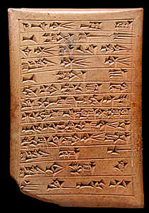
The idea of writing – setting language into a visible and permanent form through a set of symbols – is young relative to the age of our species, only a few thousand years. Among its earliest forms was the cuneiform script. The writing was a series of wedge-shaped (that's what cuneiform means) indentations in tablets of damp clay. When fired, the clay became solid, making a permanent record (Figure 6). Tonnes of these have been excavated by archaeologists and deciphered to reveal the records of the bureaucracy of the Sumerian and other Mesopotamian civilisations.
The Egyptians invented paper – the word derives from 'papyrus', the reed of the Nile which they used for paper making – so inks were needed in order to make a mark on the paper, with a 'pen' to carry the ink onto the paper in just the right quantity for legibility. In China the pen was a bamboo stick, shredded at one end to make a brush. Thanks to the skill of some brush users, calligraphy became an art form. Another simple pen was the quill, just a large feather cut across the stem at an angle and split to form a nib.
But now, as I scribble with a ballpoint pen, engineering has come onto the writing scene. Pens are manufactured and sold rather than home-made. My ballpoint pen is so cheap that when it is empty of ink I shall throw it away and get a new one – an example of how developments in engineering have led to the possibility of products that have a short life and are then discarded. As issues of sustainability grow in importance our priorities may change to make disposable items a rarity, but for now the interesting engineering question is how to make the pen so cheaply that we don't mind throwing it away.
Again, it starts with design. Obviously the thing must be designed to function as a pen, but the cost of its materials and its manufacturing process must be carefully thought about in order to get its cost very low. How is it done?
The right-hand part of Figure 7 is my pen; the left-hand part is a longitudinal section (see Engineering drawings ). It is not a unique design, and you will know that there are many similar designs in use. Indeed, it is one of the interesting features of design that many solutions can be conceived within the boundaries of a specification. What all such designs have in common is the use of a ball to transfer ink to the paper as the ball rolls across the page.
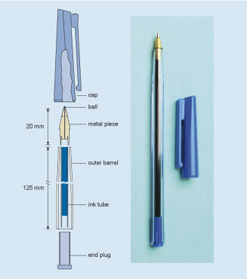
Engineering drawings
Figure 7 gives an example of a cutaway drawing: a representation of what you would see if, in this case, you were to slice the pen through the middle. It's easier to illustrate the different parts on a diagram like this than it would be using a photograph, or just words. It also allows us to show clearly the dimensions of the various parts, by marking these on the diagram, and it is used to communicate all the necessary information from the engineer who designed the component to the person who will eventually make it. You should not find diagrams like this difficult to decipher.
The pen in Figure 7 is made of six solid parts plus the ink. The outer barrel and a lid which fits over it are made of two different types of plastic. The metal piece contains the ball, and both the outer barrel and the ink tube fit its other end. The plastic end-plug prevents ink loss from the back of the pen and holds the far end of the ink tube. Each part has to be made separately and then they have to be assembled.
Activity 4 (exploratory)
- a.What are the problems that must be overcome in order for a ballpoint pen such as the one in Figure 7 to work successfully? Put yourself in the position of an engineer who has been given the basics of the design: ball, ink, and barrel, and has to solve the problems to enable it to be made. See if you can come up with three of these problems.
- b.What changes could you make to the design of the disposable pen to reduce potential environmental impact? Suggest one change that would make it easier to reuse and another that would improve recyclability.
Answer
This is what I came up with.
- a.The ball must fit sufficiently tightly that the ink doesn't ooze out. On the other hand, the ink must not be completely blocked. Also, the ball must not be damaged during the assembly process. (Maybe that counts as three problems, rather than one.)
The ink must not be too fluid or it will leak from the pen. (In many pens the end of the ink holder is open; you may have carried such a pen in a pocket, and discovered that the ink becomes more fluid at body temperature, leading to an unfortunate accident.)
The join between the metal top and the ink holder must be a good seal.
You may have come up with equally valid problems which need to be addressed for the product to work successfully.
- b.To reuse the pen a method must be provided for replenishing the ink supply. This might be done by supplying the ink tube (perhaps in combination with the end cap) in the form of a removable cartridge. The cartridge would need to be sealed before use, so that the ink does not leak: fountain pen cartridges typically use a small glass ball, or a very thin layer of plastic, for this purpose. The seal is broken when the cartridge is pushed onto the nib.
Recyclability could be improved by reducing the number of different materials involved, and making them easy to separate. The cap, outer barrel and end piece could be made from the same type of plastic. The nib section and the ball could be made from the same metal and be easily detached from the plastic parts. The ink tube would probably have to remain disposable.
You may have come up with other valid suggestions. Of course these changes may well make the pen more expensive, or compromise some other aspect of performance, so the different demands need to be weighed up against each other.
The engineering secret that enables such a thing to sell in the shops for 20 pence is to devise machinery that will make millions of pens. A million pounds invested in machinery that will make fifty million pens gives a unit cost of 2 pence per pen. That leaves 18 pence for materials, distribution costs and profit. My sums are probably in the right ballpark, but much more complete and accurate costings would be done in reality. For instance, exactly how long a period should the tooling costs be spread over? What about buildings and labour costs? And how do issues such as taxation come into the equation?
With the advent of low-cost plastic materials provided by the chemical industry, typically using oil as the raw material, such cheap, disposable objects have become open to manufacture (see Plastics and polymers ). Thermoplastics, which are a type of polymer that soften when heated and solidify when cooled, can be moulded rapidly and relatively easily to close dimensional tolerances (in an engineering context, tolerance refers to the limit of acceptable deviation from an intended value). The outer barrel, cap and end plug will be made by moulding. The ink tube is also plastic, but being of constant cross section, can be made even more rapidly by extrusion (that is, squeezing through a suitably shaped gap – think of toothpaste coming out of a tube). The tube can then be filled with ink and cut to length. Both these processes involve molten plastic being forced into a die which produces the required shape (Figure 8).
Plastics and polymers
The oil-based plastics referred to in the main text are a small subset of an important class of materials known as polymers. Polymers include a huge range of materials, both natural and synthetic, with a very wide range of properties. The one thing that they all have in common is that the molecules (two or more atoms held together by chemical bonds) from which they are made are very large, consisting of hundreds, thousands or even millions of sub-units, chemically joined together to form long chains.
A long chain can take up many different arrangements. Think of the different things you can do with a piece of string: you can stretch it out, coil it up neatly, knit it into a sheet, knot it into a net or tangle it up randomly … The possibilities are endless and each will result in a different type of structure, with different properties. The same applies to polymers: the arrangements that the chains adopt are influenced by the length of the chain, by the chemical nature of the sub-units and by the processing conditions, and can lead to materials with very different physical properties. A few examples are shown in Figure 9.
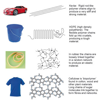
The correct chemical name for the PE in HDPE (and its close relation LDPE) is 'polyethene', but you will also find it referred to as 'polyethylene' (an older but commonly used version) or 'polythene' (a trade name). All three names may be used in this course.
The term 'plastic' tends to be reserved for synthetic polymers derived from oil, such as polyethene (PE, usually sub-divided into high density HDPE and low density LDPE) or polyvinylchloride (PVC). Many of these are thermoplastics: they soften when heated and solidify when cooled, making them relatively easy to process. The word plastic actually pre-dates the discovery of polymers by a few centuries, and originally referred to the capacity of certain materials, such as clay or wax, to be moulded or shaped. 'Plastic', in this original sense, describes the properties of some, but not all, polymer materials.
The writing end is more tricky to make. A typical ballpoint pen will inscribe many kilometres of writing during its use, hence the material for the ball needs to be hard, so that it does not wear away too quickly. Fortunately, tungsten carbide (a hard ceramic material) is often used for ball bearings, and these can be made to a very close tolerance. That is, they can be made with a high degree of accuracy, with very little variation in diameter observed across a batch of ball bearings. Thus the balls for the pen can be bought ready-made from a ball bearing manufacturer.
The pen maker has to make the metal piece to receive the ball with just enough clearance to allow the ink to flow round the ball. It can be turned on a lathe from a metal bar. If this were to be done by hand, the pen would become expensive simply because of the labour cost involved. So it is likely that a computer-controlled lathe would be used. To enable the machining to be done at high speed, for rapid output, a material that can be easily cut, and that is not brittle (so it won't chip) must be chosen. Brass (an alloy of copper and zinc) meets this requirement, but is quite an expensive material. The design/costing exercise thus has to balance material costs against tooling costs. The balance will depend on the quantity of brass used and the time needed to machine each piece. The metal piece that holds the ball at the end of my cheap ballpoint pen is indeed a yellowish metal: brass.
A production sequence is needed that will provide the top metal part, insert the ball and reduce the diameter of the end to trap the ball (Figure 10). Finally, all the parts have to be assembled. Once again, a machine must do this in order to maintain a high production rate. So a critical factor is that all parts of each sort must be interchangeable. It would be useless, for example, if a batch of end plugs that came to the assembly machine were too big to fit into the outer barrel. So this brings us on to the key part of these case studies: mass production.

1.2.3 Muskets and mass production
Achieving interchangeability was an essential breakthrough to mass production. Look around your room right now; you will see many artefacts which have been assembled from parts: your furniture is likely to have been made this way for example. Whether the parts have to be made to fit accurately, as with the ball in the ballpoint pen, or can be a sloppy fit with gaps filled with glue (as with furniture, if gaps and glue are hidden from the eye) will depend on the function to be met by the product.
Close-tolerance interchangeability was achieved in manufacturing only after a long and difficult path. It is now a characteristic difference between industrial and craft manufacture: essentially it can only realistically be achieved by machine-made parts.
It is perhaps unfortunate that many major developments in engineering have come about as a consequence of war. Tremendous efforts were made towards interchangeability in the state armaments industry of eighteenth-century France, but with very limited success. The infantry weapon of the time was the muzzle-loaded musket, where the gun was loaded by pouring gunpowder down the barrel, and shoving the ball (the precursor of the modern bullet) down on top. The gunpowder charge was detonated by a spark caused by a flint striking a steel plate, and the 'flintlock' was a critical sub-system of the gun.

The lock was a complex assembly of levers, pivots, plates and springs – some twenty parts in all. To equip a large army, many thousands had to be made, and this task fell to the esteemed profession of the locksmith. (Note that the 'lock' in 'locksmith' refers to the gun mechanism, rather than the door-fastening mechanism of modern usage.)
Master locksmiths first forged the parts from iron stock, and then complete locks would be made by sorting through piles of component parts to find a combination that could be made to fit together and work – with some judicious application of the file along the way. Thus, to make a working lock required a good deal of hand-filing and assembly (using hired labour); each lock was an individual mechanism, and the parts were rarely interchangeable between locks. Imagine how unfeasible such methods would be for the manufacture of the disposable ballpoint pen.
Production rates by such methods were very slow, so there were several hundred craftsmen in the trade working in small groups in workshops scattered around the armament factories. Locksmiths were highly skilled, and would protect their own interests, which they naturally saw as preserving the status quo. However, in 1723,
at the Hôtel des Invalides, in front of august witnesses, Guillaume Deschamps disassembled fifty flintlocks and recombined their parts to produce fifty functioning flintlocks. The minister of war ordered Vallière [a French artillery officer] to supervise the inventor's attempts to expand his system. By 1727 Deschamps had manufactured 660 locks judged interchangeable by Vallière's own inspectors, 'all properly reassembled without a single stroke of the file'. Each lock, however, had cost five times the current price. Undaunted, Deschamps proposed a larger manufacture to produce 5000 identical gunlocks, which he expected to cost only one twentieth of the current price. Tasks were to be divided among specialist workers, who would use dies, gauges and filing jigs to shape parts precisely. Master pattern locks would be distributed to the War Office, Grand Master, inspector, controller and examiner. Deschamps noted that with six hundred locksmiths in the St. Etienne region, he could locally staff a manufacture to produce 40 000 gunlocks a year.
In fact none of this came to pass. In spite of the advantages of the new process, both in the initial assembly of guns and in their subsequent repair, especially in the field, it was by no means clear that productivity could be increased or unit costs brought down. Indeed it took locksmiths longer to make parts which all matched the gauges than to make sets which could be individually assembled functionally. With large quantities of parts being made by the existing routes, it was always possible to find a set of components that would fit together suitably, even if this meant no interchangeability from one lock to the next. The locksmiths were also less than cooperative towards the introduction of the new process, fearing that their craft was being de-skilled so that they would lose their powerful position. Nor were the administrative and technical problems of organising the dispersed skilled labour force easy to overcome.
Fifty years later we read of Honoré Blanc, controller of musket production at the three factories in France, repeating the demonstration of interchangeability with the locks of the standard French musket known as the M1777. The same arguments raged and little was done. Eventually, in post-revolutionary France at Blanc's own manufacturing base at Roanne, interchangeability of flintlock parts was achieved on a large scale. New organisations of the processes, new divisions of labour and new machines contrived to keep the costs of interchangeable locks to no worse than 30% greater than the individual locks made by the old methods. When Napoleon's armies marched across Europe, the bases of mass production had been set.
1.2.4 Ammonia synthesis by bulk production
To make high explosives, such as TNT, requires chemicals called 'nitrates'. At the time of the First World War these were obtained from a natural mineral, which was mostly supplied from South America. Germany was cut off from these mineral supplies, so its chemical industry was charged with the task of manufacturing nitrates artificially.
Nitrates are essentially composed of two gaseous elements: nitrogen and oxygen, which are chemically combined. Nitrogen is abundant in the atmosphere, around 76% by mass, but in an unreactive form. The task therefore came down to coaxing atmospheric nitrogen into a more reactive condition. A particularly good method of achieving this is to combine nitrogen with another gaseous element, hydrogen, to form ammonia. The Haber–Bosch process for making ammonia was the outcome of the German war-driven research and enabled Germany to maintain its supplies of munitions. The process is now the mainstay of ammonia production world-wide each year, with ammonia mainly used as the basis of nitrogenous fertiliser. That said, it is also used as a constituent of many household cleaners, as a refrigerant in industrial refrigeration systems, to scrub sulphur dioxide from the burning fossil fuels used in power plants, and for the pulping of wood in the paper industry (Figure 12).
Activity 5 (video)
Watch Video 1 which describes the background to the discovery of how to manufacture ammonia artificially.
Transcript: Video 1 Manufacturing ammonia artificially (2 minutes)
The production of a chemical like ammonia is rather different from the mass production used for a ballpoint pen. This is because the product, ammonia, is not particularly useful in itself: it becomes the starting material in yet further processes. The product does not come out as discrete items, and production may be continuous. This type of production is often referred to as 'bulk production'.
Ammonia production is a good example of engineering as the 'appliance of science', the science in this case being chemistry (see Engineering with atoms ).
Engineering with atoms
When chemistry is applied as a means to an end, where that end is a product with a function, it can be thought of as engineering with atoms. Clearly chemistry is large-scale engineering, and not one atom at a time. The chemical reactions involved often progress without any intervention from humans, indeed some reactions can only be prevented by ensuring that the chemicals involved are kept well apart. However, there is still engineering skill required for chemical manufacture, such as creating the ideal conditions for bringing atoms together to produce the required product, be it a drug, a fertiliser or furniture polish.
True 'atomic engineering' is beginning to emerge in the field of nanotechnology, where atoms and molecules are manipulated singly, in small groups, or in layers a few atoms thick. Many products are coated with thin films for special purposes. One can think of examples such as the anti-reflective coatings on lenses, hard coatings of titanium nitride on drill bits, and self-cleaning glass windows. These are coated with a very thin layer of titanium dioxide that breaks down dirt particles with the help of sunlight and the oxygen in the air, and have been available to consumers since the early 2000s.
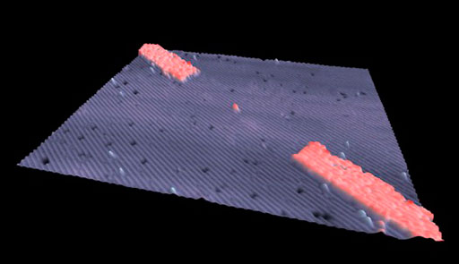
Manipulating atoms one by one takes this a step further, and the ability to do this is especially interesting to computer chip manufacturers. In February 2012, a group of researchers at the University of New South Wales announced that they had made a transistor consisting of a single atom of phosphorus. (A transistor is a device used for amplifying and switching electronic signals.) Figure 13 shows the transistor sitting in the space created by removing an atom of silicon from the surface of a silicon crystal. The two wide bands running diagonally across the image are the electrodes; the gap between them, where the phosphorus atom sits, is 20 nanometres wide. This particular transistor would be difficult to use as it behaves well only if cooled to −233 °C, about 40 K above absolute zero, but the ability to create this device will undoubtedly lead to more practical applications.
For the production of ammonia, the elements nitrogen and hydrogen have to be coaxed to react together: ammonia is the product of this reaction under the right conditions. The right proportions are also needed: 1000 kg of ammonia requires 820 kg of nitrogen to react with 180 kg of hydrogen (see Units of mass ). The reactants (i.e. the chemicals that are reacting) are gases, and so is the product. So one constraint on the production system is that it has to supply the ingredients and remove the product in the gaseous state.
Units of mass
Before defining the units of mass it's very important that the distinction between 'mass' and 'weight' is clear. In everyday language we use the term 'weight' when we're really talking about mass.
For example, many people are interested in their body mass index as a measure of health. When I visit my doctor she asks me to stand on the scales (Figure 14) so that she can 'weigh' me. The reading from the scales is 72 kilograms (kg). To calculate my body mass index my doctor also needs to know my height in metres, which is 1.74 m.

Now, when my doctor wants to find my body mass index (BMI), she does the following calculation
Fortunately, this is in the healthy range of 20–25.
You may be wondering why I have put 'weight' in inverted commas and why BMI isn't referred to as 'body weight index'. Well, what my doctor is interested in when I stand on the scales is how much of me there is – that is, my mass. And in SI units we measure mass in kilograms. So, the equation should say
But what the scales are actually doing is measuring the force my body exerts on the scales when I stand on them. This force is produced by the gravitational effect of the Earth pulling on my body and this, in engineering terms, is my weight. Weight is measured in 'newtons' however, the scales are calibrated to give a read out in kilograms.
If my doctor and I were on the Moon, where the effect of gravity is much less than it is on Earth, the force that my body exerts on the scales would be less and my weight would be lower. But my mass would not change – there would still be the same amount of me!
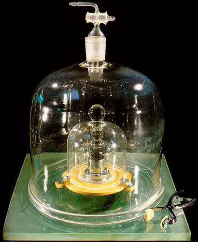
The basic unit of mass is the gram, but it is actually the kilogram (1000 grams) that is standardised and which provides the SI unit for mass. A litre of pure water was defined to have a mass of 1 kilogram. Again the definition was translated into a single prototype, this time as a cylinder of a platinum–iridium alloy, which is dense and uncorrodable. The standard kilogram is actually quite a small cylinder (Figure 15), about 4 cm high and wide, housed in an environmentally controlled safe at the BIPM (the International Bureau of Weights and Measures) in Paris.
Once again – as with length – multiples and subdivisions of the basic unit, the gram, are useful; and, because the SI generally uses a factor of 1000 to define multiples and subdivisions, the prefixes that you met in connection with length are also used with mass.
| Factor | Symbol | |
|---|---|---|
| microgram | × 1/1 000 000 | μg |
| milligram | × 1/1000 | mg |
| gram | 1 | g |
| kilogram | × 1000 | kg |
| tonne | × 1 000 000 | t |
Notice that 1000 kg (a megagram) is actually called a tonne. (Its spelling distinguishes it from the imperial 'ton', though they are very close – to within about 2%. The imperial system of units is discussed further later in this section.)
You will find examples of SI units of mass in everyday situations, often in combination with other units. Listen out for figures describing air pollution in micrograms per cubic metre (μg m −3 ). The legal limit (in 2012 in the UK) for the concentration of alcohol in a driver's blood is 80 mg per 100 cm 3. Chocolate is often sold in bars of 100 g and sugar in 1 kg bags.
Theoretical chemistry provides us with a clear understanding of what conditions are needed to produce ammonia. There is no need to go into great detail here regarding the chemical principles involved, but it is worth looking at their consequences as an example of the fundamental physical laws that constrain much of engineering. Making ammonia is not as simple as stirring the raw materials together in a bucket; and understanding the process by which ammonia is formed allows us to make it as efficiently as possible.
First, the reaction between nitrogen and hydrogen proceeds better at high pressures. If the engineer can provide a high-pressure system for making the ammonia, it will be much more efficient, and so more productive, than one operating at normal atmospheric pressure.
Secondly, chemical reactions often produce heat, and the formation of ammonia certainly does this. However, if the temperature becomes too high, the reaction can become slow; so the engineer can help production by getting rid of the heat generated by the reaction, thereby keeping production high.
Thirdly, it's important to extract the ammonia as it is being made. As more and more ammonia is produced in the reaction chamber, using up the nitrogen and hydrogen, the reaction will slow down and eventually stop. This would happen before all the nitrogen and hydrogen were used up: the presence of the ammonia slows the reaction. Extracting the ammonia product and pumping in more ingredients will keep production continuous.
This is an example where the engineering is driven by the chemistry. Without an understanding of how ammonia is made by this reaction, and how chemical reactions behave in practice, it would be an extremely inefficient process, and indeed perhaps impossible to manufacture ammonia on any viable industrial scale. Yet the chemical knowledge is insufficient without the engineering expertise to build a plant to the required specification: a plant that will fulfil the conditions that I have outlined above.
Having collected the arguments from chemistry on the conditions to make ammonia it remains to ask how to make it quickly. Typically plant will only be economic at production rates of a few thousand tonnes per day. The optimum pressures and temperatures need to be found. That is a job for theory and for development research.
So, with all this science understood, our chemical engineers have to design and build a system that takes advantage of it. Figure 16 indicates the principles of the plant.
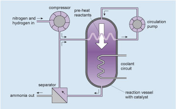
The gases at high pressure are pumped around the circuit shown (follow the arrows starting at the circulation pump, which pumps the mixed, but unreacted, ingredients into the reaction vessel). The gases enter the reaction vessel at the top and some of the nitrogen and hydrogen react to form ammonia as they pass over a catalyst within the reaction vessel (see Catalysts and converters ). The mixture leaving the reaction vessel at the bottom passes to the separator where the ammonia product is removed. The unreacted nitrogen and hydrogen, together with enough extra nitrogen and hydrogen injected from the compressor to make up for what has reacted, return to the pump via a heat exchanger within the reaction vessel which both pre-heats the reactants and removes some of the reaction heat. More excess heat is removed from the reaction vessel by the coolant circuit. Thus a continuous production of ammonia is achieved. I will not go into the subtleties of the internal design of the reaction vessel which make the process efficient, nor of the control systems which link the heat and gas flows. Rather I will concentrate on the engineering of the reaction vessel itself.
Catalysts and converters
You may have come across the term catalytic converter , probably in the context of cars and exhaust emissions. A catalyst is something that speeds up or otherwise aids a chemical reaction. A true catalyst doesn't participate in the reaction at all: it just helps it on the way, and is unaffected itself, being left behind as good as new once the reaction is over. In petrol- and diesel-engined cars, a chamber with a platinum-based catalyst is fitted as part of the exhaust system. Some gases in the exhaust, particularly nitrogen oxides and unburnt fuel molecules, decompose into more benign gases when they come into contact with the catalyst.
In the case of ammonia production, iron granules with a large surface area are the usual catalyst.
The ammonia reaction vessel is large, perhaps a cylinder 20 m high by 2 m in diameter, which has a volume of about 63 m 3 (see Units of area and volume ). For efficient performance, the pressure needs to be about 350 times atmospheric pressure (or '350 atmospheres').
The contents of the reaction vessel, at a temperature of several hundred degrees Celsius, include a poisonous gas, ammonia, and an explosive one, hydrogen. The consequences of a leak could be extremely dangerous. So, beyond the primary engineering to provide function, an additional issue here is safety. How do you make a vessel of that size, capable of holding the pressure, with at least six pipes going into it, and guarantee that it is safe? The answer lies largely in 'past practice'. Because pressure vessels have been made for a long time, for many purposes (for example, high-pressure steam boilers in power stations), the 'know how' has gradually developed. Each increment of extra performance demanded from time to time has pushed knowledge a bit further, and the occasional accident serves as a salutary reminder that we don't always get it right.
Units of area and volume
The basic units of area and volume are the 'square metre' (m 2 ) and the 'cubic metre' (m 3 ) (Figure 17). These are simply shapes which have sides that are 1 m in length.
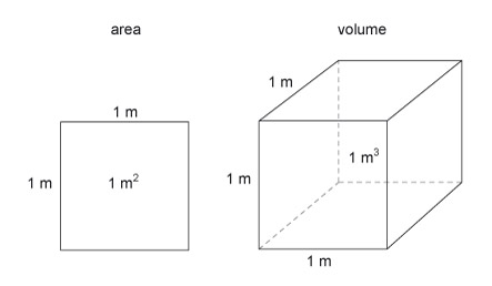
Square metres are inconveniently small for measuring land holdings so the French Revolutionary Committee decided to define 100 m 2 (i.e. 10 m × 10 m) as 1 are (pronounced 'air'). A more frequently used measure of land area is the 'hectare'.
Activity 6 (example)
Use Table 1 in Section 1.2.1 to remind yourself what 'hect' means and then work out how many square metres there are in a hectare.
Answer
'Hect' means × 100, so 1 hectare is 100 are, which is
- 100 × 100 m 2 = 10 000 m 2.
Cubic metres, on the other hand, are inconveniently large for measuring a person's daily intake of food or drink. You will often come across the cubic centimetre, cm 3 (i.e. 1 cm × 1 cm × 1 cm, or 0.01 m × 0.01 m × 0.01 m) or other units derived from the metre. A related unit of volume, the litre, has also been defined and is commonly used to measure volumes of liquid. A litre is the volume of a cube of 1 decimetre – or 10 cm edge length. The symbol for 'litre' is its initial letter, l, but this is so easily confused with the number 1 (for example, eleven litres can be written as 11 l) that it is usually safest to write out the word litre.
An even smaller unit of volume, the millilitre, is also useful. It is one thousandth of a litre. The symbol for millilitre is ml, which is not as ambiguous as the litre symbol.
Activity 7 (self-assessment)
- a.Use Table 2 in Section 1.2.1 to remind yourself what 'deci' means, and then work out how many litres there are in a cubic metre.
- b.A bottle of water has a volume of 500 ml. How many cl is this?
- c.What is the relationship between 1 ml and 1 cm 3 ?
- d.The standard size of a British brick is 215 mm × 102.5 mm × 65 mm. First guess its volume in litres, then calculate it.
- e.How many bricks make a cubic metre of wall (ignoring the mortar)?
Answer
- a.The 'deci' prefix means × 1/10, which is equivalent to ÷10, so there are 10 dm in one metre. Hence,
- 1 m 3 = 10 × 10 × 10 dm 3 = 1000 litres.
- b.The 'milli' prefix means ÷1000. The 'centi' prefix means ÷100. So there are 10 ml in 1 cl and, therefore, 500 ml = 50 cl.
- c.10 cm = 1 dm so
- 10 × 10 × 10 cm 3 = 1 dm 3 = 1 litre.
- So 1000 cm 3 make 1 litre, and hence 1 ml is the same as 1 cm 3.
- d.The dimensions of the brick in cm are 21.5 cm × 10.25 cm × 6.5 cm.
- The volume of the brick in cm 3 is therefore
- 21.5 × 10.25 × 6.5 cm 3
 1432 cm 3.
 - But 1 ml is the same as 1 cm 3 so the volume of the brick is 1432 ml, or 1.432 litres.
- My guess, thinking of a litre box of drink by comparison, was that the brick was 'similar' and would have a volume of about one litre. I was wrong by a factor of 1.432.
- e.There are 1000 litres in a cubic metre. We know from (d) that each brick is 1.432 litres in volume, so we'll need 1000/1.432 = 698.3 bricks; in other words, approximately 700 bricks.
1.3 Standards
When boilers were first made for steam engines, little was known about steel. Plates were riveted together and engineers were ignorant of the stresses in the material. Of course there were successes and there were failures; both can be learned from, even if the lessons are only 'use thicker steel plates'. Later it became possible to weld plates, and new lessons had to be learned.
All this accumulated experience is brought together into a 'standard'. The standard will dictate critical features of the design, construction methods and safety testing of pressure vessels. For example it will guide the designer in relating wall thickness to diameter and pressure. For the ammonia vessel I described in the previous section, the standard specifies that the plate would have to be 150 mm thick. Then permitted types of steel and the welding methods will be specified. Finally the whole thing has to be tested to beyond its working pressure.
Standards govern the design and construction of virtually everything which carries any safety implications. Any company that transgresses the standards, and whose product is then responsible for an accident, will find itself in serious trouble. For the moment though it is interesting to contemplate the apparent conflict between opportunities for innovation and the requirement to adhere to standards. As standards derive from past practice, they are apparently not conducive to innovation. What is the way out of this dilemma? In reality standards are revised, amended, and superseded to account for changes in knowledge and practice.
You can look around your home to try to find evidence of this – you should find the phrase 'Conforms to BS xxxx ' (the BS standing for 'British Standard', and the xxxx being a number) or similar. Electrical goods, or their packaging or instruction manuals, would be a good place to search. For example, I found in the instructions for a French-made electric kettle that its moulded-onto-the-wire mains plug conformed to BS 1363 and that only fuses approved to BS 1362 should be used as replacements. Furthermore the kettle was constructed to comply with the radio interference requirements of EEC directive 87/308/EEC. I have also noticed the number BS EN 228 (where the EN indicates that the standard is applicable throughout Europe, not just in the UK) on fuel pumps for unleaded petrol. These last two regulations appear to control the function or composition of the product rather than its safety.
Activity 8 (self-assessment)
Which of the following list would you put into the categories of one-off production, mass production, and bulk production?
- a.A modern 3-bedroom house on a development of 30 houses.
- b.Liquid oxygen for a chemical laboratory.
- c.A USB flash drive.
- d.A Blu-ray Disc of a movie.
- e.The Channel Tunnel.
- f.A photocopier.
- g.Garden compost.
- h.Car tyres.
- i.A hand-made paperweight.
Answer
- a.A modern 3-bedroom house on a development of 30 houses is a one-off (no economy of scale here).
- b.Liquid oxygen for a chemical laboratory is produced in bulk.
- c.A USB flash drive is mass produced.
- d.A Blu-ray Disc is mass produced.
- e.The Channel Tunnel is a one-off.
- f.A photocopier is mass produced.
- g.Garden compost is produced in bulk.
- h.Car tyres are mass produced.
- i.A hand-made paperweight is a one-off.
1.4 Additional thoughts
So where have we reached so far?
First we have seen that, beyond the shelf-building level of engineering, which I suppose most of us can undertake with more or less skill, there is a profession of engineering which dates back a long way. We shall examine the origins of this profession over the coming sections. Professional engineers, working either alone or in teams, can undertake much more complex tasks by virtue of their talents, training, knowledge and experience. The great diversity of engineered products has led to many specialisms within the profession.
Secondly, with each of the short case studies it has become apparent that the engineering of any period rests on prior achievements. The ballpoint pen, by virtue both of its materials and the construction methods, could not possibly have been made by the engineers of the Pont du Gard, despite their great skill and expertise. Clearly the builders of that remarkable bridge nevertheless drew on the prior knowledge of how to construct arches (the French continue the art of fine bridge building with the Millau Viaduct shown in Figure 18). This aspect of the 'progress' of engineering will occupy our attention later.

The third aspect of engineering we have seen in action is its organisational aspect. One of the engineer's roles is to ensure that resources are available to achieve the goal. Engineers control the actions of others to bring about the success of a project: they depend on the skills of their stone masons or lathe operators or welders. Badly organised engineering is just as chaotic as a badly conducted orchestra.
A fourth important realisation is that engineering is quantitative : measurement and calculation are vital to its practice. At its simplest it may only be spatial quantification, as for example to build the bridge. Further down the line though, a wide range of measurement capability is demanded. Ammonia synthesis calls for measurements of temperature, pressure, gas flow rates and chemical concentrations even within the small part of the process that we have looked at. Notice, however, that there is a big difference between being quantitative and being scientific. The builders of the Pont du Gard had no scientific knowledge of, say, the stresses in their structure; they did not design it scientifically, using theories of how arches worked. They just had the 'know how'. In contrast, the ammonia pressure vessel was constructed with full knowledge of how the material should behave, even to the extent of knowing the consequences of there being a flaw (in the welds of the vessel, for example).
Measurement implies units to measure in: metres of length, kilograms of mass and so on. Historically there have been many definitions of standards for measurement. Now we have settled more or less completely on the SI ( Système International ). But the SI is not yet universal: American engineers got astronauts to the Moon using feet and inches for length, and pounds for mass (see Different systems of units ).
Different systems of units
The SI system of units is not the only one which is available, or indeed, in common usage. The most widely used alternative is the system of pounds for mass, and feet for length. This is the 'imperial' system of units.
In the US, imperial measurements are more common than the SI metric system. This can lead to problems if there is a mix-up as to which units are being used. The NASA Mars Climate Orbiter was lost in 1999 due to a mix-up between the two systems. A computer directed the wrong thrust to be applied to bring the craft into Mars orbit because its program was in one system and its data in the other. Interestingly, Americans refer to the imperial system as 'English units'.
Not every engineering decision about a length needs to be based on an actual measurement. Most of Blanc's gauges for the parts of the M1777 musket lock were of the 'go/no go' type. A particular pin, for example, had to be small enough to enter one gauge hole but big enough not to go into another; so the pin diameter lay between the two hole diameters. The alternative approach of defining the size of the pin as, say, 5.00 mm ± 0.01 mm (that is, the diameter must fall somewhere between 4.99 mm and 5.01 mm) and providing an instrument to measure the pin to that accuracy was not available to Blanc – the micrometer (an instrument for measuring small distances) had not been invented by then and the millimetre had not been defined. For his purpose, all the pins had to be the same – give or take a bit. It probably did not matter exactly what that size was.
Activity 9 (exploratory)
When you place a ruler alongside another rule, or tape measure, do the lengths match up exactly ? If there is a difference, is it significant?
Answer
I found that there was a slight difference between the two rulers that I chose. However, since I only ever use them for coarse measuring (to within 2 mm or so) this is not a problem.
We have also seen an example of how science can inform engineers of how to proceed. Without a thorough understanding of ammonia chemistry on the part of engineers, the Haber–Bosch ammonia manufacture process could never have been developed. But, as we shall see, some remarkable achievements in materials processing have been developed without scientific understanding. We speak of the Bronze Age or of the Iron Age in archaeology because the people of those times had discovered how to get metals from minerals; and in the case of the Bronze Age, how to make various copper alloys (not just bronze) so as to enhance the properties of their metal. They did these things without any knowledge of chemistry. The role of science for engineering has been largely twofold:
- to provide new perceptions of what might be done – electric motors, transistors, radio, digital cameras, the Airbus A380, etc.
- to enable developments to be made more effectively and efficiently by underpinning experience with theory.
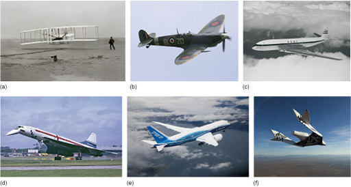
This brings me to the issue of design , which lies at the heart of all professional engineering. Whatever enterprise engineers are going to coordinate, it starts off as a mere feeling. A 'wouldn't it be nice if ?' sort of thing. Along the line, someone has to turn that vague aim into a practicable idea. By practicable I mean not only that whatever has been conceived of will meet the function implied by the goal, but that it can be made too. For how many ages have people watched birds and longed to fly? In mythology, Daedalus (unquestionably an engineer) made wings of feathers glued on with wax, enabling him and his son, Icarus, to fly. But Icarus flew too close to the Sun and the wax melted, resulting in the first fatal air crash. Of course, this didn't really happen, nor could it have happened. We now realise that human muscle power cannot be sufficient to get us off the ground by flapping wings. Leonardo da Vinci drew pictures of a screw-driven machine, but he had no way of powering it. The Montgolfier brothers became airborne in 1783 in the first hot-air balloon, but as the balloonist is at the mercy of the wind it isn't really 'flying'. Eventually, when the internal-combustion engine was available, we began flying – just over 100 years ago. The development from the Wright brothers' contraption to a modern aircraft demonstrates again each engineer's debt to those who have gone before (see Figure 19).
The point I want to make is that design is the creative part of engineering. It comes from inside our heads. It is a manifestation of imagination – putting experiences and ideas together in new ways to conceive of new possibilities. Note the plural: there is usually more than one way of reaching the goal.
One of the fascinating things about imagination is the surprises it springs. People had been pushing heavy things around on rollers for thousands of years without the flash of inspiration that invented the wheel. The idea of fixing an axle to the load and threading each end through rollers so they stay with the load is a subtle perception: a beautiful example of an imaginative surprise. It could have happened in any of thousands of minds at any time over thousands of years, or maybe it just happened in one mind. Whichever it was, no doubt it was accompanied by the thought 'Why didn't I think of that before?'.
But the idea had to be followed by action. Though the inventor could perceive a wheel in the mind's eye, none yet existed. How to put the idea into practice would then call for more imagination. This time it is a different kind of imagination: ideas can be tested straight away against the yardstick of practicability.
2 Engineering by design
In this section we focus on the engineering design and manufacture of products and particularly how these two activities in a company are dealt with side by side. We will start with a relatively simple product. This example is a consumer product that has been in the process of development for around 30 years. This is the Brompton folding bicycle, which has become one of the leading products in a growing market for portable bikes with increasing use by commuters on trains and buses.
2.1 Taking an engineering design to production
Go to buy any functional product, and you will almost certainly be presented with a range of different designs. Some of the differences will just be in styling, whereas there may also be real differences in function or quality, which you may see reflected in the price. Different design concepts lead to competing products with particular sets of advantages and disadvantages.
Before a company launches a new product they need to be sure that the product will appeal to customers and can be produced at the right cost. In this section we will look at how companies make sure they have a product they can produce. Moving from concept to production depends critically on the industrial and social context. An idea for a new product, or a modification to an existing design, requires both human effort and financial input if it is to come to fruition.
Part of the design process is the development of prototypes. A prototype is a 'test' version of the product, and may have different functions depending on when it is constructed during the design cycle. If the product is simply having a change to its styling, the prototype will be important in establishing the 'look' that will be attractive to consumers. If a new piece of technology is being used to improve a product, the job of the prototype may be more technical: to ensure that the product's performance is up to scratch. Prototype development may be one of the most costly and time-consuming stages of finalising the design; it may involve extensive market research, or prolonged consumer testing.
If the design life cycle is shortened to hasten the arrival of the new product in the marketplace, the risk of failure goes up. More designs for a product arriving faster on the shelves is good for consumers, who will revel in the choice, but not good for employers or employees who are staking money and jobs on success!
The design story of the Brompton folding bicycle is a reasonably accessible example that allows you to see how a product is created and brought to market through prototype and production. However, remember that most designs fall by the wayside, either never reaching full production or being replaced by new or improved products quite quickly. Its long-term success makes it an unusual design example.
The Brompton bicycle has incrementally changed to meet the needs of market and production/manufacturing constraints. The Brompton company has now established a successful niche product with a strong brand. You might like to consult the website to see for yourself the presentation of this particular brand for what is essentially a functional product that does a particular and quite well-defined function. In fact it does much more than that – it may be a point of conversation or a personal item expressing an owner's personality, signifying lifestyle choices. On their website you can see how these other attributes of the functional bicycle have been taken up and used to inspire new brand products, such as clothing. I also suggest that you look at the section of the website that looks at the factory which gives you a real appreciation for the bicycle and the various engineering processes that contribute to its design and manufacture.
2.2 Folding bicycles
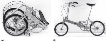
Andrew Ritchie started designing a folding bicycle in 1975, stimulated by the Bickerton folding bicycle design. The Bickerton (Figure 20) is made from aluminium, and is hinged at the chainwheel bracket. This means that the chain and chainwheel are on the outside when the bicycle is folded, and the two wheels come together.
In essence, Ritchie was inspired by the thought that he could do better. His two major criticisms were that the bicycle didn't fold well because the chainwheel, the dirtiest part of a bicycle, was prominent; and that aluminium was not the best material for a folding bike.
Aluminium is too soft for a folding bicycle, it just doesn't stand up to the knocks, the everyday wear and tear.
The first criticism is easy to accept, but his view on aluminium is not at all obvious. After all, many bicycles are made from aluminium, which is a light, corrosion-resistant material, seemingly ideal for a portable bicycle. If it is good enough for major parts including frame and body panels of top-of-the-range cars like the Jaguar XJ and the new (at 2012) fourth generation Range Rover, why not for a bicycle also? Aluminium's corrosion resistance and low weight make it a good choice for automotive applications. Reducing body weight in a vehicle reduces carbon emissions through lower fuel consumption. In addition we notice that reducing the weight of the body has a number of knock-on effects including smaller brakes and smaller engine – which reduce weight even further – leading to a virtuous cycle of improving fuel performance.
In an established company an idea for a new product such as the Brompton would include other people in critical roles. For example, market researchers consulting with bicycle users estimate the size of the potential market. Designers with technical expertise in, say, frame design and structural analysis ensure viable, functioning designs. Cost would play a large part in the discussions, as would risk and the effect of the project on existing products and commitments to customers and suppliers. However, the story of the start of the Brompton did not involve this kind of backup. Ritchie was largely on his own at this point.
An independent designer can often find it difficult to get a sympathetic hearing when they take their ideas to established manufacturers. They face the 'not invented here' syndrome, where companies tend to put their faith in their own in-house ideas but cannot see the potential in ideas from outside. Alternatively, they see potential legal and economic problems in protecting and investing in a design that may have been shown to competitors. This is a common enough story: as you may be aware the Dyson vacuum cleaner was hawked around established vacuum cleaner companies who rejected the idea. Ritchie was to experience the same rejection from bicycle manufacturers.
His basic idea, which remained constant through the development of prototypes, was to hinge the bicycle to make the wheels come to the 'centre', one on each side of the chainwheel. In this way the wheels would shroud the oily chain and chainwheel.
Such a 'kinematic' solution (referring to the way that the parts of the bicycle move relative to each other) occupies a different design space from that of the Bickerton. It gives the same functional solution – reducing the length of the bike down to something that is more portable – but the way by which this is achieved is different. The concept of where the bicycle is hinged, and how its parts are arranged when folded is different. So how best to hinge the wheels? How can the neatest package be produced? What is the history of folding bikes and what can we learn from the labours of others?
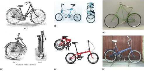
Attempts to pack a bicycle into a convenient shape have a long and honourable history as told by Hadland and Pinkerton (1996) in their book It's in the Bag!: a History in outline of portable bicycles in the UK. They quote from Henry Sturmey's earlier book The Indispensible Bicyclist's Handbook first published in 1877:
The idea of putting a bicycle into a bag is, indeed, a queer one, but of considerable value for all that, in these days of high railway charges.
Figure 21 shows a collage of solutions to the problem of packing a bicycle. Common to all these designs is the problem of the protruding chainwheel so Ritchie's concept looks to be a genuine innovation.
2.3 Prototyping and improving
In Ritchie's first prototype design, which is called P1 for short, the rear wheel hinged forward in its own plane from the lowest point of its triangular support structure, i.e. the wheel did not move sideways for folding. The front wheel of P1 also moved (almost) in its own plane underneath the bicycle to sit alongside its partner; in this case some sideways movement is needed to ensure that the front wheel sits next to the rear one, rather than just bumping against it at its hinges. To achieve this, the front wheel needed a complex, skewed hinge to move it the few centimetres sideways so as to clear the rear wheel and chainwheel.
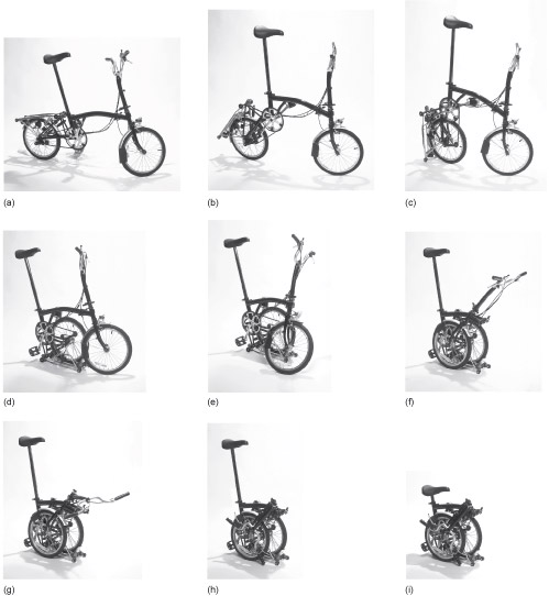
As well as moving the two wheels to the centre it was necessary to move the saddle, together with its pillar, and the handlebars into the same space. The seat pillar telescoped to get the saddle into the packing space, which has the advantage that saddle height adjustment and packing are accomplished by the same mechanism. The telescoped seat pillar slid down behind the hinged rear wheel, so locking it in place, an important feature that survived the transition from prototype to production. Figure 26 shows a modern version of the cycle being folded.
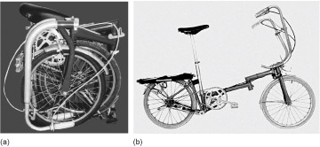
Ritchie was driven by a search for 'the ultimate in compactness' when designing and building his first prototype P1, which was a platform for various design ideas. The chainwheel and the saddle competed for space in the folded package, so Ritchie tried to move the chainwheel away from where the saddle needed to be, into the corner of the side elevation rectangle.
It was too complicated, I gave up an inch when that idea was dropped.
In the picture on the left of Figure 23 you can just see what was happening in this prototype where the saddle and the chainwheel were competing for space – look in the top left-hand corner and you can see the saddle just above the chainwheel behind the rest of the bike in the folded package. Compare this with the later production design in Figure 22 where the saddle and chainwheel are kept apart and Ritchie gave up his 'inch' to move the design forward. P1 used 18-inch wheels, then common on children's bicycles. The main tube of the frame was lower than the production model and the bicycle was not stiff enough. Bowden cables (i.e. those used for bicycle brakes and gear shifts) linked the front and rear wheel-folding mechanisms.
For prototype P1 the problem with the frame was that it was deflecting too much under the load applied to it: one solution to the problem would be to use more material, to make the tube thicker walled or larger diameter. An alternative is to change to a material that is inherently stiffer. The material property related to stiffness is called the Young's modulus. Two components with identical dimensions will show different stiffness if they are made from steel and aluminium, say. The Young's modulus of steel is about three times that of aluminium, so it will make a stiffer component. Indeed evaluation takes place throughout design so that designers are checking all the time about whether their proposal will work and deliver what a customer needs and expects.
Ritchie is a regular bicycle commuter in London, so he tests designs and design changes routinely and expertly. He was pleased with the realisation of the basic design concept in the first prototype:
I had demonstrated that the design concept could result in a compact folding bicycle.
Ritchie also uses the expression 'good luck rather than design' to describe unpredicted advantages of his conceptual design solution.
Activity 10 (self-assessment)
The main frame of a bicycle is essentially a hollow tube. The tube is hollow to reduce mass (removing material from the middle of the tube reduces the stiffness, but not critically, whilst reducing the mass significantly). Suggest two ways that the frame can be made stiffer.
Answer
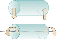
This is a simple question about the shape of the tube. First, you could make the tube a larger external diameter whilst keeping the thickness of the tube the same. The bigger tube has more material (because it is a larger radius but the same thickness) but more importantly the metal material is further away from the centre line of the tube. Material further from the centre makes it stiffer if you try to bend the tube or twist it – see above figure. Second, you could make the tube from a stiffer material, that is, with a higher Young's modulus which you will explore later. Steel tube would generally be stiffer than aluminium alloy and a titanium alloy stiffer than an aluminium one, while carbon fibre might be stiffer than many metals. Bicycle tubing is a subtle design issue. A designer needs to balance competing factors: it should be both light and stiff, as well as strong enough to avoid damage and deformation. This indicates a vital difference between strength and stiffness that we will come to later in this course.
Activity 11 (exploratory)
In this activity you will take a closer look at another folding bike and compare its frame with the Brompton.
I suggest that you look at Airframe (Figure 21(b)) or Dahon (Figure 21(d)), you may want to do some research on the Web. Compare the frames in terms of:
- configuration
- location of hinges.
Discussion
I have chosen the Airframe bike (b) in the figure below, taken from the company website. Look at the frame configuration, which is very different to the Brompton. It is essentially three rigid triangular structures rather than one strong 'beam' as seen in the Brompton (a) in the figure below. It has smaller radius tubes with joints that can be rotated to fold the bike. It is probably not as compact as the Brompton. It is constructed from aluminium alloy tubing jointed at saddle, bottom bracket and handlebars using special purpose joints. The steel cross brace from saddle to front wheel holds the whole structure rigid and when disconnected allows the whole bike to fold.

2.3.1 The second prototype (P2)
The major design difference between P1 and subsequent prototypes was the removal of the complex skewed hinge required to move the front wheel in its own plane underneath the bicycle to sit alongside the rear wheel. The front wheel now hinged orthogonal to the plane of the bicycle (i.e. it moved sideways from the line of the frame, as happens in the production model in Figure 22.
The rear wheel continued to be folded underneath the frame, as in the production model in Figure 22(b). This prototype P2 saw the introduction of castors on the rear luggage rack, on which the bicycle sat when the rear wheel was folded underneath. These too have survived to the production models, and can also be seen in Figure 22 and you can see their final position in Figure 22(d) at the bottom of the folded package for rolling it along.
Unlike the final production model, P2's handlebars hinged down, one each side of the package. Also unlike the production model, the seat pillar of P2 consisted of more than one tube that telescoped during folding.
Two more prototypes were built using sliding tubes to produce hinges, this time with 16-inch wheels. Wheel size is a key issue for the designer of a folding bike. Smaller wheels are easier to pack small, but the smaller the wheel the bigger the pothole feels! There is also the 'make or buy' decision to consider. Mass production of bicycle wheels is a big issue; it is much easier for a manufacturer to buy in wheels produced by a large manufacturer than to dedicate machinery and labour to the production of wheels just for their own product.
Ritchie's intention was to sell the design. To further this ambition, he applied for and obtained a patent in 1981. It is worth noting that his patent may have been difficult to defend, owing to the number of previous designs of folding bicycle that were available. He certainly could not have afforded to defend it if his design had been copied by a large manufacturer, but nonetheless it is a formal statement of the design, a design representation, and a claim to intellectual property.
In total between 1975 and 1979, Ritchie built four prototype machines with a low main tube to prove and develop his ideas. His next problem was to turn the design into a product that you or I could buy. Before pursuing the story I shall look in some detail at the structural design of bicycles in more general terms.
2.4 Bicycle structures
A bicycle consists essentially of a horizontal beam, to which is attached the wheels and a seat post. It is this beam which, structurally, is the most important part of the bicycle. There are forces acting on this beam when a cyclist simply sits on the machine, and they can be particularly large when the cyclist stands on the pedals going uphill, for example. This beam must provide stiffness for the bicycle: a wobbly bicycle isn't much use because the rider wants the downward force on a pedal to result in work that propels the bicycle forward, not into twisting and bending of the structure. A wobbly frame would also feel unstable to the rider. As has already been noted, the Brompton uses a low horizontal beam.
Many bicycles use a high beam, with diagonal posts to join this beam to the pedals and rear wheel in a twin triangle configuration known as a 'diamond frame' (Figure 24(a)). As we have discussed previously, what is required is a stiff structure that is as light as possible. The shape and size of the bars is critical as is the overall structure of the frame, for example the frame in Figure 24(a) being essentially a pair of triangles in a 'diamond' frame. The triangle is a potentially strong structure that is also light. Also, we have a choice of materials: aluminium, steel, or something more exotic such as carbon or titanium. Figure 24(b) shows a carbon-fibre composite bicycle. This material has a good stiffness with a low density (so low weight), and in addition the frame is designed to be particularly aerodynamically efficient. A bicycle similar to this, the Lotus Sport bike, was ridden by Chris Boardman when he shaved six seconds off the 4000 metres Individual Pursuit world record at the Olympic Games in Barcelona in 1992. This design represented a step-change innovation at the time; the implications are still being worked through in current designs.
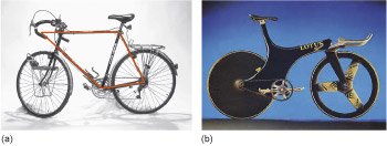
A racing bicycle like that in Figure 24(b) is built regardless of cost and the suitability of the design for mass production. In our earlier terminology, it occupies a different design space from the folding bicycle, primarily because of the difference in function: to win races, rather than to be portable and affordable. Certainly such a bicycle has no requirement to be foldable. The frame of the Lotus Sport pursuit bicycle was moulded from woven sheets of aligned carbon fibre, layered in a mould with epoxy resin, which was then cured. It weighed 8.5 kg. Although the resulting composite has an excellent stiffness-to-weight ratio, weight is relatively unimportant in a pursuit race because only the first 125 m involve acceleration. The rest of the race takes place at a more or less constant speed – as fast as possible. So it is aerodynamic drag, which accounts for 96% of the total resistance to motion, that is the predominant design parameter for a pursuit bicycle. About one-third of the total drag is due to the bicycle.
However, the main criterion for the Brompton is foldability, with weight coming an important second; aerodynamics are not important at all. An ordinary bicycle weighs about 12 kg and is relatively easy to lift and use over short distances. Key components such as wheels, gears and handlebars are available in aluminium and are generally lightweight. The designs for these are mature and well optimised for the range of everyday uses.
Activity 12 (exploratory)
Find two rulers or long flat objects of similar sizes and thicknesses but made from different materials. Wood and plastic will do fine. I shall assume you have a wooden and a plastic ruler to hand, that they are the same length and have about the same cross-sectional dimensions – thickness and width. Approximately the same dimensions are required because you are going to look at differences between materials. Bend one of the rulers about both cross-sectional axes. You will find it very easy to bend one way, but not the other (Figure 25). From this you can observe that stiffness changes in different directions and according to where the loads are applied.
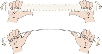
Having completed the experiment, answer the following:
- a.How would the ruler behave if it had a square cross-section.
- b.Which material was the stiffest when you bent the rulers?
Answer
- a.The ruler would bend the same extent in both directions, i.e. it is symmetrical.
- b.The wooden ruler is likely to be stiffer than the plastic one.
2.5 Brompton production
Let's return to the story of the development of the Brompton. Because Ritchie could not sell his idea, he decided to set up his own factory to manufacture the bicycles. He borrowed money from friends (the interest on the loans was a bicycle) to build 50 bicycles of which 20 were for sale. After the increasing complications of the prototyping stage, manufacturing constraints become a powerful influence on the designer:
Bending one top tube is difficult enough, bending 50 is really tiring.
The main tube was positioned higher and a simpler bought-in offset hinge replaced the purpose-built tube hinges. This forged hinge, which was critical to the Brompton's development, was from France. So, detailed design changes were made to the hinging system with some benefits to compactness resulting from positioning the hinge higher in the frame. The telescoping seat pillar was dropped, becoming a single tube, and the frame was braced with a small diagonal cross-beam to give it extra stiffness.
Ritchie continued production with the help of a government loan:
After the first 50 I got a small-firm government loan to produce batches of 50 bicycles; 400 in a year and a half.
Designing and manufacturing low-cost tooling was a harder job for Ritchie than designing the bicycle. There are many design routes to producing a lighter frame or a more easily manufactured frame that are not available to a small batch manufacturer. He had to use soft, mild steel for the main tube as he could not bend stronger alloy steel, and the main tube had an aesthetically ugly kink from the bending process. Plastic parts were not moulded for initial small scale production but machined from solid blocks, and metal plate was drilled, cut and bent. The process is essentially scaled-up craft production.
During this period Ritchie learned from customers and from riding his own bicycle. Indeed, sometimes detailed redesign was necessary in the light of problems and failures brought to his attention by users. The business remained vulnerable, although there was helpful press exposure.
At 8.00 am today, as always, Andrew Ritchie arrived at work on his bike. Mr Ritchie works at Kew. He has a workshop there and he built the bike he arrived on in the workshop. A most remarkable bike it is too. It takes a few seconds to fold it up into a neat package less than 2 ft square which you can pick up and carry anywhere. No other collapsible bike in the world, says Ritchie, collapses so totally and so easily. And it is just as simple to un-collapse it into a bike again. Ritchie, an old Harrovian who read engineering at Cambridge, is 35 and says he is appalled by the amount of his life he has already given to this bike. He had the idea at the beginning of 1976, but it wasn't until early last year that he was able to move into the workshop at Kew and put the bike into production. He had orders for 30 bikes, mostly from friends and friends of friends. These were made and delivered by last March and, to his great relief, they brought in orders for 20 more.
By the time these were made another 30 orders had come in and there was some welcome help from HMG in the shape of a Small Firms Loan Guarantee. So this particular small firm stays bravely afloat in these choppy seas, an example to us all. It currently has a workforce of two – Patrick Mulligan, brazier and Andrew Ritchie, managing director and assembler – and this will increase as orders come in. Meanwhile there are 56 Bromptons – that is what the bike is called – on the road now and 24 more ready for delivery and I can report that Judge Abdela has been seen arriving at the Old Bailey on one, that Lord Fraser of Tulley-Belton, the Scottish Law Lord, rides one, and that Ritchie's bike, No 7 from the production line, got him from South Kensington to Kew and back all through the blizzards. It is, of course, an expensive way of making a bike, and each one costs £195 by the time you have added VAT. But they are extremely slick little bikes, and with only 80 made so far, think of the rarity value.
Changes to manufacturing methods as well as the sourcing of parts necessitated more design work. For example in 1981 the French manufacturer of forged hinges discontinued production so Ritchie stopped batch production and wrote a business plan. After a hiatus of five years, in 1986, Ritchie eventually raised £90 000 from a customer, friends and family. This was only half of the money he needed to go into mass production, but he went ahead anyway.
The drive to design for manufacturability continues apace. A special tool was designed to curve the main tube, which removed the ugly kink. Also in 2000, a power press was installed to allow the use of a higher specification of steel for the main frame member.

A special pedal is used on one side of the bicycle (Figure 26). The pedal folds away so that it does not project from the folded bicycle. This adds a significant cost. The pedal on the other side does not fold, and nestles in a tangle of spokes and tubes when the bicycle is folded. This type of folding pedal is now available from pedal manufacturers and specialised manufacture is no longer needed.
In Figure 27 we show some of the craft-like assembly operations that have been developed over the years to be slick and fast. Further, testing is very important to maintain the product as fit for purpose with its customers with the necessary qualities of durability and reliability. We will look at the important part played by testing in designing and developing products in the next section.
The Brompton bicycle is now an international success story. We first visited the company for The Open University in 1999, and the design and production principles of the company at that time have been retained.
2.5.1 Brompton production 2012
Previous sections have presented an historical view of product development for this successful product. The scale of the manufacturing operation and the size of the company have changed considerably. However, the core values, and indeed the core processes largely remain from the first production run. This is a testament to a well conceived and tested design that has always focused on its customer needs.
The Brompton bike is exported all over the world. It is produced in several variations, with different accessories and also different materials for the frame to provide a lighter product, essential for some customers in this increasingly competitive folding and portable bike market.
Activity 13 (self-assessment)
In the Brompton bicycle you have seen examples of the following activities:
- proposing a possible design
- analysing the design
- testing the design or prototypes
- identifying customer requirements
- developing brand
- manufacture.
- a.Give an example from the Brompton case study of each of these activities. Please note that this is not a list of successive activities that follow one another. Indeed the activities keep being repeated as the design gets refined. You may also find Web information on the Brompton a useful point of reference to help answer this question, although it is not essential. For example the Brompton website illustrates how the brand is being developed. I want you to give at least one example of each type of activity.
- b.I want you to pause for a moment to think about how a designer can try to ensure that a design meets the requirements of its potential customers. Can you identify ways that Ritchie and his team used to discover they had a feasible design that consumers might purchase.
Answer
- a.Activities in manufacture might include: (i) assembly of supplied items, e.g. pedals and wheels and frame at the company factory; (ii) manufacture of frames in the company factory. For this exercise I don't want a comprehensive answer – just a few words on specific things the company does.
- b.I will list a few. First, the frame material and structure were tested for strength and stiffness. Second, prototype bikes were tested on the road. Third, the weight and compactness were tested by going through cycles of typical use where the bicycle is folded, unfolded, carried and stowed in the course of a commuter journey.
The Brompton bicycle is a niche design, marketed at high cost to a specialised market. It competes in a crowded market for folding commuter bikes. It meets a need for a compact, reliable means of personal transport that has achieved a reputation for reliability and durability, as well as its primary functional characteristics of quick and compact folding.
Bicycles are essentially simple products. Brompton has a few suppliers: a simple core subsystem – the frame – is manufactured in-house. Assembly requires little in the way of specialised equipment. There are some specialised jigs and fixtures used to hold the frames during manufacture and assembly as well as specialist welding equipment for making the frame. Specialised manufacture will take place for several components at their supplier's plant. We have noted how several of these are relatively standard and produced using specialised facilities in large volumes supplying several bike manufacturers. Examples are the rear wheel hub with its gears and the folding pedals. As with many simple consumer products the economics of design and manufacture depend on a careful balance of costs, using the available supply of high volume components at lower cost combined with the higher cost of special components made by the company specifically for their product. Getting this balance right is one of the keys to a successful design and designers must keep this in mind constantly as they develop a product.
2.6 The context of design and innovation
In this section I will introduce some of the issues and debates that have engaged designers and informed their practice. The ways that new designs are created and manufactured is constantly changing and adapting to particular circumstances. No two cases will be the same, indeed it is the newness and inventiveness of design that often gives a product a distinctive competitive edge with potential customers and markets.
We have seen that design is a complex activity. It has many stages and at each stage must take into account both opportunities and constraints. Designers try to speculate as much as possible within the constraints of time and cost as well as the requirements of customers and clients. The activity or process of design treads a fine line between freedom and constraint. Getting the balance right seems to yield useful and satisfactory designs.
There does not seem to be any recipe for achieving this balance. Design is complex with many factors to take into account. There are models of design process that can act as useful guides to stages and outputs in this process, but they will not tell you how to design a particular thing.
2.6.1 Innovation
Design is rather like problem solving. We try to define the problem, perhaps in terms of a client's requirements, then search possible solutions for a satisfactory outcome. However, design itself is much more difficult to define. The design problem, although specified by requirements, acquires new constraints as the design proceeds. New possibilities and new needs are continually suggested as the design is developed from concept to detail and on to market. The problem does not remain static.
A major resource for design is technology. This may include principles of engineering and applied science, or more tangible products of science such as new materials or electronic devices available for use in new designs. The resources are specific to a particular problem. Any problem has its own context. This might consist of market, customer requirements, or ways of working within a particular industry. I will discuss these contexts and their influence on design later in this section.
With technology and contexts we can classify several types of design.
- Consider a well established context, such as personal transport in some form of automobile to run along roads. Problems of pollution require new means of propulsion. These might be solved using new technology. This may not be completely new technology but rather technology new to the context. So a fuel cell developed for space applications may be applied to cars.
- Consider a well established context and the development of technology already used in that context. An example of this might be developing more efficient internal combustion engines for cars (Figure 28).
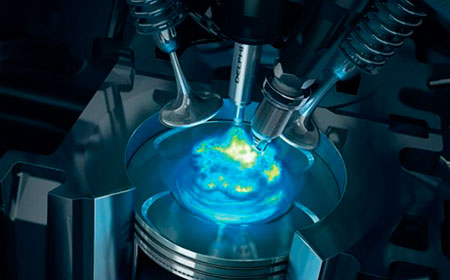
- A new context arises from social and cultural trends or scientific discovery. For example, the context of long-distance air travel. This new context has led to the design of new aircraft with some new technologies. However, for the most part it is a question of using the application of well-established technologies. The Airbus A380 wing is a good example of this type of incremental engineering innovation, common in complex engineering products.
- A new context might combine with new technology. Two examples are the development of radar and nuclear weapons during the Second World War. More benign examples include the new responses to home energy use following the rising costs and scarcity of fossil fuels, or the use of autonomous vehicles to explore the sea bed or maintain offshore oil and gas production facilities.
These four classes may be arranged as a table (Table 4). Names are given to each of the classes. Innovation can be viewed as including something new in technology or in the context to which it is applied. Inventions are not always closely attached to context. However, these inventions are applied science rather than design when no specific product emerges. When a new technology is matched to a new problem or context we have a design invention.
| Old technology | New technology | |
| New context | innovation | invention |
| Old context | routine design | innovation |
We should be rather generous in our interpretation of 'technology'. It will include new ideas or principles on which designs can be based. These new technologies do not always deliver new products easily. Turning out a product that works is usually fraught with difficulties.
The world of large structures provides good examples. Some of the cathedrals we see today are the survivors of designs produced by secret guilds of masons 700 years ago. Flying buttresses (Figure 29) were a design innovation that looked beautiful and allowed tall walls with large windows to be built. The function of the flying buttresses, and the decorated finials on the top of the verticals, is to keep the internal forces inside the stone so that all elements are in compression, or pushing against one another. Stone is very good at resisting compression but very poor at resisting tension forces. The simple arch also makes use of this property of stone to span spaces in bridges and vaults. There were other ways of achieving the same artistic effect of tall walls and large windows. Iron reinforcing bars were placed in the walls to resist sideways forces. In some medieval cathedrals you can see both methods used, literally side by side. On the outside, public wall of the church there are buttresses and plenty of ostentation but on the interior, private, side there are fewer, less ostentatious buttresses and more iron reinforcing within the walls. It is informative to note that parts of cathedrals did fall down. This contributed valuable knowledge to subsequent designers. It gives us a valuable message as well. Designers learn a lot from failures.
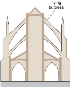
The first large suspension bridges in China, several hundred years ago used principles that were subsequently seen in the bridges built by Telford and Brunel in the 1800s. These later engineers rapidly pushed to the limits the available materials and the scientific understanding of their day. There was a great deal of uncertainty in their designs, although they had the benefit of some scientific analysis and could build simple theoretical models of how structures might behave. Brunel, for example, applied elements of numerical modelling to the business of building bridges.
Telford and Brunel were in competition to build the Clifton suspension bridge. Telford's design used two towers built up from the river bed (Figure 30). Brunel commented sarcastically that he had not thought of building towers from the sand of the river bed when there were good rock buttresses to build on.
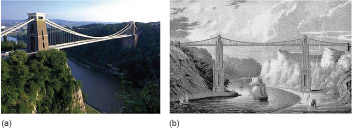
Telford's design was more cautious than Brunel's, so the towers had to be closer together because the span was more limited. The cost of Telford's towers was much greater, but the structural uncertainty in his design was less. Put another way, it had a higher safety factor. Nowadays the analysis of a suspension bridge is routine; the relationships between the cost of towers and the tensile strength (that is, strength under tension or pulling) of the main wire ropes are well understood. The properties of the relevant materials are known in great detail.
However, there is still uncertainty. The Millennium suspension footbridge over the Thames (Figure 31) was found to behave in erratic ways when opened to large numbers of pedestrians in June 2000. The swaying bridge was alarming to use, was closed for repairs within days and opened later with a modified design that has been trouble free for many years.
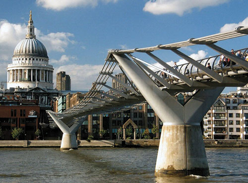
Interestingly, Brunel was a financial disaster for people prepared to invest in his designs. The Clifton suspension bridge was not finished in his lifetime because of a shortage of money. Design is not necessarily profitable; it is a risky and uncertain business.
2.6.2 Uncertainty
Designing takes place under various degrees of uncertainty. This is another way to classify design. The early stages can be full of uncertainty, whilst later stages can be more routine. Indeed the whole design process may start with a rough specification of what is required. However, in all design projects it is not known how a design will perform until it is completed, tested and then used. Each design project is a response to a new situation. It would not be design otherwise. So designers face uncertainty in all they do. They try and reduce uncertainty by:
- a.using models to predict how designs will behave
- b.using experience gained from the performance of previous designs for similar problems.
As experience (of success and failure) increases and predictive models become more accurate, the inherent uncertainty in design decreases. A well-established technology that is matched to a well-established context has little uncertainty. In these circumstances designers have the task of creating variations and modifications on the basic design.
Once a design solution is well-understood, the production of variant designs becomes a mature business, where ingenuity goes into making the processes as efficient as possible. Managing design becomes more important than the fundamental activities of innovation and design.
In the building industry the creation of a new McDonalds restaurant uses the same well-established rules all over the world. Similarly, some types of automotive and electronics factories have become almost standard items. The machines and assembly lines can be established from a green field site in less than two years. These types of design are standard and routine. Design uncertainties are low but other uncertainties of unpredictable markets and competition remain.
However, large international companies retain a mix of innovative products and variant designs. They spread their risk across many products, recognising that they have to innovate to survive. Today's innovative products are the basis of tomorrow's variant designs.
Activity 14 (self-assessment)
The analysis in Section 2.6.2 identifies four sources of uncertainty:
- vague or rough specification
- unknown aspects of a design's behaviour
- innovative technologies
- unpredictable market demand.
Looking back over the examples of design so far in this section, identify an example illustrating each of the four sources of uncertainty.
Answer
Depending on which example you took, you may have come up with any of the following points:
- a.The requirements may be vague; the specification may be poor, e.g. knitwear or handbags.
- b.Unknown aspects of behaviour and performance.
- c.Unpredictable market demand for the product.
- d.Innovative technologies, e.g. turbo fan turbine blades.
Innovation has been identified as a critical component in business success. However, innovation involves uncertainty and risk. The imperatives for companies to move away from the routine to new contexts and new technologies are now very strong. However, the tendencies of many designers are to reduce uncertainty. They tend to be more like Telford than Brunel in the case of the Clifton suspension bridge. As we have discovered, designers cannot escape uncertainty but that does not stop them trying to minimise it where possible. To maintain a balance between staying within the bounds of known and well understood designs and exploring new possibilities, companies try to create a 'culture of innovation'.
Tim Brown has been a key figure in design and innovation and in 2012 held the position of CEO at IDEO, a leading design consultancy that has played an important role in increasing the understanding and improving design practice in a broad range of industries. Brown comments:
My message for business leaders is always, if you want to be more innovative, if you want to be more competitive, if you want to grow, you can't just think about what your next product's going to be or what your technology's going to be. You have to think about the culture that you're going to build that allows you to do this over and over and over again. ... Cultures are basically built around value; they're built around what people think are important. And if you evolve what you think is important, you can evolve the culture. I mean IBM is a great example of a company that went from being a highly technocratic technological culture to being essentially a management consulting culture today by changing what they thought was important.
You can't expect to change it overnight; it takes a lot of effort by a lot of people over a lot of time. But I absolutely believe it's possible to do. I think it's essential. I mean, let's face it, the world is changing so dramatically today that hardly any organisation is set up for the future. And so if we can't change our cultures, then essentially we're accepting that the organisations we have today will disappear and other ones will emerge to replace them. It's not a very optimistic view and it's also not one that shareholders will probably get very excited about.
In discussing technology, innovation and uncertainty we have concentrated on the functional or engineering performance of designs. However, there are other important features of any design, such as how a design appears to a customer. Appearance and feel of a product can be a major factor in the commercial success of the design and is the subject of 'industrial design'.
2.6.3 Industrial design

The term 'industrial design' is often used to denote those design activities mainly concerned with the appearance and aesthetics of a product as illustrated in Figure 32. In contrast the term 'engineering design' is often used narrowly to indicate those design activities that deliver the physical performance of the product as shown in Figure 33. Thus, for example, the engineering design of an iPad is about the electronics and software. The industrial design is about the appearance of the case and interaction with the functions of the device through visual and touch interfaces.
In some cases the technical issues of engineering design can be separated from the issues of industrial design. This is particularly the case with mature products where functional development is limited by the technology. The functional parts of these products can be clothed in a new aesthetic.
Activity 15 (exploratory)
- a.Think of an example of a design where a new appearance for a product was created but the underlying function remained unchanged. By underlying function I mean either the technological principle of its operation (how it works – internal combustion engine for cars) or what the design does for a user (cars provide a flexible means of transport).
- b.Think of an example the other way round where the way a product worked changed radically but its appearance or more broadly, the way people interact with it, remained largely unchanged. You might like to consider how cars or computer data storage can illustrate these cases, but please explore more widely.
Answer
- a.Hatchback car as variant of the four door saloon car, plastic kettle replacing aluminium or stainless steel.
- b.Hybrid car with electric drive, whilst car retains appearance, or memory chip storage replacing hard disk storage.
The judgements that designers and consumers make about the balance of appearance and function are subjective. That is, people make their own judgements about this balance, which can differ widely from individual to individual.
Designed products can be seen and thought about in many ways. They are invested with 'life' and meaning by people who use them. This extra meaning, for example in the fashion status of functional products (such as catering equipment now popular in domestic kitchens), is one of the key elements in a successful product. Designed objects acquire many layers of meaning. The process often starts with designers themselves and is continued by advertising. This interpretation is what people do well. In fact it is one of the important activities in designing where new possibilities for developing partially completed designs emerge. The design evolves and adapts as the designer sees and thinks in different ways.
Designs are not just differentiated by what they do and how they do it, or what they look like, but also by the wider social and economic contexts in which they are created and used. Other contexts for design might include the ways an industry is structured, its markets or even politics. Let us look at the aircraft industry, which includes airframe designers such as Boeing or Airbus and engine designers such as Rolls-Royce or General Electric.
In the aircraft industry the life of a design and its variants is of the order of 40 or 50 years. Rolls-Royce maintains a full range of jet engines, some used in aircraft built in the 1970s. There are a number of key technologies, business relationships and supplier industries who come together to make an aircraft: electrical and hydraulic systems, structures, materials, aerodynamics and engines. Figure 34 shows the dominating design requirements at different points in the airframe.
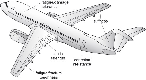
Fatigue (see Fatigue ) is a very important concept in designing for the operating life of a product. The extent to which fatigue will occur in a particular design depends on how the product is used – the operating conditions. Detailed understanding of the long-term effects of this fatigue is difficult to predict without extensive testing. A lot of the knowledge gained about fatigue is empirical. It is case-by-case and material-by-material. Patterns do emerge but experience shows that they must be used with caution. For long lifetime products, such as aircraft, the ability to predict the effects of operating conditions is critical. I emphasise this because a lot of our perceptions of good engineering design hinges on quality and, more particularly, reliability and durability during the typical life cycle conditions.
Fatigue
Metal fatigue is an extremely common cause of material failure. Fatigue is a very subtle process, the onset of which can go unnoticed until the fatigued component fails. Fatigue can occur at stresses much below the strength of the material, so may cause failure in a condition that was originally considered safe by a designer.
Fatigue occurs when the stress in a component oscillates with time. If the oscillations are sufficiently great, they can lead to the initiation and growth of cracks within the material. These cracks can grow until the component fails, often quite catastrophically, Figure 35.
The existence of fatigue has been recognised for over 100 years, but it is only in recent decades that the process has been understood thoroughly to the point where it can be designed against successfully. Failures such as the loss of three Comet airliners in the 1950s, the Markham colliery disaster in 1973, the Hatfield rail crash in 2000 and the grounding of the fleet of A380s in 2012 were all caused by fatigue. The lessons learnt in each case mean that designers are progressively better equipped to prevent it occurring in future.
How are the design activities of airframe companies dependent on context? Let us have a look at materials development in the context of a company like Airbus. The industry is a user of advanced aluminium alloys because they are strong for their weight, as well as new composite materials. Associated with each material is a large body of knowledge on performance from tests and in-service data. To develop and use a new alloy or new composite is a significant commitment.
In the case of alloys, Airbus is interested in new aluminium–lithium alloy for use in airframes. Lithium is a light atom, so if an alloy can be developed with comparable properties to existing alloys, then it will reduce the weight of the airframe. The consequent effect to the airline in reduced operating costs or increasing payload could be a major commercial benefit. However, Airbus does not develop alloys. They are developed and promoted by alloy producers, so the product design company works closely with the metal design company, who also work with Airbus' competitors. The context of design becomes more and more intricate.
To add to this complexity, if a competitor such as Boeing is working on such an alloy then Airbus cannot afford not to parallel the work, even if they know that the prospects of success are remote. Designers in the different companies watch each other, not in the sense of industrial espionage, but in the open forums where companies that simultaneously compete and collaborate, meet. The same principle applies to aero-engine companies. A new alloy that will operate at higher temperatures makes a more efficient engine, so if General Electric is working on a new class of material then Rolls-Royce also has to work on this class.
The ways that these complex sets of interrelationships behave changes from business to business. In order to provide a contrast, compare the aerospace context with the design of packaging for household foodstuffs and cleaning products. Unilever and Proctor & Gamble compete fiercely in a global market for soap powder. They try out new packaging in test markets and watch each other's test markets carefully.

Over the past 20 years many different delivery mechanisms for washing machine detergent have been introduced and superseded. Quite recently small soluble plastic flexible bags of liquid clothes washing detergent have been introduced to improve the delivery and dispersion of detergent through the washing load in domestic washing machines, Figure 36. These small bags of detergent are placed directly in the washing machine drum with the dirty clothes. They are sold in huge quantities worldwide and require a considerable design effort to equip factories with the new tooling to make the new packaging. However, this can be accomplished relatively quickly and the advantage to be gained in the market depends critically on the speed with which new designs of tooling, machines and manufacture of the new detergent packages and subsequent delivery to the market can be put in place. So 'design' operates quite differently in the world of washing detergent compared to the world of airframes. Designers of soap powder can try out possibilities in markets (and change quickly to respond to success and failure) but aircraft designers usually only get one shot.
Industrial and engineering design are not really quite so distinct as the discussion above might imply. I want to explore the commonalities. Think of industrial design as the design of those parts and aspects of a product that are concerned with the ways that a product is used – how users interact with it. A car steering wheel and associated controls can be viewed as the interface to the mechanical and electrical functions. The design of these controls is surely about appearance and feel but their layout, usability and clarity contributes to the essential engineering function of the car. There is no point in having a great new engineering design of a 'powertrain' (engine and transmission) without the driver being able to take full advantage of it. Industrial design meets engineering design. In order to deliver good industrial design, engineering design skills are employed and vice versa. For the car controls, designing a control switch that 'feels right' requires suitable material, size and structure to deliver the right strength and stiffness, as well as attributes of shape, colour and texture.
To conclude these reflections about the nature of design and innovation on a lighter note, let's touch on a famous design case study from the history of navigation. Clocks in the 1700s only worked accurately if their mechanisms were kept still on the mantelpiece. But clocks were needed to tell the time at sea for the determination of longitude. Valuable prizes were offered for a solution and eventually a satisfactory design was created by John Harrison (Figure 37). The story of this design and its social, political and economic contexts is related by Dava Sobel (2005) in her book Longitude.
The new design certainly met a need. There were numerous innovations in the internal clock mechanism to achieve the accuracy that was required. But the design did not behave in new ways – it still counted the seconds mechanically. The matching of design and operating conditions was the key to success; the design of the marine chronometer allowed the mechanisms of the clock to work independently of the disturbances of a voyage at sea. Clever design of the clock mechanism decoupled the internal function from external context.
Design is complex and there are many ways to handle this complexity. We have seen in this section so far how design problems are commonly broken down into stages of increasing detail and definition. There are many activities in the process of design, and these are used in different mixes and with different emphasis according to context. The various ways that designers approach complex problems where there are no clear or even rational answers, under conditions of extreme uncertainty, makes design an exciting area of study. Design lies at the heart of engineering practice – it makes things that are useful, beautiful and, perhaps more often than it should, unsatisfactory. But that is what happens when we engage with complexity – surprise and disappointment, success and failure.
3 Engineering to rule
The invention of new products or processes lies at the heart of industrial activity, producing new devices or ways of making products which make a vital contribution to economic success in the world. Engineers and designers want to ensure that any new development they make is protected from unscrupulous exploitation. A new product, a new mechanism or a new technique can be extremely valuable in the marketplace because it gives the inventor a monopoly over its exploitation. There would be little incentive for invention and innovation if a new development could instantly be copied and marketed by anyone with the manufacturing capability.
Hence the existence of patents. In this section we will look at the system of patents, in the context of how they are developed and how they can be used to protect an idea or a product from infringement. The box on Patents provides a brief history.
Patents
The patent system as we use it today dates back to Elizabethan and Jacobean England, when the government wanted to provide a monopoly for innovators. But the idea of patents is much older, and goes back to at least the reigns of Edward II and III (the latter died in 1377).
An example of an early patent is the grant for the manufacture of worsted cloth that was made in 1315 to the town of Worstead in Norfolk. The remit of the patent was at that time much wider than just newly invented products (worsted being widely known before the grant of a patent), and extended to whole branches of industry (such as mining). But this meant the system could be abused by monopolists imposing artificially high prices in the total absence of competition: a recurring feature of any system that grants sole rights to one person or company. In the modern patent system, a patent expires 20 years after it is granted, so any monopolisation can only be relatively short term.
From Georgian times, the document granting a patent required the inclusion of a description of the invention and the way it worked. The first recognisably 'modern' patent dates back to 1711, granted to one John Nasmith, who had an idea for preparing and fermenting the wash from sugar and molasses.
Outside the UK, patent systems that were very similar were developed in other European countries and in the United States of America (which was especially keen after the 1789 War of Independence to remove any royal connection with the patent process). However, until recently one important difference remained between the USA and the rest of the world. The US patent system stipulated that the 'first to invent' wins the race for patent protection, rather than the 'first to file' principle adopted virtually everywhere else in the world, but in 2013 America joined the rest of the world in switching to the 'first to file' system.
Product invention and innovation is taken for granted by many as something that 'just happens', perhaps as a natural part of the design process. It is also often assumed that 'invention' is the prerogative of the scientist rather than the engineer or designer. However, a new discovery must be developed into a working machine or device capable of manufacture before the invention can be formally patented. A new theory or scientific observation may lead to an invention, but it is not sufficient in itself for the award of a patent.
Invention is not restricted to machines or devices, but also includes new materials, compounds (such as drugs), and processes. In this section we will concentrate on simple mechanical devices. It may be surprising, but it is true that simple devices are still being invented to solve fairly mundane problems, such as hollow beams to support brickwork or new ways of storing and transporting rubbish. The same inventive principles underlie simple devices as the much more complex machines that often attract public attention, and which tend to obscure the basic simplicity of the inventive process.
Invention is closely linked to the design process. Invention is often the starting point in generating a successful design. Patenting is just one stage in the process: a patent is not a guarantee of making a successful product; you will see that neither is it necessarily a guarantee of having made a genuine invention.
3.1 Problems in collieries
Before we look at any devices in detail, it is useful to examine what invention involves. Invention usually starts with a problem, and it is the solution to that problem to which the invention is addressed.
The original miners' lamp was proposed almost simultaneously by Humphrey Davy and George Stephenson to prevent explosions in coal mines. Until the invention of this lamp, mines were lit by candles. This was very dangerous because the open flame could ignite the methane gas (or 'firedamp') found in coal pits. This methane explosion could then cause a larger explosion in the clouds of coal dust disturbed by the first blast. A disaster in 1812 at Felling Colliery in County Durham killed over 50 miners, and spurred many people, including Davy, to seek a safe light source.
Davy solved this particular problem by reasoning that what was needed was a way to restrict the flame inside a shield so it could not ignite any methane outside of the lamp. However, sealing the flame completely in an enclosure would just cause it to extinguish through lack of oxygen. Davy reasoned that a metal gauze (a type of mesh) could conduct heat away and prevent a flame escaping to cause an explosion. But what size gauze to use? If the gauze mesh is too coarse, the flame will pass through the gaps. Too fine, and there will be a reduction in the light output and the shield will be too fragile. Davy showed that a maximum gap size of around 1 mm in the wire gauze was needed to prevent flame transmission, a value that he determined by experiment.
Davy never patented the invention but was rewarded by an award of money subscribed by grateful mine owners. Ironically, his important contribution (shown in Figure 38) led to a greater number of explosions in the short term. The reason was that the iron gauze could be damaged too easily and rusted very quickly. The critical mesh size was exceeded if only one interconnection was broken. Later inventors in the middle of the 19th century created better versions of the lamp by using several gauzes (the idea of fail-safe or redundancy, so that if one rusted, there were others to prevent the flame penetrating), and by using glass to surround the flame below the gauzes.
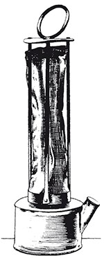
Until very recently, lamps of Davy's basic design were still in regular use for testing gaseous atmospheres. If methane gas is present, it will burn as a blue cone above the main flame (with the gauze preventing the flame from igniting the methane in the mine). The height of the cone enables the estimation of the concentration of methane in the air, from 0.5% up to several per cent.
The mine workings must be evacuated if the methane concentration reaches 1.25%, so the lamp gives critical warning of dangerous conditions. It has now been replaced by methanometers, which monitor the methane concentration using an alumina sensor soaked with palladium or platinum catalysts. However, the sensor is easily poisoned by sulphur, which is prevalent in mines, so the devices need constant and regular maintenance, and there is still much reliance on flame lamps for their ease of use and reliability.
Activity 16 (self-assessment)
- a.Describe briefly the problem which led to the invention of the flame safety lamp.
- b.What single key idea led to a solution to the problem?
- c.How was this concept translated into a working device?
- d.Indicate what practical problems arose when the device was used in collieries, and how those problems were overcome.
Answer
- a.The problem that led to the flame safety lamp was the widespread occurrence of methane explosions in collieries. They were caused by ignition of the methane by open flame lamps used for illumination in the pits.
- b.The single key idea that led to a solution of the problem was the observation that iron gauze of fine enough mesh size would prevent a methane flame penetrating through it.
- c.The idea was used by Davy to construct a safety lamp by enclosing a simple flame lamp with a cylindrical gauze capped by another piece of gauze of the same mesh size (~1 mm). Any methane gas in the colliery air would burn safely within the lamp, giving a blue cone above the bright part of the flame. It would be prevented from reaching the outer colliery atmosphere by the gauze.
- d.The main practical problem that arose as a result of use of the design in working collieries concerned rusting of the gauze. Moisture could attack and corrode the wires, and if just one such wire rusted through, the lamp became unsafe and a flame could pass through and cause an explosion. The rusting problem was solved by providing more than one enveloping gauze, so if one rusted through, another was there to provide protection. The flame could also be protected by a glass cylinder below the set of gauzes.
3.2 Lighting inventions
The Davy lamp is just one example of an inventive solution to a problem. In that case, existing materials were used to provide the answer. In some cases, though, the development or use of new materials is part of the inventive process, and the new material allows the creation of new products. In this section I will look at some lighting inventions that progressed through materials development.
Although flame safety lamps were only of limited applicability outside coal mines, there was a long-felt need for brighter lighting during much of the 19th century. With the growth in manufacturing industry, complex machines needed continuous supervision and maintenance, and illumination by candles or oil lamps was far from adequate (even during daylight hours). Although intense sources of light had been known since Faraday's work on The carbon-arc lamp , they were not readily portable and were not safe or cheap enough for regular use either in industry or in homes.
The carbon-arc lamp
The carbon-arc lamp was one of the first light sources to exploit the discovery of electricity. The device was fairly simple: a very high voltage was generated and applied to two carbon rods. Holding these rods close together produces a spark between them (Figure 39) because a high electric field is produced in the air gap between the ends of the rods. With a powerful electricity source, the spark will be continuous, and can be extremely bright.
The problem with this design is that the rods are burnt off rapidly, and so need to be continuously pushed together in order to maintain the electric current and hence the light. If the gap between the rods becomes too large, the electric field will drop to a point where the spark will no longer form.
The development of coal gas – flammable gases extracted from coal – provided a readily available source of energy when piped distribution systems were constructed. However, the illumination from naked flames was not great, being not much better than a candle, and there was the continuing danger from fire. This problem did result in the invention of the incandescent mantle, where the flame is played on a woven structure impregnated with metal salts that shine brightly, i.e. are incandescent, when heated in an open flame. A similar development used lime as the incandescent material (hence the expression 'limelight').
One problem with all these methods is that a high temperature is generated by the light source, which could clearly be a fire hazard. There was no 'safe' lighting system available apart from miners lamps in collieries.
Although the concept of electricity had been understood for some time, the development of electricity-generating systems (pioneered by Edison in the USA) encouraged efforts to develop a light source powered by an electric current. If this could be done successfully, then electric light could be the solution to low intensity (candles, oil lamps) or dangerous (carbon-arc, gas flame) lighting. Although electric lighting works by heating a wire until it becomes hot enough to glow brightly (it becomes incandescent ), the invention of the light bulb neatly side-steps the danger of having exposed high temperatures by enclosing the incandescent source in a glass envelope. The key to the solution of the problem of electric lighting lay not so much in the need for an electric current, since this was already available, but rather in the need to find a material which could withstand:
- the high temperatures needed to reach incandescence and
- glow brightly without melting;
- which would conduct electricity, and
- which would last for a reasonable time.
The solution was found independently by Edison in the USA and Swan in Britain in about 1879. Heated carbonised filaments would provide a continuous light if they were protected from oxidation (i.e. burning) by being enclosed in either an inert atmosphere (which does not react with the filament) or a vacuum (Figure 40). Both solutions worked, although the lifetime of the lamps was still limited by today's standards. Nowadays, the preferred filament material is tungsten. It possesses a very high melting point (3410 ºC) and can be readily fabricated into the coiled wire filament of electric light bulbs.
Activity 17 (self-assessment)
- a.What was the key problem in making the first incandescent electric light?
- b.What had been the previous methods used for producing light artificially? What were the perceived problems with these methods?
- c.Why was choice of material important for the electric light filament?
Answer
- a.The critical problem in making an incandescent electric lamp was finding a material that would resist burning in air at the high temperatures created when an electric current flowed through the filament.
- b.The previous practices (the 'prior art') in the field of illuminating lights before 1879 included:
- open flame lamps or candles
- flame lamps with a mantle
- lime lights
- carbon arcs.
Open flame lamps provided very little illumination, but it could be increased by providing a mantle around the flame. These were composed of a woven structure impregnated with chemicals (inorganic salts) which increase the illumination level. One such salt was lime, which created an intense light when heated by an open flame. The carbon arc lamp consisted of two electrodes supplied with electricity which, when close enough, allowed a continuous spark to travel between the electrodes. Although the arc provided a very bright light, the carbon rods burned away rapidly.
- c.The material choice for a filament for an electric lamp is important because the following properties are needed:
- very high melting point
- electrically conducting
- capable of being made into a fine filament.
There is much interest in improving the efficiency of the incandescent lightbulb. One innovation involves halogens such as bromine and iodine. Small amounts added to the atmosphere in the bulb increases the efficiency by allowing the filament to work at a higher temperature, and halogen bulbs are used in car lights as well as in domestic lights. Fluorescent bulbs have been promoted for their greater efficiency and lower working temperature, although more expensive to purchase. Light-emitting diodes (LEDs) have also been developed, being of simple construction and greater efficiency. Domestic light bulbs using LEDs are available, although at some great expense. They are also now widely used in small torches.
3.3 New materials
Many problems have been solved by the application of a new material or process. The unique properties of a new material can make possible products or product forms that were previously unconsidered. This is a theme that I will explore further in introducing the steps of invention and product development.
The development of the carbon filament seemed a logical step because it had been shown very early in the Victorian period by Davy and Faraday that the illumination from a candle is supplied by brightly glowing, heated carbon particles. (The experiment is easily carried out: simply play a flame against a cold surface and the surface will quickly blacken with the deposit of carbon particles from the flame.) Inventors already had some idea of what direction to proceed since it was known that carbon could conduct electricity (hence its use in the carbon-arc light). Thus Edison performed experiments on thousands of carbonaceous (carbon-rich) materials before arriving at bamboo fibres, which could be charred to create a carbon filament that would conduct electricity.
This trial-and-error approach to solving a problem has always been one of the principal ways in which inventions are made, and it is still an important tool in the inventive method. It is not a step entirely into the unknown, however, because the inventor will have a good idea of the properties needed, and the classes of material that will meet those needs: the inventor always builds on what has gone before.
For simple products, many alternative materials may be acceptable, especially where the desired main property criteria are mechanical (like strength or stiffness) rather than for more specialised applications (like optical or magnetic properties). Another important mechanical property is Toughness. Thus a chair can be made in steel, wood, plastic, composites, textiles, and even inflated rubber. Each material has its own characteristic set of properties, and within each of the very large classes of material, there are numerous types and grades that can show enormous variation of individual properties. Iron, for example, can be obtained in several forms: as wrought iron (soft and ductile), steel (tough and stiff), or cast iron (stiff but brittle). Wood can vary from a stiff and heavy hardwood like oak to softwood, and even includes a light foam (balsa wood). Aluminium is much lighter than steel but can meet and achieve equivalent functions, although at greater raw material cost. Modern plastic materials can offer a wide variation in properties from a tough polymer like polyethylene to a brittle material like polystyrene.
Toughness
Put simply, toughness is just the opposite of brittleness. A material is said to be brittle if it is easily broken by an impact. Most ceramics are brittle: you will be aware that a ceramic mug will shatter if dropped on a hard surface. Metals, however, are almost always tough materials: a dropped metal saucepan might suffer a dent, but will not shatter.
This is essentially the difference between a brittle material and a tough one: tough materials will tend to absorb damage by denting or changing their shape permanently in some other way, whilst brittle ones will break.
You can demonstrate the difference between tough and brittle to yourself using a metal paperclip and a piece of chalk. You will find that bending the paperclip doesn't cause it to snap even though a lot of deformation is involved. (If you bend it back and forth repeatedly you can break it, but this shows a different phenomenon – metal fatigue.) The chalk, on the other hand, snaps in two very easily, despite being thicker. The chalk (which is essentially a ceramic material) is much less tough than the steel used to make the paperclip.
Toughness is not as easy to calculate for a material as strength. Strength just needs a measure of the force needed to break the material and the area of the sample over which the force was acting. Calculating toughness requires knowledge of the force required to break a specimen of the material that has a crack of known length in it. Figure 41 shows a typical specimen used to test the toughness of metal samples, and how it is loaded. A crack is grown into the sample by imposing metal fatigue on it, which involves loading and unloading the sample many tens of thousands of times at a load much below that at which the sample would normally fail. This causes a crack to grow in the sample, and the geometry and loading of the test piece are designed so the crack grows in a controlled manner.
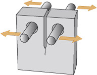
You may ask yourself: how did my simple paperclip and chalk test for toughness manage to show anything, as there were no cracks visible in my samples? The answer is that all materials contain small flaws or cracks, even if they are not apparent to the eye: they may be only fractions of a millimetre in size. Toughness is a measure of how susceptible a material is to fracture, even if obvious large flaws are not present.
Toughness is very useful for designers because it can be used to predict whether small flaws in a structure are safe or unsafe. Good toughness is important if you're designing a bicycle, which must be reasonably resistant to heavy bumps, or a knife that won't splinter in the washing-up bowl.
As the property specification becomes more severe for a specific product, the choice of materials diminishes. Let's look at two examples of how materials are used to meet a product specification.
Kitchen table
A domestic kitchen table has to meet several functions: act as a level work top for preparation of food for cooking, support moderate loads when in use either as a work bench or as a surface from which meals can be eaten; and be resistant to impact blows from users. It should also resist the moderate heat and humidity that arises during cooking and related tasks, and it might have to withstand the heat of a hot pan from the cooker being placed upon it. An additional requirement might include wear resistance for the worktop itself so that knife blades do not scar or harm the material of construction. Such scars could act as a reservoir for food debris, which could decay there and form a breeding ground for harmful bacteria. These are all functional requirements of the design. There are also constraints on the form: the dimensions should conform to the space available in the kitchen and the height to the normal working height of the cook.
The materials used must therefore be capable of withstanding loads applied to the working surface without noticeable distortion, be impact and wear resistant, and resist the effects of moisture and heat. Many woods, such as oak and pine, are well capable of meeting these demands, and are the 'traditional' materials of choice. Modern equivalents include combinations of steel legs and plastic-faced wooden worktops, where the plastic finish may offer greater wear resistance and hence be less likely to act as a source of bacterial contamination, but may not be suitable for the placing of hot objects.
Light bulb
The outer case of an electric light bulb presents a much tighter property specification than the kitchen table, since all the materials of its construction must be able to withstand the high working temperatures produced by the incandescent filament. The exterior shell (or envelope) of the bulb, which is the prime container for the glowing filament, must also resist atmospheric pressure since it encloses a vacuum around the filament itself. It must be translucent or transparent to allow light from the filament to escape. The base to which the envelope is attached needs to provide safe electrical contacts for the filament. The material used in the bulb must also be corrosion resistant.
Glass is the only material capable of meeting the stringent requirements of mechanical and thermal stability needed for the envelope. Its thickness can be controlled to provide varying levels of mechanical resistance (to external impacts for example), although a domestic bulb is normally fragile because glass is brittle. Metal contacts are usually made from aluminium sealed in an insulating material, and the cap is also normally made from aluminium, a tough metal.
Activity 18 (self-assessment)
- a.What is the function of a lightweight ladder with 15 rungs for use around the home?
- b.What materials properties should be included in its specification?
- c.Describe from your own knowledge what materials are used in such a product and how it meets the specification.
(The answer to this activity mentions Angles , so it would be helpful to read the box below before looking at it.)
Answer
- a.The main function of a ladder is to provide access to the upper parts of a wall or building that are normally inaccessible. In normal use it will be leant at an angle to a wall so the user can climb to a given position and gain that access. It must support the user in a stable and safe way, so the materials of construction must resist deformation under the weight of the user (plus any additional load carried by the user, such as paint or tools). The ladder is normally used at an angle of about 75 degrees to the horizontal (as shown by a warning notice posted on all new ladders), and the ladder will normally be fitted with an anti-slip device. Since it is certainly used externally, and may be left outside for some time, it should be resistant to the weather (rain, frost, sunlight, etc.) It should also be light enough in weight to be moved easily.
- b.The material used for the ladder should be strong enough to not fail under the user's weight. It should also be stiff so it does not flex unduly during use. It should be resistant to degradation if left exposed to the elements.
- c.The main materials of construction include wood and aluminium for both the stiles and rungs. Wooden ladders usually rely on unprotected feet and tips, while aluminium ones are normally equipped with rubber feet and plastic tips to prevent slip during use. While both wood and aluminium are intrinsically stiff enough to provide stable ladders (they have reasonably high Young's moduli), problems could arise if the thickness of the component parts is too low. Both materials offer acceptable resistance to deformation caused by the user, but there are differences in environmental resistance. Wood in particular is susceptible to rot from fungi, algae and bacteria, which can cause major structural weakness in the long term. Aluminium is much less susceptible to such degradation.
Angles
Quite often the relative position of two objects is defined in terms of the angle between them. A ladder leaning against a wall might carry a warning that it should be used at an angle of around 75º (75 degrees) to the horizontal (Figure 42). Note that it is important to say what the angle is relative to: the angle that the ladder makes with the wall is much smaller: 15º.
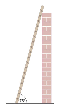
By definition, a complete circle sweeps out 360º. A ladder standing vertically on a flat planar surface would be at 90º (a quarter of 360º). You will probably already have a familiarity with this notation for describing angles.
3.3.1 What is an 'invention'?
The range of materials available is currently expanding at a high rate, giving designers a wide choice for a specific product. When a new material is introduced, inventive minds immediately examine the material for its new properties. This problem is not new, and can be illustrated by the introduction of rubber from the New World in the 18th century. It had been used by native Amerindians as a material for making pots and shoes, as well as for leisure activities such as ball games (see The discovery of rubber ).
It was formed by collecting liquid latex sap from one species of tree, boiling the water out of it, and then heating the semi-fluid resin product to harden over shaped formers. Rubber has substantial elasticity, and is capable of being extended to many times its original length (think of the extent to which you can stretch a rubber band). This elasticity also means that items made of rubber show tremendous bounce! No other materials behaved in this way so it naturally became the object of enquiry when it reached Britain in around 1750.
The discovery of rubber
Spain's desire to colonise South and Central America was driven by a greed for gold and silver. But of the many new discoveries made, one plant was destined to prove extremely valuable in the long term. It was Hevea brasiliensis , a large tree that exuded a latex sap when cut. When collected, the sap could be dried to a solid material and fabricated into many useful products. It was seen by Christopher Columbus during his second voyage between 1493 and 1496. He came across Amerindians playing a game with rubber balls. This game, known as the Sacred Ball Game, had been developed by Olmec Indians as early as 1000 BC. It was played only by the most important members of society in a rectangular court 283 feet long, 100 feet wide and 27 feet high (Figure 43).
After the solid ball was thrown into the court, the players had to pass it to team mates using hips, legs or elbows, and manoeuvre the ball into one of two rings in the centre of the court to score. Side bets were usual, and the winners had the right to strip spectators of clothing and jewellery. Omens were read from the way the game developed, as well as from the nature of the victory. Apparently the losing side could pay with their heads (as the drawing may suggest).
One of the first applications for rubber happened almost by chance. Rubbing small pieces of the material against pencil marks was found to remove them. Such a simple use would not be expected from a planned research effort! This is an example of invention by accident or happenstance, and in this case, the word 'rubber' became absorbed into the language as a term for an eraser.
What were the main features of this 'invention'? They were:
- The discovery was new (no one had done it before, apparently).
- The result was unexpected (not easily predicted from existing knowledge in that particular field) and not at all obvious to workers in the field (or art ).
- The effect could be applied to making a product for use by many people (it is capable of manufacture).
Moreover, once the discovery had been made, systematic research led to better erasers. It was found later that adding various fillers such as chalk would improve the effect. The filler actually weakens the rubber material, making it easier for pieces to be abraded away, and so taking the graphite smears of writing away more easily. So perhaps we ought to add another feature:
The basic invention was capable of improvement (better versions could be made).
The first three points are in fact incorporated into any legal framework for defining new inventions: they must be
- novel
- original (non-obvious)
- capable of manufacture (or otherwise realised in a functional way because not all patents cover mechanical devices).
Activity 19 (self-assessment)
Does the development of the safety lamp by Davy qualify as inventive according to the three main points given above? Justify your answer against each of the three points.
Answer
Davy's lamp design is inventive because:
- It was novel: no one had made such a design before.
- Presumably the use of the gauze was not obvious at the time, or it would have been used previously!
- The concept was applied successfully to making a product so it was clearly capable of manufacture.
Our definition of an invention : a novel idea that has been transformed into reality – given a physical form such as a description, sketch or model conveying the essential principles of a new product, process or system.
The three points are capable of application to any new product, whether inventive or not. Lawyers have codified them and developed specific legal tests to ensure that a new product can be evaluated for its originality. We have already come across the fourth criterion in the discussion of flame safety lamps. They show evolutionary development from the original Davy lamp, in addressing problems of integrity and longevity in the severe environment of the mine. Each individual improvement is patentable if it meets the three basic criteria of novelty, originality and manufacture. We have said already that there must be some context of need, and there must be some use for the invention.
The basic test used to evaluate any new material discovery is therefore to ask three specific questions:
- Is the application novel?
- Is the use original, or not obvious to a skilled practitioner?
- Can the material be manufactured for this specific application?
If it has not been used at all anywhere, then the application is novel, but if some record is found, or a witness comes forward who can attest the use of the same material in the same application, then it will not be novel, and the application cannot be inventive.
The second question is much more difficult to answer, and will depend on the skilled practitioner who responds. If a not dissimilar material had been used before in such an application, then it is conceivable that using the new material could well be obvious.
The final question is the most straightforward to answer. If the material is capable of manufacture, then it satisfies the third criterion.
3.3.2 Innovation in processing
An example of development and innovation in processing is the story of iron and steel. Although wrought iron was well known for centuries (since the so-called Iron Age), it needed heavy working by blacksmiths in order to shape it into usable products. It was also rather soft and susceptible to corrosion (rusting). Harder products such as swords could be made by repeated working and folding, but steel as we know it today was unknown until the 1850s.
Large-scale production of iron was only achieved relatively recently, by Abraham Darby in the 1750s (see The Darby family and cast iron ). So-called 'cast' iron became the structural basis of the first phase of the British Industrial Revolution, being widely used for large structures such as bridges (e.g. the Coalbrookdale bridge: Figure 44), buildings (e.g. the Crystal Palace: Figure 45) and for a host of applications in industrial machinery.

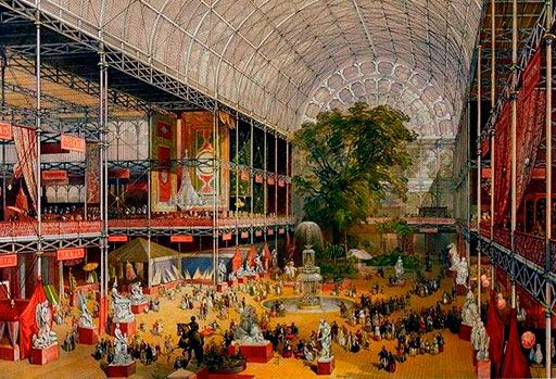
The Darby family and cast iron
The development of cast iron as an engineering material is very much the story of the Darby family, who developed large-scale methods of making this valuable material.
The key step in smelting iron ore to raw metal is the reducing agent used: a reducing agent is a chemical that reacts with the iron oxides in the ore to release the iron in metallic form. Charcoal (produced by partial burning of wood) had been used for two millennia for making wrought iron in small quantities, but it was the development of the coal industry that prompted Darby to try coke (made by controlled heating of coal in the absence of air) as a more effective fuel than charcoal. This development in 1708 led to the cast iron industry founded on the banks of the River Severn at Coalbrookdale. Coal itself cannot be used for the iron-making process because of impurities such as sulfur, which impair the qualities of the iron produced. Consequently it was coke that was the key step in developing a furnace capable of making cast iron on a large scale. The Old Furnace (shown in Figure 46) was the forerunner of the modern blast furnace, and was used to make the members of the first cast iron bridge, spanning the River Severn at Coalbrookdale (Figure 44).
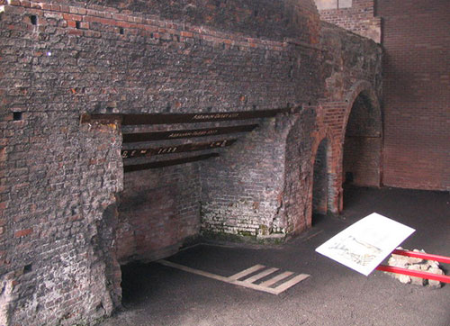
Coke, together with limestone and iron ore, was fed in at the top and fueled by air fed in lower down (not shown); the molten cast iron was extracted at the base. The air was fed in by tuyères – pipes leading in about halfway up the furnace, which 'blasted' a draught of hot air to the charge. The mechanical properties of the coke were important because the mixture had to be both porous enough for the reduction to proceed smoothly and strong enough to resist the weight of material above. The molten iron could then be tapped and run directly into moulds. This furnace was especially important for making the key parts of steam engines. Some of the carbon of the coke dissolved in the iron (about 4%), which gave the material its relatively low melting point, but also made it very brittle.
It was a key discovery: that the amount of carbon present in the iron controlled not only its melting point but also its properties. By controlling the addition of carbon through the use of coke, a form of iron was made that could be cast on an industrial scale. When we talk of iron as the material used for a range of engineering use, we are almost always referring to an alloy of iron that contains some carbon.
3.4 Limitations of new materials
Quite often a new invention is found to have deficiencies when it is tested in use. For example, when the properties of rubber were examined in more detail, it was found to deform slowly under an applied load, a phenomenon known as Creep. Another drawback to the use of rubber in products was its tendency to melt and become sticky at even moderate temperatures. This is now known to be related not so much to the purely physical attribute of melting, but rather to chemical degradation. The material, in other words, oxidised slowly in air.
Of course this was just another set of problems waiting to be solved. In 1846, it was discovered – almost accidentally, by Goodyear – that rubber could be stabilised by heating with a small amount of sulphur in a process called vulcanisation.
Creep
Creep is a phenomenon whereby a material will deform very slowly as a result of a stress. Application of a load, or stress, causes a strain to occur. When creep occurs, the strain continues to increase over time, and will no longer return to zero when the load is removed.
The effect of creep can be observed in lead pipes (used in older buildings) that have gradually sagged over the years. In more modern materials, plastic guttering can also show sagging between supports. Creep is accelerated as the temperature rises, so it is a very important factor in engineering applications where the temperatures are high, and for metals that are being used close to their melting point. For example, materials for jet engine combustors need to be creep-resistant. Alloys used for soldering electronic components on circuit boards have low melting points for ease of manufacture, but they can be susceptible to creep at ordinary room temperature.
As with any fundamental advance in technology, the initial discovery of a new material is followed by a sequence of further discoveries that widen the scope of the original invention or discovery, and any associated patents are known as 'improvement' patents. It is a stepwise sequence, each further step relying on the previous development. What came before a particular invention is known as the 'prior art' – the accepted knowledge base – of this particular area of invention.
Problems in exploitation were also encountered with cast iron: it is brittle in tension, like stone. The design of structures using cast iron must allow for this deficiency, as with stone. That is why the original iron bridge was built as an arch with the imposed loads placing the arches in compression. But one important advantage of cast iron is that it can be made into large beams, rather like wood: it does not have to be used in blocks like stone. So the designer of the Coalbrookdale Iron Bridge made the cast beams to fit together like wooden beams: the ends were shaped so that they could mesh together just like the joints on a wooden structure, and the joints were pinned with dowels (Figure 46).
3.5 Why have standards?
There are standard definitions for all the fundamental units of measurement: the metre for length; the kilogram for mass; the second for time, etc. This is the simplest form of standard; that is, a statement of 'this is how it is' (for example, how something is defined or how it is measured). A supermarket is in trouble if the 5 kg of potatoes that you bought only weighs 3 kg on the scales when you get them home (assuming, of course, that it is not your weighing equipment that is at fault).
Frequently the purpose of a standard is to ensure that everyone is talking the same language. For example, many engineering standards concern definitions of the terms used in particular fields. Problems are created when terms are misinterpreted (as with the Mars Climate Orbiter ). You want to be sure that 5 kg means the same to others as it does to you. Engineers specifying the strength required of the steel cable for a road bridge want to know they are talking the same language as the supplier of the material.
Mars Climate Orbiter
A rather embarrassing failure to standardise occurred in 1999. A planetary probe that was supposed to go into orbit around Mars steered into the planet's atmosphere and burned up instead. The reason? The team responsible for generating software to drive the motors was working in the Imperial system of units, which measures force in pounds-force, lbf. However, other teams on the project expected that the output from the software would be in Newtons. The difference between the two systems of measurement is about a factor of 4.5, and hence 10 N is equivalent to about 2.2 lbf.
You might think that a factor of nearly five is quite large: certainly you would be surprised if your supermarket shopping bill was five times more or less than what you expected. However, the calculations of precisely how much thrust is required from a motor in order to send a spacecraft into orbit around a planet are highly complicated, involving the mass of the craft, its velocity (remember this is a vector, and so includes both speed and direction) and the gravitational force being exerted on it by the planet. Small wonder that it's unlikely you would notice if the end result was out by a factor of five, though a factor of 20 or 100 might instantly appear wrong.
You can then take this argument a step further. The engineer will want to be assured that the test method used to obtain the stated value of strength is a sound, reproducible one that is accepted to give the 'right' answer. (I say 'right' using quotation marks, because for some properties there may be more than one way of obtaining a number to put against the value, but it is likely that only one of them will be the accepted standard route.) This may require any machines used in the testing procedure to be calibrated to a certain level of accuracy, which would again be specified by some form of standard.
This may sound like a horribly circular process, but in many cases careful calibration and standardisation at many levels are needed in order to convince a customer that a product meets the required specification. Potentially this can save the customer money by removing the need for testing when the product arrives from the supplier (and also removing the need for the customer to maintain and calibrate test equipment of their own). There is now a series of standards designed to ensure the quality of product passed to a customer. Indeed a 'product' does not have to be a physical object; it could be a service, a procedure or almost anything else for which standardisation might be considered desirable. We will take a look at an example of such standards later.
Standards also provide some reassurance to the customer. The power supply for the computer I am using to write this has a 'CE' mark on it, indicating that it conforms to a European standard, in this case to prevent it interfering with other electrical equipment or being unduly affected itself by equipment nearby. Many electrical appliances carry this mark (Figure 47) – in fact it is illegal for electrical equipment to be sold that does not conform to this standard. This is an example of a standard being enforced as law in order to protect the public. As you see how standards are constructed and applied in practice, you should be able to develop some answers to the question 'Why do we have standards?'
3.6 Developing standards
In the UK, standards are issued by the BSI (British Standards Institution). There are many other national and international standards organisations, such as ASTM (American Society for Testing Materials), DIN (Deutsches Institut für Normung), ISO (International Organization for Standardization). These are not bodies that develop standards in isolation and impose them on a particular engineering community. The development of a standard is often driven by a group of people working in a certain area, who want to produce a blueprint for a particular method that can be used by themselves and by their colleagues. Standards are not set in stone once issued, but may be revised and updated. Supplements or new related standards may be produced if an existing standard is found to be insufficient to cover all aspects of a particular area, or if there is a change in practice in the field for which the standard is applicable.
In recent years there has even been a drive towards standardisation of the standards themselves. When different countries had different standards relating to the same product, with different criteria and different test methods, it placed a burden on manufacturers to indicate that their product complied with each individual standard if the product was sold in many countries. Many standards now have EN or ISO prefixes to indicate they have European or international applicability.
For example, in the next section we will look at a standard on eye protection. In the UK this standard existed formerly as BS 2092, but was revised in 1995 and renumbered as BS EN 166. The standard was further revised in 2002. Prior to this, there had been a plethora of standards within Europe covering this type of product.
3.7 Looking at a standard: eye protectors
In many workplaces involved directly with manufacturing, there is the possibility of hazardous debris being flung around from various sources. Obvious examples are when components are being cut or otherwise machined, or if hot or toxic liquids are being handled.
A wide range of safety equipment is used in such environments. One of the most basic is for eye protection – that is, goggles or a visor to prevent any hazard from damaging the eyes of a worker (Figure 48).

Eye protection equipment is sufficiently important to have a standard dedicated to it (designated BS EN 166: BS means it is a British Standard, and EN means it is also applicable across Europe). This means that anyone purchasing protective eyewear, whether for a school chemistry laboratory or a production workshop, can check its label to see if the product conforms to this standard and, if so, be confident that it will indeed be suitable for the job for which it is intended.
Activity 20 (exploratory)
This activity introduces you to the standard BS EN 166:2002 (Personal eye-protection – Specifications), you can find part of this standard in the appendix to this course. Only extracts from the standard are provided here because the whole document is long and contains a lot of detail not needed here. However, read carefully Section 1 Scope and look at the headings to see what it contains.
- a.Is BS EN 166 applicable for the following products?
- i.A set of goggles worn by a welder.
- ii.Protective glasses worn by a worker at a nuclear reprocessing plant.
- iii.Sunglasses for use in cold weather.
- iv.Prescription glasses (i.e. glasses to correct for a vision problem like short-sightedness) supplied to a worker who operates a lathe.
- b.Is BS EN 166 the only standard in this field?
Answer
a.
- i.Yes, this is within the scope of the standard.
- ii.No, as the standard does not cover nuclear radiation.
- iii.No, it is indicated that sunglasses are covered by a separate standard.
- iv.Yes, this is covered by the standard, in the final paragraph of the 'Scope'
- b.No. The Scope indicates there are separate standards covering, for example, eye protectors for laser light.
Before we begin to examine BS EN 166 further, it would be useful to review Writing decimal numbers and Precision.
Writing decimal numbers
In the English-speaking world, fractional decimal numbers are conventionally written with a 'decimal point' after the whole number. So 2½ is written as 2.5. This is the notation that we have already used as the norm for this unit.
In some European countries, the decimal point is often replaced by a comma; so in this example 2.5 would be written as 2,5. Because BS EN 166 is a pan-European standard, the comma notations is used for decimal numbers where there is a figure after the decimal point.
Precision
It is not unusual in standards, or any other sort of engineering specification, to see a length quoted as something like: length = 20 mm ± 0.5 mm. The ± symbol is a combination of a plus and a minus sign, and is read as 'plus or minus'.
A specified length of, for example, 20 mm ± 0.5 mm (or (20 ± 0.5) mm) means that any length from 19.5 mm to 20.5 mm will meet the specification. The 'plus or minus' part of the specified length is sometimes called the tolerance. The part of the specification that comes before the tolerance is the nominal value. In this case the nominal value is 20 mm. Any dimensions, or other measurements, in a specification are likely to be given as a nominal value and a tolerance. There are at least two reasons for this:
- In practice, an exact nominal value is usually not required. For example, a range of sizes for a particular component may give perfectly satisfactory operation when the component is used in a machine. It is more useful to the manufacturer of the component to say what this range is than to stipulate an exact length without a tolerance.
- There would be no point stipulating an exact length anyway, since there is always a degree of uncertainty in any measurement. A manufacturer could never be certain that a component met the required specification if all that had been specified was a nominal value.
A tolerance of ± 0.5 mm on a nominal length of 20 mm would not be considered unusual in many undemanding applications. A tolerance of ± 2 mm on the same nominal length would be quite wide, as 2 mm is 10% of 20 mm. Sometimes the tolerance is not spread evenly on either side of the nominal value. For example, a particular speed might be given as:
This means that the speed can be faster than the nominal speed of 12 m s –1 by up to 0.6 m s –1 , but may not be less. This particular notation is fairly unusual, and you will not encounter it again in the course.
The BS EN 166 standard is quite broad in its coverage of the requirement for a set of eye protectors. Eye protectors might have to be exposed to flying objects, small particles, splashes of liquid metal, and flashes of light bright enough to cause blindness. All of these hazards are encompassed by the standard, although it is not necessary for a particular product to be safe against every single one of them.
The most important part of the eyewear is the ocular, which forms the lens of the protective eyewear; that is, the clear barrier in front of the eye. The physical strength or endurance of the ocular is defined in the standard by a criterion, aptly named as robustness. The test for robustness in the standard is as follows:
The requirement for minimum robustness is satisfied if the ocular withstands the application of a 22 mm nominal diameter steel ball with a force of (100 ± 2) N.
The above extract states the minimum robustness. There is also an enhanced robustness criterion. If the ocular is removed from the spectacle frame for testing, this criterion is:
The ocular shall withstand the impact of a 22 mm nominal diameter steel ball, of 43 g minimum mass, striking the ocular at a speed of approximately 5.1 m s −1.
In both cases, the ball must not penetrate the lens, and the lens must not fracture or be greatly deformed if the protectors are to pass the test. If the ball passes through the lens or the lens breaks, then clearly the protectors would not be doing their job. If the lenses are tested whilst mounted in their frames, then they must not be pushed out of the frame, even if they remain intact when doing so. Figure 49 illustrates the tests.
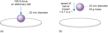
Activity 21 (self-assessment)
The volume, V , of a spherical object (a ball) is given by:
where r is the radius (which is half of the diameter) of the sphere (π see A fundamental constant (pi) ). The density of steel is 7800 kg m –3. Use this information to calculate the mass of the 22 mm diameter steel ball described above.
Answer
The volume of the ball is:
We can now use this to calculate the mass of the ball.
so
So you can see that a steel ball of the required diameter must have a mass of at least 43 g.
A fundamental constant (pi)
When dealing with circles and spheres, you will often see the symbol π cropping up. This is the Greek letter pi (pronounced pie ). It is used to represent the ratio between the circumference of a circle and its diameter. (The circumference of a circle is the distance you travel in one complete circuit of the edge of the circle.) The ratio of circumference/diameter is the same for every circle, and is about 3.14. This ratio is called π, and its exact value is impossible to determine because the decimal part of the number is infinitely long. It has been calculated to some millions of decimal places, and still it keeps going. However, for our purposes, the value of 3.14 for π is adequate.
Activity 22 (self-assessment)
Imagine you are going to test a spectacle lens against BS EN 166 for:
- a.minimum robustness
- b.enhanced robustness.
What quantities must you be able to measure accurately for each of these two sets of tests?
Answer
- a.For minimum robustness, it is necessary to know the ball's diameter and the force used to press it into the ocular.
- b.For enhanced robustness, rather than measuring force, it is necessary to measure speed, which, as we shall see, is actually done by measuring the height from which the ball is dropped.
From the introduction to this standard, and the answer to Activity 22, we can see that whilst any individual standard may appear self-contained, there is often subsidiary information that is needed by a manufacturer. BS EN 166 does not indicate how the measurements are to be performed, only what the requirements are. If the protective glasses are fitted with prescription lenses there are different standards that also need to be taken into account. In fact, the specifications for robustness given above specify that the test methods should be in accordance with the method given in another standard, BS EN 168. So, in addition to a standard on the requirements for protective lenses, there is also a standard that gives information on how the tests can be carried out for these requirements. One of the reasons for having standards is that they provide a way of disseminating advice and information on how to complete basic measurements, or use a particular product in a certain application.
Section 2: Normative references in BS EN 166 indicates other standards that are related to this one. Some of the related standards contain test methods (such as Personal eye protection – Non-optical test methods ); others cover eye protection for more specific use, such as for sun-glare filters. It soon becomes clear that no standard exists in isolation. The list of standards relating to eye protection is a good example. The standards for personal eye protection differ from those for spectacle lenses, and differ from those relating to protection from strong light sources – whether this is the sun or an artificial source of radiation (see Radiation, light and the visible spectrum ).
Activity 23 (self-assessment)
What are the units of π (pi)?
Answer
The ratio π is calculated by dividing circumference (a length) by diameter (another length). So these units cancel each other. Thus π has no units: it is just a number.
Radiation, light and the visible spectrum
In everyday speech, the word radiation is usually taken to mean the harmful emissions from radioactive material. However, in its correct scientific usage, radiation refers to various types of emission, only some of which are related to radioactivity, and only some of which are harmful. One of the commonest types of radiation is electromagnetic radiation, which is itself an entire spectrum of kinds of radiation, including for example light, microwaves, X-rays and some forms of damaging radioactivity. All varieties of electromagnetic radiation have the same fundamental nature, which is what the term 'electromagnetic' refers to. (Electromagnetic radiation is distinguished from particle radiation, which has a different nature.) We can use the example of light to illustrate properties that are common to all electromagnetic radiation.
In simple terms, light can be envisaged as travelling as a wave, rather like the way the ripples in a pond travel out from their source. The distance between the peaks of the waves (Figure 50) is known as the wave length , or just wavelength.
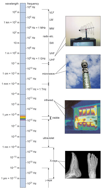
Wavelength can vary enormously, and as the wavelength changes so the properties of the radiation change. Since we classify various forms of electromagnetic radiation by their properties, the wavelength provides a useful way of specifying particular types of electromagnetic radiation. Figure 51 shows the electromagnetic spectrum. You can see that it ranges from gamma rays (one of the harmful types of radiation) at very short wavelength, through to radio waves at long wavelengths. Visible light comes somewhere in between. Here we see the use of a logarithmic scale for plotting data: the wavelengths shown on this figure range from 10 –13 m at the gamma-ray end (equivalent to a tenth of a thousandth of a billionth of a metre) to 10 6 m (one thousand kilometres) at the radio wave end.
Another useful way of characterising electromagnetic radiation (or any other wave phenomenon, such as sound) is by its frequency. This is the number of waves that pass a stationary point each second, measured by counting the peaks per second. Although frequency is a simple concept – a number per second – it is given its own unit, the hertz, abbreviated to Hz. A frequency of 10 Hz is ten complete waves per second.
Activity 24 (self-assessment)
From Figure 51:
- a.What is the approximate wavelength of visible light?
- b.What is the frequency of microwaves?
Answer
- a.Visible light falls in the range of wavelengths between 10 –6 m and 10 –7 m, and is typically 400–700 x 10 –9 m or 400–700 nm.
- b.Microwaves have a frequency between about 3 x 10 9 Hz and 3 x 10 11 Hz.
Let's now investigate the detailed procedure for the increased robustness test. BS EN 166 specifies that the test ball must strike the ocular with a certain speed: around 5.1 m s –1 (Figure 49). The standard also indicates that dropping the ball from a height of 1.3 m will provide this speed.
Of course the standard makes the assumption that the test is carried out on Earth, and that you haven't done something bizarre like cover the test rig in treacle! Gravity produces a force on everything at the Earth's surface, and when something is dropped this force causes the object to accelerate. You may also remember that the acceleration due to gravity is 9.8 m s –2.
Activity 25 (self-assessment)
If an object is dropped on Earth from rest, how fast will it be travelling:
- a.after 1 second?
- b.after 5 seconds?
Answer
Under Earth's gravity, an object will accelerate at 9.8 metres per second per second.
- a.After one second, it will be travelling at 9.8 m s –1. It's as easy as that!
- b.Every second, the object will speed up by a further 9.8 m s –1 , so after 5 seconds it will be travelling at (5 × 9.8) m s –1 = 49 m s –1. The velocity is simply the acceleration multiplied by the time for which it acts.
Activity 25 shows it is possible to calculate how fast an object would be travelling after it had been accelerating for a certain length of time. We can also calculate how fast an object would be travelling after it had been accelerating over a certain distance.
If we use symbols to represent speeds, acceleration and distance, we can make this relationship easier to write. If there is an acceleration a over a distance s , then something that starts with a speed of u will end up with a speed of v. The mathematical derivation of the relationship between all these is outside the scope of this course, but the answer turns out to be:
v2 = u2 + 2as
Thus if we know u , the starting speed of the object at a moment in time, we can work out what the final speed v will be after an accelerating or decelerating force acts upon it over the distance s.
In the case of a ball which is dropped, there is zero initial speed, so our equation becomes:
- v2 = 2as
which, if we take square roots of each side, can also be written as:
The term v is the final speed after the object has moved through the distance s (fallen this distance in the case of an object being dropped). The term a represents the acceleration that it experiences. Properly speaking, a represents the magnitude of the acceleration. You will recall that acceleration is a vector, and therefore incorporates both a magnitude and a direction. The above equation takes no account of the direction of the acceleration.
Activity 26 (self-assessment)
Confirm that a ball dropped from a height of 1.3 m will be travelling with a speed of 5.1 m s –1 when it hits the surface below if air resistance is ignored.
Answer
Using the equation
we find that:
This is just less than the 5.1 m s –1 expected.
Fortunately we have been able to use a bit of fundamental physics here to help us establish the speed of the ball – the fact that a ball dropped under Earth's gravity accelerates at a certain rate. If we had needed to measure the speed of the ball directly in order to prove that the test conditions were correct, it would have involved complicated and probably expensive equipment, all of which would have added to the final cost of the product. One of the key points that I want to convey here is that measurement methods are important. We have discussed already how the units of measurement are critical in ensuring compatibility of data. The way in which the measurements are made, in order to find values for specific quantities, is equally critical. This is why the eye protection standard has related standards concerned solely with the test methods.
You may have noticed, if you have looked at the standard, that impact resistance is not the only protection offered by eye protectors. They can also give protection against dust, and splashes of liquid metal, for example. Each of these elements of protection is tested in a particular way.
The consequence of all this is that as long as the conditions of the test, which are specified by the standard, are adhered to, the results for a particular make of eye protector should be the same no matter where the test is conducted. The fact that there is a standard for the test method as well as for the specific criteria for the protectors indicates the importance of the testing method. Without standardisation of this kind, it would be possible for manufacturers to claim that their product offered superior protection, whilst using non-rigorous testing methods to define their performance. As it is, eye protectors which conform to BS EN 166 will be labelled as having conformed to the relevant requirements.
Activity 27 (self-assessment)
A new apparatus for firing ball bearings horizontally has been developed for testing the lenses of eye protectors. The balls are accelerated at a rate of 80 m s –2 for 0.1 s, and then travel 2 m before hitting the lens. While they are travelling, there is a deceleration (a negative acceleration) of 6 m s –2 owing to air resistance. What will the horizontal velocity of the ball be when it reaches the lens? Is this consistent with the requirements of BS EN 166?
Answer
The ball is accelerated at 80 m s –2 for 0.1 s. The speed after this acceleration is just the acceleration multiplied by the time, so the speed will be:
The ball then slows down as it travels towards the lens. The final horizontal velocity can be derived from:
That is,
Note that the acceleration must be written as a negative number here, as the ball is being slowed by the air resistance.
This is above the speed recommended by the standard, so the test, although possibly more stringent than the requirements, would not conform. The machine could be adjusted to provide the correct speed.
This section has introduced you to the sorts of requirement that are aimed at in a standard for a particular product. The case we have examined, the standard for eye protectors, gives specific tests that the product must pass before it can claim to conform to the standard. This is typical of a standard for a product or a range of products. Such standards tend to define the function and performance of the product, and there may be tests the manufacturers must apply, or certain ranges of dimensions like length or weight, which the product must comply with.
This is just one type of standard. Examples of other types of standards are those dedicated to testing methods, and standards for processes or practices.
3.8 Engineering risk
Risk is a word that seems to be ever present in the language of both the engineering profession and the general public.
I will try to define the term risk later, but any observer of the TV and news media will probably have noticed an increasing demand from the public for proper explanations about how specific risks are regulated; in fields as diverse as finance, health and personal relations. In 2011, there were two stories that both caused widespread public debate about the risks involved; the Fukushima nuclear reactor melt down following the earthquake and tsunami, and the motorway (M5) pile-up in the UK, originally thought to have been caused by bonfire smoke but later evidence proved that it was thick fog. In the past, such issues rarely surfaced outside technical or specialist circles. Activities were either safe or unsafe. Indeed, this simple approach still features largely in both the public imagination and some newspaper articles. But most of us now realise that the world cannot easily be described in such absolute terms, and the safety we seek is constantly balanced against the benefits we desire. Perhaps a good example here is driving. All drivers think of their driving as safe, but most of us have performed an overtaking or other manoeuvre which, in retrospect, we considered 'risky'. What I want to do in this section is to investigate how we can identify, assess, and manage risks, and identify what part engineers have to play in this process.
The role of the engineer, in identifying and managing risks, has been recognised by the engineering profession. Among its aims and objectives, the UK's Engineering Council stresses the importance of a proper balance between efficiency, public safety and the needs of the environment when carrying out engineering activities. The Council's guidance for the institutional codes of conduct expects engineers to address risk thoroughly – applying in-depth, long-term thinking – so that they may help to encourage greater awareness of risk in others with whom they work. The key elements of the Council's Guidance on Risk (2011) are listed below.
- Apply professional and responsible judgement and take a leadership role.
- Adopt a systematic and holistic approach to risk identification, assessment and management.
- Comply with legislation and codes, but be prepared to seek further improvements.
- Ensure good communication with the others involved.
- Ensure that lasting systems for oversight and scrutiny are in place.
- Contribute to public awareness of risk.
Many serious incidents are the result of component or structural failure, but often there is some human error involved as well. Often it is difficult to separate more technical engineering issues from human factors – so-called 'hard' and 'soft' elements respectively. Likewise, perceptions of the relative significance of many of these issues is a personal one.
Activity 28 (exploratory)
You may like to test some of your perceptions of risk now with the following activity that relates to some commonly held views. Do you believe the following statements are true or false?
- Butter is the best first aid treatment for a burn.
- Accidents are due to the inevitability of statistical laws.
- The main danger from a gas leak is asphyxiation.
- A small vehicle can stop more quickly than a large one.
- Lightning does not strike twice in the same place.
- A silver spoon turns black in contact with poisonous toadstools.
- A tourniquet is the best method for stopping bleeding from a wound.
- Accidents happen to other people.
- It is impossible to remain afloat in water while wearing clothes.
- Accidents are an inevitable price of technological progress.
Answer
Many of the statements are associated with what we commonly call accidents. In fact, every one of the statements is false for specific reasons that we need not go into here. It is sufficient to note that they illustrate common perceptions linked to several types of accident.
Our perceptions of safety are often linked to our perception of the likelihood of an accident happening. But what exactly defines an accident? The word is of such common usage that, surely, we all know its meaning?
Activity 29 (exploratory)
Write down your definition of an 'accident'.
Answer
In the Shorter Oxford English Dictionary, I find the definition includes the following key points:
Accident:
- Anything that happens.
- i.An event; especially an unforeseen contingency; a disaster.
- ii.Chance, fortune.
- iii.Medically, An unfavourable symptom.
- iv.A casual appearance or effect.
- That which is present by chance and so non-essential.
These definitions imply an unexpected nature, and certainly we often link an accident to undesirable outcomes, as the references to disaster and unfavourable symptom imply. Indeed, medically we associate accidents with causes of injury or death. However, the reference to fortune implies good luck rather than an unfavourable outcome. So the term is ambiguous and embraces a range of outcomes.
Your answer probably contained at least some of the above concepts.
There are many different ways in which we can define accident, but the key characteristics of any event that could be described as an accident seem to be:
- the degree of expectedness – the less we expect the event, the more we regard it as an accident
- the avoidability – the less likely we can avoid the event, the more it is accidental
- the lack of deliberateness – the less someone is actually involved in causing an event to occur, the more we view it as an accident.
The common linguistic use of the word 'accident' alone gives no indication of causes or of results. When the outcome of an accident is likely to cause substantial damage to either people or property then we often refer to the accident as a disaster. In this context, one academic authority has produced the definition:
An accident is a non-deliberate, unplanned event which may produce undesirable effects, and is preceded by unsafe, avoidable act(s) and/or condition(s).
This definition probably matches our common perception of the word quite well, but let us look at it more closely. 'Non-deliberate' acts include trips and falls, as well as events such as earthquakes. While good engineering design may help prevent the former, engineering can probably only help to minimise the effects of the latter. The 'unplanned' element of the definition can be taken to imply that accidents are inevitable and uncontrollable. Clearly this is not necessarily true, and much engineering practice aims to prevent such events. The phrase 'undesirable effect' raises another problem. Value judgements determine whether something is desirable or undesirable, and so whether a change is required to prevent the 'undesirable effect'. Hence the view on whether something is undesirable may differ from one person to another, may vary with situation, and may differ from culture to culture.
This inconsistency has an impact on the perception of an accident. If someone lights a bonfire alongside a motorway and the smoke blows across the road reducing visibility and causing vehicles to collide, do we regard it as an accident? But what if someone decants petrol in the presence of a naked flame? Was the collapse of the Louisiana levees during Hurricane Katrina an accident?
The above examples have undesirable effects, but are all accidents undesirable? Their outcomes may be beneficial! As children we quickly learn from experience that saucepans on a cooker are hot and cause us pain. So usually we do not touch them again. We can learn from accidents. The discovery of penicillin by Alexander Fleming could be described as an 'accident'.
There is no doubt that engineers learn from accidents because accidents and disasters have often led to changes in design or legislation that improve product or customer safety. Particularly where disasters are concerned there can be a tendency to want to blame accidents on engineering failures. Perhaps you would think that 'good' engineering eliminates accidents, but you can only avoid what you can predict (and as we saw earlier most definitions of an accident would include that it would be unexpected and unavoidable). What engineers can do is design and manufacture artefacts to reduce the likelihood of, and minimise the consequences of, engineering failure. And in this context engineering failure could include both failures of components and failures of systems.
3.9 Risk management
Implicit in the Engineering Council policy is the process of evaluating alternative actions and selecting the most appropriate. We can call this 'risk management'. We do it, whether consciously or subconsciously, in our daily lives when we think about different tasks (see Everyday risk management ).
Everyday risk management
Risks are everywhere. How do we decide which ones are worthy of our attention? In an ideal world, on some regular basis, we would review our priorities systematically. That would begin by listing all the risks we face, ordered according to the threat posed by each. It would continue by listing every option for controlling each risk, characterised by some estimate of its effectiveness and cost. It would conclude by identifying the 'best buys' in risk reduction, the strategies that achieve the greatest reductions at the least cost. Those costs might be measured in money, time, effort, 'nagging' or whatever other resources we have to invest in risk management. As a by-product, this analytical process would leave a list of residual risks, which we cannot reduce at any reasonable price, but may continue to concern us.
In reality, though, such systematic reviews of risk are as rare as systematic reviews of how we spend our time, money or emotions. One obvious constraint on any of these activities is lack of time to perform them. However, even with all the time in the world, there would still be daunting obstacles. Risks are so diverse that it is hard to compile either the list of threats or the set of possible control strategies.
But although we rarely systematically review the risks that affect us we do make risk management decisions all the time, sometimes based on gut feel or common sense as much as hard facts. Reviewing my daily activities, I find many examples of conscious or subconscious risk management decisions. I decide that it is better to accept the risk of electrocution by turning on the light in the morning than to face the risk of tripping and falling on my way to the bathroom. I decide the risk from a cup of morning coffee via its known carcinogens is far outweighed by the risk of driving my car before I fully wake up! Driving to work, I fasten my seat belt, because it almost doubles my chances of surviving an accident. And, of course we all make continuous risk assessments when driving.
The life expectancy in the UK rose from 71 years for men and 77 years for women born in 1981 to an estimated 78 years for men and 82 for women for those born at the end of the first decade of the 21st century. Thus, total risks have decreased. The increased interest in risk assessment and management in conjunction with a longer life span means we worry more and more about lower risks. As we define the risks in our society in more detail, we become more fascinated by smaller, less significant risks. We fear the unknown and are confident that only what we don't know can hurt us. It's no wonder that risk management, as well as risk perception can be a highly emotional issue. I can't be the only one who drives too fast when late for an appointment.
(Adapted from Johnson, 1991 and Fischhoff, 1995)
Risk management is a practice with processes, methods, and tools for managing risks in a project, activity or event. It provides a disciplined environment for proactive decision making to:
- assess continuously what could go wrong (identify risks)
- determine which risks are important to deal with
- implement strategies to deal with those risks.
It is a decision-making process that involves the consideration of political, social, economic and engineering information together with risk-related information.
So what is risk? So far I have avoided a precise definition of the term. Like the word accident, it is a word of such common usage that we have all some idea of its meaning.
Activity 30 (exploratory)
Write down your definition of risk.
Answer
The Shorter Oxford English Dictionary, says:
Risk:
- Hazard, danger, exposure to mischance or peril.
- The chance or hazard of commercial loss, specifically in the case of insured property or goods.
If you look up dictionary definitions for risk, hazard, peril and similar words such as danger or jeopardy, you find that as well as all referring to each other in their definitions they virtually can all be used to convey the two concepts listed above. That is, they can be used to describe a particular generally unwanted event or outcome (see 1 above), or they can be used to describe the chance or probability of an unwanted event or outcome occurring (see 2 above). Although this double meaning can be confusing, in managing risks, dangers or perils we do have to first identify the outcome and estimate the likelihood of it happening.
Three definitions of risk taken from the Guidelines on Risk Issues from The Engineering Council (2011) are:
- Risk is the chance of an adverse event.
- Risk is the likelihood of a hazard being realised.
- Risk is the combination of the probability or frequency of occurrence of a defined hazard and the magnitude of the consequences of the occurrence (which agrees with the British Standard definition in BS 4778: Section 3.1: 1991 Quality Vocabulary). It is therefore a measure of the likelihood of a specific undesired event and the unwanted consequences or losses.
Note that all three deal with the likelihood of an event rather than the definition of the event itself. Furthermore, the third definition also tries to factor in just how undesirable the event is. We can consider events ranging from disasters to relatively minor inconvenience. To the people involved, even a relatively minor event (such as a fatal car accident) has enormous consequences; but it is unlikely to receive national attention. Major incidents, perhaps involving much loss of life, receive the greatest publicity and tend to raise general concerns about the risks of engineering failure; even though the failure might only have been avoidable with the hindsight gained from the incident.
So perceptions of risk are not based solely on quantitative measures but include subjective value judgements. These may be influenced by the degree to which the risk is imposed upon us, rather than accepted voluntarily, our knowledge of the problem, our trust in the 'management' of the risk and so on. Indeed, we can sometimes have very emotional or even irrational opinions about certain risks as illustrated when people talk about flying, for example.
4 Engineering for products
The previous sections gave you a broad overview of engineering, looking at historical development, the processes of design and designing, and the environment in which engineering takes place.
In this section you are going to study how designs are turned into physical products: the resources, materials and methods used, and the set of activities that goes under the heading of 'manufacturing'.
Any design is only useful if it can be made into a product. Remember that an invention is only patentable if it is capable of being manufactured. So there has to be a way of making it, using materials that have the required properties and processes that produce the required product at a reasonable cost. This, in effect, is simply restating that the way you design a product, the materials you choose to make it from and the manufacturing processes you have to use are all interconnected.
Let's first consider what is meant by the term 'manufacturing'. You probably have a general feeling for it already. The word 'manufacture' derives from two Latin words: manus (meaning 'hand') and facere (meaning 'to make'). We generally think of manufacturing taking place in a 'factory': an abbreviated form of the eighteenth-century word 'manufactory', made up from those Latin words. So manufacturing applies to artificial products: it does not apply to natural products that grow on the surface of our planet, or that can be found in the Earth's crust or in the atmosphere. On the contrary, such products are the source of what we call natural or physical resources , many of which are starting points for manufactured items.
Such resources are also often called raw materials , but this term is more generally used to describe the input of any manufacturing process. Similarly the term product can be used to describe the output of any manufacturing process. (Of course 'product' is widely used nowadays to cover many types of service as well as physical products but those are not our concern in this section.) So, crudely, a raw material is anything that can be turned into something else, and the something else it is turned into can be called a product. A mining company takes its raw material directly from the Earth's mineral resources. To such a company, iron ore is a product. An iron producer operating a blast furnace uses this iron ore as a raw material and smelts it into a new product, pig iron, in a blast furnace. This pig iron is either allowed to solidify and sent on to another works (or 'foundry') or else kept molten and fed to a steel works. The output product from the blast furnace thus becomes the main raw material for the foundry or the steelmaker. The steelmaker turns the raw iron into steel sheets or bars. These steel sheets and bars then go on to become the raw materials for other manufacturers producing the enormous variety of useful products we see all around us, ranging from car bodies, railway tracks, domestic white goods (washing machines, refrigerators, etc.), to ultra-thin syringe needles, paper clips, and every conceivable item that contains steel.
Such manufacturing chains are an integral feature of practically all of these sorts of products that our society demands. It matters little whether it be nylon stockings, a plastic moulding for a roof gutter, a child's toy, a tube of adhesive, a high voltage electrical insulator for overhead power lines, a spark plug, or a grinding wheel. Every manufacturing chain can be traced back to some natural raw material that has to be put through several, often many, different processes before the desired product is ready for sale in its end market.
The majority of optical fibres are made from silica (silicon dioxide or SiO 2 in chemical terminology), which is the major constituent of sand. Purified silica is extracted from sand. It is often chemically modified to give specific optical properties and is processed into individual fibres that are then assembled into the fibre bundles – cables – which are fast becoming the main channel of terrestrial communications networks (Figure 52).
Sand is the raw material for the production of fibres. Fibres are the raw material for cables. The network installers buy and use the cables to build their networks. For each part of this chain, every person or organisation involved up until the final user will consider themselves to have suppliers of raw materials and consumers of their products.

Activity 31 (exploratory)
All products require raw materials in some form. Choose two or three items from the following list of manufacturing activities and make a list of the raw materials you can identify for your product. Think in terms of the input materials to the process, rather than the original resources.
- a.The manufacture of ammonia.
- b.The manufacture of ballpoint pens.
- c.The manufacture of copper pipe for central heating systems.
- d.The manufacture of loaves of sliced white bread.
- e.The manufacture of PCs.
- f.The manufacture of Open University printed units.
Answer
One thing you should have noticed from this activity is that some products, such as copper pipe, consist of just one material that is simply shaped into its finished form. Others – ammonia and bread – start with several raw materials that undergo chemical change to create a single, coherent item or substance. And others still, such as the PC, are assemblies of several components made from quite different materials.
Some raw materials are easier to identify than others.
- a.Nitrogen and hydrogen.
- b.Up to four different sorts of plastic for the barrel, lid, ink tube and plug; brass for the ball holder, tungsten for the ball.
- c.Copper, probably as ingots that can be drawn into rods and then into pipes.
- d.Flour, water, yeast (plus additives such as the vitamins that were removed from the flour and so-called 'improvers'), plastic film or waxed paper for the wrapping, printing inks, adhesive tape for the closure.
- e.Manufacture of PCs is very much an assembly job, so the raw materials are all the internal components, the housings, the mechanical connectors, the connecting leads etc.
- f.Paper, card, staples (or adhesive) and inks, obviously, but do you count the intellectual and creative efforts as inputs?
Activity 32 is another exercise in choosing the right material for the job but this time taking account of the form in which that material is supplied. You may feel that picking the right match is ridiculously easy in the cases given. But I want you to take a few minutes to summarise why the other candidates are not suitable. This elimination of candidates is going to become an important aspect of your decision-making about manufacturing routes during the section.
Activity 32 (self-assessment)
List the requirements of each of the applications (a)–(c) and then match it to an appropriate material/product from (i)–(vii). Very briefly summarise why each of the other options (i)–(vii) is unsuitable.
- a.Rope for mountain climbers.
- b.See-through door panel for an electric cooker.
- c.Prefabricated roof trusses for a medium-sized house.
Candidate materials and form:
- i.High tensile strength steel wire.
- ii.Sawn, kiln-dried timber planks joined with steel nails.
- iii.Moulded PVC plastic with black colouring.
- iv.Plaited nylon fibres.
- v.6 mm thick toughened glass sheet.
- vi.Thin-walled copper pipe.
- vii.Perspex (transparent, hard) plastic sheet.
Answer
- a.Rope for mountain climbers. This matches with (iv) plaited nylon fibres. (i) steel wire would be far too heavy, might rust and would be difficult to grip. The other options are simply the wrong shape.
- b.See-through door panel for an electric cooker. This matches with (v) the toughened glass sheet. Of the other options, only Perspex is transparent, but this would soften and melt at oven temperatures.
- c.Prefabricated roof trusses for a medium-sized house. This matches with (ii) sawn, kiln dried timber planks joined with steel nails. Again, most of the other options are in the wrong form. Try nailing the other materials!
One thing that distinguishes humans from the rest of the animal kingdom is the ingenuity to devise tools and use them to achieve a purpose. The component parts of the large machines that can be seen in manufacturing plants are made by other machines and these in turn are made by others. They are all 'tools', and one tool is necessary to make another; in other words, all tools are themselves manufactured products. Indeed, most products that are manufactured have evolved from what has gone before, and all stem from the natural materials and resources on the Earth. The challenge to the engineer's ingenuity is to use these resources to the advantage of society. This can be done by understanding the properties of the natural materials and other materials that can be produced from them, before converting these into useful objects. Doing this efficiently and economically, with minimum waste of energy and materials is what successful manufacturing is all about.
Indeed, as you will see while working through this section, manufacturing is about much more than just choosing the right material in the right form. If a manufacturer concentrates just on the processing methods for converting materials into components, there is the risk of taking for granted things like the supply of raw materials to the process, the power consumed by the machinery, and the removal of finished products and waste. These are often seen as 'someone else's job'. There are circumstances when this approach is adequate. But engineers should be just as concerned about how to supply the process with materials at the right rate and cost, and how to deliver the products to the next process or to the customer at the right price. Only by doing so can they recognise and respond to important changes in the manufacturing environment brought about by legislation, currency exchange rates, new evolving markets and so on.
In this part of the section, we will look at manufacturing as a broad engineering activity, and also at some of the details of manufacturing processes, to show the myriad ways in which raw materials can be turned into the products that we see around us.
4.1 What is manufacturing?
Manufacturing is a very broad activity, encompassing many functions – everything from purchasing to quality control. Shortly we will start to look at some of the main manufacturing processes used to convert materials into products. But before doing this it is worth touching on the relationship between manufacturing processes and the manufacture of products.
To consider manufacturing as a whole we clearly have to look beyond specific sets of materials and processes that lead to single products. One way of doing this is to adopt what is known as a 'systems approach'. I am not going to do so in any depth here. There simply isn't enough space in the course. But a short overview should give you a taste for how viewing activities as 'systems' is a useful technique for organising information about them and providing a more structured way of managing them.
Looking at manufacturing as part of a broader 'production' system provides a way of identifying which factors, whether internal or external, are important, and so aids decision-making about choosing a particular manufacturing process in a particular situation. Sometimes the choice of which material and which process to use will not be trivial. Factors such as consumables needed in the manufacturing processes, the amount of scrap produced, the speed of the process, the energy required, and so on, may all need to be considered in order to make a sensible decision about the best way of making the final product.
Look at Figure 53. Down the centre of the diagram you will see a flow chart of production from design to distribution, with activities in rectangular boxes as before. I have left out the diamond-shaped decision boxes but added boxes with rounded corners for the inputs to each activity and the outputs from them. This is a very simple systems diagram – another modelling approach to add to the ones you have already met in the course.
When modelling systems, it's important to draw a system boundary around those activities that are being modelled. That then allows us to leave activities outside the boundary in the system environment. Those things we leave outside the system, in the environment, are generally drawn inside clouds. The arrows in the diagram are showing flows – flows of resources, such as power, or the flow of ideas involved in the design process. The resource moves from one box to the next on the diagram.
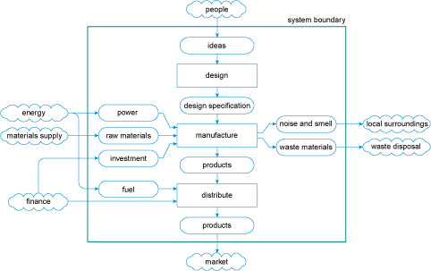
Figure 53 is an example of a process flow diagram. It tries to describe the whole activity of manufacturing a product, from the initial idea through to delivery of the product to the customer. A key message from such a view of manufacturing is that design and manufacturing are not separate activities but are intimately connected in the production system.
That is where I am going to leave this approach to modelling a production system for the moment. Before that, I need to introduce you to the vast range of methods used to transform materials into objects.
4.2 Manufacturing processes: making things
We can't hope to cover all manufacturing processes here – that would be beyond the scope of this course. Instead, you'll have a chance to explore a selection of traditional processes and some that have been developed more recently. This should allow you to appreciate the main principles involved and add further to your understanding of how choosing a process to make a particular product is intimately bound up with the product design and the selection of a material to make it from.
Remember the ballpoint pen you looked at, albeit briefly, in Section 1? Manufacturing techniques such as extrusion, injection moulding and machining were mentioned there. Here you'll be introduced to these processes in more detail, as well as to a range of others. Studying this first part of Section 4 should equip you to have a reasonable stab at deducing the methods used to manufacture many of the objects around you.
Activity 33 (exploratory)
Write down some ideas about how the following products could be made. I'm not expecting you to know or even to research specific manufacturing processes. I want you instead to think about the challenges you would face when setting out to make each one:
- sewing needle
- engine crankshaft
- disposable cutlery
- Maltesers/Whoppers.
Answer
I hope you came up with at least some of the following thoughts. You may even have come up with more than the few ideas I have put down here.
- Sewing needle – It's long and thin with a sharp point at one end and a hole at the other. It is made of metal, so it is probably best to start with a piece of wire and shape it. You could grind down one end to a point and punch a hole in the other.
- Engine crankshaft – This is a big, heavy metal object that has to withstand a lot of stress at quite high temperatures for many years. It's also quite a complicated shape and has some very precise dimensional requirements. I need to know the options for shaping large chunks of metal before I can say how something like this is made.
- Disposable cutlery – We see these everywhere. They're made from plastics but they have quite complicated shapes. So my guess would be some kind of stamping or casting process.
- Maltesers/Whoppers – Now there's a challenge. It's a honeycomb centre – like a spherical biscuit – with chocolate on the outside. I think I would bake the core in a little mould and then try to dip it into liquid chocolate. But the difficulty would be getting the chocolate to make a uniform solid coating.
It will be helpful if we base our look at manufacturing processes on a specific example. We need a fairly simple product but one that can be made from a variety of materials that, in turn, require a range of processes.
The product I've chosen is a simple gearwheel. Why use this example? There are several reasons.
- Gearwheels are found in various forms in myriad applications such as all kinds of industrial machines, cars, aeroplanes, ships, domestic products and even toys.
- It is a product that is easily understood.
- It has a mechanical function, requiring physical properties that suit the particular application, for instance gearwheels in a food mixer (Figure 54(a)) must be made of a durable and strong material whereas a flying toy helicopter requires gearwheels that are robust but as light as possible (Figure 54(b)).
- There are many different routes by which it could be made and many different materials that it could be made from.
In a food mixer, there is a single motor that drives one or two shafts to which the attachments are connected. These interchangeable attachments are fitted to one end of a series of toothed gearwheels, known as a gear train, the other end of which is coupled to the electric motor. We're going to look at just one gearwheel in the gear train of a typical mixer.
Not all manufacturing processes can be used sensibly to make gearwheels, so occasionally we'll look at the manufacturing aspects of some other comparably simple components.
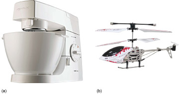
Figure 55 shows an exploded view of the gear train from the food mixer in Figure 54(a). You can see that this is a fairly complex assembly of intermeshing parts. The complexity arises because not only does the mixing tool spin on its own axis but the axis itself also moves around a circular 'orbit' in the bowl of the mixer. In addition, this particular gear train 'gears down' the motion from motor to tool by a factor of 20. But don't worry about the details of Figure 55. We're going to concentrate on the simplest gearwheel in this assembly, the one labelled as the planet gear. A photograph of this and its associated static ring gear (hidden from view in the exploded diagram) is shown in Figure 56.
As you work through this section, I shall return to the gear wheel and get you to think about the different ways it could be made.
The information in this part is organised using three Ps, which are designed to help you choose appropriate manufacturing processes in different scenarios:
- Process – the fundamental approach taken to shaping a quantity of material.
- Properties – the materials properties needed in a product or component and how they can be affected by the shaping strategy.
- Product – the external form or 'shape' of the component.
But before that we need a couple more ideas to help organise the large volume of information on processing in order to help you decide what is feasible or desirable.
4.2.1 Process
If you think about it, the number of different things you can do to a raw material to get it into a desired shape is pretty limited (Figure 57).

You could start with the raw material in liquid form, pour it into a mould that replicates the shape you want and wait for it to solidify – think of making ice-cubes or casting concrete.
You could squeeze , squash, hammer, bend or stretch the material into its required shape – similar to rolling out a piece of dough or modelling with clay, as the car body designers do in a car factory when they are working with a new body design.
You could start with a lump of solid material and carve or cut it to shape, in the same way Michelangelo transformed a block of marble into the statue of David.
Finally, you could build your shape by taking different pieces and joining them together using any number of methods: screwing, nailing, gluing, welding or stitching for example. Innumerable products involve at least some joining, ranging from a skirt to a car body, and from a desk to an aircraft wing.
So, starting with a given mass of raw material, whether it is a pile of granules of plastic, an ingot of steel, a lump of clay, a block of stone or whatever, the basic process routes for manipulating it into a specified shape nearly all fit into one of four categories:
- a.pouring, which we will refer to more precisely as casting
- b.squeezing and bending, which we will call forming
- c.cutting (sometimes referred to as 'machining')
- d.joining.
However, life is rarely simple. To start with, the wide range of engineering materials means that there are many, many variations on each of these process routes. And you shouldn't worry about trying to fit every process you encounter neatly into one of the four categories above. You will see processes that combine elements of more than one approach. The categories simply provide us with a convenient way of grouping similar processes together and examining the underlying scientific principles that unite them.
4.2.2 Properties and internal materials structures
So far I have principally treated materials just as 'stuff' that has a series of properties. You have seen that these properties vary from material to material but I have not really started to discuss why they do. I am not going to go into this in any real depth in this course but there is one important aspect of materials engineering that you have to know about before exploring materials processing much further. This is to do with the structure of materials across a whole series of size scales ranging from a few millimetres down to a few Ångströms (symbol Å; 1 Å = 10 –10 m or one ten-billionth of a meter!).
We are all familiar with the human scale of tangible products ranging from a cup all the way up to a building or a bridge. We call this scale macrostructure – 'macro' from the Greek word for 'large'. You should also be familiar with the concept that the properties of materials depend to a degree on their structure at the other extreme of scale – the type and arrangement of their individual atoms and molecules. This is usually called atomic (scale) structure. However, much of materials engineering is concerned with a size scale in between – generally too small to be seen with the naked eye, but much larger than individual atoms and molecules. This middle ground is termed microstructure – 'micro' from the Greek for 'small'.
The properties of solid materials can be profoundly influenced by their microstructure. And because a material's microstructure is almost invariably changed by the manner in which it is shaped into a product, the properties of materials in products are dependent on how they are processed.
You've already seen in earlier sections the importance of materials properties and the component geometry. Component geometry is an example of structure on a macroscopic scale. Look at Figure 58(a), which shows the second Severn Crossing. The bridge has the structure it does because it was built to achieve the task of providing a path for vehicles across the estuary, at an acceptable cost and with complete safety during construction and during use. The central portion is an example of a cable stayed bridge, where the deck of the bridge is attached to the supports by cables. This structure was chosen, presumably, as being the best solution, although there may have been several alternative structures that would have performed equally well with the final decision being made on aesthetic grounds.
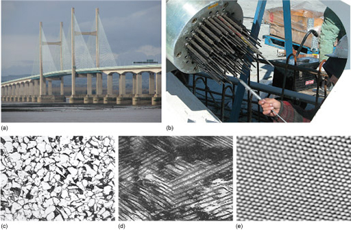
If we look at the structure of a support cable for such a bridge (Figure 58(b)), we see that it is not a solid bar of material, but is 'woven' from many thinner strands of wire. This structure (still a macrostructure) is chosen for several reasons, including safety. With a reasonable safety factor, it shouldn't matter if a flaw causes the failure of one wire strand because there are multiple paths for the load that the cable is supporting. In addition there are some beneficial properties that cable structures have compared to large single strands, such as flexibility.
The structure story doesn't stop with the material for one strand, though. I've already indicated that steel is a mixture of iron with carbon, and the way carbon affects the structure of the iron on a microscopic scale depends on the amount of carbon in the iron and the heat treatment that the iron has had. Figure 58(c) shows the microstructure of a typical steel. This shows that as we look in closer detail we begin to see that what we thought was quite a smooth, plain metal surface has a lot of underlying structure to it. Once we've zoomed in so that we can see features as small as 10 micrometres, it becomes clear that the metal is composed of small individual 'grains'. This structure in turn determines the mechanical properties, like strength and toughness, of the steel. We can control the microstructure of the iron: through alloying and heat treatment the grain size and structure can be altered, so tailoring the properties of the material that we make.
Figure 58(d) zooms in still further, showing us more of the structure within the grains themselves. Influencing things at this level is more complicated, but it can be done, and again can help to tailor the material properties.
Finally, we can zoom down to the level of the atomic structure (Figure 58(e)). In this case, we're looking at carbon, one of the elements in steel. The bonding between the atoms, and the structure they take up, critically influences the material properties, but there's nothing we can do to change it!
Some materials are more useful than others because they have the right sort of atomic bonding and atomic structure, and a microstructure that we can do useful things with. In Figure 58(e), you can see that each carbon atom is surrounded by six others in an hexagonal pattern. This is simply the way that carbon atoms arrange themselves in this instance (carbon is versatile in that it can adopt several atomic arrangements).
We will refer to microstructure frequently in this section. It is a key factor in determining mechanical properties, and it can be greatly affected by the choice of manufacturing process for a material.
4.2.3 Classifying shapes
Apart from being important in the physical performance of a component, its geometry – shape and size – is also a vital factor in choosing a manufacturing process. Some manufacturing methods are better suited to particular shapes and sizes than others. The shape of a product is usually the best place to start when deciding which processes are feasible. So we need a way to describe shape, although it does not need to be very sophisticated.
Figure 59 is a simple relationship diagram for the shape categories I am going to use.
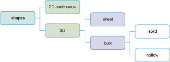
2D (continuous)
If the profile of an object does not change along its length – like a pipe, electrical cable or aluminium cooking foil – then it can be classified as having a simple (continuous) shape. For convenience I am going to call these 2D (shorthand for two dimensional) shapes. Many 2D products are used as the raw material for processes that make them into three-dimensional (3D) shapes. PVC window frames for example are made from continuous extrudate (the product of the process of extrusion, Figure 60) which is cut into suitable lengths and then joined together by fusion welding. Nails are made from short lengths of wire in a couple of simple cutting and forming steps.
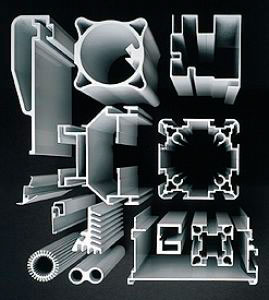
3D
Most objects have profiles that vary in all three axes. Many processes are suitable for the production of 3D shapes, so we need some further breakdown of this high-level classification. For various reasons it is best to split 3D shapes into two types, which I shall call sheet and bulk shapes.
Sheet products have an almost constant section thickness, which is small compared with their other dimensions, but without any major cavities. Buckets and car body panels (before assembly) are examples of 3D-sheet products (Figure 61). Although their overall shapes can be very complicated, you could imagine the same shape being made out of a sheet of material that is folded or draped, like origami paper shapes.
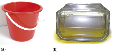
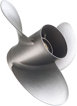
Many 3D products fall into the category of bulk shapes, and have complex forms, often with little symmetry. If they have no significant cavities in them we can call them solid (Figure 62) but if they do have cavities, they will be classed as hollow. The cavities in hollow objects can be quite simple but they can also be more complex, involving re-entrant angles (Figure 63). A re-entrant angle in a cavity means that at least one part of the cavity is larger than the opening into it. So if you cast such an object, you usually have to destroy the mould, or at least the part of it that creates these cavities. Making 3D-bulk-hollow shapes with re-entrant angles using a forming process is even more difficult.
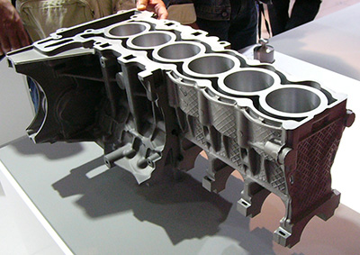
Shape is important because it provides a 'coarse filter' for choosing processes. It allows you, on the one hand, to rule out many unsuitable processes for manufacture of a given component and focus your attention on just those processes that could be used for the shape you are working with. On the other hand, it can show you immediately that you may need or want to take a more imaginative approach by, for instance, dividing one complex shape into several simpler ones that can be joined together later. Conversely, there may be potential to combine simple shapes into more complex ones to minimise the number of processing steps.
Activity 34 (self-assessment)
Consider the following list of components and objects and classify each according to the shape classification given in Figure 59:
- a.plastic tray used to hold the confectionery within a box of chocolates
- b.garden hose pipe
- c.open-ended spanner
- d.plastic (PET) lemonade bottle
- e.rail (from a railway track)
- f.flower pot.
Answer
- a.3D sheet
- b.2D continuous
- c.3D bulk solid
- d.3D bulk hollow
- e.2D continuous
- f.3D bulk hollow.
We'll next look at two different categories of process: that of joining and, since the early 2000s, a new technology that has the potential to disrupt fundamentally our entire approach to making things. This is 'additive manufacturing' which you might recognise under the title '3D printing'. It is not so much a process as a radically different way of going about creating individual objects.
4.3 Joining
In addition to manufacturing an individual component using a single casting, forming or cutting process, we could assemble it from a number of simpler shapes joined together. There are several reasons for employing joining in a manufacturing operation. A product can be too big to make in one piece. The need to transport the product from the place of manufacture to its destination may limit the processes that can be used. It is often simpler to transport the product in parts, and assemble these parts at the relevant location. The building of a house or super-tanker are obvious examples. Joining can also be useful if a product has a complex shape, or of there is a need to combine different materials together. All these factors make it advantageous to join together previously shaped components in order to fabricate a complete and useful product.
But we need to draw a distinction between joining parts together and assembling components into a finished product. Although there is some overlap, I am going to concentrate here on the former. Assembly itself is a subject worthy of study in its own right but beyond the scope of this course.
In general terms, there are three basic methods of joining material together:
- Mechanical joining , using fasteners where the elastic and/or frictional properties of a material are exploited to hold two components together physically (rivets, nuts and bolts, screws and so on).
- Gluing , where a layer of another material is introduced between two surfaces and later solidifies to form a solid joint.
- Welding , where the aim is to create a joint between two surfaces which is similar to, or even indistinguishable from, the bulk material.
Although you can join things with simple glues or even adhesive tape, here we will be concerned with methods of joining solid components in such a way that the joint will remain intact throughout its service life. The designer's aim is to select a joining process and a joint geometry such that the joint itself is not the weak link in the chain. Of course, joining techniques are also available that allow the joint to be taken apart if needed, at some time in the product's life. These are a mainstay of product assembly.
4.4 Mechanical joining
In mechanical joints, various methods are used that clamp or fasten the parts of the assembly together (e.g. nails, screws, bolts, rivets and circlips). Mechanical joints find innumerable applications from cheap plastic toys to aircraft bodies. They are versatile, easy to use, and permit different materials to be joined with ease.
Mechanical joints do have disadvantages. The fasteners join at discrete points and do not, by themselves, seal the joint against the passage of liquids and gases. Gaskets (such as rubber ones that seal washing machine doors), and the silicone bead around the bath or shower tray, are typical methods of sealing joints, but almost all the other joining methods that are examined in this section form a continuous connection between surfaces and therefore seal the joint without the need for these additional materials. The hole that the fastener goes through in a mechanical joint is a potential weak spot and failure often occurs at these sections (remember that stress = force ÷ area, so by reducing the load-bearing area the stress is increased). If allowance is not made for this during the design stage then problems may arise during service. The aluminium body of the Jaguar XJ is an excellent example of a successful design using mechanical fasteners. It is held together with over 3000 rivets and sealed with epoxy resin (Figure 64).

4.5 Adhesive joints – gluing
The essential feature of adhesive joining is that two parts are joined by placing a liquid between them, which then solidifies. If you think about it, that is exactly what happens during casting; the major difference between casting and gluing being that, in casting, it is important for the cast material to separate from the mould whereas in gluing the aim is the opposite. The strength of a glued joint depends not just on the strength of bond between each part and the adhesive layer, but also on the strength of the adhesive layer itself.
In Soldering , the layer is put in as a hot liquid that solidifies on cooling to room temperature as shown in Figure 65.
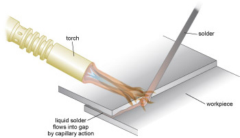
Soldering
Soldering is defined as the joining of metals using a separate filler metal that melts at temperatures below the melting temperature of the metals being joined. The bond strength is relatively low. The 'traditional' solder alloy was based on a tin/lead mixture, but all solders used commercially in developed countries are now free of lead, mostly being based on mixtures of tin and copper along with other metals, such as silver.
Typical features of the soldering process are:
- The solder alloy can be significantly different from the base material because the base material does not melt.
- The strength of the alloy is substantially lower than the base metal.
- Bonding requires capillary action, where the solder liquid is drawn into the joint.
And because of these differences, the soldering process has several distinct advantages over welding:
- Virtually all metals can be joined by some type of soldering metal.
- The process is ideally suited for dissimilar metals.
- The lower temperature than that needed for welding (welding is discussed shortly) means the process is quicker and more economical.
- The low working temperature reduces problems with distortion that can occur during welding, so thinner and more complex assemblies can be joined successfully.
- Soldering is highly adaptable to automation and performs well in mass production.
Although the principles of soldering are shared with all gluing processes, the word 'adhesive' is usually taken to mean a type of polymer glue. Adhesives now come in a vast array of different types; some stick in seconds (cyanoacrylate – Superglue TM ), some take a day or so to achieve their full strength (thermosetting epoxies), others stay permanently in a soft flexible state, like silicone adhesives. Thermosetting glues , like thermosetting plastics, are made by mixing together two ingredients, a 'resin' and a 'hardener', usually in liquid form, which react chemically to form a solid.
The major advantages of adhesive bonding are:
- Almost all materials or combinations of materials can be joined.
- For most adhesives the curing temperatures are low, seldom exceeding 180 °C.
- A substantial number cure at room temperature and provide adequate strength for many applications.
- Heat-sensitive materials can be joined without damage.
- No holes have to be made as with rivets or bolts.
- Large contact areas means high joint strength.
- The adhesive will fill surface imperfections.
The major disadvantages of adhesive bonding are:
- Most adhesives are not stable above 180 °C.
- Surface preparation and curing procedures are critical if good and consistent results are to be obtained.
- Life expectancy of the joint is hard to predict.
- Depending on the curing mechanism, assembly time may be longer than alternative techniques.
- Some adhesives contain toxic chemicals and solvents.
For successful soldering or adhesion, the 'glue' material must 'wet' the surfaces of the two objects to be joined. You can see the contrast between wetting and non-wetting when washing up greasy breakfast plates. When the plates are covered with oil and fat, water just runs off without sticking. This contrasts with what happens when the fat is removed with hot water and detergent: the plate then retains a thin covering of water. We say that water is 'wetting' the clean glazed surface.
Successful joining by solders or adhesives usually requires that the surfaces to be joined are completely clean. This can be achieved by using either mechanical or chemical techniques. The mechanical method uses abrasion to clean the surface, while the chemical methods use acidic solutions that etch the surface, as well as degreasing it with solvents. After cleaning the surface it is vital that recontamination does not occur from oxidation and airborne pollution. In particular, when heat is applied during soldering, oxidation can rapidly take place; in this case a flux can be applied which prevents oxygen from reaching the prepared surface. Abrading also has the advantage that the surface is roughened, thereby increasing the surface area, which enhances the contact area of the joint.
4.6 Welding
An ideal welded joint between two pieces of metal or plastic could be made by softening the materials sufficiently so that the surfaces fuse together, but why should we need to soften or melt the material to fuse them? The atomic bonding forces that hold atoms together in a solid would suggest that if we simply bring together two samples of the same material, they should spontaneously bond together as soon as they are within some critical bonding range of one another (of the same order as the spacing of the bonded units – atoms or molecules – in the material).
In practice, this 'bonding on contact' is frustrated by two complications. Firstly, it is extremely difficult in this macroscopic world to shape two surfaces so that they really fit together. Usually, surfaces have a roughness, with an average height far in excess of the range of bonding, and when two such surfaces are brought together they will 'touch' only at the 'high' spots (rather like trying to get two pieces of sandpaper to mesh together precisely). Secondly, surfaces are often chemically contaminated. Most metals are very reactive and in air they become coated with an oxide layer or with adsorbed gas. This layer prevents intimate contact from being made between two metal surfaces.
Clearly then, to achieve bonding on contact:
- the contaminated surface layers must be removed
- recontamination must be avoided
- the two surfaces must be made to fit one another exactly.
4.6.1 Solid-state welding
In highly deformable materials, such as metals and thermoplastics, the above aims can be achieved by solid-state welding, that is, forcing the two surfaces together so that plastic deformation makes their shapes conform to one another. At the same time the surface layers are broken up, allowing the intimate contact needed to fuse the materials without necessarily melting them. This was the principle of the first way known to weld metals – by hammering the pieces together whilst hot. It is not always essential for the parts to be hot: ductile metals such as gold can be pressure welded at ambient temperatures. Processes that join without melting the material are called solid-state welding.
Solid-state welding can be carried out in various ways. For example, two metal sheets laid over each other can be welded together by rolling – 'roll bonding'. Bimetallic strips for thermostats are made this way. Deformation of the surfaces can also be done in more exotic ways such as rubbing the two surfaces against one another (friction welding) or by using explosives to fold one sheet of metal against another (explosive welding).
Plastics can also be joined using similar processes. Commonly polyethylene gas pipes are welded using heat and pressure. In this case a heated plate is used to warm the two surfaces. Once hot, the plate is removed and the pipes are forced together under pressure, thereby forming a welded joint. The heat sealing of thermoplastics works on the same principle. Two layers of plastic sheet that are to be joined are overlapped and compressed between heated tools. This forces the materials together and the joint is made because of the intimate contact between the surfaces. Although it may seem that the surfaces have melted and flowed together, in practice they are just pressed together very tightly, with some resulting deformation of the surrounding material.
4.6.2 Fusion welding
In fusion welding, the parts to be joined are brought together, melted and fused to each other. In some processes the interface is filled with a molten substance, supplied by a filler rod, similar in composition to the materials being joined.
During fusion welding the areas that are being joined comprise an intimate mixture of parent material, and filler rod (if one is used), within the welded zone. In all methods of fusion welding, heat must be supplied to the joint in order to melt the material. Inevitably, temperature profiles are created and the resulting differential expansions and contractions can cause distortion, and in extreme cases, the formation of cracks, in the assembly. As welds are, in fact, small castings, welds contain both the microstructure and porosity endemic in cast material (Figure 66).
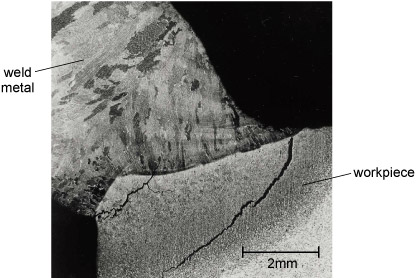
(Soldering can minimise some of these problems because the parent material is not melted and so temperature profiles are not as great. But because in soldering there is a discrete join between the materials as opposed to an intimate mixture of material, welding is by far the stronger of the two processes.)
Activity 35 (video)
The most basic welding process using electricity as the energy source is 'manual metal arc' welding (MMA). Watch Video 2 of two workers welding an attachment to a pressure vessel and think about the level of operator skill required to make consistently high integrity joints by this method.
Submerged arc welding (SAW) is a way of automating arc welding but can only be used when the geometry of the workpiece is suitable. Watch Video 3 of SAW and notice how much more controlled the production of the joint can be when there is no need for an operator to manipulate a welding torch.
All welding is a form of casting, where the mould is formed by the solid material on either side of the joint. In electroslag welding (ESW), this is taken to an extreme. Watch Video 4 of ESW and try to work out what is happening. Write some notes in the box below.
Discussion
Hopefully you could make out from the video that there is a pool of molten steel formed between the two surfaces to be joined. The melt pool is held in place by the workpieces on either side, the solidified weld metal underneath and two plates clamped to either side of the weld, forming a rectangular space. There is an electrical discharge between the steel electrodes, which melts the electrodes to create the weld pool. Flux added to the space melts and floats on top of the steel. The steel at the bottom of the pool solidifies as the source of heat from the electrodes move upwards and further away.
4.7 Joining our gearwheel
Whilst we cannot make our food mixer gearwheel just using joining processes, we could make it out of several pieces that could be joined together.
Activity 36 (video)
Watch Videos 5 and 6 of laser welding gears and press-fitting differential gears. As you watch, think about how much easier it is to make the teeth on a gearwheel if they can be formed on a separate ring that is joined to the body of the gear in a separate operation.
In practice, any of the joining processes (soldering, adhesion and welding) would allow the wheel to be built up from bits. Wooden gearwheels and waterwheels used in mills many years ago, known as cog wheels, were made by joining together individual parts that could easily be replaced if any wore out after prolonged use. However, these were on a different scale from that of a gearwheel from a food mixer. So although building a gear would be possible, it is not really a practical proposition. At the extreme, imagine trying to build a gearwheel from parts; each tooth would need to be manufactured individually and then screwed, glued or welded together to the central ring. A great number of hours would be spent manufacturing each one.
Although the gearwheel itself is not suitable for being made through an assembly process, it is itself assembled into the food mixer, which has many discrete parts, made from a range of processes. There is always a stage at which a single product is likely to be assembled in some form into a larger product for a particular use.
Activity 37 (self-assessment)
Imagine you were making a large sculpture. List three reasons why you would make it in several pieces and join them together and three concerns you might have as a result of that decision.
Answer
Some of my reasons:
- I could build the sculpture from smaller, more manageable components.
- I could incorporate several different materials.
- I wouldn't need the means to make the object in one piece.
Some concerns are:
- Joints may be a weak point in the sculpture, and even welded joints will not necessarily have the strength of the materials that are joined.
- I shall have to pay attention to surface preparation because this can affect the joint properties in many cases.
- I'm not sure about the longevity of the sculpture.
You may have suggested other, equally valid, factors.
4.8 Additive manufacturing
This section is about what is being presented as a new approach to manufacturing things although, as you will see, the novelty comes from the scale on which it is practised rather than the basic idea. The concepts and technologies are not spectacularly new. They started being developed in the 1980s. But it's only since the early years of this century that they have reached the level of maturity that allows them to be considered as mainstream manufacturing processes. And the language used to describe them has evolved over that period along with the techniques. In the early days they were generally described as 'rapid prototyping' or 'RP' methods. That was because they were first used as ways of creating prototype models of designers' concepts. As the range of applications and the level of sophistication increased, people began to talk of 'rapid manufacturing'. But the name that has really grabbed the public's imagination is '3D printing'. At the time of writing barely a day goes by without another news article with that in the title.
The USA National Intelligence Council predicted that additive manufacturing will by 2030 advance beyond its current functions of creating models and rapid prototyping in the automotive and aerospace industries to transform how some conventional mass-produced products are fabricated.
But we need a better, less fashionable and more engineering-focused name. So we call this section 'additive manufacturing' because that's what we're doing – manufacturing things by adding solid material selectively to make the shape rather than removing material or forcing material to take up the shape of a separate die or mould.
Here I am going to unravel additive manufacturing in a little more of the detail so that you can begin to think about how this approach introduces new possibilities to the world of manufacturing.
4.9 Fundamentals of additive manufacturing
Unlike casting, forming or powder processing, additive manufacturing (AM) does not require a mould or tool to shape the surfaces of an object. Unlike cutting, AM techniques do not involve removal of material. They do have some similarities to certain joining processes, however, as you will see.
There is nothing fundamentally new about AM in principle. Building a house from bricks typifies the AM principle, as does building a model out of Lego bricks. The basic building blocks in both cases are simple rectangular shapes that can be fixed together to build up larger and more complex overall shapes (Figure 67). The regularly shaped blocks can be used to approximate features like curves. But the limit of definition is the size of the block. From a distance the assembly may appear to have smooth curves (Figure 67(a)). Look too closely (Figure 67(b)) and all you see are square edges. Smaller blocks can be used to create better approximations. But larger blocks allow you to build faster.
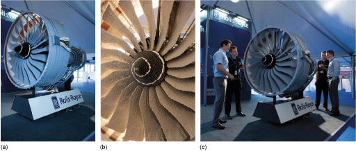
Someone who uses Lego blocks to make a model, or a mason who lays stone blocks in the shape of a building, has to 'imagine' the shape of their products before starting the construction and understand how the simple blocks can be used to create those shapes. Of course there is usually help at hand from drawings and written instructions.
4.9.1 Creating shapes
With modern AM techniques, the starting point is a digital description of the product in the form of a 3D CAD model (Figure 68). This then has to be broken down into units – the building blocks of the AM process – but rather than the rectangular blocks I have been discussing, the building block of all AM processes is a 2D layer or slice through the object. These layers are themselves generated from a file created by the CAD software that defines all the surfaces of the object in question. This can be deconstructed into the 2D slices needed to drive the AM machine.
Dividing a complicated 3D object into layers presents an interesting challenge. There are two main issues to do with shape, rather than to do with data processing, which is not our concern here. The first is similar to the question of how big to make a house brick. How thick should each layer be? The second is something more to do with geometry. Figure 69 shows an abstract object made by an AM process. Imagine what each layer taken through the object looks like in two dimensions. Many of them will consist of a more or less random set of disconnected bits, depending on where the slice cuts through the object.
So if such an object really is to be built out of layers, there has to be a way of placing each bit on top of the previous layer and holding it in the correct place as the following layer is formed.
We shall revisit these two issues as we look at a selection of different AM processes next.
4.9.2 Processes and materials
The analogy to an inkjet printer is a powerful one in understanding how a 3D printing machine works. Figure 70 shows a schematic of a conventional inkjet printer. As the print head tracks across the paper, a signal from the microprocessor controller in the printer causes droplets of ink to be fired at the paper in appropriate places. The print head tracks back and forth across the paper as the paper itself advances under the head, thus allowing the full area of the paper to be used.
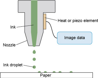
Now imagine printing a document using a very viscous ink which deposits on the paper as a distinct layer when it is dried. Once the first print is finished, insert the same paper back into the printer and print the same document again. Clearly, this will result in the deposition of more ink on top of that which has already dried. By repeating the process on the same paper, and maybe altering the design of each layer a little from its predecessor, it should be possible to create a 'textured' print. Some adaptation to the printer would obviously be needed to allow the texture to build up under the print head. But this is the model for a basic 3D printing machine.
Additive manufacturing techniques are not just variants of 3D printing. They include methods for solidifying material in situ and for removing material selectively. To provide an overview of this variety, I am going to outline three types of process according to the condition of the starting material. These three groups are:
- liquid or semi-solid processes
- powder processes
- solid processes.
Each successive layer of deposited material must be fused to the one below or 'consolidated' into the finished form, and here too are a variety of mechanisms. I have summarised the relationships between the condition of the starting material and the consolidation mechanism in the diagram in Figure 71.
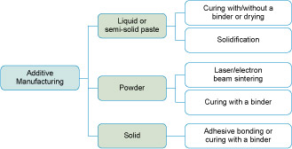
Now let's briefly look at one example from each of the three principal groups. This will give you some idea of the range of AM techniques that exist and their relative strengths and weaknesses.
Liquid-based processes – Stereolithography Apparatus (SLA)
SLA is an additive process in which an ultraviolet (UV) laser beam is used to set off a chemical reaction locally in a bath of a liquid UV-sensitive resin (a liquid polymer) which causes it to solidify. The laser beam traces out the shape of each layer of the object on the surface of a pool of resin above a moving platform. Once the first layer is formed the platform moves down by the depth of one layer before a new coat of liquid resin is applied on the newly formed surface. The next layer is then deposited directly on to the layer below. Repetition of the process results in a 3D part. The entire geometry of the machine can also be inverted so that the developing part is raised out of the reservoir of liquid rather than lowered into it.
After fabrication, the part will be rinsed in a solvent to remove excess resin and further curing can be carried out in a UV furnace. Figure 72 outlines the principles of SLA.
Materials suitable for SLA are limited to specialised polymers, so this process can only be used for models. One other limitation is that the liquid resin cannot support isolated 'islands' of solid material. So a complex shape like that in Figure 69 would need additional supporting features added to the design which would then be removed after fabrication (these are often referred to as 'scaffolding').
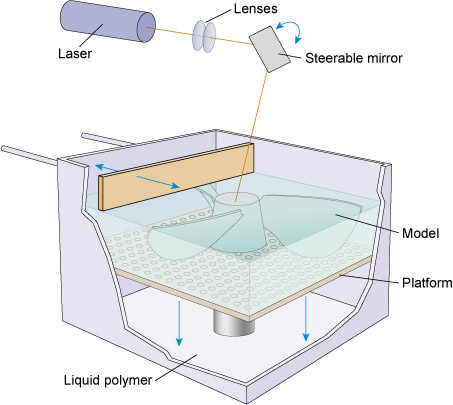
Powder-based processes – Selective Laser Sintering (SLS)
SLS uses a laser to selectively melt and fuse powder particles (Figure 73). It is not very different from SLA but, instead of a liquid, we have a powder and, instead of a chemical reaction, we have melting and re-solidification. But SLS very specifically gets round both of the drawbacks of SLA listed above. There is no reason in principle why any material can't be used for SLS. The technique is already being applied to aerospace-grade titanium alloys, stainless steels and even nickel-based superalloys. The products are fully serviceable components. And, because the powder reservoir effectively scaffolds the isolated solid parts, there is no need for post-processing to remove unwanted features. For these reasons, SLS is probably the additive manufacturing process with the most potential for making high integrity finished components.
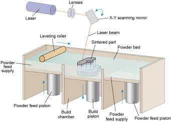
Solid-based processes – Laminated Object Manufacturing (LOM)
LOM uses thin paper sheets or wood laminates to construct a product. It is a three-stage process comprising adding, bonding and cutting stages. Figure 74 shows an automated LOM machine where the material is fed to the workpiece in the form of a continuous sheet. Material is placed over the emerging part and glued to the surface of the topmost layer. Then a laser beam is used to trace the outline of the new layer and cut through the new material. The process is repeated until the part is fully built. The sections outside the digital model are cut into small cubes. These cubes can be easily broken up and removed from the main part (located in the centre) once the process is completed. As each layer is cut differently from the one below, a precise control of the laser beam is essential in order to cut the top layer without damaging the layers below.
The final material is a fine laminated paper with properties similar to wood but without a grain. But, like SLS, isolated areas are scaffolded as the part is built up, avoiding the need for features that have to be removed after fabrication.
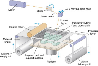
4.10 Capabilities and potential of additive manufacturing
Conventional manufacturing methods like casting of metals or injection moulding of polymers are, at present, far less costly than additive manufacturing for mass production. However, AM is more flexible, and quicker and less expensive when producing a small number of the parts, let alone its unique capability of producing complex shapes or geometries that might be very difficult, if not impossible, when using conventional manufacturing methods. Some AM techniques are even capable of depositing multiple materials to make complex components comprising several parts each made from a different material.
Interest in 3D printing is growing very fast and applications are to be found as far afield as the food industry (chocolate), construction (concrete) and in creating decorative objects like in Figure 69. But perhaps the most exciting possibilities are in the medical sector. 3D printing technology has been applied to reconstructive surgery in the form of implants that are customised to a patient's needs. Figure 75 shows an actual 3D printed implant used to replace the diseased bone of an 80-year old woman in Holland. Efforts are also currently focused on 3D printing of body tissue with the tantalising prospect of being able to recreate replacement organs in the laboratory for transplant back into the human body.
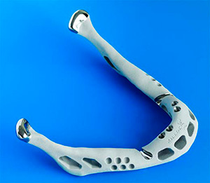
4.11 3D printing our gearwheel
I hardly need say that several AM processes are eminently capable of producing the overall shape of a gearwheel. There are, however, two issues to do with the performance of the product made this way that might affect whether we would choose to make a gearwheel by AM. The first has to do with the materials. However, with SLS now being used for a wide range of metal alloys, apart from many polymers, that, too, is hardly a limitation.
The second issue is about the surface texture of an AM-made part. Think back to the example of a Lego model of an aircraft engine in Figure 67. You can see that the surfaces have a texture on the scale of the building blocks. AM processes are similar, although on a different scale. The degree of approximation to the shape we actually want is determined by the thickness of each of the layers laid down during the process. And the layer thickness will be a classic compromise between the limit of capability of the process and the commercial viability based on production cycle time.
As regards the first of these, the best of current technologies (2013) allow layers down to around 50 µm thick. If surface features up to this size are tolerable in the finished gearwheel, it can be made this way. If not, it may be possible to add one further finishing process to add the final dimensions accurately, just as we saw with formed blanks although with far less material to remove in the final stage.
5 Engineering: pushing back the boundaries
Figure 76 shows a selection of zinc–carbon batteries from different times. There has been a clear trend towards ever more versatile sources of electricity, packing in more energy per kilogram together with improvements in ruggedness and flexibility; at the same time, however, environmental issues have constrained the range of chemicals involved. Over the years the pace of battery development has been set by the requirements of different users. Let's look back briefly to the beginning of industrial-scale electricity to see where the idea of the battery came from.
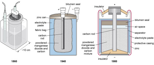
In the 'Electro-optic Age' at the start of the twenty-first century, digital cameras, mobile communication sets, tablet computers and numerous other gadgets rely on batteries as a sort of 'life support' system. Weight and size are of utmost importance in these devices – they require lightweight (portable) batteries with enough electrical energy to keep them working for at least several hours at a time. Implanted medical devices such as cardiac pacemakers make even greater demands, needing several years of capacity in a battery that cannot be much bigger than a large coin.
In the 1950s, when semiconductor technology first offered radios that were small enough to fit into a pocket, batteries were already sufficiently small that they could be classed as portable. Such portable batteries were thanks to the requirement for a portable energy source for the electric torch or pocket lamp, the invention of which was enabled by the advent of tungsten-filament bulbs – when these appeared in the early 1900s, batteries (though non-portable) were already available. An electric torch needs a steady supply of current, preferably throughout a long lifetime. Dim lights are useless, so lifetime was a major issue for this generation. The shelf life and the after life are critical too. The electricity in a battery comes from harnessing the energy generated by a process of controlled corrosion. It is important for an unused battery to remain in peak condition until it is needed, so the corrosion that will ultimately make it work must be prevented from getting underway before then. In batteries from 50 years ago, the corrosion tended to continue even when the battery remained unused, ultimately resulting in it bursting through its package – good for the torch manufacturer in the 1950s as the corrosion quickly spread, rendering the whole device unserviceable!
Earlier still, the electric telegraph was the first major consumer of electrical energy derived from batteries. The development of the electric telegraph was spurred by the expansion of railways and the requirement for universally agreed time. By the end of the 1800s, telegraphy was calling for improvements in battery systems to give longer-range, higher-reliability signalling through cables that criss-crossed the globe. One might ask, which came first: the battery or the telegraph? The fact that the battery did by several years leaves one wondering just why anyone bothered to devise such a convenient source of electricity without it having any application. There clearly was no real necessity at this stage. Instead, curiosity provided the driving force.
5.1 Electrical beginnings
In eighteenth and nineteenth century Europe, scientific enquiry was considered a worthwhile pastime for the nobility and the landed gentry (who tended to have the time to indulge in pursuing their curiosity). It was during this period that serious investigation into electricity began.
The study of electricity had a somewhat protracted infancy. Back in the sixth century BC Thales recorded some curious effects associated with amber, the fossilised resin. When rubbed with silk or with cat fur, amber acquired the ability to attract tiny seeds, feathers, and particles of dust. It was not until the enquiries of William Gilbert in the late sixteenth century that it was established that there were many other substances that could, when rubbed, produce a similar effect.
Thales
Thales (pronounced 'thay-leez') was a Greek philosopher of the Ionic School (seventh century BC). According to Thales:
The original principle of all things is water, from which everything proceeds and into which everything is resolved.
This particular view has not stood the test of time. However, Thales' observations on the curious attractive properties of ancient resin when rubbed with silk are themselves preserved in all things electrical, as the word 'electron' is derived from the Greek word for amber.
William Gilbert
William Gilbert (1544–1603) was physician to Queen Elizabeth I. At the end of the sixteenth century his curiosity led him to discover that, when rubbed, sulphur, wax, glass and many other substances behaved in the same way as amber, in that they could begin to attract small particles of dust, etc. Today we attribute these effects to 'static electricity'. It is said to be 'static' because most of the effects arise from the presence of electrical charges, rather than their motion. Gilbert was equally fascinated by lodestone, a mineral that retains what we now know as magnetism.
In fact, Gilbert described how to detect 'frictional electricity' by means of 'an iron needle moving freely on a point'. It is easy to imagine how magnetism must have frustrated his early work – iron was the worst material he could have chosen, because electricity can actually cause it to become magnetic. Even so, in time he was able to distinguish electricity from magnetism and he was wise enough to leave open the possibility that these effects were nevertheless closely related. How right he was, though it was over 250 years later that the links were firmly established.
During the eighteenth century the first fruits of electrical engineering became available; see Figure 77. These were machines that generated electricity by winding handles that in turn rubbed disks or cylinders of glass on fixed cushions of silk or leather. Combs of metal 'swept up' the electricity and transferred it to metal rods and spheres, from which sparks could be made to fly. For those with the time and funds to be curious, these machines must have proved tremendously fascinating.
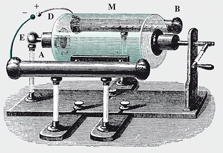
There were so many things to find out about electricity. Why for instance, did the weather have such a profound influence on the effectiveness of the above machines? Figure 78 shows an example of even more ambitious research into the effects of electrifying boys!
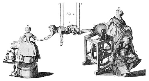
5.1.1 Luigi Galvani (1737–98)
Under these circumstances of curiosity, it is not surprising that Galvani, a physician by training, was studying the interaction of electricity with animals. Galvani had noticed that when a dead, partially dissected frog happened to come into the path of an electrical discharge, the leg muscles flexed, twitching the legs as though in a spasm. More curiously, sometimes the frog needed only to be near Galvani's electrical machine to be so affected, not necessarily directly in the path of a spark. Subsequently, it was realised that twitching accompanied nearby sparks when the spinal cord of the frog was pierced by a grounded metal (i.e. a piece of metal that was connected to the ground and so would act as a path for draining away charge). It can't have been long before Galvani was planning experiments with the ultimate spark, lightning – which, by the late 1740s, Benjamin Franklin had already shown to be electrical in nature. This was the chain of events that led to Galvani doing experiments that involved piercing the spinal cords of dissected frogs with metal hooks and hanging them from iron railings. The railings provided the effective path to ground. It is likely that the iron of the railings would have been scraped clean to ensure good electrical contact between the hook and the railing. The plan was presumably to set the specimens in place on a stormy day and to note any correlations between lightning flashes and twitching legs. The strange result was that some legs twitched as soon as they were hung on the railing – even in clear weather.
5.1.2 Alessandro Volta (1745–1827)
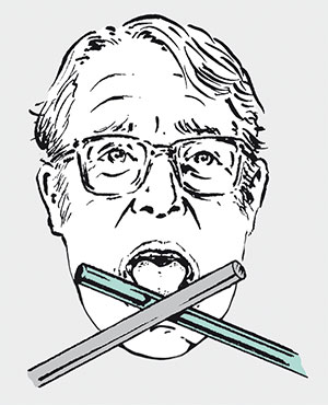
Volta, a compatriot of Galvani, was also interested in the study of electricity. He read Galvani's account of a range of careful experiments, attributing the twitching of the frogs' legs to the drawing of electricity from the nerve–muscle system. Volta, in the best tradition of science, reserved his judgement pending further, independent, investigations. He fixed his attention particularly on the fact that the connection to the nerve necessarily involved two different metals being in contact. Volta must have been aware of contemporary curiosity about the peculiar things that happen when different metals are joined together. Figure 79 shows the sort of experiment Volta's contemporaries were carrying out – an unpleasant taste can be detected when the tongue is touched to the junction of two crossed rods of different metals. Volta went further. He placed a silver coin on his tongue and then inserted a strip of tin foil into his mouth – a sour taste sensation correlated exactly with the foil touching tongue and coin simultaneously. Some interaction was evidently taking place between the two metals in his mouth. So Volta rejected Galvani's physiological description of the cause of the twitching frogs' legs. Instead he set about seeking a purely inorganic, chemical explanation, based on the contact of different metals.
5.1.3 Galvani versus Volta
So, in summary, the phenomenon to be explained was this. A frog's leg appears to twitch when a brass hook through the spinal cord is hung on an iron railing, which the frog's leg also touches; the effect needs moist or damp conditions. The same effect could be replicated with the iron railing replaced by an iron rod; see Figure 80.
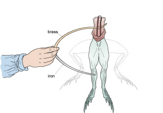
Galvani's medically-based explanation was as follows:
There is electricity within the body of living animals; it is important to the functioning of muscles and nerves. This electricity can be drained, even from dead and dismembered animals. One way to do so with a frog is to pierce the spinal cord with a metallic conductor. As the electricity drains away, muscle spasms occur.
Volta's position was this:
A brass hook on an iron railing, in the presence of moisture, will generate energy capable of electrically stimulating animal tissue in contact with both metals. Applied to sensitive areas of muscle one should not be surprised to see spasms.
Galvani's group tried to refute Volta's claim by showing that the effect still occurred, although less vigorously, using iron hooks and iron railings. Volta's side discounted this, saying that the iron of the hooks was probably a different composition from that of the railing – therefore these are still 'different' metals in contact. For our purposes, it is not necessarily helpful to describe a pair of metals as being different if both happen to be what we want to call iron: I'll use the description dissimilar instead to emphasise that the pair are not identical.
5.2 Simple electrochemical cells: invention or discovery?
Before Galvani reported his work on animal electricity in 1791, Volta had been preoccupied with the static electrification of substances, deriving his electric charges from things being rubbed. The various machines available could do the work necessary to separate the electrical charges involved by a considerable distance, investing in them a large amount of energy. However, this energy was soon spent in brief, but spectacular, sparks.
The pulling apart of electrical charges that the machines achieved was rather like the stretching of elastic bands: strong forces build up, directed towards restoring the initial arrangement.
By contrast, Volta found that the electricity created by the contact of dissimilar metals through a chemical solution (i.e. chemical energy) appeared to be of much lower energy. It was found that although displays of sparks could be made, they were feeble. Importantly, though, these sparks persisted for as long as the metals were joined through the various chemical solutions, particularly acidic ones (see Acids and alkalis ); see Figure 81. Today we call an arrangement in which two metals are joined through a chemical solution an electrochemical cell, because what happens in the cell involves both electricity and chemistry. An electrochemical cell is the basis of all batteries.
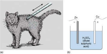
Acids and alkalis
You will probably be familiar with the word 'acidic'. An acid is a chemical solution that has a high concentration of hydrogen ions (a hydrogen atom minus its electron). An alkali, which may be considered to be the 'opposite' of an acid, has a low concentration of hydrogen ions. Here 'high' and 'low' are generally taken to be relative to pure water. Water, formula H 2 O, does not have all its constituent atoms joined together as the formula suggests. In practice, some of the H 2 O molecules will split apart in the water to form positively charged H + (hydrogen) ions, and negatively charged OH – (called 'hydroxide') ions.
A solution that has a higher concentration of H + ions is an acid; one with a higher concentration of OH – ions (which will tend to mop up stray H + ions and so reduce their concentration) is an alkali. You won't have to remember these facts, but it's useful to know the definitions. A measure of the concentration of hydrogen ions – and so a measure of the acidity – is the pH number. You may have seen claims that shampoos are 'pH balanced with your hair'; or if you are a serious gardener, you may have had cause to check or adjust the pH of your garden soil.
Still curious, Volta discovered that not all metal combinations 'tasted' the same – their 'effectiveness' (the apparent strength of the interaction) differed. This may sound like a rather subjective approach to scientific research, but it must be remembered that the electric instruments we use today have all been developed following Volta's work.
Volta published a list of metals in an order that reflected their efficacy in terms of strong taste:
zinc, tin, lead, iron, copper, platinum, gold, silver, graphite.
The further apart any pair were in this list, the greater the stimulation of the taste buds. You may have experienced this effect yourself if you have traditional amalgam fillings in your teeth (based on mercury); a scrap of aluminium foil from a chocolate-wrapper or a metal fork touched directly against the filling will give the tongue a bitter-tasting twinge.
The inclusion of carbon (graphite) in Volta's list is interesting. As a conductor of electricity, graphite was apparently to be considered a metal.
Activity 38 (self-assessment)
Which pair from Volta's list is likely to give the greatest sensation on the tongue?
Answer
Zinc and graphite, being furthest apart, are likely to produce the greatest effect.
A more convenient way to assess different combinations of materials was using electrochemical cells like the one shown in Figure 81(b). Volta was able to investigate this chemical electricity using techniques he had devised for frictional electricity. In light of these experiments, Volta modified his ordering of the electrochemical effects of dissimilar metals. His final order reversed the positions of tin and lead and those of silver and gold.
Activity 39 (self-assessment)
Did Volta invent or discover the electrochemical cell?
Answer
It looks like discovery to me. There was no real application for such a cell at that stage.
There was a long and controversial debate among European scientists as to whether the Galvani observations were manifestations of animal electricity or were entirely accounted for by Volta's description of the behaviour of dissimilar metals. As we now know, both were right to some degree. As modern electrocardiographs – like those used to monitor heart activity in hospitals – show quite clearly, animals are electrically active. Indeed, the nerves themselves communicate by peculiar electrical means.
5.3 An inventive step – a 'battery' of cells
Having shown that electrical energy could be harnessed from dissimilar metals in contact, Volta then took his discovery forward a crucial step. He demonstrated that a pile of bimetallic discs such as the ones in Figure 83 would generate electrical energy in proportion to the number of discs in the stack. Increasing the number of discs in the stack increased the amount of energy generated.
Essential to Volta's electric pile was a moisture-bearing layer between the pairs of discs. This arrangement was a development of a horizontal arrangement in which a number of electrochemical cells are connected in series; the 'moisture-bearing layers' were a convenient way to enable a vertical stack of cells to be built. Volta recorded his work in a letter to the Royal Society of London in 1800.
In modern terms we can recognise that the pile is a battery of electrochemical cells placed in series so the electromotive force (e.m.f.) of each cell adds to the e.m.f. of the cell before it – thus making it possible to produce giant batteries. Some 3500 cells in series could drive a continuous stream of sparks through a half-millimetre gap between spheres connected to each end of the pile, for several hours on end.
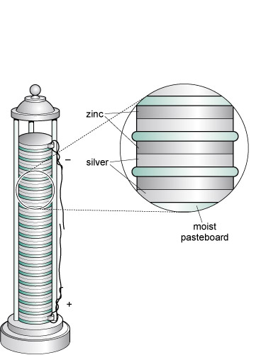
Activity 40 (exploratory)
Identify 'an inventive step' in Volta's work on generating sparks from the contact of dissimilar metals.
Answer
In fact two inventive steps can be identified. The first is the construction of the pile to form an additive combination of individual electrochemical cells. The second is the use of moist pads to join successive elements.
So where was the necessity that brought about the invention of the battery? Well, beyond the need to satisfy curiosity, there was none. The battery had to mark time while applications were developed. One of the first major uses was in telegraph systems, such as that patented in 1837 by Cooke and Wheatstone (Figure 83). Another early application of 'galvanic electricity', as it was called, was for the remote detonation of explosives by means of an electrically-heated fuse wire. Mining engineers and military engineers alike must have been relieved to discover that explosions could be precisely and safely triggered from a considerable distance.

Shortly after this, a major industrial process turned to electricity to revolutionise the manufacture of domestic artefacts, by electroplating silver onto the surface of otherwise unattractive, but cheap and easily formed metal. However, the full width of the range of uses for electricity was not at first recognised. This extract from an article written in 1851 about the 'The Science of the Exhibition' by Robert Hunt, Esq., Keeper of Mining Records, Museum of Practical Geology is pessimistic about the future applications of electricity:
Although satisfied that, with our present knowledge of electrical forces, we can scarcely hope to adapt the electric light to any useful purpose, within the limits of any ordinary economy, or to apply electro-magnetism as a motive power; it is quite possible that we may, by a careful study of the primary laws of these forms of electrical force, arrive at new conditions which may enable us to apply them. The empirical mode of proceeding at present adopted is of the most hopeless character. The models of electro-magnetic engines exhibited have much in them which is exceedingly ingenious; but, although working well as models, they do not promise to work with regularity or economy on the large scale; and for the present we must rest content to burn coals in our furnace rather than zinc in our batteries.
It is just as well that these discouraging words were not taken to heart.
And so, telegraphers, mining engineers and electroplaters led the demand for more reliability and greater capacity from batteries; battery technology entered a development phase which still continues today.
From the 1870s electric bells caught the imagination of consumers. About 30 years later electric torches were introduced. These needed portable, non-spillable battery units. Since then, any electrical device seems to have been rendered more versatile and more mobile by ever more ingenious electrochemical schemes.
5.4 Batteries, chemistry and corrosion
Batteries such as the one Volta invented are devices put together to encourage chemical reactions between metals and Electrolytes. These reactions are as sure to happen as a ball is to roll downhill, though it is not so easy to understand why. Suffice to say that there is such a thing as 'chemical energy' in the same way that there is kinetic energy and gravitational potential energy. We'll get by for now with only a superficial look at the science.
The link between chemistry and electricity is not an accident. The clustering together of atoms in solids, and to a lesser extent in liquids (and barely at all in gases), is the result of the chemistry of the material in question – and this chemistry is itself affected by the electrons within the atoms. So it is both chemical and electrical.
Electrolytes
An electrolyte is a substance that conducts electricity by mechanisms distinctly different from those in metals. Normal metallic conduction is accounted for by the drifting of electrons that are free to roam around away from their parent atoms. Conduction of electricity in this way is a defining feature of metals. Electrolytes conduct electricity through a drifting of electrically charged atoms rather than electrons. Electrically charged atoms are known as 'ions'. Figure 84 contrasts conduction in metals and electrolytes.
Many electrolytes are solutions in water or some other solvent. Strong electrolytes contain a high concentration of ions and conduct electricity well. These good electrolytes include strong acids and alkalis, and most 'salts'. A salt is a chemical compound which, when dissolved, liberates positive and negative ions from their ordered positions in the solid. These released ions are then free to carry electric charges between electrodes immersed in the solution.
A battery contains an electrolyte in either a liquid or a paste-like solution. Liquid electrolytes are used in electrolysis, electroplating, and other chemical processes.
A few solids, particularly oxides, conduct electricity ionically (meaning through the movement of charged atoms) at temperatures close to their melting point. A few other substances exhibit ionic conduction when they are in a molten state.
Whenever chemical rearrangements – or 'reactions' – occur, atoms are required to swap or share electrons with each other. Energy is bound up in any arrangement of atoms. Where the result of a rearrangement binds up less chemical energy than before, chemical potential energy is released. In some cases the energy is released as electrical energy, just as a rolling ball can transfer its potential energy into kinetic energy as it rolls down a hill. The cell within a battery is configured to intercept these transactions so that the electrical energy made available by the chemical reorganisation can be gathered up. Ultimately things are arranged so there is a separating of electrical charge, driven by chemistry. You may already know that we call this subsequent pushing and pulling of charges an electromotive force or emf, which is denoted and measured in volts.
In the case of batteries, the chemical rearrangements involve relocating atoms from the electrolyte onto the surface of one of the 'two dissimilar metals' that Volta prescribed. At the surface of the other metal, atoms pass into the electrolyte (Figure 85). The electricity is inseparable from the chemistry here as the atoms leaving the electrolyte are electrically charged (positive) and more properly called positive ions. These atoms collect negative charges from the metal as they pass from the electrolyte onto the metal surface, so becoming neutral atoms once more. Similarly atoms of the dissolving electrode leave negative charge behind and enter the electrolyte as positive ions.
A battery will be spent when the electrode that is giving up ions to the electrolyte has been completely consumed, or rather 'dissolved'. Metals that are consumed in this way are said to be undergoing corrosion. In a similar way, I am certain that the bottom of my wheelbarrow is spent when rust has eaten a hole through which I can see the ground. Chemically the processes in a battery and in the Corrosion of steel have a great deal in common: two dissimilar metals and an electrolyte are all in contact.
Chemical reactions that occur spontaneously, such as corrosion, are useful for generating energy. Sometimes, by careful design, we can divert the energy into electricity, otherwise it usually ends up as heat, light, or sound. In some cases, we can even use electricity to drive the chemistry backwards. This is the secret of rechargeable batteries, which we will come to in the next section. It's also behind a clever strategy for inhibiting corrosion called Galvanic protection.
Corrosion of steel
Steel is not the only metal that corrodes in the atmosphere, but as a major structural metal it's the one of which we are most aware. The iron in steel was extracted from an ore in which it was in a stable chemical combination with oxygen (and to a much lesser extent with other elements). As it corrodes it is simply returning to that stable state as inexorably as a ball rolls downhill.
Corrosion occurs whenever steel is in contact with air and moisture, which acts as an oxygen-bearing electrolyte. The 'dissimilar metals' requirement we mentioned earlier can be provided initially by microscopic variations in the steel composition, or in the oxygen concentration of the moisture with which it is in contact.
In the corrosion process, chemical rearrangements occur because, chemically speaking, a 'more efficient' arrangement can be found that lowers chemical potential energy.
Figure 86 shows the process schematically, with the steel joined to a dissimilar metal to make things easier to follow. Of the two dissimilar metals, one, and always the same one for any given pair, will be the preferred local host for any oxygen and this is the one that corrodes. Atoms of this metal swap their own electrons for other negative charge (electrons) stuck to atoms of oxygen. This process, the familiar hallmark of corrosion, is marked by the red arrow in Figure 86. The metal atoms leave the metal and enter the electrolyte 'in search of oxygen'.
The other metal cooperates in two ways. First it takes in refugee electrons from the dissolving material; a local electric current is always associated with corrosion. Second, it takes part in the hand over of electrons to oxygen atoms, indicated by the mauve arrow. The final products of corrosion build up in the electrolyte.
Corrosion of steel is one of the most familiar examples of oxidation, rust being a mixture of iron oxides. Oxygen has quite a reputation as an aggressive collector of two electrons per atom; in fact among chemists it's common practice to refer to 'oxidation' when atoms surrender electrons to other atoms even if oxygen isn't directly involved.
You are likely to have seen corrosion if you've looked at ships in harbours. Scratches in the paintwork expose the steel. The 'dissimilar metals' in this case extends to the difference between painted and bare steel. Corrosion proceeds under the paint, causing it to blister and peel off, exposing more steel (see Figure 87).

Galvanic protection
When dissimilar metals are in contact in the presence of an electrolyte, corrosion may occur. Knowing this, could we use it to our advantage? We would need to know, in the first instance, which of the two metals corrodes. The answer is in Volta's ordering of bad-tasting metals that was presented in Section 4.2. Following additional experiments, Volta revised the order of his list:
- zinc, lead, tin, iron, copper, platinum, silver, gold, graphite.
Taking this further, Table 5 lists the galvanic series. It orders metals in terms of corrosion, and is determined by slightly more sophisticated methods than Volta's 'suck it and see'!
When two of these metals are connected together in the presence of an electrolyte, the uppermost in the list will be the one which corrodes.
Notice the similarities between Volta's list and the galvanic series. In Volta's list there are some differences in the ordering but this is probably related to the purity of the material available to him.
| Chemical symbol | Element name |
|---|---|
| Mg | Magnesium |
| Al | Aluminium |
| Ti | Titanium |
| Zn | Zinc |
| Fe | Iron |
| Cd | Cadmium |
| Ni | Nickel |
| Sn | Tin |
| Pb | Lead |
| Cu | Copper |
| Ag | Silver |
| Au | Gold |
From the order given by the galvanic series one can pick out two familiar combinations:
- Galvanised steel : zinc coatings on steel afford an excellent protection against rusting; where the coating is scratched and steel (iron) and zinc are joined in the presence of water (the electrolyte) it is the zinc that corrodes.
- Tin-plated steel : tin plating will prevent rusting of steel as long as the coating remains entire; if scratched or cracked then corrosion of the exposed steel (iron) will be driven by the tin whenever an electrolyte (e.g. water) is present. Dented or scratched tin cans are not the best packaging for food!
Here are a couple of less well-known combinations:
- 'Sacrificial metals' : zinc (or aluminium) blocks bolted to the steel hulls of large ships inhibit corrosion as the zinc (or aluminium) block preferentially corrodes.
- Impressed current : because a current flows between the corroding metals, a battery or other source of e.m.f. can be used to push charges the other way, so inhibiting corrosion; see Figure 88.
Historically, anti-corrosion measures based on the galvanic series have been referred to as 'sacrificial anodes' and 'cathodic protection'. For our purposes, I prefer to reduce the risk of confusion with some of our electrical terminology by using the more general expression 'galvanic protection'.
5.5 Electricity from sunlight
We have just looked at batteries as a means of storing energy. Next we will look at ways in which energy can be generated usefully in the first place.
We have had means of producing energy from fossil fuels for several centuries, and from nuclear reactions since the 1960s. But what about one of the current engineering challenges – power from sunlight?
Solar radiation can be harvested directly in two ways: as heat or as electricity. Here we will concentrate on the direct generation of electricity. Photovoltaics (PV), the current technology for achieving this, has many advantages compared to other sources of electricity. It is modular, free from maintenance and suitable for urban and remote applications alike. These are also some of the attributes of batteries, so watch out for the differences.
Photovoltaics
Like the words 'news' and 'electronics', I will be using 'photovoltaics' as a singular plural. It sounds awkward at first. Electronics has played a major part in the technological revolution of recent years. Photovoltaics is a major subset of electronics.
The term photovoltaic derives for the Greek word for light – photo – and the term volt for electromotive force. So photovoltaic implies an electromotive force from light. Although its use has greatly increased in recent years and is still accelerating, the true worth of photovoltaics is yet to be fully realised.
The photovoltaic effect was first observed in 1839 by the French scientist Alexandre-Edmond Becquerel (1820–1891), the father of the more famous Henri Becquerel who discovered radioactivity. He noticed an increase in a wet battery's voltage when its silver plate electrodes were exposed to light. In 1877 the photovoltaic effect was observed in the solid material selenium, and in 1883 an American inventor, Charles Fritts, made a selenium photovoltaic cell. It was very inefficient, converting less than 1% of light falling on it into electricity.
It was to take the revolution in understanding of the fundamental properties of materials and of light in the early twentieth century to explain these effects. The development of modern solar cells had to wait until the electronics revolution of the 1950s. Calvin Chapin, Daryl Fuller and Gerald Pearson of Bell Labs (Figure 89) produced the first silicon cell in 1953. By the following year a cell efficiency of 6% had been achieved.
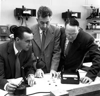
Photovoltaic solar cells have been used for power in space since the launch of the Vanguard 1 satellite in 1958. These cells are the power source of choice for space missions within the inner solar system because of their high reliability and zero-maintenance properties – the benefits of having no moving parts! But it was not until the global oil crisis of 1972 that development of terrestrial applications also became significant.
In parallel with developments for users in remote areas, there has also been the provision of photovoltaic cells for low-power consumer goods, such as watches, calculators and low-level garden lighting where convenience is the key. Now there is a large range of areas in which photovoltaics offers a viable alternative to conventional means of power production.
Throughout the development of photovoltaics, efficiency (the ratio of electrical output to incident solar power) has increased and cost has come down significantly. There are now many ground-based (or 'terrestrial') applications that are viable (see, for example, Figure 90).
The search for low-cost, highly efficient solar cells is the subject of intensive research efforts worldwide. The National Renewable Energy Laboratory in the USA produces regularly updated data on progress in this area. Figure 91 shows a chart produced in late 2013.
An efficiency approaching 40% has been produced with exotic materials in the laboratory, and under some circumstances it has been possible to exceed 40%. In production an efficiency of 15% is straightforward to achieve and it is possible to buy modules with 19% efficiency. There are perfectly satisfactory explanations of this rather low efficiency which we'll come to in due course.
Photovoltaic cells are convenient for some portable power systems: pocket calculators have used low performance cells for many years; the exploration and exploitation of space would be considerably more expensive and difficult without PV technology. PV technology provides a solution too in remote locations that are otherwise without power: cathodic protection of pipelines, radio signal boosting, weather stations and power for isolated communities are all candidates for PV systems. A double benefit can be gained with mobile recharging systems for laptop computers, portable music systems and mobile phones, as portable equipment is here taken for use into remote locations. Large PV systems integrated into roofs or office buildings in urban environments and connected to the mains network have considerable appeal, but such concepts are better built-in from the start and many of our urban developments are not easily adaptable.
This part of Section 5 is an overview of photovoltaics: how it works, what materials are employed, and its likely place in the future scheme of energy generation and implementation.
The generation of useful electricity from sunlight is clearly a major engineering challenge. However, it should be examined in the overall context of power generation and the growing use of 'renewable' energy sources. This is the aim of the following section. I will then go on to look at just how sunlight can be used as an energy resource, before studying in more detail the technology and engineering of modern photovoltaic cells.
Activity 41 (exploratory)
Go to Best research-cell efficiencies to bring up the latest version of the chart in Figure 91. Compare the charts to see how much progress has been made since mid-2012 (the time of writing of this course).
- a.Which technology has made the largest incremental improvement in efficiency?
- b.Which seems to be currently the most actively researched?
- c.What other criteria, besides efficiency, do you think play a part in determining the practical and commercial viability of a given type of photovoltaic cell?
5.6 Photovoltaics in the context of renewable energy
Energy use is fundamental to our modern economy and society. Energy enables manufacturing, communications, transportation, entertainment, and the domestic and work environments. However, its generation from nuclear and fossil fuels is presenting increasing problems (see Energy from atoms and molecules ). Long-term side effects and limitations in the amount of fossil fuel available mean that we must develop new attitudes to energy generation, and also new technologies for energy generation. Our future management of energy needs to be radically different from what took place in the twentieth century. What is needed is an energy supply that is 'renewable'. In fact, the best we can hope for is something that appears on our time scales to be everlasting – rather like coal and oil must have looked a few generations ago. So, what we mean by 'renewable' is a resource that is naturally replenished over a short time span.
Energy from atoms and molecules
There are a number of ways to get energy from atoms and molecules. Here are three. Burn a hydrocarbon or other organic substance; break up the nuclei of massive atoms; fuse together nuclei of some of the smaller atoms. The first is common place, but not without an environmental impact. The second is the nuclear industry's serious business. The third is incredibly difficult to control and is the subject of lengthy and expensive research programmes.
- a.Burning releases energy, i.e. things get hot as they burn. This is essentially a rapid process involving chemical combination with oxygen; if the reaction is too rapid then an explosion is likely to occur.
A simple reaction to describe is the burning of carbon, the major component of coal, forming carbon dioxide.
C + O 2
 CO 2
CO 2Two other simple reactions are the burning of hydrogen (making water) and the burning of methane.
2H 2 + O 2
 2H 2 O
CH 4 + 2O 2
 CO 2 + 2H 2 O
All we need here is to observe that rearranging the atoms in these reactions releases energy as heat. More complicated hydrocarbons such as fuel oil and aviation spirit burn in much the same way, giving the same energetically preferred products (CO 2 and H 2 O) together with lots of heat.
- b.Very big atoms with nuclei that combine many tens of protons and neutrons are rarely stable, energetically speaking. You know what happens to unstable systems – like a pencil balanced on its end, they are likely to fall into a more stable configuration that has lower energy. Some very big atoms emit radioactive particles as their nucleus shifts around to achieve some lower state of energy. Others, like a type of uranium known as U-235 (a huge atom with a total of 235 neutrons and protons in its nucleus), can be triggered into flying apart by hitting them with neutrons. Huge amounts of energy are released when such massive atoms are split in two. Making use of this requires arranging the nuclear fuel and controlling the neutrons so as to ensure that just enough fission is happening to maintain this reaction at a constant rate. Nuclear power stations achieve this and harness a substantial fraction of the energy released. A commonly quoted figure is that one tonne of uranium fuel can produce the same amount of electricity as 150 000 tonnes of coal.
- c.At the other end of the nuclear scale are the tiny nuclei of hydrogen and helium atoms. Very small nuclei are also not favourable in energy terms, so considerable savings in energy can be made if small nuclei are squeezed together to make bigger nuclei, though enormous forces must be overcome before it is achieved. The process is called nuclear fusion. Making a power station that recovers useful energy from nuclear fusion requires holding small quantities of mind-bogglingly hot gas away from the sides of its container, and finding materials for the container that can remain intact for years despite suffering a very heavy bombardment of neutrons. Although researchers have been able to sustain a fusion reaction for several seconds and extract more energy than was put in, many obstacles still stand in the way of building a power station that can maintain a useful power output over months and years. Fusion processes in the Sun are responsible for its entire output of energy, demonstrating both the incredible potential of nuclear fusion and the extreme conditions associated with the ignition of fusion reactions.
5.7 Types of renewable energy
The most widely used fuel in the world is biomass – wood and vegetation. In developing countries, wood is the most widely available fuel, especially in rural areas; but unfortunately in many cases it is not used in a renewable fashion, resulting in deforestation. This has further knock-on effects, such as soil erosion and environmental degradation, which can be a significant problem. Properly managed biomass can be an important source of renewable energy. Several types of fast-growing trees are suitable for short rotation cropping, in which trees are harvested and replanted after about five years, or coppicing, in which the trees are regularly pruned and their branches harvested. Thus, there is no reduction in the number of growing trees. Other crops such as rapeseed and sugar cane are often grown for their oil, which has many uses, including fuel for transport. Sugar cane can also be converted into ethanol for use in motor vehicles.
In 2013, the most widely implemented renewable energy scheme for large-scale power generation was large-scale hydroelectricity, in which stored water is released downhill through generating turbines. Water gets into the high-level reservoir in two ways:
- directly, after falling as rain or snow on higher ground
- as part of a scheme where water is pumped from lower down when 'surplus' energy is available, to be released at times of peak energy demand.
In the latter case, the main purpose of the scheme is short-term energy storage, rather than to be a source of energy. However, most suitable hydroelectric sites have now been developed, and there are significant social and ecological problems associated with forming the reservoirs. Also, suitable sites tend to be remote from areas requiring energy.
Tidal barrage schemes are similar to large-scale hydro schemes, with the twice-daily tide carrying seawater into an adapted natural reservoir, which is drained via generating turbines. One such success, and a major engineering project, was the barrage across the estuary of the Rance just outside St Malo (Figure 92). But the potential for large-scale power generation in this way is not without major consequences for the environment because large areas of land must be flooded for the reservoir.
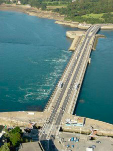
The smaller scale motion of the sea – wave power – may itself offer a useful way of generating electricity.
Wind mills and water mills have long been used to provide mechanical energy from renewable sources. In the UK and many other countries, wind farms in remote hilltop locations (as well as other, less remote sites) link mechanical energy through turbines to the electrical grid, and large offshore schemes, rated in hundreds of megwatts, are increasingly common. However, wind energy is a highly variable resource, and no wind turbine will ever be able to provide power 100% of the time.
This brings us on to solar power: energy directly from the Sun. Photovoltaics is the key to electricity generation directly from sunlight. As with wind power, though, the availability of solar energy is subject to variation, not just between night and day, but also as the length of day changes with the seasons, particularly at high latitudes. Solar power is also very dependent on the weather, though weather patterns are generally predictable over the longer term.
There are two technologies for harvesting solar energy. Solar thermal energy is used for space heating in passive designs of houses (e.g. just having south-facing windows), and in systems where solar energy is used to heat air in wall cavities, which is then actively circulated around the house (known as Trombe walls). Alternatively, active solar water heating with panels mounted on roofs will feed heated water either directly for use or via a heat exchanger for pre-heating domestic water; see Figure 93.

There are also large-scale applications. In some, an array of steerable mirrors is arranged to focus sunlight on a central tower where the concentrated heat drives steam turbines to generate electricity. In others, parabolic, tilting mirrors direct the light onto a pipe that carries a fluid that is cooled in a steam generator connected to a turbine. These systems, examples of which are shown in Figure 94, have to be big to minimise heat losses. Large solar thermal schemes are usually also able to store heat, either in the form of molten salt, or as superheated steam, to keep the turbines spinning at night or at other times when the solar energy input is less than the desired output of the plant.
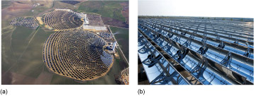
Photovoltaic technology generates electricity directly from sunlight and is the main subject here. It is modular, i.e. it can be built up in small sections – and so is just as applicable to small-scale domestic application as to large power stations. Its chief benefits lie in its silent, pollution-free operation with almost zero maintenance and it is well-suited for use in urban environments. (A variant of the technology, thermo-photovoltaics, use a particular type of photovoltaic cells to turn radiant energy from any heat source into electricity. The heat source can be from fossil fuels or biomass as well as from concentrated sunlight.)
Because of its variable nature, renewable energy usually requires integration with so-called power conditioning – electrical engineering aimed at levelling the supply. This may involve energy storage systems, such as batteries, or the hydro-storage mentioned earlier, or the use of the mains network as a store so that power is exported to the grid at times of abundance and imported at leaner times.
Activity 42 (self-assessment)
- a.List four types of renewable energy.
- b.Give two advantages of photovoltaics compared to other renewable sources.
Answer
- a.Biomass, wind, solar, geothermal, hydro, tidal and wave are the principal ones. You may also have thought of ocean and thermal.
- b.There are several advantages: it is a modular system, so as many modules as required can be installed at a particular location; it is silent in operation; it is virtually maintenance free.
5.8 Why renewables?
For several decades the finite nature of fossil fuel reserves has been appreciated. Although known reserves have increased, this is offset by their greater inaccessibility. But there is another imperative for a reduced dependency on coal, gas and oil. Over the past three decades there has been mounting evidence, first for the increasing level of pollutants and carbon dioxide in the atmosphere through the use of fossil fuels, and secondly that the increase in carbon dioxide is causing an increase in the temperature of the atmosphere through The Greenhouse Effect. It is almost universally accepted that this is having an effect on weather patterns and sea level. The debate is now over how large and catastrophic these effects will be, and whether they can be reversed or at least mitigated.
The Greenhouse Effect
The Greenhouse Effect refers to the way in which temperatures rise when heat loss is inhibited, originally used in connection with glass 'greenhouses' used in gardens to provide a warm environment for plant growth. Such a structure allows daylight to pass through the glass and fall upon objects within it. The warmed objects lose an equivalent amount of energy predominantly by emitting long wavelength infrared radiation. Because the glass is less transparent to this than it is to the shorter-wavelength light that comes in, the air and the objects inside the greenhouse continue to warm up until they are warm enough to lose energy as fast as they gain it.
This effect is not restricted to greenhouses. It also applies to the entire global system. Radiation incident from the Sun warms the whole of the planet. The average temperature of the Earth is the result of the amount of cooling by radiation emitted from the Earth's surface just balancing the amount of heating by radiation incident from the Sun. The atmosphere acts like the glass of the greenhouse. In particular, it is more difficult for radiation from the relatively cool surface of the Earth to penetrate the atmosphere than it is for radiation from the relatively hot surface of the Sun. In fact if this weren't the case and the Earth had no insulation provided by the atmosphere then life as we know it would not exist – the entire surface would be frozen. In truth the greenhouse effect – in moderation – is no bad thing.
The problem comes when, in effect, the Earth's insulation layer is supplemented by another layer or a more effective material. For the Earth, gases such as carbon dioxide and water vapour are responsible for ensuring that the atmosphere provides this insulation. So we have to be careful. Increased levels of carbon dioxide in the atmosphere resulting from the burning of fossil fuels causes an enhancing of the greenhouse effect.
Average global temperatures have certainly risen over the past century by about 0.5 °C and the level of carbon dioxide (a major greenhouse gas) has increased from 280 ppm (parts per million) in pre-industrial times to a current level of 392 ppm (at the time of writing, 2012). Predictions for the rise in global temperatures over the next 100 years vary from 0.5 °C to 3 °C. The lower end of this scale will almost certainly be survivable, but even the smallest temperature increase may lead to more frequent and more catastrophic weather events. The Intergovernmental Panel for Climate Change has predicted that several low lying Pacific islands will become swamped by increased sea levels as a result of Seawater expansion and that countries such as Bangladesh could lose as much as 17% of their land area – an area populated by around 20 million people. In addition to this, melting of the ice over Antarctica and Greenland will have an effect at least as great as that of seawater expansion upon sea levels.
Seawater expansion
Water does not expand much on heating: a mere 0.02% per degree Celsius. That's not much; surely it can't lead to significant deepening of warmed oceans? So what if the top few metres of water do become a little warmer?
Let's try a few sums. To keep things simple I'll presume that sideways expansion is restricted by the continental land masses so that any expansion of the water in the sea causes a simple increase in its depth, see Figure 95.
The US National Oceanic and Atmospheric Administration has examined seawater temperatures over 40 years towards the end of the twentieth century and reported the following:
- A temperature rise of about 0.3 °C on average over the first 300 m of depth has occurred.
- A temperature rise of about 0.06 °C on average over the range from 300 to 3000 m of depth has also occurred.
The depth of water expands by 0.02% per degree Celsius. That's 0.2 mm per metre of depth for each degree Celsius. For the first 300 m the expansion is (0.2 × 300) mm per degree Celsius, so a 0.3 °C rise would cause a depth increase of:
0.3 × (0.2 × 300) mm = 18 mm.
The next 2700 m will similarly account for an extra depth of over half as much again.
Activity 43 (self-assessment)
Show that expansion of 2700 m of deep sea on warming by a mere 0.06 °C will lead to a depth increase of about 30 mm.
Answer
The temperature rise × (the number of mm of expansion per metre of depth per degree × the depth in metres) = increase depth in mm.
- 0.06 × (0.2 × 2700) mm = 32 mm
It is clear that if the temperature of the oceans continues to rise over the next century then some lower lying lands could literally 'go under'.

There is a long record of data for the global average sea level, taken for the most part from tidal gauges, but latterly from more sophisticated tools such as satellite radar measurements. Figure 96 shows the long-term trend.
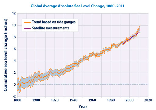
Hence, there are compelling reasons to rapidly expand energy generation technologies that are non-polluting. The facts are becoming recognised at an international level. The first climate change conference at Rio de Janeiro in 1992, followed by the conference at Kyoto in 1997, sought to set legally binding commitments on countries for reductions in carbon dioxide emissions so as to achieve the same levels of emission as existed in 1990. As a result of this the UK is now committed to a target of reducing carbon dioxide emissions by 80% relative to their 1990 level by the year 2050. Measures to achieve this include cleaning up factory and power station emissions, reducing energy consumption and increasing energy generation from renewable energy sources. This last has been translated into an increase in renewable energy generation to a level of 10% of UK energy production by 2020, from a level in 2000 of about 1%.
Unfortunately, the Kyoto Protocol does not go very far. If fully implemented it is likely to restrict the increase in global temperature by no more than a tenth of a degree. Predictions suggest that cuts in carbon dioxide emissions will have to be around 60% just to stabilise its level in the atmosphere at about 550 ppm (i.e. twice the pre-industrial level). This is a level that whilst still having some effect, is likely not to be catastrophic.
Against this background, renewable energy derived from sunlight appears promising. Approximately the same amount of energy falls on the Earth's surface in one hour as all human civilisation generates for its use in a whole year. Although most of this falls on the sea and relatively inaccessible land areas, and of course drives the weather and other global processes, there is still a vast store to be tapped, for which we are now developing the technology.
Activity 44 (self-assessment)
List the main problems associated with continued and increasing use of fossil fuels.
Answer
- Resource depletion: natural gas is forecast to run out first, oil will follow, coal reserves are good for a few centuries but will become increasingly costly to extract.
- Pollution: particulates from industry and transport, and CO 2 and other greenhouse gases.
You may also have mentioned various other socio-political problems associated with energy resources being concentrated in small areas of the globe.
In this course we are primarily interested in an engineering solution to reducing the emissions of greenhouse gases by implementation of renewable energy.
5.9 Why photovoltaics?
Electricity is the most versatile form of energy available to us, and is intimately integrated into our society. It can be generated from many sources, can readily be transported, and can be used for almost any application. For example, high quality lighting, motors for machines and appliances, communications and entertainment equipment are all readily fuelled by electricity. It is also used for heating and cooking and even for transport.
Renewable energy systems that generate electricity directly are particularly appropriate for integration into our existing infrastructure. These systems include hydro-, tidal-, wave- and wind-power and PV. Hydro, tidal and wave are necessarily large systems that are also very dependent on location. Wind farms produce electricity directly and can be sited close to points of use but their sheer size means they are not suitable for the urban environment. You can see the odd small turbine here and there in towns and cities, but these cannot supply anywhere near enough power to make a serious impact. Furthermore, the efficiency of wind turbines increases with size because wind speed increases with height. By their very nature wind turbines have to be obtrusive.
PV technology stands out as the only renewable option that:
- generates electricity directly
- is practical for small and large scale
- is suitable for the urban environment and remote applications alike
- is silent and is a very low-maintenance ('fit and forget') technology.
It also has a low 'embodied energy', meaning the amount of energy invested in making PV modules is relatively small. It is generally recognised that PV is the most versatile of the renewable energy technologies and the most likely to be integrated on the small to medium scale (see Where the Sun shines brightly).
Where the Sun shines brightly
Figure 97 shows the global and UK distribution of solar energy as a resource. The global map shows the insolation (solar power per square metre on a surface facing the Sun) worldwide for the months of January and June. The UK map shows the distribution of its annual total solar energy input onto horizontal surfaces.
Solar energy is highly seasonal and variable. Figure 98 gives an idea of its variation through the year in four locations. These are averages over a month and take into account typical weather.
The amount of sunlight reaching a given location on average in a given month can be predicted from past records with a fair degree of accuracy. This sunlight includes direct sunshine and the diffuse daylight that occurs on overcast days. Although not transmitting as much energy, this latter component can add a significant fraction to the overall energy levels, particularly in a temperate climate such as that in the UK. Another factor is that at relatively high latitudes, such as the UK, the length of the days in summer means that the total amount of energy compares quite well with those countries where the Sun is higher in the sky. Of course this advantage is reversed in the winter.


5.10 PV terminology
Figure 99 explains some of the terminology applied to photovoltaics. The photovoltaic or solar cell is the base unit.
Cells are connected together electrically and fabricated into modules, and these are installed at a site in an arrangement known as an array. There remains the task of conditioning the d.c. electricity from the array. This may involve storage in batteries or conversion to a.c., which may then be connected to the mains.
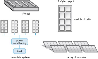
Renewable energy, together with greater energy efficiency and a reduction in energy consumption, offer a route to offset the consequences of climate change that are occurring through the overuse of fossil fuels. There are many resources and technologies, but for electricity generation in urban and remote environments alike, photovoltaics is an attractive option because of its modularity and quiet, maintenance-free operation. The technology is also suitable for integration with existing fossil fuel resources, or with other renewables, to overcome the mismatch between resource availability and demand.
5.11 Economics, environmental impact and integration
The costs of using PV technology go beyond those of the manufacture of modular arrays of solar cells. A simple formula relating investment to return would require a detailed knowledge of any subsidies and charges associated with PV electricity.
All manufacturing processes have some environmental impact. As the main reason for the implementation of PV is to reduce the environmental impact of energy generation, it is crucial that the benefits outweigh the impact of manufacture.
In the large-scale implementation of PV and other renewable energy systems other factors such as the impact on the infrastructure of the national supply grid have to be considered. A grid that relies heavily on erratic, renewable sources will need special measures to keep it stable.
5.12 Economics and implementation
The quantity 'euros per watt in peak sunshine (€ Wp −1 )' is a measure of the price of a module in euros divided by the number of watts it will produce in peak sunshine. It is useful for comparing the price of different module types and shows long term trends. The € Wp −1 prices of PV modules have fallen dramatically as the market has increased over the past three decades or so, as shown in Figure 100.
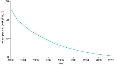
The price of a PV module is only part of the cost of a complete system. Total costs break down into three main areas: the cost of the PV modules; the cost of the support structure; and the cost of installation. In northern Europe, systems are most commonly installed on building roofs or south-facing walls, so I'm not going to consider cost and availability of land in the economic argument.
Support structure costs are a particular problem for retrofitted units, where the system cost is, say, added to that of the roof. For new buildings and renovation, the cost of architecturally integrated PV-cladding and PV-roofing units can be integrated into the cost of the standard cladding or roofing.
Installation costs are high for two reasons. First, installation is a specialist electrical task involving a d.c. power system. Second, the installations are individually tailored to each site.
Schemes are available for PV mortgages on better terms than standard unsecured loans. These spread the capital costs over several years, and although this does not as yet make them truly viable, it can make them affordable.
With grid-connected systems the price one gets for exporting PV generated electricity to the grid is currently substantially higher than the price for consumed power. One argument in favour of this approach is that to make 1 kW h of electrical energy from a thermal source such as a fossil fuel power station takes 3 kW h of thermal energy. This means that 1 PV kW h is 'worth' 3 thermal kW h. Other arguments are that embedded generation is useful to a power grid, in order to maintain supply at weak points in the system. Added value can also accrue from avoiding the losses involved in power transmission.
Germany and the UK have good subsidy rates, and other countries are following suit. But ironically, where other factors are at play, such as poor supervisory systems, these can sometimes be too high. Subsidies of 90% in India resulted in a large number of installations, but when these were audited it was found that three times as many systems had been sold as were actually in place! The reason was that systems were resold over the border in Nepal at cheap prices that still raised a profit.
5.13 Large-scale implementation
PV module fabrication is essentially the same for all cell types, and is a very different sort of process from cell manufacture. It therefore lends itself to the establishment of independent module fabrication facilities that are able to handle a number of different initial cell materials. This enables local fabrication using local labour that is not dependent on high technology nor particularly sensitive to the cell materials. The same PV modules may be built from different components. The performance of the final assembly in different complete installations is a crucial engineering test.
As the number of installations increases, the prices of systems come down and domestic embedded generation becomes more and more viable. When the amount of electricity generated by PV installations reaches about 10% of the total amount of electrical energy available from the national grid, the grid will no longer act as an effective store. This is because the seasonal nature of the energy supply will be too erratic for the grid demand. Electricity generation by all renewables in the UK in 2011 was about 9.4%, with PV contributing a small, but growing fraction (Figure 101).
Activity 45 (self-assessment)
A medium-to-long-term problem for PV, and for renewables in general, is the question of energy storage. What's needed is the energy equivalent of a portfolio of investment accounts covering short-, medium- and long-terms.
Suggest two ways that energy from PV can be stored. Think in broad terms about the answer, and consider all the different forms of 'energy' and energy storage that you've encountered in the course. Comment in each case on the storage time scale and any environmental issues.
Answer
You may have chosen two of the following:
- a.Hydro-storage is one possibility, but in the UK for instance, there are very few environmentally acceptable sites available. Long-term storage is, in principle, possible this way.
- b.A short-term, small-scale solution is battery storage. A medium-term energy bank is available when electricity and water are mixed; that's something that I was always taught to avoid doing! The electrolysis of water to produce hydrogen and oxygen is a straightforward process. This is converting solar energy, through electrical energy, to 'chemical energy', if you like. The hydrogen can be stored for later use; burning it recombines it with oxygen to make water and heat energy. However, hydrogen gas itself is not easy to contain and this is a bulky way to store energy. Various techniques are being developed such as pressurisation, liquefaction, adsorption on adsorbent surfaces and conversion to other fuels such as ammonia, methane or methanol.
- c.Other options might be to store energy as electric current in a ring of superconducting material or as kinetic energy by spinning a large fly-wheel.
Don't forget that the discussion here concentrates on electricity production, but the majority of energy use is as heat. You'll need to follow modules on renewable energy to see the whole picture.
5.14 Environmental impact
Everything we manufacture and use on a large scale has an environmental impact, and PV is no exception. There are two factors to consider here. First is the effect on the environment of any materials used in the manufacture of cells, modules, arrays, systems and finished installations. Second is the effect of embodied energy – that energy invested in the manufacture and disposal of exhausted or out-of-date installations. The assessment of these factors are brought together in a life cycle analysis in terms of the inventory from 'cradle to grave' of pollutants released and of the total energy used. These figures can be compared with the relevant figures for conventional electricity generation of the same capacity.
PV modules have a pretty clean sheet during their operational life. They emit no pollutants. Fossil fuel energy used in production, installation and decommissioning, however, gives rise to both embodied energy and net emission of pollutants such as carbon dioxide (CO 2 ), sulphur dioxide (SO 2 ) and the oxides of nitrogen (N 2 O, NO and NO 2 , collectively called 'nox', i.e., NO x ) and particulates.
5.15.1 Materials and pollution
There are various chemicals and solvents used in both bulk and thin film processing. No heavy metals are used in silicon cell production, either in bulk processing or in amorphous thin film. Cyanide compounds and toxic gases are used, however, but these are controlled by burn off, good practice and recycling. In this regard the industry is no worse than many other 'high-tech' processors.
Some of the exotic semiconductor compounds proposed as more efficient alternatives to silicon involve the toxic elements cadmium and selenium, but the quantities are not large because of the extreme thinness of the active material. (1 m 2 of a cadmium telluride cell contains a maximum of about 2 cm 3 of cadmium.) Of course, multiplied by many metres squared this does add up to a potential problem. However, within the cells the material is sealed and so is isolated from the environment. Tests have shown that even in the event of fire toxic contamination is very localised because the combustion products have low volatility. In processing, careful procedure and regular checks can minimise risks to workers, and recycling procedures have shown that very little toxic material escapes to the environment. Decommissioning of cells has also been addressed: containment and recycling of the toxic elements is quite feasible. There remains the question as to whether this will be practical on an administrative and economic basis.
5.15.2 Embodied energy and a bit more pollution
The other environmental impact comes from embodied energy. In this respect bulk processing has a much higher impact than thin film because of the higher temperatures involved. The cells are designed to save energy, so energy used in their manufacture should be minimised. The energy used to make cells derives mostly from fossil fuels, and fossil fuels are responsible for greenhouse gas emissions and a fair amount of cadmium emission (principally from coal but also from oil). However, when the emissions resulting from the production of PV cells are compared to those for burning fossil fuels as a primary energy source, even systems based on bulk crystalline silicon are at least ten times better than fossil fuel generation per kW h of electricity produced.
The energy pay back periods depend on the amount of sunlight that a module is exposed to, but the figures quoted here are based on sensible positioning in a temperate location. For crystalline silicon modules it takes about three to four years to capture more energy than was consumed in making the units. They are usually guaranteed for ten years, and their life is expected to be around 30 years. The thin film technology-based cells, produced using lower-temperature manufacturing processes, can pay back the energy consumed in production after only two years, but the expected life of such cells is around 20 years. So, embodied energy is recouped when cells have been generating for only around 10% of their expected life.
The other components of photovoltaic systems (support structure, inverters, wiring and installation) will also have an associated embodied energy; some of this may be offset where the PV arrays also provide a roofing or cladding material.
5.15.3 Availability of raw materials
Large-scale manufacture of some types of photovoltaic cells could use significant fractions of the world supply of some raw materials. The principal elements in question are indium and, to a lesser extent, tellurium.
Thin film technologies are potentially affected by limited supplies of indium and similar elements because of the use of indium tin oxide for the transparent front contact layer. Whether lack of indium resources becomes a limiting problem depends on the price of these elements on the world market. A clever conservation approach is to recycle modules at the end of their life by etching off the active material, leaving the indium tin oxide intact ready for reuse with a fresh film of semiconductor. Even so, there are now many research groups around the world looking for alternative transparent conductors, such as for example fluorine-doped tin oxide.
5.16 Summary
The price of PV modules has decreased dramatically over the past few decades and thin film processes are starting to have a further effect on decreasing prices. Other components of PV systems have also to be considered and their costs reduced. The degree of financial viability of a PV system depends on subsidies and the price received for exported PV electricity.
With decreasing prices, large-scale implementation becomes more plausible – most likely as grid-connected embedded generation. At a certain level of market penetration this will present problems for electricity supply because of the variability of the resource. This will require either development of long-term storage technologies or the integration of PV with other renewables and cleaner fossil fuel technologies.
As with any technology there is an environmental impact. With PV this impact is nearly all in manufacture and the bulk of this is caused by the energy used to produce the cells. However, this energy is 'paid back' within 10% of the useful life of the PV cells. The emission of pollutants and greenhouse gases associated with the manufacture and life of PV systems is less than that for the same amount of energy derived from fossil fuels.
Renewable energy technologies offer a route to reducing carbon dioxide emission and mitigating global warming if implemented on a large scale. Any near-term systems have to work within the existing infrastructure and this means a mix of renewable and non-renewable capacity.
Photovoltaics is the most modular renewable technology that is suitable for the urban environment. Integration with other renewables enables it to contribute significantly to the reduction of greenhouse gas emissions.
The resource of solar energy is essentially inexhaustible. Sunlight comes in a continuous range of wavelengths, or photon energies, and this results in a compromise in the optimum materials employed. PV cells are made from semiconducting materials under conditions of very high purity. They are solid state devices with no moving parts and are hence silent and almost maintenance free. There are a number of different materials employed with varying efficiencies, environmental impacts and applications.
There are parallel drives to produce either high efficiency cells by bulk crystalline processing or lower cost thin film cells with lower efficiency. The cost of the thin film technologies in particular decreases as production increases, see The next generation.
The next generation
Thin film processing offers a big decrease in manufacturing costs when applied to large-scale production. Other techniques are being researched that offer even greater reductions in cost. These include the use of semiconducting polymers and titanium dioxide activated by a light absorbent dye as the chief active materials in photocells. The deposition techniques include techniques in which a paste is spread or sprayed on the substrate and then dried. These techniques are all in the next league down in terms of cost and energy, but also, unfortunately, of efficiency.
Applications range from stand-alone remote power systems, through power for satellites to embedded generation on domestic houses or offices. Implementation in a wider energy strategy would involve integration with energy storage mechanisms, in batteries, connection to the national grid or a chemical fuel. Economic viability remains a key issue.
Activity 46 (self-assessment)
From the information you have gained on different material types for PV cells and the discussion of systems and applications, what do you think are the main considerations for system designers in choosing cell types for particular applications?
Answer
The application and load to be supplied are the prime consideration, then come the area available for modules and the budget available. You could also include in your answer aspects such as ease of installation, types of system, e.g. stand-alone or grid connected. You might also mention particular high efficiency cells based on semiconductors other than silicon, or the flexible nature of some thin film cells. There are, in fact, a large number of permutations available to an engineer and a wide range of materials and systems to choose from.
Conclusion
This course has provided you with a whistle-stop tour of the historical development of engineering, design and energy capture through some engineering projects and products that we are familiar with in our modern-day world. In addition we have shown how rules and manufacturing can impact on how engineering a product is constrained.
Appendix: British Standard Personal eye-protection – Specifications
The European Standard EN 166:2001 has the status of a British Standard
ICS 13.340.20
National foreword
This British Standard is the official English language version of EN 166:2001. It supersedes BS EN166:1996 which is withdrawn.
The UK participation in its preparation was entrusted by Technical Committee PH/2, Eye-protection, to Subcommittee PH/2/2, Industrial eye-protectors, which has the responsibility to:
— aid enquirers to understand the text;
— present to the responsible European committee any enquiries on the interpretation, or proposals for change, and keep the UK interests informed;
— monitor related international and European developments and promulgate them in the UK.
A list of organizations represented on this subcommittee can be obtained on request to its secretary.
Cross-references
The British Standards which implement international or European publications referred to in this document may be found in the BSI Standards Catalogue under the section entitled “International Standards Correspondence Index”, or by using the “Find” facility of the BSI Standards Electronic Catalogue.
A British Standard does not purport to include all the necessary provisions of a contract. Users of British Standards are responsible for their correct application.
Compliance with a British Standard does not of itself confer immunity from legal obligations.
Summary of pages
This document comprises a front cover, an inside front cover, the EN title page, pages 2 to 35 and a back cover.
The BSI copyright date displayed in this document indicates when the document was last issued.
Amendments issued since publication
Amd. No. Date Comments
ISBN 0 580 38916 2
| Foreword | ||
| 1 | Scope | |
| 2 | Normative references | |
| 3 | Terms and definitions | |
| 4 | Classification | |
| 4.1 | Function of eye-protectors | |
| 4.2 | Types of eye-protectors | |
| 4.3 | Types of ocular | |
| 5 | Designation of filters | |
| 6 | Design and manufacturing requirements | |
| 6.1 | General construction | |
| 6.2 | Materials | |
| 6.3 | Headbands | |
| 7 | Basic, particular and optional requirements | |
| 7.1 | Basic requirements | |
| 7.2 | Particular requirements | |
| 7.3 | Optional requirements | |
| 8 | Allocation of requirements, test schedules and application | |
| 8.1 | Requirements and test method | |
| 8.2 | Test schedules for type examination | |
| 8.3 | Application of eye-protector types | |
| 9 | Marking | |
| 9.1 | General | |
| 9.2 | Ocular marking | |
| 9.3 | Frame marking | |
| 9.4 | Marking of eye-protectors where the frame and ocular form a single unit | |
| 10 | Information supplied by the manufacturer | |
| Annex ZA (informative) Clauses of this European Standard addressing essential requirements or other provisions of EU Directives |
EN 166:2001 (E)
Foreword
This document has been prepared by Technical Committee CEN/TC 85, "Eye-protective equipment", the secretariat of which is held by AFNOR.
This European Standard shall be given the status of a national standard, either by publication of an identical text or by endorsement, at the latest by May 2002, and conflicting national standards shall be withdrawn at the latest by May 2002.
This European Standard replaces EN 166:1995.
This document has been prepared under a mandate given to CEN by the European Commission and the European Free Trade Association, and supports essential requirements of EU Directive(s).
For relationship with EU Directive(s), see informative annex ZA, which is an integral part of this document.
According to the CEN/CENELEC Internal Regulations, the national standards organizations of the following countries are bound to implement this European Standard: Austria, Belgium, Czech Republic, Denmark, Finland, France, Germany, Greece, Iceland, Ireland, Italy, Luxembourg, Netherlands, Norway, Portugal, Spain, Sweden, Switzerland and the United Kingdom.
EN 166:2001 (E)
1 Scope
This European Standard specifies functional requirements for various types of personal eye-protectors and incorporates general considerations such as:
- designation;
- classification;
- basic requirements applicable to all eye-protectors;
- various particular and optional requirements;
- allocation of requirements, testing and application;
- marking;
- information for users.
The transmittance requirements for various types of filter oculars are given in separate standards (see clause 2).
This European Standard applies to all types of personal eye-protectors used against various hazards, as encountered in industry, laboratories, educational establishments, DIY activities, etc. which are likely to damage the eye or impair vision, with the exception of nuclear radiation, X-rays, laser beams and low temperature infrared (IR) radiation emitted by low temperature sources.
The requirements of this standard do not apply to eye-protectors for which separate and complete standards exist, such as laser eye-protectors, sunglasses for general use, etc. unless such standards make specific reference to this standard.
The requirements of this standard apply to oculars for welding and allied processes but do not apply to equipment for eye and face protection for welding and allied processes, requirements for which are contained in EN 175.
Eye-protectors fitted with prescription lenses are not excluded from the field of application. The refractive power tolerances and other special characteristics dependent upon the prescription requirement are specified in EN ISO 8980-1 and EN ISO 8980-2.
References
Acknowledgements
Except for third party materials and otherwise stated in the acknowledgements section, this content is made available under a Creative Commons Attribution-NonCommercial-ShareAlike 4.0 Licence.
Cover image: Ian Sane in Flickr made available under Creative Commons Attribution-NonCommercial-ShareAlike 2.0 Licence.
The material acknowledged below is Proprietary and used under licence (not subject to Creative Commons Licence). Grateful acknowledgement is made to the following sources for permission to reproduce material in this course:
Section 1
Video 1 contains BBC content © BBC.
Figure 1(a) Jan Kratochvilla/Dreamstime.com; Figure 1(b) The Hubble European Space Agency Information Centre; Figure 1(c) http://en.wikipedia.org/wiki/File: Shard_London_Bridge_May_2012.JPG. This file is licensed under the Creative Commons Attribution-Share Alike 3.0 Unported license; Figure 1(d) David Pruter/Dreamstime.com; Figure 1(e) TommL/www.istock.com; Figure 1(f) StockCube/www.istockphoto.com; Figure 2 Taken from: http://en.wikipedia.org/wiki/File:Pont_du_Gard_Oct_2007.jpg. This file is licensed under the Creative Commons Attribution-Share Alike 2.0 Generic license; Figure 6 Taken from http://www.mesopotamia.co.uk/writing/home_set.html; Figure 8 Taken from http://www.componentforce.co.uk/category/264/plastic-injection-moulding; Figure 9(a) Brian Sullivan/Dreamstime; Figure 9(b) Peter Gudella/Dreamstime; Figure 9(c) Cheryl Casey/Dreamstime; Figure 9(d) Gemenacom/Dreamstime; Figure 10 Taken from http://science-techquest.blogspot.co.uk/2012/07/do-you-really-understand-everyday.html; Figure 11 Copyright 1997–2007 Keith Doyon (KeithDoyon@MilitaryRifles.com) required wording; Figure 12(a) Taken from http://www.ehow.com/how_7968489_use-ammonia-household-cleaning.html; Figure 12(b) Courtesy of Donald M Hofstrand. Taken from http://www.agmrc.org/renewable_energy/ethanol/using_the_wind_to_fertilize_corn.cfm; Figure 12(c) Taken from www.halelife.co.uk; Figure 12(d) Stuart Pear/ Dreamstime.com; Figure 12(e) © Moreno Soppelsa/Dreamstime.com; Figure 13 Taken from http://blogs.scientificamerican.com/observations/2012/02/21/transistor-shrunk-down-to-scale-of-single-phosphorus-atom/; Figure 14 Mark Wragg/iStockphoto.com; Figure 14 Imagewell/Dreamstime.com; Figure 15 Courtesy of NIST; Figure 18 © Stavrositu Iuliana/Dreamstime.com; Figure 19 Comet 1: http://www.rafmuseumphotos.com, Spitfire: photo of Spitfire: Franck Cabrol/Gnu Free Documentation Licence/Wikimedia Commons, Dreamliner: Boeing 787 Dreamliner, Concorde: photo of Concorde: Steve Fitzgerald/Gnu Free Documentation Licence/Wikimedia Commons, Spaceship: Virgin Galactic LLC www.virgingalactic.com, Wright Bros Flyer 1: Out of copyright.
Section 2
Figure 20 photograph courtesy © Mike Hessey; Figure 21(a) drawing of Faun folding bike (circa 1895) artist unknown; Figure 21(b) http://airframebike.com/; Figure 21(c) Dursley-Pedersen pre 1910 bicycle; Figure 21(d) Dahon folded/unfolded bicycle; Figure 21(e) Trusty Bicycle, © Phillisca in Flickr; Figure 22 Folding Brompton courtesy: www.brompton.co.uk; Figure 23 Brompton prototype © Mike Hessey; Figure 24(a) © Mike Hessey; Figure 24(b) Lotus Monocoque; Figure 26 courtesy of Brompton Bicycle Ltd www.brompton.co.uk; Figure 27 courtesy of Brompton Bicycle Ltd www.brompton.co.uk; 28 Delphi internal combustion engine http://delphi.com/; Figure 30(a) from: www.propertyinbristol.org copyright unknown; Figure 30(b) Reproduced with the permission of the Librarian, the University of Bristol; Figure 31 Millennium Bridge © Peter Visontay Earth Photography http://www.earth-photography.com/; Figure 32 Aaron Neuhauser (2007) at Arizona State University College of Design; Figure 33 Engineering Design courtesty of Catapult Global LLC http://catapultglobal.com; Figure 36 from www.productsafety.gov.au.
Section 3
Figure 44 (author unknown) made available under CC Att SA licence http://creativecommons.org/licenses/by-sa/3.0/; Figure 46 © M J Richardson made available under http://creativecommons.org/licenses/by-sa/2.0/; Figure 47 Philips CE mark; Figure 51 (top to bottom): VHF © P M Northwood; microwave © iStockphoto.com; infrared image Science Photo Library; X-ray of feet iStockphoto.com.
Section 4
Figure 52(a) sand http://wisconsingeologicalsurvey.org/; Figure 52(b) fibre http://www.exel.co.uk; Figure 52(c) © Intel; Figure 54(a) Kenwood food mixer, http://www.kenwood.com/; Figure 54(b) image from: http://img.alibaba.com/; Figure 58(a) © Sarah Charlesworth (Geograph.org.uk) made available under Creative Commons licence, http://creativecommons.org/licenses/by-sa/2.0/deed.en; Figure 60(b) © C Frank Starmer http://ravenelbridge.net/ made available under Creative Commons licence: http://creativecommons.org/licenses/by-nc-sa/2.5/; Figure 60 image from: http://www.1st-product.com/; Figure 61(a) image from: http://image.made-in-china.com/; Figure 61(b) courtesy of © WorldAutoSteel: http://www.worldautosteel.org/; Figure 62 used with permission of Brunswick Corporation © 2013, http://www.mercurymarine.com/; Figure 63 © 160 SX (talk) https://en.wikipedia.org/wiki/File:BMW_6- cylinder_block_Al-Mg.jpg. Made available under Creative Commons licence: http://creativecommons.org/licenses/by-sa/2.5/; Figure 64 http://www.jaguar.co.uk; Figure 67(a), (b) and (c) These photographs are reproduced with the permission of Rolls-Royce plc, copyright © Rolls-Royce plc 2012. http:// www.rolls-royce.com/news/assets/copyright_notice.jsp; Figure 68 image using Turbocad Mac Deluxe v5 from: http://blog.bestsoftware4download.com; Figure 69 http://www.eurekamagazine.co.uk; Figure 75 www.layerwise.com.
Section 5
Figure 87 © Yali Shi/http://depositphotos.com; Figure 89 ATT Bell Labs; Figure 90 photographer: Ralf Hogson. Courtesy of Network Rail www.networkrail.co.uk; Figure 91 http://www.nrel.gov; Figure 92 http://com.fr.free; Figure 93 http://www.yougen.co.uk; Figure 94(a) http://energystoragetrends.blogspot.co.uk/2010/12/doe-guarantees-145-billion-loan-for.html; Figure 94(b) Sopogy/Keahole Solar Power; Figure 96 United States Environment Protection Agency. http://www.epa.gov; Figure 97(a) http://neo.sci.gsfc.nasa.gov; Figure 97(b) http://www.contemporaryenergy.co.ok; Figure 97(c) http://re.jrc.ec.europa.eu/pvgis PVGIS © European Communities 2001-2007; Figure 100 http://www.decc.gov.uk Open Government Licence 2.0.
Every effort has been made to contact copyright owners. If any have been inadvertently overlooked, the publishers will be pleased to make the necessary arrangements at the first opportunity.
Don't miss out:
If reading this text has inspired you to learn more, you may be interested in joining the millions of people who discover our free learning resources and qualifications by visiting The Open University - www.open.edu/ openlearn/ free-courses