The oceans
Use 'Print preview' to check the number of pages and printer settings.
Print functionality varies between browsers.
Printable page generated Saturday, 21 February 2026, 3:00 AM
The oceans
Introduction
The oceans cover more than 70 per cent of our planet. In this free course you will learn about the depths of the oceans and the properties of the water that fills them, what drives the ocean circulation and how the oceans influence our climate.
This OpenLearn course is an adapted extract from the Open University course S206 Environmental science.
Learning outcomes
After studying this course, you should be able to:
explain in your own words, and use correctly, all the bold terms in the text
identify, classify and interpret various features visible on the ocean floor
interpret temperature and salinity plots recorded in the oceans
interpret spatial maps of temperature and salinity and deduce ocean circulation
evaluate the role of the different oceans in the global ocean circulation.
1 The effect of the oceans on climate
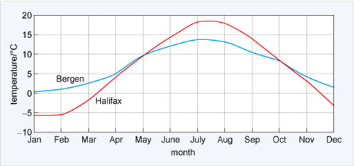
You can see the effect of the oceans on regional climate by looking at the annual cycle of monthly air temperatures at two coastal locations at different latitudes. You might expect that the closer to the Equator, the warmer it would be. But is this the whole story?
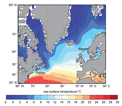
Figure 1 shows the relative locations of Bergen, Norway (60° N, 5° E) and, 1700 km closer to the Equator, Halifax, Nova Scotia (44° N, 63° W). As it is further south you might expect Halifax to be much warmer than Bergen. But you can see in Figure 2 that this is not the case.
-
What are the main differences between the atmospheric temperature cycles of Halifax and Bergen?
-
Halifax is warmer than Bergen in summer, but colder in winter.
The range between the maximum and minimum temperatures is also different; in Halifax it is ~24 °C (-6 °C to +18 °C), whereas in Bergen it is ~12 °C (~0 °C to +12 °C). It is only from May to the end of September that Halifax is warmer than Bergen. This arises because a vast quantity of heat is being supplied by the ocean. You can see this heat in Figure 1 because the colours representing equal sea surface temperature are not along lines of equal latitude. North of the Spanish coast water temperatures are warmer on the east side than the west. And it is a remnant of a warm water current called the Gulf Stream which flows across the Atlantic Ocean towards Northern Europe.
In subsequent sections you will see that the shape of the ocean basins (Section 2) combined with the properties of seawater (Section 3) and the ocean currents (Section 4) and the cryosphere are responsible for the Gulf Stream.
So far, you have seen how the oceans can influence regional climate. In the following sections you will investigate the reasons for this in more detail.
1.1 Summary of Section 1
- The oceans cover more than 70 per cent of the Earth.
- Heat is moved around the planet by the oceans and this heat affects regional climates.
2 Mapping the oceans
The saline oceanic water absorbs electromagnetic radiation very efficiently, so we can see very little of what lies beneath the surface. Because of this, more is known about the shape of the surface of the Moon, Venus and Mars than about Earth. In this section you will explore how the ocean basins have been mapped, and examine some of the features of the ocean floor.
2.1 Mapping the deep
Until the late 1930s the only way to measure the depth of the ocean was to use a line with a weight on the end. For example, in 1521 Ferdinand Magellan stopped his ships in the Pacific Ocean during the first circumnavigation of the globe and lowered such a line. After paying out all the line they had he was sure that the weight had not touched the bottom, but how deep was it? He knew the ocean was deeper than his 400 fathoms of rope (~730 m) – so he concluded that his ship was over the greatest depths in the oceans!
2.1.1 Bathymetry techniques
The development and use of a technique called sonar (SOund Navigation And Ranging) revolutionised the investigation of the oceans' depths. Originally developed for hunting submarines, in sonar a ship sends out a pulse of sound (a 'ping'), which is reflected by the target and the reflected sound wave is detected. It was soon realised that if they were 'loud' enough the underwater pings could detect the sea floor. If you measure the time it takes for a reflected ping to be heard and know the speed of sound in water, then you can derive the water depth. Using sonar, ships could record continuous depth measurements without stopping.
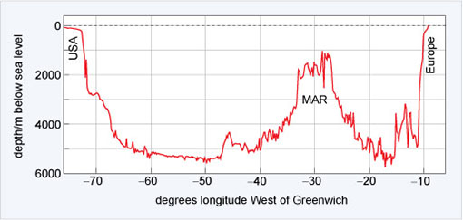
Figure 3 shows the bathymetry (i.e. depth measurement) across the North Atlantic Ocean along a latitude close to 39° N. At the point −30° W is the Mid-Atlantic Ridge (MAR).The variability in depth is astonishing.
A further technological development in the late 20th century has enabled scientists to derive bathymetry using data from satellites orbiting the Earth at unprecedented resolution. But because of the way the satellites orbit the Earth the resolution of the data decreases towards the North and South Poles.
-
What will happen to the amount of detail that can be seen if the resolution of the data decreases?
-
It will also decrease.
Imagine what a height contour map of a mountain range would look like if you had only one average height in each 10 km square - many hills and valleys would simply disappear.
2.1.2 Bathymetric data online
Today some of the very best bathymetric data are freely available online, as you will see from Activity 1. Here, you will use Google Earth to investigate some of the features of the ocean floor and to navigate around using latitude and longitude.
Activity 1 The ocean depths
Part 1: Downloading and exploring a layered data file
Note: to complete every part of this activity, you will need to install the desktop version of Google Earth.
First watch Video 1, which demonstrates how to use Google Earth to look at the ocean. (You need to view this video in 'Full Screen' mode to see the details.)
Transcript: Video 1 Using Google Earth to look at the ocean.
Question 1
Using Google Earth find out the water depth at ~47° 34′ N, 7° 33′ 30″ W.
Answer
The most straightforward way is to type 47 34 N 7 34 W in the 'Search' box, then use your mouse and the latitude and longitude information on the bottom right to move your cursor to the correct point and so find the water depth at 47°34′ N, 7° 33′ 30″ W.
The water depth is approximately 1103 m.
Question 2
By moving your pointer, find out the approximate water depth off the coast of France and the depth of the darker (and so deeper) region to the west.
Answer
The water depth off the west coast of France is approximately 120 m and the depth in the dark blue region to the west is ~4600 m.
The light blue region is called the continental shelf and the deeper region is called the abyssal plain. The area between these two regions is the continental slope.
Task 2
Now download the Activity 1 data file to your computer and open it in the desktop version of Google Earth. Video 2 demonstrates how to use Google Earth with a file containing information in layers.
Instructions for downloading and opening the data file
Note: the file for this activity may download as a '.zip' file. If so, you will need to change the file extension to '.kmz' in order to open it easily in Google Earth. You can do this selecting the 'Save as' option when you download the file and changing the extension so that the file name ends in '.kmz' (i.e. 's206_1_activity_1.kmz'), then saving the file to your computer.
You may find that double-clicking on your saved data file automatically causes Google Earth to open. However, if this does not happen, you can open the file manually from the 'File' menu in Google Earth by clicking on 'Open…' and then using the resulting dialogue box to navigate to where you saved the data file, selecting it, and clicking 'Open'.
Transcript: Video 2 Using Google Earth with a file containing information in layers.
Having watched the video, now answer the question below.
Question 3
Open the Google Earth layer 'Depth Section across the continental slope'. This yellow line represents a depth transect across the continental shelf, the continental slope and the abyssal plain.
Using the technique demonstrated in Video 2, what is the average depth and slope of the continental shelf, the abyssal plain and the continental slope? Also record the length of the section you highlighted.
Answer
The average depth and slope of the continental shelf, abyssal plain and the length of the transect length over which the average is generated is shown in Table 1.
| Location | Average depth/m | Average slope/° | Transect length/km |
|---|---|---|---|
| Continental shelf | ~159 | 0.2 | 50 |
| Abyssal plain | ~4727 | 0.2 and 1.0 | 27 |
| Continental slope | ~2467 | 0.4 and -7.5 | 49 |
From your measurements you should be able to see that both the continental shelf and the abyssal plain are astonishingly flat. A slope of between 0.2° and -0.2° over 50 km is flatter than anything one would observe on land. And despite the continental slope looking steep, the average slope is only -7.5°. Features look abrupt and steep in Google Earth and in the way relative heights in charts are represented, when in fact they are not.
Task 3
Now watch Video 3 from the United States National Oceanic and Atmospheric Administration (NOAA), which shows some of the features of the sea floor using the same data you are using in Google Earth.
Part 2: Examining other features
Exploring ridges and trenches
Now watch Video 4 which demonstrates how to measure some of the other layers in the Google Earth file you have downloaded.
Transcript: Video 4 Demonstration on how to use layers with Google Earth.
The extremely large mid-ocean ridge and the trenches that you saw in Video 3 are part of the tectonic plate system of the planet. Using the Google Earth layers, explore some of the features you saw in Video 3: the mid-ocean ridge, and the sections across the Marianas Trench (the deepest known location), the Scotia Sea Trench (a more typical ocean trench) and the section shown in Figure 3. You should investigate and note the depths, gradients and general features you observe.
At divergent plate boundaries, tectonic plates are moving apart and new sea floor is being created in undersea volcanic eruptions. In convergent boundaries sea floor is being destroyed.
Question 4
Which sort of tectonic boundary are the Mid-Atlantic Ridge, the Marianas Trench and the Scotia Sea Trench?
Answer
The Mid-Atlantic Ridge is a divergent boundary whereas the Marianas and the Scotia Sea Trenches are on convergent boundaries.
Exploring undersea vents
One of the most exciting discoveries in marine geology of recent years was the discovery of hydrothermal vents, where very hot water escapes from the Earth's crust into the oceans. If you click in the open box next to 'vents_InteRidge_2011_all.kml', all of the undersea vents known up to 2011 will be displayed on your map. The different coloured symbols indicate whether the vent has been directly or indirectly observed, and whether it is active or not.
Question 5
Are the vents typically found on divergent or convergent boundaries?
Answer
Overlaying the vent locations on the tectonic boundaries shows that the vents are typically found on divergent boundaries.
Task 4
To get an idea of the physical environment of a deep-sea vent, now watch Video 5 from the BBC series Planet Earth, and answer the questions that follow.
Transcript: Video 5 Physical environment of a deep-sea vent.
Question 6
Why is the water leaving the vents like billowing black smoke?
Answer
It is extremely hot and the water contains a chemical cocktail. The sulfides in the water solidify into chimneys and are presumably colouring the water black.
Question 7
How is life able to survive around the deep-sea vents?
Answer
A particular type of bacterium can use the chemicals in the hot water, and this in turn is eaten by shrimps and other animals.
Question 8
What are the fastest-growing marine invertebrates?
Answer
Giant tube worms are the fastest-growing invertebrates.
Question 9
Why do the animals on a deep-sea vent lead a tenuous existence?
Answer
Each community is unique and vents can start and stop rapidly. When they stop, the inhabitants will die.
Exploring Arctic gateways
For the final part of this activity, click in the open box next to the file called 'Arctic Gateways'. This file contains two transects: 'The Bering Strait' and 'The Greenland-Iceland-Scotland Gap'.
Question 10
Looking at the bathymetry across the two transects, which has the deepest depths from the Arctic to the rest of the global ocean? Is it the transect between the Pacific and the Arctic Ocean or the transect between the North Atlantic and the Arctic Ocean?
Answer
The deepest depths are between the North Atlantic and the Arctic Ocean along the Greenland to Scotland transect. Here water depths are in one region > 1000 m. The shallowest depths are between the Pacific and the Arctic Ocean across the Bering Strait, and water depths are only ~ 50 m.
You will see later in the course that the difference in maximum depths between the two ocean basins is critical for the circulation of the global oceans.
2.2 Summary of Section 2
- Typical features of the oceanic sea floor include the continental shelf, abyssal plains and mid-ocean ridges.
- Deep-sea vents provide a unique habitat far from the energy of the Sun.
- The deep passages to the northern seas are only in the Atlantic Ocean and they are relatively shallow.
3 Seawater
The presence of dissolved salts radically changes the physical properties of water.
In this section you will look at some of these properties and the typical vertical distribution of salinity and temperature throughout the oceans.
3.1 Salt in the oceans
The saltiness in seawater is due to a mixture of many different ionic constituents. If you boiled away 1 kg of seawater in a pan you would find, on average, 34.482 g of solid material left. (You would probably end up with less salt as some ionic constituents would form gases.) Almost 99.95% of the total mass of this solid material is made up of the constituents listed in Table 2.
| Ion | % by mass of 34.482 g | Weight/g kg−1 |
|---|---|---|
| Chloride Cl− | 55.04 | 18.980 |
| Sulfate SO42− | 7.68 | 2.649 |
| Hydrogen carbonate, HCO3− | 0.41 | 0.140 |
| Bromide, Br− | 0.19 | 0.065 |
| Borate, H2BO3− | 0.07 | 0.026 |
| Fluoride, F− | 0.003 | 0.001 |
| Sodium, Na+ | 30.61 | 10.556 |
| Magnesium, Mg2+ | 3.69 | 1.272 |
| Calcium, Ca2+ | 1.16 | 0.400 |
| Potassium, K+ | 1.10 | 0.380 |
| Strontium, Sr2+ | 0.04 | 0.013 |
Quantitative analysis of the salt content in different oceans shows that although the total amount of dissolved salt varies from place to place, the major elements are always present in the same relative proportions. This amazing fact is called the principle of constancy of composition.
-
If the ratio of the amounts of the ions of K+ to Cl− in the Atlantic Ocean was 0.02, what would be the ratio of the two ions in the Pacific Ocean?
-
The ratio of the K+ to Cl− ions would be exactly the same at 0.02, because of the constancy of composition of seawater.
The dissolved salts mean that seawater conducts electricity well and conductivity is directly proportional to the salt content. Salinity is defined by comparing the conductivity of a water sample with that of a reference sample of 'standard seawater'. Since salinity is effectively describing a ratio it has no units - but it can be labelled 'practical salinity units' (PSU). In older books and on some websites, you may find salinity expressed in parts per thousand (abbreviated to ppt or given the symbol ‰). While this is technically incorrect, for all practical purposes they are equivalent. The salt composition in the global oceans has not significantly varied in the last 108 years. The residence time of seawater is ~4000 years. So the processes that add salt to the ocean and the processes that remove salt from the ocean must be in balance.
The salinity of seawater of average ocean density is 34.482.
3.2 The density of fresh water and seawater
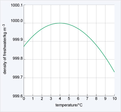
Fresh water and seawater have very different physical properties. Imagine a freshwater lake in winter. As the air temperature falls the temperature of the water at the surface decreases and its density changes (Figure 4).
-
What is the temperature at maximum density?
-
The maximum density is at ~4 °C (Figure 4). At both lower and higher temperatures than this the water is less dense.
While it is hard to see on the scale in Figure 4, the maximum density is at 3.98 °C. As a lake cools to this temperature in winter the surface waters will sink through convection and warmer water rises to the surface. With continued cooling this warmer surface water also becomes dense and sinks. As the surface water is being cooled the lake will become stratified. That is, the density will increase with depth to 1000 kg m−3, and the deep water will have a temperature of 3.98 °C. Imagine the convection continuing until all the water has reached 3.98 °C.
-
What will happen to the water in the lake when all the water is cooled below to 3.98 °C?
-
The water at the surface of the lake will cool and become less dense. This means that it will not sink away from the surface. So the lake will end up with a cool surface layer with warmer, denser water beneath.
Eventually the surface layer of water will be cooled to the freezing point (0 °C) and ice will form on the surface. At this point the temperature and density of the water will have a structure like that shown in Figure 5.
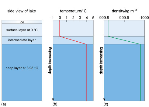
Figures 5b and c show that the temperature and the density increase with depth from the surface to the bottom layer, where the temperature is 3.98 °C and density is at its maximum.
Let us think about this a little more.
Usually when a liquid is heated the molecules acquire more energy and become more widely spaced, so in the same volume, the density decreases. In fresh water the opposite may happen, depending on the temperature. When fresh water at 3.97 °C (Figure 4) is cooled the density will decrease. You know from the lake (Figure 5) that ice (i.e. solid water) is less dense and floats. But cooling a liquid usually packs the molecules more closely, which increases the density. This means that below 3.98 °C cooling results in the water molecules spacing out and both the liquid and the solid water below this temperature expand. This is an amazing physical property and is why pipes burst and water in cracks shatters rocks in cold temperatures. The molecular structure of a water molecule is shown in Figure 6.
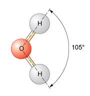
In H2O, the oxygen and the hydrogen atoms share electrons, and the angle between the two hydrogen atoms is 105°. This results in a small net negative charge on the oxygen side of the molecule, and a small net positive charge on the hydrogen side. This is a polar structure in which molecules are weakly attracted to each other and form weak 'hydrogen bonds'. At low temperatures a more ordered packing of water molecules develops and the density is reduced. If the temperature is increased but is <3.98 °C, the hydrogen bonds break, but the molecules still pack together closely. Above 3.98 °C, the increase in internal energy means the molecules become more widely spaced and, following Figure 4, the density decreases.
Seawater is saline and the salt affects the density. Figure 7 shows the vertical structure of the temperature, salinity, and density at latitude 20° S in the Atlantic Ocean over an abyssal plain almost 5300 m deep.
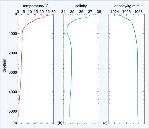
Figure 7a shows 28 °C temperature at the surface to below 1 °C at the sea floor. The variation in salinity in 7b clearly affects the temperature of maximum density shown in 7c. The seawater density ranges from 1024 to 1028 kg m−3, ~24-28 kg m−3 denser than fresh water (Figure 4), and density increases with depth and the water is stratified all the way to the sea floor (although >3 000 m depth there is only a small increase). Because seawater is typically 1024-1028 kg m−3 there is a density anomaly, σt (pronounced 'sigma t') given by:
where ρ is the density of water.
-
What is the range of σt for typical seawater?
-
The density anomaly for typical seawater is in the range 24-28 kg m−3.
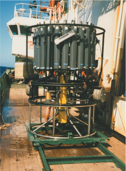
Box 1 explains how the physical properties shown in Figure 7 are measured.
Box 1 Measuring the physical properties of the ocean
Much of our knowledge about how the oceans circulate is based on measuring the various parameters such as temperature and salinity from the surface to the sea floor. The water which makes up this range is called the water column. The most important instrument used by oceanographers is called a CTD (Figure 8), which measures the conductivity and temperature of the seawater and depth (pressure).
Because pressure in the ocean is proportional to the weight of the water above, it is given by the hydrostatic equation:
where p is pressure, z is a change in depth and g is the acceleration due to gravity. The minus sign indicates that the vertical coordinate z (depth) is positive in an upwards direction. So by measuring pressure, Equation 2 can be arranged to get depth.
Other parameters can also be measured, such as sediment particle density, the amount of chlorophyll present (in algae), and so on. A CTD is lowered from a ship on a winch at a rate of ~60 m min−1. If the ocean is 5300 m deep, as in Figure 7, a round trip is 10 600 m and one profile can take almost three hours.
3.3 The surface properties of the oceans
The surface properties are the parts of the ocean that are most familiar to humans. They are also relatively straightforward to observe, and reveal a surprising amount about the underlying circulation.
The following sections explore briefly two of the fundamental properties of oceanic surface water.
3.3.1 The surface temperature
The only significant source of energy heating the oceans is from the absorption of solar radiation arriving at the surface. The low albedo of water means that most solar radiation is absorbed to heat the surface - and generally, the greater the intensity of the incoming solar energy, the warmer the water (Figure 9).
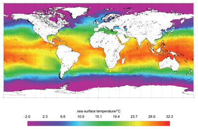
In general, the sea-surface temperature (SST) is colder at high latitudes and warmer in the mid-latitude and equatorial regions, but there are exceptions. For example, the North Atlantic coast of Africa has an SST of ~15 °C compared with >28 °C at the same latitude on the other side of the Atlantic. Note the light blue along the northwest European coast (see Figure 1), and the green 'tongue' of water extending up the west coast of South America. Clearly, there is more to the surface temperature distribution than simply incoming solar energy. The heat must be being redistributed.
3.3.2 The surface salinity
Sea-surface salinity is determined by two competing processes: precipitation and evaporation. Precipitation (P) (including rain and river flow) reduces the salinity of the sea surface while evaporation (E) increases surface salinity by the removal of water. The (E-P) balance is shown in Figure 10 along with the resulting approximate global surface salinity distribution.
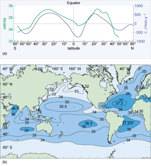
A negative E-P value freshens the sea surface, and the shape of the purple line in Figure 10a is interesting. The 'M' shape between 60° S and 60° N shows positive peaks at ~25° S and 20° N due to decreased rainfall and high evaporation, while the trough is due to high rainfall and river inputs.
Figure 10b shows a striking difference between the Atlantic and the Pacific Oceans: the salinity in the Atlantic is much higher. In the Pacific Ocean, lines of equal salinity, called isohalines, tend to follow lines of latitude, but not in the Atlantic because of the ocean's circulation. Another example can be seen off the coast of Portugal where less saline waters extend southwards. Like the SST, the surface salinity is being redistributed.
3.4 The vertical distribution of properties
The properties of the ocean surface are changed by (E-P) and solar input but, as you have already seen in Figure 7, there are variations in these properties with depth.
-
How can surface changes be carried deeper into the ocean?
-
The energy can be transported downwards by the conduction of heat and diffusion of salt, and by being mixed up by the wind.
Both conduction and diffusion in the ocean are slow processes that can effectively be ignored. It is the effect of the wind on the surface of the ocean that dominates. Wind creates turbulence, thus mixing water to create a layer of almost constant temperature, salinity and density called the wind-mixed layer (Figure 11).
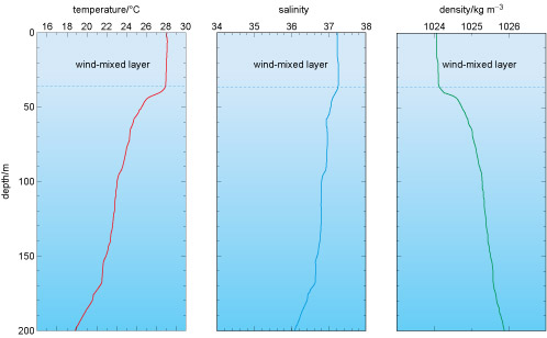
Figure 11a shows the surface-mixed layer is approximately 38 m thick, with a temperature of ~28 °C, salinity of 37.2, and density of 1024 kg m−3. In locations where the winds are particularly strong, the mixed layer can be up to 200 m thick. Beneath the mixed layer temperature and salinity both decrease down to ~800 m depth (Figure 7). This region of rapidly decreasing temperature is called the permanent thermocline; below this, the water temperature decreases to <1 °C at the sea floor. While the temperature and salinity vary with depth, the density - which is a function of both - continues to increase.
Figure 12 shows a plot of temperature against salinity. The x-axis shows salinity and the y-axis is temperature. The density anomaly σt of seawater is shown by the contours (red lines), which are labelled in kg m−3.
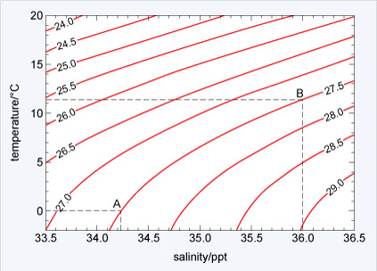
Figure 12 has two labelled points: A has a temperature of 0 °C and salinity of 34.23; point B has a temperature of 11.4 °C and salinity of 36.0. But you can see that both points lie on top of the 27.5 kg m−3 σt contour. Despite a very different temperature and salinity they have the same density anomaly. One final, very important point is that Figure 12 shows that the gradient of the density anomaly lines is not constant. If you look at point A, keeping salinity constant but increasing the temperature to +5 °C will decrease the density anomaly to approximately the 27.1 kg m−3 σt contour - a change of 0.4 kg m−3 (27.5-27.1). At point B, keeping the salinity constant but increasing the temperature by +5 °C to 16.4 °C would decrease the density anomaly to approximately the 25.9 kg m−3 σt contour - a change of 1.6 kg m−3 (27.5-25.9). This non-linear response is also clear if you keep temperature constant and vary salinity, and while there is a simple equation to calculate density in fresh water, the equivalent for saline water is very complicated.
-
What is the density anomaly of seawater with a temperature of 15 °C and a salinity of 35.0?
-
Using Figure 12 the density anomaly of seawater can be determined as σt = 26.0 kg m−3.
3.5 The water properties along the Atlantic Ocean
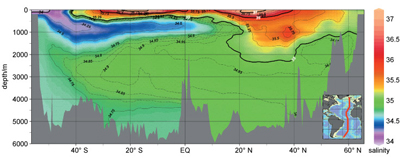
So far, you have looked at single profiles in one location. Figure 13 shows a line of CTD measurements called a hydrographic section. It shows the temperature and salinity distribution along the length of the Atlantic Ocean.
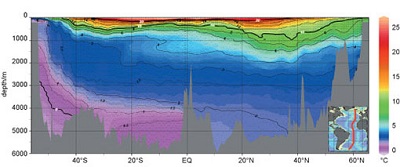
Figure 13 includes data from >120 CTDs and is created by plotting the latitude of each CTD station as the x-axis (which is over 11 000 km long), the y-axis as the depth measurements and colours representing equal temperatures and salinities measured at the CTD stations.
In Figure 13 the black lines of equal temperature - called isotherms - are superimposed on the colours and 0 °C, 10 °C and 20 °C are bold lines with white numbers. The spiky grey shaded region at the bottom of the plot is the sea floor along the section similar to that shown in Figure 3. The red line on the inset map shows the location of the section.
In the upper 1000 m the range of temperatures is very large (from blue to bright red) and the temperature can change as much as 20 °C. The isotherms are a squashed 'W' shape and are generally shallow at high latitudes above 40° N and 40° S, at their deepest points at about 30° N and 30° S, and shallow again at the Equator. Below 1000 m to the sea floor the temperature change is relatively small (4-5 °C). The isotherms at these depths have a 'U' shape across the Atlantic Ocean, rising towards the poles and deepest around the Equator. The mauve region in the south which contains the 0 °C water is close to the surface at 50° S. This is very cold water from the Antarctic that is descending and spreading throughout the deep ocean to be stopped by the seamounts of the Mid-Atlantic Ridge.
-
Is there ice in the deep ocean close to Antarctica?
-
No, there is no ice at this depth. Just as in fresh water, the ice would float because of the molecular structure of H2O. The salt in the seawater has lowered the freezing point of the water below 0 °C.
-
Based on what you have already learned, think of reasons why very cold water formed in the Arctic does not spread out through the deep ocean.
-
When exploring with Google Earth you found that the gateways from the Arctic to the rest of the global ocean are relatively shallow. The densest cold Arctic water is not able to enter the rest of the global ocean.
Finally, Figure 13 shows that at the Equator the temperature between the surface and the sea floor varies over a wide range - almost 30 °C. In higher latitudes the temperature range between the surface and the sea floor is very much reduced, for example at 52° S the range is only ~3.5 °C. Solar radiation is mostly responsible for heating the surface of the ocean, and the lack of solar radiation in the high-latitude regions is responsible for cooling the surface. Waters of different temperature are then spread throughout the oceans because colder water is denser and sinks beneath the warmer waters.
The salinity distribution in Figure 14 is more complicated. It is almost as though a clockwise circulation is wrapping the colours up. The very low-salinity, mauve-coloured water at the surface at about 50° S sinks and extends north at ~900 m depth. This implies that the low-salinity water at about 800 m depth in the salinity profile in Figure 7 originates in the Antarctic. North of this blue 'tongue' of water, there is an orange-yellow patch of water between 20 and 40° N of salinity ~35.5. Lastly, note that in the South Atlantic water below 4000 m must be the most dense - denser than the fresher water from the north.
In Section 4 you will see that both Figures 13 and 14 show features which are a result of the circulation of the ocean.
3.6 Summary of Section 3
- The constancy of composition means that the ratio of many different dissolved salt ions in seawater is constant.
- Water has very unusual physical and chemical properties and the polar molecular structure means that in fresh water maximum density is not the freezing point. However, in seawater this is different and density is a non-linear function of temperature and salinity.
- Seawater is heated at the surface by solar radiation and the salinity of seawater is controlled by the balance between evaporation and precipitation, E-P.
4 Ocean currents
In Section 1 it was noted that ocean currents can affect regional climate and the global surface distribution of temperature and salinity. In this section the focus is on surface currents and the three-dimensional global ocean circulation. You will learn that what drives this complex three-dimensional system is ultimately due to the energy from the Sun.
4.1 The global surface circulation
Unusual items washed up on beaches indicate the existence of ocean currents. For example, tree trunks are often washed up on the beaches of eastern Greenland - yet no trees have grown there for thousands of years. Figure 15 is a schematic diagram of the surface currents.
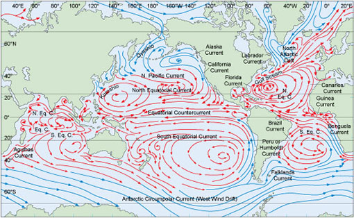
The fresher waters off the coast of Portugal mentioned in reference to Figure 10 are part of a vast clockwise surface circulation in the North Atlantic which consists of the Gulf Stream, the North Atlantic Current and the North Equatorial Current. This clockwise circulation is reflected in an anticlockwise pattern in the South Atlantic Ocean.
In the Pacific Ocean a similar clockwise pattern exists in the Northern Hemisphere and likewise an anticlockwise pattern in the Southern Hemisphere. The main difference between the two oceans is that the circulation in the Pacific Ocean is orientated more along lines of latitude than that in the Atlantic Ocean.
In the higher latitudes of the Northern and Southern Hemispheres the situation is different:
- the north has a series of smaller closed circulation
- the south has a continuous current around the Antarctic continent called the Antarctic Circumpolar Current.
4.2 The effect of the wind on the oceans
The wind provides one of the main forces that move the surface of the oceans. When the wind moves across water, surface friction transfers energy from the wind to the water through wind stress. Wind stress has the Greek symbol τ (tau) and is proportional to the square of the wind speed, W:
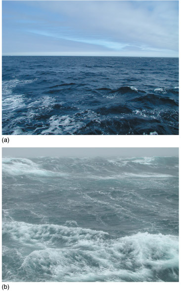
where c is the constant of proportionality. So if the wind speed increases from 1 m s−1 to 4 m s−1 then wind stress will increase by a factor of 16. This large jump in the wind stress happens because when the winds are weak, the surface of the ocean is relatively flat (Figure 16a) and there are few wave tops for the wind to push against. As energy is transferred from the wind to the ocean, the surface becomes rougher and 'stretched', so more of the surface is in contact with the wind (Figure 16b). The increased surface area leads to more energy being transferred to the ocean and larger surface waves.
Once the surface of the water is moving, some of the wind's energy is transferred downwards into the water column through internal friction called eddy viscosity. The result is that momentum is transferred downwards and the mixed layers you saw in Figure 11 develop.
-
What effect will a rise in wind speed have on the thickness of the layer of well-mixed water?
-
It will increase because the surface waters will be mixed to a greater depth as more energy is supplied.
When the wind blows across the oceans, the surface waters are mixed and they start to move. But the direction of movement is not simply the same as the direction of the winds. The Earth is rotating and moving currents are affected by the Coriolis force, which arises from the rotation of the planet. Moving objects in the Northern Hemisphere are deflected to the right and those in the Southern Hemisphere are deflected to the left. The understanding of how the rotation of the planet affects moving ocean currents was developed through an experiment in the polar seas as described next.
4.3 Ekman drift
The obvious way to observe whether the oceans move in the direction of the winds is to follow a floating object. Early Arctic explorers noted that icebergs did not drift exactly in the direction of the winds, but 20-40° to the right of the wind direction. The Swedish mathematician Vagn Ekman developed a theory of wind-driven ocean currents to explain this observation. He started with the theoretical idea of an infinitely deep and wide ocean with no variations in density and imagined the ocean as a series of infinite horizontal layers.
A wind will move the surface through wind stress, but the surface is then acted upon by the Coriolis force and so is deflected to the right (in the Northern Hemisphere). This moving surface layer is also acted upon by friction with its lower surface - the eddy viscosity - and the layer underneath starts to move. But the transfer of momentum by friction is an inefficient process and the energy transferred is greatly reduced. This means that when the forces are in balance, the speed of the second layer down will be much less than that of the top layer. In the second layer the balance of forces means that it too is deflected to the right by the Coriolis force. This second layer is in contact with the deeper third layer and exactly the same processes happen there, and so on.
The result is that the energy transferred downwards significantly decreases with each layer and, more importantly, each layer will be deflected progressively to the right (in the Northern Hemisphere). The consequent rotation pattern in the upper layers of the ocean is called the Ekman spiral (Figure 17). The total depth of the frictional influence of the wind is called the Ekman layer.
Ekman found that, in his ideal ocean, the direction of the surface current will be approximately 45° to the right of the wind direction in the Northern Hemisphere, and 45° to the left of the wind direction in the Southern Hemisphere. A limitation of Ekman's theory is that the oceans are not infinitely wide and deep and that the eddy viscosity (that is, the friction between successive layers) varies with depth.
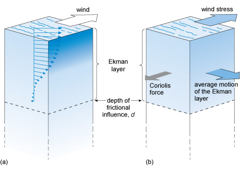
The most important point about Ekman's theory is that there is a layer of water (shown in Figure 17) at the surface (not necessarily the same thickness as the mixed layer) which is influenced by the wind and moves with a mean current called the Ekman drift over the depth of the Ekman layer. This is to the right of the wind direction in the Northern Hemisphere and the left in the Southern Hemisphere. Under typical conditions the depth of the Ekman drift is strongly influenced by the thickness of the mixed layer and is largely dependent on the time of year and wind speed, typically varying from tens of metres up to 200 m.
From the Ekman drift velocity and the depth over which it acts, the total transport of water due to the Ekman drift, called the Ekman transport, can be calculated. Armed with this basic theory of the wind-driven surface circulation, you can now investigate the effect of the global surface winds (Figure 18) on the oceans.
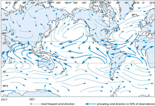
Figure 18 compares well with the map of mean surface currents in Figure 15. Where surface currents join in continuous circulation patterns as in the North Atlantic, the effect of the Ekman drift is striking.
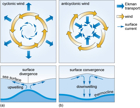
4.4 Divergence and convergence
Focusing on a closed surface wind circulation such as that in the North Atlantic Ocean (Figure 18), you can see a clockwise pattern repeated in the sea-surface current map in Figure 15. A large closed surface water circulation is called a gyre, and this particular one is the North Atlantic Gyre.
-
What will be the effect of Ekman drift in the centre of the North Atlantic Gyre?
-
There will be a slow movement of water into the centre of the gyre.
The drift of water into the centre of the gyre causes a surface convergence that pools water and actually raises the surface of the ocean by approximately a metre.
-
What will happen to the level of water in the centre of a gyre in the Northern Hemisphere where the circulation of the winds and surface currents is anticlockwise?
-
There will be a divergence. This will depress the surface of the ocean.
A clockwise circulation is called anticyclonic, and an anticlockwise one is cyclonic. Because of Ekman transport, an anticyclonic circulation causes a convergence of surface waters and a cyclonic circulation a divergence. Figure 19 shows that surface convergence and divergence have an effect beneath the surface.
4.5 Surface water masses
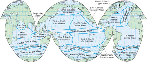
The surface circulation patterns (Figure 15) and the resulting Ekman drift can be compared with the SST (Figure 9) and the sea-surface salinity (Figure 10b). There are large volumes of water in the mixed layers where both the temperature and salinity are relatively constant. Such a water volume with relatively constant temperature and salinity is called a water mass. Section 3 noted that the surface temperature and salinity are determined by the regional climate and so water masses are regionally named (Figure 20).
-
Would all of the surface water masses shown in Figure 20 have the same density anomaly? Hint - you may have to look at Figures 9, 10b and 12.
-
No, they would not. The density of water is a function of temperature and salinity, and each water mass has a different temperature and salinity value. You can see from Figure 12 that different temperatures and salinities lead to different densities.
4.6 The frozen seas
Because of the effects of temperature and salinity on the density of seawater (Figure 12), the cold polar seas have a tremendous climate impact on the rest of the planet.
Ice forms first as small crystals called frazil ice. These form at the surface and develop a layer that looks similar to an oil slick (Figure 21a). The crystals then coalesce to form small plates called pancake ice, which have rounded edges caused by constantly being bumped (Figure 21b). As more seawater freezes, the pancakes grow up to 3 m in diameter and eventually freeze together or are piled up on top of each other by storms to form larger ice floes. Water can freeze onto the bottom and snow falls on the surface, increasing their thickness to typically more than 2 m (Figure 21c).
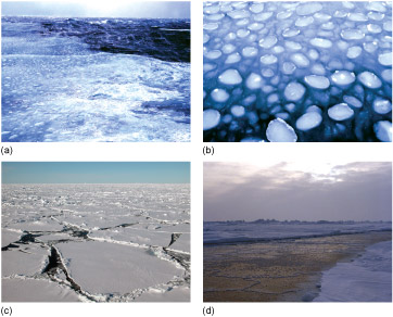
A large area of this ice is called pack ice or simply 'the pack'. When conditions are calm the frazil ice can develop directly into large sheets of ice and so miss out the pancake stage. The ice floes can be kilometres wide and the gaps between individual floes small. The breakup of sea ice is not simply the reverse of the sequence when ice grows; the large ice floes break up into small floes and then melt straight into water.
Activity 2 Sea ice in the climate system
Part 1: The growth of sea ice
Watch Video 6 about the process of sea ice generation, recorded for the BBC television series Life in the Freezer. Make notes as you watch it. Once you have watched the video, try to answer the questions below.
Transcript: Video 6 Process of sea ice generation.
Question 1
At what temperature does the sea freeze?
Answer
The commentary says that the sea begins to freeze at -1.9 °C.
Question 2
What causes the sea ice crystals to develop into pancake ice?
Answer
A slight swell on the surface of the ocean causes the crystals to coalesce and form the pancakes.
One feature notable by its absence in the clip you have just viewed is bad weather! That clip clearly focuses on film recorded either from the shore or in calm seas. Undoubtedly, most of the sea ice growth that happens at both poles takes place in winter, and in bad weather.
Part 2: Sea ice growth in Antarctica
Video 7 was recorded by satellite and shows the ocean around Antarctica covered by sea ice. At the bottom of the map is the date, on the left-hand side the day of the year, and on the right-hand side the day, month and year. Green, yellow, red and purple represent sea ice concentration, light blue represents open water and the grey areas represent land such as Antarctica and South America. View the clip now and focus on where the ice remains throughout the entire Antarctic summer.
Question 3
Where does the sea ice remain throughout the Antarctic summer?
Answer
In January 1998, the sea ice remains mainly close to the coasts and in one location called the Weddell Sea.
Question 4
Now view Video 8. It shows the same information as the previous clip but much faster. This time focus on the proportion of the year that the sea ice is growing compared with the proportion of time that it is decaying.
Does the sea ice in Antarctica grow and melt at the same rate throughout the year?
Answer
No, the cycle is asymmetric. The sea ice grows over a longer period (~6 months) than its seemingly rapid retreat (~4 months).
Part 3: Sea ice growth in the Arctic
The Arctic Ocean is a deep sea covered by a relatively thin layer of sea ice a few metres thick. Video 9 is quite long, so you should start it now and then read the explanation below as you are watching it.
In the video the white and shades of light to dark blue that are expanding and shrinking show the concentration of sea ice similar to that in the previous clips in the Antarctic. This was recorded by the same satellite as previously. The date for the ice concentration is shown in the top left corner as year-month-day, so '1994 7 16' represents the ice concentration on 16 July 1994.
Finally, there are the locations and drift tracks of what are called IABP buoys. This stands for International Arctic Buoy Programme buoys: small scientific packages which are deployed on the ice and report their position and weather data such as air temperature and air pressure. The location of the actual scientific package is shown as a red dot and there is a trail showing where the buoy has been. When the ice melts the buoy sinks and then is lost.
Watch the video all the way through and then try to answer the following questions.
Question 5
The drift of the buoys can be shown to represent the movement of the sea ice, ocean currents and winds. However, the drift is generally not smooth: why do you think this might be?
Answer
The buoys sit on the sea ice and so are moved about by the winds. Storms will make them drift both faster and more slowly and in different directions, as will ocean currents.
Question 6
In the bottom left quadrant of the picture is the Beaufort Sea. What is the general sense of movement of the ice which the buoy tracks reveal?
Answer
The buoys drift generally in a clockwise direction around the Beaufort Sea - although sometimes this occasionally completely reverses.
Question 7
In some areas the buoy tracks are almost stationary (i.e. they have short trails behind the red dots), but in other places they seem to drift relatively rapidly (they have long trails behind the red dots). Can you identify the regions where the drift appears to be the most rapid?
Answer
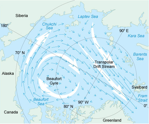
Within the Arctic Ocean the region above the pole shows the fastest drift, from the left-hand side of the frame to the right-hand side. Once the buoys pass the gap between Greenland and Svalbard they rapidly increase in speed, and then disappear as the ice they are resting on melts. Overall the drift of the sea ice in the Arctic can be divided into the clockwise so-called Beaufort Gyre and the transpolar drift as shown in Figure 22.
Question 8
The video of the Arctic showed the drift of the tracks of IABP buoys over (sometimes) many years. Based on what you saw in the distribution of Antarctic ice, why do you think that such buoy drift records have not been made for the Antarctic?
Answer
The videos of the Antarctic showed that most of the ice melts, so there would not be extensive tracks over many years. In areas where the ice does remain over the summer, such as the Weddell and Ross Seas, the drift has been shown to be clockwise.
Further information
Follow the link below if you would like to find out more about the voyage of the Fram when the eminent Norwegian scientist Fridtjof Nansen used the Transpolar Drift Stream in his attempt to reach the North Pole.
Follow the link below if you want to know more about Ernest Shackleton's drift across the Weddell Sea in a clockwise direction when his ship - the Endurance - was crushed in the ice.
4.7 The global ocean circulation
As seawater freezes and ice is formed in the annual cycles you saw in Activity 2, salt is squeezed from between the ice crystals into the ocean beneath in a process called salt rejection. The result is that if you took one pancake ice floe (Figure 21b) and melted it in a bucket, the water that resulted would be fresher than the seawater you started with. So what has happened to the salt?
The answer is it has increased the density of the seawater just beneath the ice. This is a small-scale physical process, but the effects are global and profound, as is clear from Figure 13. Salt rejection from sea ice generation in the Antarctic creates dense water which sinks and floods away from the continent. The coldest water is not the most saline; it is the combination of the cold temperatures and increased salinity that makes the water dense enough to sink to the sea floor.
The very large volume of water of uniform temperature and salinity flooding away from Antarctica is called Antarctic Bottom Water (AABW) because it is formed in the Antarctic and is dense enough to reach the bottom of the ocean and flow away from the continent. The lowest-salinity water at ~1000 m depth and ~40° S, coloured purple and blue in Figure 13, is formed by the climatic conditions in the mid-latitudes of the Southern Hemisphere and is not as dense as AABW.
You have investigated a section through the Atlantic Ocean, but had you looked at any section radiating from Antarctica along a particular longitude, the picture would have been broadly similar. The sea ice generation and resulting salt rejection is driving a cold, relatively salty, dense water current northwards along the sea floor at great depth.
If a deep, cold, salty current is flowing away at depth, there has to be water flowing towards Antarctica to replace it. Arctic salt rejection increases the density of the waters at the other end of the planet but, because of the shallow sea floor between Greenland, Iceland and the UK, the densest water is contained and cannot flow south. What can escape into the North Atlantic sinks to the sea floor, and so is called North Atlantic Deep Water (NADW). The resulting picture of ocean circulation in the Atlantic when these water masses meet is shown in Figure 23.
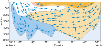
The dense AABW (coloured blue) spreads northwards along the sea floor and the NADW (brown) spreads south.
-
Based on Figure 23, which water mass is denser, AABW or NADW?
-
The NADW flows over the AABW so it must be less dense.
Figure 24 shows that NADW is both warmer and more saline than AABW, so it is less dense (Figure 23). However, the NADW is denser than the water mass coloured white and consequently is sandwiched between this and the AABW.
The actual boundaries between the layers are not as distinct as the colours in the picture would suggest, but overall there is an overturning circulation along the length of the Atlantic Ocean. In the Pacific and Indian Oceans the picture would be similar to Figure 23 south of the Equator, but the northern end would be different.
The Indian Ocean does not reach the Arctic, and in the Pacific Ocean, as you have seen, the gap between Asia and North America is so narrow and shallow that the ocean is virtually closed off to the north. This means that virtually all of the deep waters formed in the Arctic enter the global ocean in the North Atlantic. The result is a vast three-dimensional circulation across the entire global ocean called the thermohaline circulation ('thermohaline' meaning heat and salt) (Figure 24). This was proposed in the 1980s by American climate scientist Wallace Broecker. It is often referred to as the 'conveyor belt'.
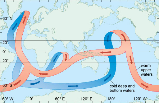
Figure 24 is of course a gross simplification, but it is useful to help you think about the way the global ocean circulates over hundreds of years. It makes clear that polar processes such as the sea ice growth can drive the global ocean circulation and move vast quantities of heat and salt around the planet. Ultimately it is these processes that are responsible for the sea surface temperature distribution you saw in Figure 1, making the UK and Norway warmer than locations at similar latitudes on the west side of the Atlantic.
-
What could be the effect of reduced deep-water formation in the North Atlantic Ocean on the climate of Western Europe?
-
Reduced deep-water formation in the North Atlantic could decrease the strength of the deep branch of the oceanic 'conveyor belt' in Figure 15. This could reduce the strength of the whole conveyor belt and so less heat would be carried from the Pacific Ocean into the Atlantic Ocean. Ultimately, it could lead to cooling of the climate of Western Europe.
Activity 3 The circulation of the oceans
Part 1: Ocean models
You are probably familiar with meteorological agencies such as the United Kingdom Meteorological Office (UKMO) using computer models to predict the weather. The models they use are 'coupled' models, with a model of the atmosphere and a model of the oceans passing data between them, which increases the accuracy of their predictions.
The latest high-resolution computer models need large computers to run them, and the results are both impressive and beautiful to watch. One large ocean model is called ECCO2, which stands for Estimating the Circulation and Climate of the Ocean, Phase II. It is easy to think of the ocean having a rather simplistic circulation pattern such as that shown in Figure 15, but that is only because it is hard to observe.
Video 10 shows modelled oceanic surface currents from June 2005 through to December 2007. Dark patterns under the ocean represent the undersea bathymetry. The land topography is exaggerated 20 times and the bathymetry is exaggerated by 40 times. When you have watched the clip, try to answer the questions below.
Question 1
What is the most surprising thing about the flow of water around the coast of South Africa?
Answer
From 37 seconds onwards in the clip you can see that, instead of a continuous flow of water, there are discrete, rapidly rotating patterns of closed circulation. These are called ocean eddies, and if you saw these patterns on a weather map you would call them storms.
Question 2
Is the strength of the currents the same on both sides of the northern Pacific and Atlantic oceans?
Answer
No, the current is stronger on the western side of each of these great oceans. These currents are called western boundary currents and they include the Gulf Stream and the Kuroshio. There are also western boundary currents in the Southern Hemisphere, but they rotate in the opposite direction.
Question 3
The previous video showed the surface currents. From the same ocean model Video 11 shows the sea surface temperature and the modelled sea ice concentration. What you will observe is the annual cycle of temperatures over several years. Note the difference in North Atlantic temperatures either side of the basin that was pointed out in Figure 1
Can you identify the western boundary currents and the ocean eddies around South Africa that were so clear in the previous video?
Answer
It is possible to see both of those features, although they are perhaps not as clear as in the previous visualisation.
Part 2: The thermohaline circulation
Video 12 shows an animation of the schematic thermohaline circulation shown in Figure 24. It is important to note that this animation is purely on our understanding of the global ocean circulation rather than model output like in the previous two videos. It is also important to remember that one complete circulation would take several hundred years.
The shading on the beginning of the animation represents water density. Bright regions are less dense shallow currents and lighter arrows are dense and deep currents. The depths of the oceans and land topography are highly exaggerated (100× in oceans, 20× on land) so that the depth differences in the currents show up more clearly. When you have seen the video, try to answer the questions before.
Question 4
Between Greenland, Iceland and Scotland, is the densest current flowing southwards in the location of the deepest channel you identified in Activity 1?
Answer
Yes, the densest current is flowing southwards just north of Scotland.
Question 5
In the western boundary current of the North Atlantic (the Gulf Stream), is the thermohaline circulation in the same direction at all depths?
Answer
No. It is only the surface waters that are flowing northeastwards towards Europe; at depth the waters are flowing in the opposite direction.
Question 6
In the previous videos you saw that the flow of water around South Africa appeared in the computer model output as a constant stream of eddies. How does this flow appear in the thermohaline circulation?
Answer
The constant stream of eddies around the coast is represented as a continuous flow of less dense water.
Question 7
What is the main difference between the representations of the flow of water around Antarctica in Figure 24 (above) and this video?
Answer
Figure 24 does not show a continuous clockwise circulation around Antarctica (the Antarctic Circumpolar Current - see Section 4.1), like the animation or the previous model output in this activity.
In this activity you have seen just how complex and beautiful the ocean circulation is.
Conclusion
- The effect of the wind stress on the surface of the ocean is passed down through the water column through eddy viscosity and energy is transferred into the water column.
- The net result of the Ekman spiral in the Northern Hemisphere is to cause a slow transport of moving water to the right of the wind. In the Southern Hemisphere it causes a slow transport of moving water to the left.
- Different climates produce water masses of different densities. Sea ice generation in the polar regions creates very dense water masses.
- The processes that drive a circulation pattern throughout the Atlantic Ocean also operate in the other oceans of the world. The differing densities of water have set up a global circulation pattern which is drawn schematically as an 'oceanic conveyor belt' that redistributes large amounts of heat around the Earth.
Keep on learning

Study another free course
There are more than 800 courses on OpenLearn for you to choose from on a range of subjects.
Find out more about all our free courses.
Take your studies further
Find out more about studying with The Open University by visiting our online prospectus.
If you are new to university study, you may be interested in our Access Courses or Certificates.
What's new from OpenLearn?
Sign up to our newsletter or view a sample.
For reference, full URLs to pages listed above:
OpenLearn - www.open.edu/ openlearn/ free-courses
Visiting our online prospectus - www.open.ac.uk/ courses
Access Courses - www.open.ac.uk/ courses/ do-it/ access
Certificates - www.open.ac.uk/ courses/ certificates-he
Newsletter - www.open.edu/ openlearn/ about-openlearn/ subscribe-the-openlearn-newsletter
Glossary
- abyssal plain
- The flat part of the ocean floor that lies between about 4 and 6 km below the sea surface.
- albedo
- The reflection coefficient of a surface - the fraction of the amount of incoming radiation that is reflected from a surface.
- Antarctic Bottom Water (AABW)
- Cold, dense bottom water mass that forms around the Antarctic continent (especially in the Ross and Weddell Seas) and spreads northwards in all three ocean basins.
- bathymetry
- The study of underwater depth of lake or ocean floors.
- constancy of composition
- The principle for seawater that, although the concentration of dissolved salts can vary from place to place, the relative proportions of the ions remains virtually constant.
- continental shelf
- The part of the ocean floor bordering the continents at a depth of 200 m or less below the sea surface.
- continental slope
- The part of the ocean floor extending from the edge of the continental shelf to the start of the continental rise. The continental slope has an average gradient of around 4deg.
- Coriolis force
- An apparent force invented to explain the deflection of bodies moving over the surface of the Earth without being frictionally bound to it. It acts 90° to the right of the direction of motion in the Northern Hemisphere, and 90° to the left in the Southern Hemisphere.
- eddy viscosity
- Internal friction between the molecules of a liquid that transfers momentum.
- Ekman drift
- The mean current across the Ekman layer.
- Ekman layer
- The depth of influence of the Ekman spiral.
- Ekman spiral
- The vertical spiral pattern of water velocities that develops in the upper ocean as a result of the Coriolis force acting on moving water. The pattern develops to the right in the Northern Hemisphere, and to the left in the Southern Hemisphere.
- Ekman transport
- The volume of water transported by the Ekman drift.
- frazil ice
- The initial form of sea ice: a slurry-like suspension of ice crystals.
- gyre
- A large-scale circulatory feature of the ocean circulation, usually extending across many thousands of kilometres.
- hydrographic section
- The standard way for presenting a series of CTD (seawater conductivity and temperature, and depth) measurements taken across an ocean or a feature in the ocean.
- hydrothermal vents
- Fissures on the seafloor out of which flows water that has been heated by underlying magma.
- isohalines
- Contour line joining points of equal salinity either on maps or in vertical sections.
- isotherms
- Contours of constant temperature.
- Mid-Atlantic Ridge (MAR)
- A north-south suboceanic ridge in the Atlantic Ocean from Iceland to Antarctica on whose crest are several groups of islands.
- North Atlantic Deep Water (NADW)
- Deep water mass formed mainly in the Norwegian and Greenland Seas.
- pack ice
- A mass of ice floating in the sea, formed by smaller pieces freezing together.
- pancake ice
- Sea ice rind broken up into pieces a few centimetres in diameter, with upturned edges resulting from multiple collisions.
- permanent thermocline
- The region beneath the mixed layer where temperature decreases with depth.
- salt rejection
- A process that occurs during sea ice formation where salt is pushed from forming ice into the surrounding seawater, increasing the salt concentration there.
- stratified
- (In the context of water) Where water masses with different properties of salinity, oxygenation, density and temperature form layers that act as barriers to water mixing.
- thermohaline circulation
- Global oceanic circulation through a series of strong currents, driven by deep water formation in the polar seas and heating of water in the tropical seas; an effect of temperature and salinity differences. Also called the ocean 'conveyor belt'.
- water mass
- A very large volume of water with uniform temperature, salinity and, therefore, density.
- wind stress
- The frictional force that transfers energy from the wind to the surface of the water.
- wind-mixed layer
- Surface water that has been mixed by the wind to create a layer with uniform physical properties.
Acknowledgements
This course was written by Mark Brandon.
Except for third-party materials and otherwise stated in the acknowledgements section, this content is made available under a Creative Commons Attribution-NonCommercial-ShareAlike 4.0 Licence.
Course image: Joshua Conley in Flickr made available under Creative Commons Attribution-NonCommercial-ShareAlike 2.0 Licence.
The material acknowledged below is Proprietary and used under licence (not subject to Creative Commons Licence). Grateful acknowledgement is made to the following sources for permission to reproduce material in this course:
Figure 8: courtesy of Mark Brandon
Figure 9: http://www.ospo.noaa.gov/
Figure 10(a) and 10(b): from: Tait, R.V. (1968), Elements of Marine Ecology, Butterworth Heinemann
Figure 13 and 14: from Schlitzer, R. (2000) 'Electronic atlas of WOCE hydrographic and tracer data now available', Eos, Transactions American Geophysical Union, vol. 81, no. 5, p. 45
Figure 16: courtesy of Mark Brandon
Figure 18: from Perry, A.H. and Walker, J.M. (1977) The Ocean-Atmosphere System, Longman
Figure 20: adapted from Emery, W.J. and Meinke, J. (1986) 'Global water masses - summary and review', Oceanologica Acta, vol. 9, Copyright © 1986, Elsevier Science
Figure 21: courtesy of Mark Brandon
Figure 22: adapted from: MacDonald et al. (2005) 'Recent climate change in the Arctic', Science of the Total Environment, vol. 342, no. 1-3, 15 April 2005, Elsevier Inc.
Video 1: Using Google Earth to look at the ocean with Mark Brandon : © content: Google Earth/Data SIO, NOAA, U.S. Navy, NGA, GEBCO. https://www.google.co.uk/intl/en_uk/earth/
Video 2: Using Google Earth with a file containing information in layers with Mark Brandon © content: Google Earth/Data SIO, NOAA, U.S. Navy, NGA, GEBCO. https://www.google.co.uk/intl/en_uk/earth/
Video 3: United States National Oceanograph and Atmospheric Administration (NOAA) http://www.noaa.gov/
Video 4: Demonstration on how to use layers with Google Earth with Mark Brandon. © content: Google Earth/Data SIO, NOAA, U.S. Navy, NGA, GEBCO. https://www.google.co.uk/intl/en_uk/earth/
Video 5: extract (including transcript) from BBC Planet Earth Episode 11 'Ocean Deep' © BBC
Video 6: extract (including transcript) from BBC Life in the Freezer, Episode 4 © BBC
Video 7: Mark Brandon for The Open University using data from NASA
Video 8: Mark Brandon for The Open University using data from NASA
Video 9: The international Arctic Research Center University of Alaska Fairbanks
Video 10: NASA/Goddard Space Flight Center Scientific Visualization Studio
Video 11: NASA http://www.nasa.gov/
Video 12: NASA http://www.nasa.gov/
Every effort has been made to contact copyright owners. If any have been inadvertently overlooked, the publishers will be pleased to make the necessary arrangements at the first opportunity.
Don't miss out:
If reading this text has inspired you to learn more, you may be interested in joining the millions of people who discover our free learning resources and qualifications by visiting The Open University - www.open.edu/ openlearn/ free-courses