Use 'Print preview' to check the number of pages and printer settings.
Print functionality varies between browsers.
Printable page generated Tuesday, 21 July 2026, 10:42 PM
Global trends in death and dying
1 Introduction

What is death like around the world? How do we know what the causes and circumstances of death are globally? Are these changing, and if so, why? We will try to find the answers to these questions in this short module.
At the end of this course you should be able to:
- Understand global trends in death and dying
- Analyse major causes of death in the global context
- Critically reflect on the social factors that influence health and how this links to death
The course starts by taking a look at global patterns of death and dying, introducing key ideas such as ‘The Global Burden’ and the concept of variations in the causes of death across time and place. Using specific examples the course then explores the social factors affecting death and dying’, highlighting the role of inequality.
You will find a range of short activities throughout the course, which allow you to explore some information, reflect on it and test your understanding. These, along with the quiz at the end, go towards gaining an Open Badge.
2 Patterns in death and dying

In this section we will explore some global death patterns, looking at total numbers, the main causes of death and variations in the level of deaths in different places and social circumstances.
As we explore these patterns we introduce key ideas developed by scholars of death and dying including “The Global Burden”, and the “Social Determinants” that provide this course with its title ‘Global trends in death and dying’.
2.1 Death and dying: The facts
In this section we will explore some global death patterns, looking at total numbers, the main causes of death and variations in the level of deaths in different places and social circumstances. As we explore these patterns we introduce key ideas developed by scholars of death and dying including ‘The Global Burden’, and the ‘Social Determinants’ that provide this course with its title ‘Global trends in death and dying’.
Now let us look at some facts about the global distribution of death.
Activity 2.1
a.
50-60 Million
b.
10-20 Million
c.
90-100 Million
d.
150-160 Million
The correct answer is a.
Answer
The answer is 56 million.
You might have guessed correctly, you may have been lower, or even higher than the estimate. The figures showed the range of peoples’ guesses and your position in that ranking.
As you looked for the number of people who die each year you probably started to think about causes of death, perhaps about your own personal or professional experience, or the ways in which death is portrayed in the media. It might be worth pausing at this point and recording those thoughts and influences.

You’ll be asked to make notes a number of times as you work through the course in your reflective log. Keeping a note of your reflections as you work through the course, is a useful way to place the materials in context, to embed the learning and allow space for personal or professional reflection.
The remainder of this section 2 looks at those global death figures in more detail, perhaps challenging some of your conceptions.
Activity 2.2
Before we go on to look at that in more detail we are interested in capturing your initial thoughts and ranking of the Global Top 10 causes of death.
Open the poll and select the top three causes of death in the global context.
You will be able to compare your answer with others. Then click the link below to move onto 2.2 Your 'Global Top 10'.
2.2 Your ‘Global Top 10’
The graph below shows the top 10 causes of death globally, taken from data by the World Health Organization in 2012.
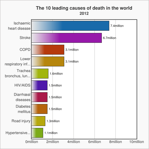
WHO data shows the patterns are not stable and change over time. For example:
- Diarrhoea is no longer among the 5 leading causes of death, but is still among the top 10, killing 1.5 million people in 2012.
- HIV deaths decreased slightly from 1.7 million (3.2%) deaths in 2000 to 1.5 million (2.7%) deaths in 2012.
- Chronic diseases cause increasing numbers of deaths worldwide. Lung cancers (along with trachea and bronchus cancers) caused 1.6 million (2.9%) deaths in 2012, up from 1.2 million (2.2%) deaths in 2000.
- Diabetes caused 1.5 million (2.7%) deaths in 2012, up from 1.0 million (2.0%) deaths in 2000.
2.3 Cardiovascular disease
Cardiovascular disease (CVD) is the main cause of death in the world. CVD is a general term that describes a disease of the heart or blood vessels.
Open the link below in a new window and watch the video on cardiovascular disease, the patterns, causes and consequences.
The global burden of cardiovascular disease
This video highlights:
- Cardiovascular disease (CVD) is the world's biggest killer. 30% of global deaths are due to cardiovascular diseases.
- CVD was responsible for 17.3 million deaths in 2008; by 2030 23.3 million deaths will be related to CVD. And it will remain the number one cause of death and disability worldwide.
You will have noted the different kinds of CVD and that there are important questions about their prevention and treatment.
The video also introduced the ‘Global Burden of Disease’, the social and economic implications of people dying prematurely or suffering from various diseases and disability. We will explore this concept in more detail in the next section.
2.4 What is the ‘Global Burden of Disease’?
In the previous section we introduced the term “Global Burden of Disease”(GBD), so what does it mean?
Global burden of disease can refer to the overall impact of diseases and injuries at the individual level, at a societal level, or to the economic costs of diseases. Specifically, the GBD refers to a WHO and World Bank study published in the World Development Report 1993 that measured the total loss of health resulting from diseases and injuries. Updated in 1996 and again in 2000, the study generates the most comprehensive and consistent set of estimates of mortality (another term for death) and morbidity (another term for illness) by age, sex and region. When the report was written, infectious disease accounted for 43% of the global burden.
2.5 Variations in death by geography and income
The World Bank classifies economies into four income groupings: low, lower-middle, upper-middle, and high.
For the 2017 fiscal year, the World Bank defines low-income economies as those with a gross national income (GNI) per capita of $1,025 or less. High-income economies have a GNI of $12,476 or more, per capita. The tables below show the low and high income countries, taken from September 2016 data. You can view the data direct from this link.
| Afghanistan | Guinea | Rwanda |
| Benin | Guinea-Bissau | Senegal |
| Burkina | Faso | Haiti |
| Sierra Leone | ||
| Burundi | Korea, Dem. Peoplés Rep. | Somalia |
| Central African Republic | Liberia | South Sudan |
| Chad | Madagascar | Tanzania |
| Comoros | Malawi | Togo |
| Congo, | Dem. | Rep. |
| Mali | Uganda | |
| Eritrea | Mozambique | Zimbabwe |
| Ethiopia | Nepal | |
| Gambia, The | Niger |
| Andorra | Gibraltar | Oman |
| Antigua and Barbuda | Greece | Poland |
| Aruba | Greenland | Portugal |
| Australia | Guam | Puerto Rico |
| Austria | Hong Kong SAR, China | Qatar |
| Bahamas, The | Hungary | San Marino |
| Bahrain | Iceland | Saudi Arabia |
| Barbados | Ireland | Seychelles |
| Belgium | Isle of Man | Singapore |
| Bermuda | Israel | Sint Maarten (Dutch part) |
| British Virgin Islands | Italy | Slovak Republic |
| Brunei Darussalam | Japan | Slovenia |
| Canada | Korea, Rep. Kuwait | Spain |
| Cayman Islands | Latvia | St. Kitts and Nevis |
| Channel Islands | Liechtenstein | St. Martin (French part) |
| Chile | Lithuania | Sweden |
| Croatia | Luxembourg | Switzerland |
| Curaçao | Macao | Taiwan, China |
| Cyprus | SAR, China | Trinidad and Tobago |
| Czech Republic | Malta | Turks and Caicos Islands |
| Denmark | Monaco | United Arab Emirates |
| Estonia | Nauru | United Kingdom |
| Faroe Islands | Netherlands | United States |
| Finland | New Caledonia | Uruguay |
| France | New Zealand | Virgin Islands (U.S.) |
| French Polynesia | Northern Mariana Islands | |
| Germany | Norway |
These classifications of income for economies provides a useful framework for examining patterns at a global scale. You can read more about how the world bank classifies countries here.
Activity 2.3
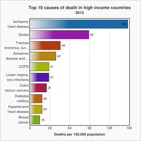
The WHO uses these income for economies to look at patterns of death between income groups (see below). The graph below shows the top 10 causes of death in low income countries, taken from data by the World Health Organization in 2012.
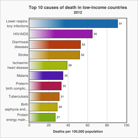
The graph above shows that in low income countries the main causes of death are communicable diseases, diseases that spread from one person to another or from an animal to a person like diarrhoea or malaria.
Non Communicable Diseases (NCDs) which are non-infectious or non-transmissible, such as cardiovascular diseases and cancer, move up to the top of the list as the income of countries increases.
Ischemic Heart Disease, is also known as Coronary Artery Disease. It is a condition that affects the supply of blood to the heart.
Reflect on these patterns in relation to your thoughts about the top three causes of death in section 2.2. Your ‘Global Top 10’.
Where do the three causes you identified sit in each of the three tables? Before you move on to the next section you might want to write down what you think the reasons are for the differences and record in your reflective log.
Discussion
So you can see that geography and income play an important role in contextualising death and its causes: income classifications are a useful way to analyse data about death which reveals patterns around the world.
2.6 What links poverty and poor health?
In the previous section we noted a pattern between the income of a country and the causes of death. Poverty and poor health worldwide are closely linked to each other. The causes of poor health for millions of people around the world are rooted in political, social and economic injustices. Poverty is both a cause and a consequence of poor health. Poverty increases the chances of poor health and can also trap communities in poverty. For example, the “burden” of infectious and neglected tropical diseases kills and weakens millions of the poorest and most vulnerable people each year effecting their economic productivity.
Health Poverty Action is a group which seeks to influence policy and practice directly through interventions and indirectly through campaigning and advocacy. Health Poverty Action argues that cycles of poverty and health are intimately linked, suggesting:
- The economic and political structures, which sustain poverty and discrimination, need to be transformed in order for poverty and poor health to be tackled.
- Marginalised groups and vulnerable individuals are often worst affected, deprived of the information, money or access to health services that would help them prevent and treat disease.
- Very poor and vulnerable people may have to make harsh choices – knowingly putting their health at risk because they cannot see their children go hungry, for example.
- The cultural and social barriers faced by marginalised groups – including indigenous communities – can mean they use health services less, with serious consequences for their health. This perpetuates their disproportionate levels of poverty.
- The cost of doctors’ fees, a course of drugs and transport to reach a health centre can be devastating, both for an individual and their relatives who need to care for them or help them reach and pay for treatment. In the worst cases, the burden of illness may mean that families sell their property, take children out of school to earn a living or even start begging.
- The burden of caring is often taken on by a female relative, who may have to give up her education as a result, or take on waged work to help meet the household’s costs. Missing out on education has long-term implications for a woman’s opportunities later in life and for her own health.
- Overcrowded and poor living conditions can contribute to the spread of airborne diseases such as tuberculosis and respiratory infections such as pneumonia. Reliance on open fires or traditional stoves can lead to deadly indoor air pollution. A lack of food, clean water and sanitation can also be fatal.
Source: Health, Poverty, Action
2.7 The rise of Non-Communicable Diseases
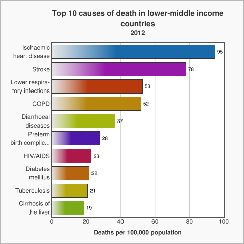
Earlier we noted the increase in rate of death by Non-Communicable Diseases (NCD) as the income of a country increases. This is not a matter of income and geography, it also varies over time. As the graph below shows, NCDs are on the rise throughout the world, irrespective of the country’s economic status.
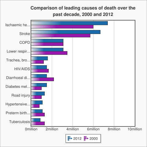
The top three diseases of the graph, including Ischaemic Health Disease, Stroke and Chronic Obstructive Pulmonary Disease (COPD), are all Non-Communicable Diseases (NCD). One of the main reasons for this is the fact that low income countries are rapidly adopting the lifestyles of high income countries (unhealthy diet, physical inactivity, tobacco use, harmful use of alcohol) that can cause Non-Communicable Diseases. .
There are a number of factors beneath these risky behaviours. Factors such as globalisation (integration of people, goods, ideas of different nations), urbanisation (the move towards people living in cities) and the ageing of a population. We call these factors "the causes of the causes“, and explore them in the next section.
2.8 ‘Western diseases’ and other unhelpful simplifications

In this section we ask you to read the following article, which explores how globalisation is influencing changes in the eating habits of young people in Bangladesh.
In ‘McDonaldization without a McDonald’s’ Nasima Selim, Taufique Joardar and Shahaduz Zaman (this course’s author) note while Bangladesh is one of the few developing countries in the world without McDonald’s, the food consumption practices of a group of urban affluent university-educated young people in Bangladesh suggest the process of “McDonaldization” is happening anyway. The food culture of urban affluent globalised young people of Bangladesh is changing and this has an impact on their health and wellbeing.
You can read a version of the full article on ResearchGate
Income groups are a useful way to look at global patterns of death, but we need to be careful that these ‘big picture’ patterns do not obscure our understanding of what is happening at a local level. This article suggests that geography and location are important, and that income and social class are also factors.
Activity 2.8
Make notes of the key points you learned from the article in your reflective log. Reflect on whether this has challenged existing ideas you had about global health, and if so, make a note of your response to this challenge.
Discussion
So you can see that global health is not just about geography, but also is related to social class and income. There are not only differences in health conditions between countries, but also within a single country.
3 Towards the homogenisation of global death

At the end of the last section we suggested the causes of death were becoming more similar across the world. In this section we look more carefully at this, considering particular examples and exploring the ‘causes of the causes’.
3.1 Income, poverty and death
Despite the fact that disease patterns are becoming similar across the globe, currently there are still differences between the rich and poor countries. Take at look at the infographic below, summarising data from the World Health Organisation.
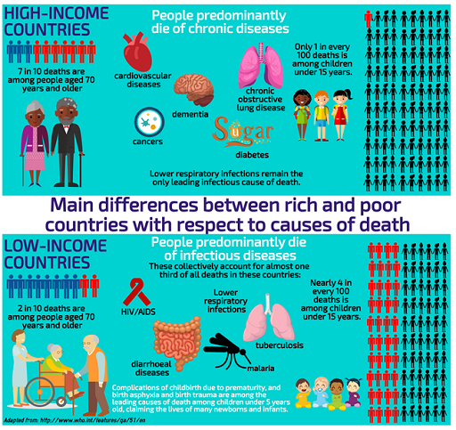
In high-income countries: seven in every 10 deaths are among people aged 70 years and older. People predominantly die of chronic diseases: cardiovascular diseases, cancers, chronic obstructive lung disease or diabetes. Lower respiratory infections (pneumonia, asthma, bronchitis etc) remain the only leading infectious cause of death. Only one in every 100 deaths is among children under 15 years.
In low-income countries: People predominantly die of infectious diseases: lower respiratory infections, HIV/AIDS, diarrhoeal diseases, malaria and tuberculosis collectively account for almost one third of all deaths in these countries. Complications of childbirth due to prematurity, and birth asphyxia and birth trauma are among the leading causes of death, claiming the lives of many new-borns and infants. In addition nearly four in every 10 deaths are among children under 15 years, and only two in every 10 deaths are among people aged 70 years and older.
Why is this? Why do we see these very different trends? Unicef state multiple causes, the first set relate to an inability to fight infection through lack of immunisation, poor diet (in particular Vitamin A) and the second is living in circumstances where people encounter thriving disease causing organisms, for example lack of sanitation and overcrowded living conditions.
Activity 3.1
In low income countries infant and maternal deaths are the two major cause of deaths.
Here are some figures about infant mortality in 2012 from a report by Save the Children:
- 1 million babies died on the day they were born
- 2.9 million died in in their first 28 days
- 6.6 million died before their fifth birthday, most from preventable causes.
This number has almost been halved since 1990, but still means that 18,000 children died every day in 2012.
You can find out more by reading the Save the Children Report ‘Ending Newborn Deaths’. After you have completed the reading, carry out the following activity 3.1, shown below.
Note the key points from the Save Our Children report.
In the next section we will discuss the challenges of child mortality. From your reading of the report what would you consider to be the key global challenges? Take a note of your ideas now in your Reflective log.
Discussion
Some points to consider:
- Equality is when something is distributed equally, irrespective of need.
- Equity is when something is distributed according to NEED. This has a relation to the idea of justice.
From reading this text, can it be said that the prime challenge of global health is inequality?
3.2 The challenges of child mortality

The challenge: accelerating child survival
The United Nations set a series of Millenium Development Goals, the fourth one (of 8) was to reduce child mortality, the target of reducing it by 2/3 of the 1990 levels by 2015. WHO figures from 2015 show 9.2 million children under-five are dying each year. While this is less than the 12 million in 1990, it is still not reaching the goals. Most of these children are dying in developing countries from diseases like , pneumonia, diarrhoea, malaria, measles, preventable diseases.
Key facts: uneven and insufficient progress
- More than one billion children are severely deprived of at least one of the essential goods and services they require to survive, grow and develop. These include nutrition, water, sanitation facilities, and access to basic health-care services, adequate shelter, education and information. As a result almost 9.2 million children under-five die every year. A further 3.3 million babies are stillborn.
- Most of the 25,000 children under five that die each day are concentrated in the world’s poorest countries in sub-Saharan Africa and South Asia. There, the child mortality rate is 29 times greater than in industrialised countries: 175 deaths per 1000 children compared with six per 1000 in industrialised countries.
Causes of child deaths under-five years of agemala
Six conditions account for about 70% of all child deaths: acute lower respiratory infections, mostly pneumonia (19%), diarrhoea (18%), malaria (8%), measles, (4%), HIV/AIDS (3%), and neonatal conditions, mainly pre-term birth, birth asphyxia, and infections (37%). The relative contribution of HIV/AIDS to the total mortality of children under-five, especially in sub-Saharan Africa, has also been increasing steadily. Malnutrition is a factor in more than half of the children who die after the first month of life.
Why are death tolls still high?
Poor families are often unable to obtain even the most basic health care for their children. Poor people or people not seeking care quickly enough contribute to up to 70% of all deaths of children under five years old.
- Of the 12 countries where more than 20% of children die before their fifth birthday, nine have suffered a major armed conflict recently.
- Countries with weak and fragile health systems (not having basic health care services) have not been able to provide effective child survival strategies that are crucial to reduce under-five child deaths, and especially neonatal deaths. Basic health services have been lacking as well as nutrition, water supplies and sanitation facilities.
- Almost half a million deaths each year due to malaria in children under-five in sub-Saharan Africa could have been prevented with the use of insecticide-treated bed nets, shown to reduce under-five mortality rates by up to 20%
You might be interested in exploring these patterns and those that have changed over time by exploring the work of well known statistician and myth buster Hans Rosling, This TED talk from 2006 is a good place to start.
You can explore the data yourself here
To see more videos and explore the data please see gapminder
3.3 Infant and maternal mortality
First, open this link in a new window and watch the video on global maternal mortality.
Infants from low income countries have much poorer health than their counterparts in high income countries. Let’s ask a few ‘why’ questions:
Why do the infants have inferior health? We have indicated some reasons for child death in developing countries in the earlier section. But now we would go to deeper level of causes in order to understand the complexity of the problem.
We will now focus on the point that the causes have links to a time before the child was born, or even conceived. We need to think of the child and mother as one unit and understand the health of the child also depends on the health on the mother as well. In developing countries infants have poor health because generally the mothers of those infants have inferior health, in particular anaemia and iron deficiency.
Iron deficiency is one of the most frequently occurring nutritional deficiencies in the world and is reported by the World Health Organization (WHO) to affect four to five billion people. WHO estimates that two billion people suffer from anaemia (a condition in which there is a deficiency of red cells or of haemoglobin in the blood). Approximately 50% of all anaemia is due to iron deficiency, a condition of deteriorating iron reserves in the body caused by low dietary intake of iron, poor absorption of dietary iron, or blood loss (for example, from hookworm, repeated childbirth or heavy menstruation). Iron deficiency anaemia (IDA) is the most severe form of iron deficiency, and results when the body’s iron supply cannot support production of haemoglobin (an essential component of blood) in adequate amounts to maintain normal functioning of the body.

Why do the mothers of those infants have inferior health with anaemia and iron deficiency? It is because they are poorly nourished.
Why mothers are poorly nourished?
Because they have low food intake.
Why do they have low food intake? Because they are poor.
You can see that by continuing to ask ‘WHY?, we are able to look beneath the surface and find the ‘causes of the causes’ of infant mortality.
Asking probing questions about these reasons and causes is a way for us to develop a critical understanding of how death (and health) are shaped by a range of factors.
Watch this video animation explaining the ‘Causes of the causes of infant mortality’.
Transcript
Infants from low income countries have much poorer health and higher mortality rate than their counterparts in high income countries. The reasons for this are complex. Why do infants die young in some countries? Because of poor health. Why do the infants have inferior health?
The causes of inferior child health have links which go back in time, before the child was even conceived. We need to think of the child and mother as one unit and understand the health of the child also depends on the health of the mother as well. In developing countries infants have poor health because generally the mothers of these infants have inferior health, in particular anaemia and iron deficiency.
Iron deficiency is one of the most frequently occurring nutritional deficiencies in the world and is believed to affect 4 to 5 billion people. Half of all anaemia is due to iron deficiency, a condition where depleting iron reserves in the body are caused by low dietary intake of iron, poor absorption of dietary iron or blood loss for example from hook worm, repeated childbirth or heavy menstruation. Iron deficiency anaemia is the most severe form of iron deficiency and means the body cannot function normally.
So, the cause of inferior child health can be linked to iron deficiency causing poor health in the mother. And why do the mothers of these infants have anaemia and iron deficiency? It is because they are poorly nourished. So, poor nutrition is a cause of the cause of child health. Why mothers are poorly nourished? Because they have low food intake. They do not consume enough calories from nutritious food to properly nourish their bodies. And why do these mothers have low food intake? Because they are poor. And why they are poor? The reasons of poverty are complex; starting with the inequality in society, war, displacement, lack of education and so on.
You can see that by continuing to ask ‘why’, we are able to look beneath the surface and find the causes of the causes of infant mortality. Asking probing questions about these reasons and causes is a way for us to develop a critical understanding of how death and health are shaped by a range of factors.
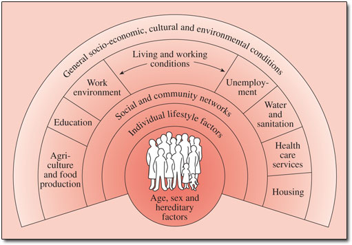
3.4 The Social Determinants of Health
In the introduction to the book Social Determinants of Health’ edited by Michael Marmot and Richard Wilkinson (2006), Marmot starts by pointing out the fact that in the Scottish city of Glasgow people living in the most deprived districts have a life expectancy 12 years shorter than those living the most affluent (see also WHO 2011). This gave rise to the concept of ‘The Glasgow Effect’. The idea of Glasgow as the “sick man of Europe” where people experience a reduced life expectancy plays out patterns from earlier work, life expectancy is geographically uneven, and as this article in the UK Guardian notes relates to a complex range of factors.
Broadly these are the ‘Social Determinants of Health and are often represented graphically (see Figure 3.3). Marmot, Wilkinson and a range of other academics have built up a substantial body of work around this area. Marmot's article in the Lancet from 2005 provides more detail and a global perspective and Social Determinants of Health: The Solid Facts also edited by Wilkinson and Marmot provides useful background.
A positive initiative
There are examples of programmes in various developing countries that are positively contributing in reducing the infant and maternal mortality. Click to the next activity to watch a video and explore further.
Activity 3.4
Follow this link and watch a video of the health project run by BRAC, the largest Non-Governmental Development organization (NGO) in the world, located in Bangladesh.
Think about what you observed in the video. What do you feel are the most important features of the BRAC programme? Make a note in your reflective log, of any interventions that you feel would be valuable in other contexts that you are aware of.
Discussion
As you can see in this video, despite constraints on resources and limitations on a number of levels, individuals and organisations are tackling the problem of infant mortality in innovative ways. There is much we can learn from programmes in developing countries, such as the example in this video.
3.5 Suicide
Sometimes people take their own lives, suicide is a sensitive issue, and one that seems to be growing.
If we look at the bare facts:
- Befrienders Worldwide summarise The World Health Organisation's report called "Preventing suicide: A global imperative", which estimates that each year approximately one million people die from suicide, which represents a global death rate of 16 people per 100,000 or one death every 40 seconds.
- It is predicted that by 2020 the rate of death by suicide will increase to one every 20 seconds.
- In the last 45 years suicide rates have increased by 60% worldwide.
- The patterns are also changing:
- Suicide is now among the three leading causes of death among those aged 15-44 (male and female). Suicide attempts are up to 20 times more frequent than completed suicides.
- Although suicide rates have traditionally been highest amongst elderly males, rates among young people have been increasing to such an extent that they are now the group at highest risk in a third of all countries.
- Suicides globally by age are as follows: 55% are aged between 15 to 44 years and 45% are aged 45 years and over.
Mental health disorders (particularly depression and substance abuse) are associated with more than 90% of all cases of suicide. However, suicide results from many complex social and cultural factors and is more likely to occur during periods of socioeconomic, national, family and individual crisis.
Move on now to Activity 3.5 where we ask you to read a short article by Maia Szalavitz who explores the paradox that the countries with the happiest people also have the highest rates of suicide.
Activity 3.5
Let us read this piece by Maia Szalavitz asking “Why the Happiest States Have the Highest Suicide Rates”
You might want to write some initial thoughts about this article in your reflection log.
Are you convinced by her explanation; if not, why not?
Discussion
The article (linked to research) makes some quite bold claims, that happiness is often linked to greater equality, while reducing status anxiety and stress those flatter socio-economic structures might lead people to see their unhappiness in relation to people “just like them” and feel depressed. It is certainly interesting, and perhaps a little controversial.
3.6 A humanitarian death
We said at the start that death is a universal occurrence, and many of the patterns we looked at have some large numbers. While we might challenge them we also normalise them. Humanitarian crises are slightly different, but in many ways are no less tied into questions of income or social status. Humanitarian crises are rather linked to more complex global political, economic and human rights issues.
What do we mean by a humanitarian crisis? The United Nations Office for the Co-ordination of Humanitarian Affairs (UN OCHA) 2014-2017 strategy sees its role in …”response to the persistent global challenges. They include armed conflict, chronic vulnerability, displacement and an ever increasing demand for humanitarian assistance due to the growing numbers of disasters worldwide.”
The World Economic Forum gathered the views of major humanitarian organisations on (their top concerns for 2016). They range from natural disasters like El Niño, drought in South Sudan, to wars and conflicts like Central African Republic, Yemen, Burundi and South Sudan to name a few.
Syria is at or near the top of most humanitarian organisations’ and individuals’ lists. For people in Europe there is a visible aspect of people trying to escape waiting at the borders of the European Union, but most of the people the people who have escaped are in neighbouring non-European countries. For example, in April 2016 UNHCR listed 4.8 million as of concern with 2.7 million in Turkey and one million in Lebanon. You can find up to date information here.
Like those who are displaced to other countries, those who are internally displaced are often the most vulnerable in society. Displacement and the inability to access reliable medicines and food affects their health. The Syrian Centre for Policy Research estimates 11.5% of the country’s population have been killed or injured and there are 1.9 million people wounded. Their estimate of deaths is 470,000, they note life expectancy has dropped to 55.4 in 2015 from 70 in 2011 and economic losses are estimated at US$225 billion (Click here for more information). While these numbers may be contested (the UN estimate is 250,000, death is a highly political and politicised issue.
4 Summary and conclusions
We have discussed the global distribution of death, causes of death, the concept of the global burden of disease and its relation with the socio-economic condition of a country, the concept of social determinants of health. We also have thought about deaths which are not due to disease, for example, death due to suicide or humanitarian crisis. So what can we say about the he global future of dying and death?
- It is estimated the number of annual deaths worldwide will reach 91 million by 2050, with most growth in Low and Middle Income Countries (LMICs).
- Global projections indicate that the number of people aged over 80 worldwide will increase from 102 million in 2009 to 395 million in 2050.
- There are implications for developing countries of deaths associated with new infectious diseases, HIV/AIDS, multi drug resistant TB, and complex humanitarian emergencies.
- By the second half of the 21st Century some half a billion people each year will experience the death of a person close to them.
Throughout the course we have often hinted at the social nature of death, and implied many are preventable, not just those related to war or famine or communicable diseases, but also ones like heart disease. However, at the start we also noted we all have to die sometime. Where deaths cannot be prevented – what are the ways in which care and comfort can be brought to people in their end of life?
This short animated video summarises these points, which are being examined in detail as part of a Wellcome Trust funded research project Global Interventions at the End of Life, based at the University of Glasgow.
The Glasgow End of life Studies group is comprised We are a group of dedicated researchers based at the University of Glasgow who are looking at end of life issues around the world. Our backgrounds are in medical sociology, global health policy, public health, theology, psychiatry, philosophy, nursing and palliative care. Our research has a focus on the interventions used when a person is dying. You can learn more about our research and other related courses at the End of Life Studies website.
Now try the end-of-course quiz to consolidate your knowledge and understanding from the course. Completing the quiz is part of gaining the statement of participation and the digital badge.
End of course quiz
Check what you've learned so far by taking this end-of-course quiz.
There are five questions.
You may take three attempts to answer each question.
Each question has 3 points available.
A point will be deducted for each incorrect attempt.
You can review your total score for the test at the end.
If you achieve at least 50% in the end-of-course quiz, you will be eligible for the Global Trends in Death and Dying course Statement of Participation.
When you have finished the quiz, please return to the course for the final activity.
Activity 4.1
Having completed the course and the quiz. You may wish to review and add to your reflective notes.
- Looking back at your notes in what ways have your ideas about end of life changed?
- What did you find unhelpful or difficult? Why?
- What are your three main learning points from the course?
Transcript
Thanks for taking part in our course on Global Trends in Death and Dying.
We’ve discovered a little about death around the world, how and why the causes and the circumstances of death vary in different locations and social settings.
We’ve thought about the patterns of death and dying and discovered that these patterns are changing, for a range of reasons, and we’ve learned about the social determinants of health and how they relate to death.
I hope this module has inspired you to find out more about these issues.
There’s a whole range of articles, videos and podcasts which you might find interesting on the End of Life Studies blog, why not follow us and add your comments? We’d love to hear what you think.
Thank you!
You may wish to take your interest in this topic further – here are some ideas for what you might do.
Read Shahaduz Zaman’s blog post raising questions about the global future of death and dying
Sign up to receive email updates from the End of Life Studies blog
Browse some of our blog articles and add a comment
Follow the End of Life Studies Group on Twitter and on Facebook
Browse videos on our YouTube channel there are videos which we have filmed at conferences and lectures, and there are playlists which hold lists of videos and films relating to our study but made by others.
Listen to some audio on SoundCloud, or sign up for our podcast . This is something which we are developing all the time, so if you find a related audio item on SoundCloud, please let us know endoflifestudies@glasgow.ac.uk
Acknowledgements
This course was written collaboratively by Shahaduz Zaman, Catriona Forrest and David Clark. It has been written as part of research led by the End of Life Studies Group at the University of Glasgow and supported by the Wellcome Trust and produced by the Opening Educational Practices in Scotland project.
Except for third party materials and otherwise stated (see terms and conditions), this content is made available under a Creative Commons Attribution-NonCommercial-ShareAlike 4.0 Licence.
Every effort has been made to contact copyright owners. If any have been inadvertently overlooked, the publishers will be pleased to make the necessary arrangements at the first opportunity.
Don't miss out
If reading this text has inspired you to learn more, you may be interested in joining the millions of people who discover our free learning resources and qualifications by visiting The Open University – www.open.edu/ openlearn/ free-courses.