Use 'Print preview' to check the number of pages and printer settings.
Print functionality varies between browsers.
Printable page generated Sunday, 28 June 2026, 11:24 PM
TI-AIE: Physical representation in mathematics: handling data
What this unit is about
In this unit you will learn about developing your students’ understanding of the ways in which data can be represented and summarised graphically. These student skills are important because of the widespread use of diagrams to represent data in business, politics, marketing and science, and more generally in media reporting.
A good understanding of how diagrams are constructed to show data is an important life skill. Newspapers and TV programmes use diagrams to back up points. Being able to understand and analyse a diagram is one way in which mathematics can empower your students to act knowledgeably in the real world.
By working through the activities in this unit you will also think about developing ways to enable your students to use their own bodies physically and aspects of their lives as resources to understand mathematics. This process is known as ‘embodiment’. Embodiment requires students to become totally involved in the mathematics they are learning, and to think and ask questions about the subject.
What you can learn in this unit
- How to represent data graphically, using for example bar charts, histograms, line graphs and pie charts.
- Some ideas to use students as physical representations to represent statistical ideas.
- How to base students’ learning in their own context.
This unit links to the teaching requirements of the NCF (2005) and NCFTE (2009) outlined in Resource 1.
1 Working with data
Pause for thought Think about the many ways there are of using diagrams to represent data. List a few of the ones that you have seen recently. Look in some newspapers, or if you have access to the internet explore some news reports online. What types of diagrams can you find? Look carefully at these diagrams. What information do they claim to be giving you? Do they actually show what they are said to show, or are there some subtle (or none too subtle) ways in which the diagrams have been manipulated to enhance their message? Keep these diagrams – they can be used for an activity later. |
The use of data is increasing, not just throughout India but also the rest of the world. This is almost certainly due to the increasing availability of computers and electronic means of collecting, organising and storing data. Data conveys information, which can be numeric (quantitative) or descriptive (qualitative). Since this unit is about mathematics, most of the data represented here will be numeric.
Lots of numeric data could be collected in schools: the number of students attending each day, the number of classes, the number of classrooms or the number of teachers. You can probably think of more. If these numbers are just kept in a book and not ordered or represented in any way, then any messages they might be able to provide will be lost.
So data is presented in such a way that it enables the person interrogating it to understand something about the world and the way it works. If the population of a country is continually rising but the amount of food produced stays static, then more food will need to be imported. A graphical representation may get this point across clearly.
Data is ordered and represented in many ways, for example by using:
- tables
- pictograms
- bar charts
- histograms
- pie charts
- line graphs.
Each type of diagram has its own rules and conventions. In mathematics, examples are:
- striking through bundles of five tally marks
- the independent variable goes along the horizontal x-axis
- the dependent variable is shown using the vertical y-axis
- the spaces between the markings on each axis must be equal.
Some of these rules and conventions are more important than others.
Activity 1 uses the students themselves to form bar charts, so that they begin to think what the data represented by bar charts really means.
Before attempting to use the activities in this unit with your students, it would be a good idea to complete all, or at least part, of the activities yourself. It would be even better if you could try them out with a colleague, because that will help you when you reflect on the experience. Trying them for yourself will mean you get insights into learners’ experiences which can, in turn, influence your teaching and your experiences as a teacher.
Activity 1: Representing your own data
Part 1: Constructing bar charts
Preparation
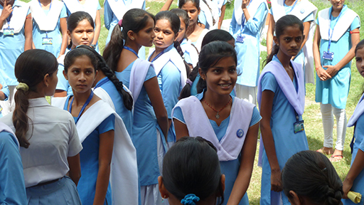
Your students will need a lot of space for this activity, so it will be a good idea to go outside or to an assembly room (Figure 1).

When taking students to work in the school grounds you should always make sure your students are aware of safety hazards they might encounter such as moving vehicles or building works, and prepare for changes in the weather.
You will need to find some surface that can be used for drawing axes. The corners of a building will work, especially if you can use chalk on the walls to show the markings on an axis. If you have access to an area of paving stones this would be useful, but it is not essential.
The activity
- Tell the students they are going to make a bar chart showing the number of sisters that students in their class have.
- Ask the students how many sisters they each have.
- Ask all those who have no sisters to make a straight line going out from where you decide zero will be.
- Then ask the students who have one sister to make a line next to the zero line, but not touching it. Make sure that they stand the same distance apart in their line as those with no sisters. Ask the students why they should do this.
- Continue with two sisters, three sisters and so on. Leave a space where there are gaps in the number of sisters. There may be those with four sisters but not five and then perhaps some with six.
- Either ask the students what sort of chart they have formed, or tell them that they have formed a bar chart.
- Now ask some questions, such as: How many people have three sisters? How many do not have sisters? What is the most popular number of sisters (the mode)? What would be an efficient way of working out how many sisters the whole class has?
- Divide the class into groups of about 10 students. Ask them to make their own bar chart. They could choose a subject of their own or one from a given list. Ideas could be: the number of people who prefer certain Bollywood stars, or what they like to eat for lunch, or how many drinks they have in a day. When they have made their bar chart ask them to call you over to see it and then ask them similar questions to the ones above.
- To conclude the task, ask each group to show their bar chart to the rest of the class. Encourage students to ask the group questions about their chart.
Part 2: Constructing pie charts
Preparation
Pie charts can be constructed in much the same way, but they need a little more organisation. You will need pieces of paper, a long length of string or cord, and a pair of scissors.
Use about 20 students to start with.
The activity
- Ask each student to pick their favourite choice from a given category: types of breakfast dish (for example, sandwich, idli, poha, paratha or upama) or types of fruit. Four or five categories will work best for a pie chart.
- Instruct the students to draw or write their choice on their piece of paper.
- Gather those who have made the same choice together to hold hands in a chain, then ask all of the students to join hands to make a circle.
- Use the string to go from the centre of the circle to mark the divisions between the categories, thereby making a pie chart.
- Now ask them to decide which is the most popular category. That is, which sector of the circle contains the most students? Explain that this is called the ‘mode’.
- Ask more questions, such as how could you tell which was the biggest from two similar sectors if you could only see the pie chart and not the students.
Video: Involving all |
Case Study 1: Mrs Chakrakodi reflects on using Activity 1
This is the account of a teacher who tried Activity 1 with her elementary students.
I tried the first activity with Class VI. They loved the idea of forming the bar charts. In our class we had no students with four sisters and only one student with five sisters. The number with one sister was the most popular and very few students had three sisters.
They could all answer the questions put to them very easily. So when the next part was being done there were a lot of suggestions in the various groups about the different bar charts they could make. One group said they would count the numbers of brothers and sisters each student had and make a graph for that. Another group said they would ask the students how many graduates they had in each of their families.
Yet another group came up with saying that they would find how many glasses of water each student drank in a day. Mona objected, saying she doesn’t always drink using a glass but the group leader Dinesh countered this by saying ‘We are going to ask them for an estimate in terms of glasses of water’.
I did the pie chart activity with Class VIII. I asked them that if they were given the option of choosing their favourite breakfast dish out of the following five choices, what would they opt for: sandwich, idli, poha, paratha or upama? I asked Mita and Neha to come forward to put tally marks in the columns I had made for each one of them as they went through all the students to make their choice. Mita also made each one of them stand up and join a group with the same favourites. This way they could verify the number Neha had put up in the tally mark.
They were then very taken up with the way the circle was made with the groups remaining together. And some could at once guess which was going to be the biggest section.
We then had a big discussion about how the sectors were to the whole circle as the arc of that part was to the circumference, also how the central angle of that sector was to the whole central angle. Some were not so convinced about that so we then tried representing it on paper and seeing whether that really was the case. But I was happy with the discussion that took place. I am sure that quite a bit of what we discussed would become permanent learning for most of the students.
Reflecting on your teaching practice
When you do such an exercise with your class, reflect afterwards on what went well and what went less well. Consider the questions that led to the students being interested and being able to progress, and those you needed to clarify. Such reflection always helps with finding a ‘script’ that helps you engage the students to find mathematics interesting and enjoyable. If they do not understand and cannot do something, they are less likely to become involved. Use this reflective exercise every time you undertake the activities, noting, as Mrs Chakrakodi, did some quite small things that made a difference.
Pause for thought Good questions to trigger such reflection are:
|
2 Moving from physical representation to recording data
One of the things that is often forgotten when interpreting the representation of data is that the bars of the bar chart or the sections of a pie chart represent the number of people (usually people, but it could be other categories) that have a particular characteristic. So in counting the number of sisters in Activity 1, the height of the bar labelled ‘6’ shows the number of students in the class who have six sisters.
Some students can get very confused between the number of people shown by the bar and the number of – in this case – sisters. Exposing them to activities like this will help them to be able to reason out problems such as how many sisters altogether are shown by this chart or that table.
Having physically made bar charts and pie charts with their bodies, it would be useful to challenge the groups to have a go at recording their charts on paper. This will help them make connections between their activity and work in textbooks later. If your class has access to a computer and handling data software, it would also be useful to get some or all of the children to produce their charts on the computer. Computer software can process data into accurate and colourful graphical representations instantly. This can be very helpful, but it may also get in the way of students thinking carefully about what a chart actually represents. The link with their physical activity will give greater meaning to the charts that students produce on the computer.
Moving from the bar or pie charts that they have made themselves to inspecting and interpreting bar or pie charts in a book, or constructing written descriptions of bar or pie charts, the students will benefit from their memories. For example, of how they all lined up, how they made sure that the spaces between them were equal, so that it was easy to tell which bar or sector was the biggest, and so on.
As discussed at the start of this unit, bar charts and other representations of data are used widely in newspapers and magazines, on television programmes and on the internet. The next activity will help the students in your class to see that this is the case, but it will also help them to understand the need for rules and conventions when dealing with data. The activity also aims to get students thinking about whether the representations are as effective as they might be in representing data, or whether the representations are constructed in such a way that hides something or emphasises something unfairly.
Activity 2: Bar charts and graphical representations of data in the real world
Preparation
A few days before this lesson ask the students to look for bar charts and other graphical representations of data in newspapers and magazines that they have at home, or by searching on the internet. Ask them to bring in any examples they find.
This activity works well if done in groups of four students, because more examples are then available for them to examine.
The activity
Instruct the students along the following lines:
- You were asked to bring examples of bar or pie charts you have come across. Put these on a desk to share with your group.
- Sort quickly through the charts and decide which you think you understand without spending too much time examining them (the ‘easier’ pile) and which ones you think you will need to examine more carefully to understand (the ‘harder’ pile).
- Now examine the harder pile and discuss in your group what it is about these graphs that makes them more difficult to understand. Write down your thoughts about this.
- Now examine the easier pile and discuss in your group what it is about these graphs that makes them easier. Write down your thoughts about this.
- Compare the two lists. What is the same, and what is different about these two lists?
- Use your answers to write a list of ‘good things to do when constructing bar charts’ or ‘good things to do when constructing pie charts’.
Case Study 2: Mr Rawool reflects on using Activity 2
This activity did not get off to a good start: I had asked students to bring in examples of bar charts – and they managed to bring in … none. Perhaps it was lack of motivation to make the effort, or perhaps they did not know where to look to find charts. To motivate them I told them what I had read in this unit so far, and also asked them to think of examples where charts are used in real life.
To give them an example I showed them the magazines and newspapers that I had brought in with examples of charts, so they could see where they could find them. By the next lesson most students had brought in several examples – some even managed to download some charts from the internet.
The students worked in groups of four. They found the charts they regularly saw on the TV easy, especially those related to games and advertisements, and decided this was because the information it represented was simple. They did notice however, that some of these ‘easy’ charts used scales were not clear, and the labels on the axes were also not always correct. They had more problems with charts representing medical and economic information. They found it hard identifying what was represented on each axis and interpreting what exactly was shown in each chart.
I collected the charts to use for later exercise problems and told the students to bring in more if they could, so that we could have a whole library of charts to use for years to come.
Pause for thought What do you think about the way Mr Rawool responded when his students did not bring in any examples of bar charts? How might he have anticipated this potential situation in his preparation for the lesson? What do you think are the advantages of asking children to bring in this kind of resource, and can you think of any difficulties that might arise from the kind of examples they might bring in? |
3 Discrete and continuous data
Numerical data can be of two types: ‘discrete’ and ‘continuous’. Discrete data is counted, whereas continuous data is measured.
- Discrete data can only take certain values. For example, the number of students in a class is discrete as you cannot have half of a student. Hence bar charts, such as the ‘sisters’ example in Activity 1, show discrete data.
- Continuous data can take any value within a range. For example, a person’s height could be any value within the range of human heights – people do not grow to certain fixed heights. Time is another good example as you can measure the time taken to run, say, from 100 m to fractions of a second. Representing continuous data requires more care because you have to decide which part of the graph each single measurement fits in, and sometimes this is a fine judgement. The next activity asks the students to think about this.
Activity 3: ‘People maths’ and histograms
Preparation
Once again, this activity is best done outside the classroom for reasons of space. You will need a way to measure heights, for example a stick about 2 m long marked in cm.
This activity will provide good opportunities for you to use questioning to promote your students’ thinking. As part of your planning, you can use Resource 2 to help you think about how you will use questioning during the activity.
Use a group of about 20 students so that there are enough to divide up into categories but not so many that what you are illustrating becomes obscured.
The activity
- Ask the students to arrange themselves in order of their height.
- Ask a pair of students to find the median height.
- Ask one student to find the range of this group of students by measuring the height of the shortest and the tallest person. Discuss whether this is the same as the range of the whole class. Why, or why not?
- Ask the students: ‘If someone wanted to know the ‘average’ height of an 11-year-old (or the ‘average’ age of students in your class) would the worked out median be a good representation? Why, or why not?’
- Now ask: ‘I want you to draw a histogram for your heights. Or should this be a bar chart? ‘
- Ask the students what would be a sensible way to divide up the heights of the students to make a chart; this will depend on the range. Aim for five ‘bars’. Move the students to make the bars.
Now move back to the classroom.
- Ask a student to measure and record all the heights of the 20 students on the blackboard.
- Ask the students to construct a tally chart and then to draw the histogram for this data.
- Ask why the bars on the histogram touch whilst the bars on the bar chart did not.
Video: Using questioning to promote thinking |
Case Study 3: Mrs Mohanty reflects on using Activity 3
My class contained 63 students, so I asked 26 of them to come forward, taking care to see a wide range of heights was represented. The rest were asked to stand back and help make the observations and note down the discussions.
The discussion on why they could not be represented as bar graphs was heated and extremely participatory. Mohit said that it would seem we will have to make 26 bars when one of the students said that they could very well be represented as a bar each in a histogram if the measuring was carried out extremely accurately.
Then there was a discussion on how many groups we could make, whether there was a restriction or rule by which we could decide. That was when we talked about how the range could help us decide on this. Some wanted the class interval size to be 3 cm, and some were for having it 5 cm. Ultimately I asked them to do what they felt was right and to actually make the groups and see how they worked when shown on the paper. So we made a line and measured all the 26 students for their heights.
I asked them to form groups of four for putting the data on a proper form by using the tally marks and then drawing the histograms. At this point I also thought it advisable to talk about why bar charts have gaps between the bars and histograms do not. This discussion was also very interesting and quite a few contributed to it. By the end of it I felt that they had convinced each other of the reasons for it being so.
Pause for thought Mrs Mohanty included a lot of whole class discussion during this activity. Can you think of any strategies that she might have used to include discussion in pairs or smaller groups during the main part of the activity? Now think about how the activity went with your class and reflect on the following questions:
|
4 Summary
In studying this unit you have thought about how to enable your students to develop a clear idea about what charts showing data represent. You have considered how to help students to construct bar charts, pie charts and histograms, and you have also thought about the role of the range, mode, median and mean.
A major theme of this unit is that when the students use themselves to represent mathematical data and concepts, they will remember those ideas better because they are physically involved and can ask questions.
You have also seen how reflecting on your teaching is important in becoming better at supporting the learning of your students.
Pause for thought Identify three techniques or strategies you have learned in this unit that you might use in your classroom, in other topics. |
Resources
Resource 1: NCF/NCFTE requirements
This unit links to the following teaching requirements of the NCF (2005) and NCFTE (2009) and will help you to meet those requirements:
- View students as active participants in their own learning and not as mere recipients of knowledge; how to encourage their capacity to construct knowledge; how to shift learning away from rote methods.
- Let students see mathematics as something to talk about, to communicate through, to discuss among themselves, to work together on.
- Let students learn important mathematics and see mathematics is more than formulas and mechanical procedures.
Resource 2: Using questioning to promote thinking
Teachers question their students all the time; questions mean that teachers can help their students to learn, and learn more. On average, a teacher spends one-third of their time questioning students in one study (Hastings, 2003). Of the questions posed, 60 per cent recalled facts and 20 per cent were procedural (Hattie, 2012), with most answers being either right or wrong. But does simply asking questions that are either right or wrong promote learning?
There are many different types of questions that students can be asked. The responses and outcomes that the teacher wants dictates the type of question that the teacher should utilise. Teachers generally ask students questions in order to:
- guide students toward understanding when a new topic or material is introduced
- push students to do a greater share of their thinking
- remediate an error
- stretch students
- check for understanding.
Questioning is generally used to find out what students know, so it is important in assessing their progress. Questions can also be used to inspire, extend students’ thinking skills and develop enquiring minds. They can be divided into two broad categories:
- Lower-order questions, which involve the recall of facts and knowledge previously taught, often involving closed questions (a yes or no answer).
- Higher-order questions, which require more thinking. They may ask the students to put together information previously learnt to form an answer or to support an argument in a logical manner. Higher-order questions are often more open-ended.
Open-ended questions encourage students to think beyond textbook-based, literal answers, thus eliciting a range of responses. They also help the teacher to assess the students’ understanding of content.
Encouraging students to respond
Many teachers allow less than one second before requiring a response to a question and therefore often answer the question themselves or rephrase the question (Hastings, 2003). The students only have time to react – they do not have time to think! If you wait for a few seconds before expecting answers, the students will have time to think. This has a positive effect on students’ achievement. By waiting after posing a question, there is an increase in:
- the length of students’ responses
- the number of students offering responses
- the frequency of students’ questions
- the number of responses from less capable students
- positive interactions between students.
Your response matters
The more positively you receive all answers that are given, the more students will continue to think and try. There are many ways to ensure that wrong answers and misconceptions are corrected, and if one student has the wrong idea, you can be sure that many more have as well. You could try the following:
- Pick out the parts of the answers that are correct and ask the student in a supportive way to think a bit more about their answer. This encourages more active participation and helps your students to learn from their mistakes. The following comment shows how you might respond to an incorrect answer in a supportive way: ‘You were right about evaporation forming clouds, but I think we need to explore a bit more about what you said about rain. Can anyone else offer some ideas?’
- Write on the blackboard all the answers that the students give, and then ask the students to think about them all. What answers do they think are right? What might have led to another answer being given? This gives you an opportunity to understand the way that your students are thinking and also gives your students an unthreatening way to correct any misconceptions that they may have.
Value all responses by listening carefully and asking the student to explain further. If you ask for further explanation for all answers, right or wrong, students will often correct any mistakes for themselves, you will develop a thinking classroom and you will really know what learning your students have done and how to proceed. If wrong answers result in humiliation or punishment, then your students will stop trying for fear of further embarrassment or ridicule.
Improving the quality of responses
It is important that you try to adopt a sequence of questioning that doesn’t end with the right answer. Right answers should be rewarded with follow-up questions that extend the knowledge and provide students with an opportunity to engage with the teacher. You can do this by asking for:
- a how or a why
- another way to answer
- a better word
- evidence to substantiate an answer
- integration of a related skill
- application of the same skill or logic in a new setting.
Helping students to think more deeply about (and therefore improve the quality of) their answer is a crucial part of your role. The following skills will help students achieve more:
- Promptingrequires appropriate hints to be given – ones that help students develop and improve their answers. You might first choose to say what is right in the answer and then offer information, further questions and other clues. (‘So what would happen if you added a weight to the end of your paper aeroplane?’)
- Probing is about trying to find out more, helping students to clarify what they are trying to say to improve a disorganised answer or one that is partly right. (‘So what more can you tell me about how this fits together?’)
- Refocusing is about building on correct answers to link students’ knowledge to the knowledge that they have previously learnt. This broadens their understanding. (‘What you have said is correct, but how does it link with what we were looking at last week in our local environment topic?’)
- Sequencing questions means asking questions in an order designed to extend thinking. Questions should lead students to summarise, compare, explain or analyse. Prepare questions that stretch students, but do not challenge them so far that they lose the meaning of the questions. (‘Explain how you overcame your earlier problem. What difference did that make? What do you think you need to tackle next?’)
- Listening enables you to not just look for the answer you are expecting, but to alert you to unusual or innovative answers that you may not have expected. It also shows that you value the students’ thinking and therefore they are more likely to give thoughtful responses. Such answers could highlight misconceptions that need correcting, or they may show a new approach that you had not considered. (‘I hadn’t thought of that. Tell me more about why you think that way.’)
As a teacher, you need to ask questions that inspire and challenge if you are to generate interesting and inventive answers from your students. You need to give them time to think and you will be amazed how much your students know and how well you can help them progress their learning.
Remember, questioning is not about what the teacher knows, but about what the students know. It is important to remember that you should never answer your own questions! After all, if the students know you will give them the answers after a few seconds of silence, what is their incentive to answer?
Additional resources
- A newly developed maths portal by the Karnataka government: http://karnatakaeducation.org.in/ KOER/ en/ index.php/ Portal:Mathematics
- National Centre for Excellence in the Teaching of Mathematics: https://www.ncetm.org.uk/
- National STEM Centre: http://www.nationalstemcentre.org.uk/
- National Numeracy: http://www.nationalnumeracy.org.uk/ home/ index.html
- BBC Bitesize: http://www.bbc.co.uk/ bitesize/
- Khan Academy’s math section: https://www.khanacademy.org/ math
- NRICH: http://nrich.maths.org/ frontpage
- Art of Problem Solving’s resources page: http://www.artofproblemsolving.com/ Resources/ index.php
- Teachnology: http://www.teach-nology.com/ worksheets/ math/
- Math Playground’s logic games: http://www.mathplayground.com/ logicgames.html
- Maths is Fun: http://www.mathsisfun.com/
- Coolmath4kids.com: http://www.coolmath4kids.com/
- National Council of Educational Research and Training’s textbooks for teaching mathematics and for teacher training of mathematics: http://www.ncert.nic.in/ ncerts/ textbook/ textbook.htm
- AMT-01 Aspects of Teaching Primary School Mathematics, Block 1 (‘Aspects of Teaching Mathematics’), Block 2 (‘Numbers (I)’), Block 3 (‘Numbers (II)’): http://www.ignou4ublog.com/ 2013/ 06/ ignou-amt-01-study-materialbooks.html
- LMT-01 Learning Mathematics, Block 1 (‘Approaches to Learning’) Block 2 (‘Encouraging Learning in the Classroom’), Block 3 (‘Data and Chance’), Block 4 (‘On Spatial Learning’), Block 5 (‘Exploring Numbers’), Block 6 (‘Thinking Mathematically’): http://www.ignou4ublog.com/ 2013/ 06/ ignou-lmt-01-study-materialbooks.html
- Manual of Mathematics Teaching Aids for Primary Schools, published by NCERT: http://www.arvindguptatoys.com/ arvindgupta/ pks-primarymanual.pdf
- Learning Curve and At Right Angles, periodicals about mathematics and its teaching: http://azimpremjifoundation.org/ Foundation_Publications
- Textbooks developed by the Eklavya Foundation with activity-based teaching mathematics at the primary level: http://www.eklavya.in/ pdfs/ Catalouge/ Eklavya_Catalogue_2012.pdf
- Central Board of Secondary Education’s books and support material (also including List of Hands-on Activities in Mathematics for Classes III to VIII) – select ‘CBSE publications’, then ‘Books and support material’: http://cbse.nic.in/ welcome.htm
References
Acknowledgements
Except for third party materials and otherwise stated below, this content is made available under a Creative Commons Attribution-ShareAlike licence (http://creativecommons.org/ licenses/ by-sa/ 3.0/). The material acknowledged below is Proprietary and used under licence for this project, and not subject to the Creative Commons Licence. This means that this material may only be used unadapted within the TESS-India project and not in any subsequent OER versions. This includes the use of the TESS-India, OU and UKAID logos.
Grateful acknowledgement is made to the following sources for permission to reproduce the material in this unit:
Figures 1 and 2: The Open University.
Every effort has been made to contact copyright owners. If any have been inadvertently overlooked the publishers will be pleased to make the necessary arrangements at the first opportunity.
Video (including video stills): thanks are extended to the teacher educators, headteachers, teachers and students across India who worked with The Open University in the productions.