
3.2 Specialist software tools
There are now several freely downloadable statistical programs for conducting more complex analyses. Even for simple analyses, there are many advantages to using statistical software, including the ability to reproduce graphs and maps if data is updated, or if another user needs to conduct analyses. Some software programs have steep learning curves but are very powerful once mastered.
R is an example of a free statistical software programme that can be used to summarise and present data in interesting ways, including producing a range of graphs and maps. You can download R by visiting the R project website.
QGIS is an open-source Geographical Information System (GIS) platform that can be run on all operating systems and can support a number of database formats and functionalities. It allows users to analyse and edit spatial information as well as creating and exporting graphical maps.
Activity 7: Interactive graphing and mapping of AMR data
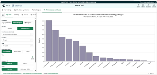
Box 1: Steps for generating a graph from the IHME data visualization tool
Step 1: From the VizHub, click on the icon ‘Antimicrobial resistance’ if it is not already selected. (There is a tab at the top left of the interactive display.)
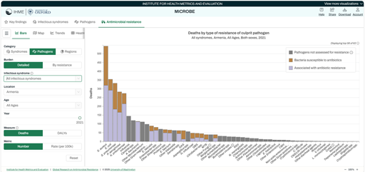
Step 2: On the ‘Antimicrobial Resistance by Year’ page, make the following selections:
- Select ‘Pathogens’ on the left-hand side.
- Select the ‘By resistance’ tab.
- Then use the drop-down menu showing as ‘Infectious Syndrome’ to select ‘Endocarditis’.
- Underneath, use the drop-down menu to select Kenya. You can either type the name in the box or scroll down until you reach Kenya.
- Finally, click on the ‘Attributable’ tab, which selects those deaths directly caused by resistance to the pathogen.
Check that the Measure is set to ‘Deaths’, and the Metric is ‘Number’.
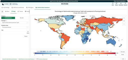
Box 2: Steps for generating a map from the IHME data visualization tool
Step 1: From the VizHub, click on the ‘Map’ icon (at the top left of the interactive display).

Step 2: On the ‘Map’ page, make the following selections:
- Select ‘Resistance’, then select a Pathogen – from the drop-down menu, click on ‘Salmonella enterica serovar Typhi’.
- Select an antibiotic class – select ‘fluoroquinolones’.
3 Creating data visualisations using common software