

1.2.2 Plotting variability in data
Data obtained from a sample should be representative of the population of interest. Since it is rarely possible to include the entire population in a sample, there is always some degree of uncertainty or variability in how well the data represent the population (see the Sampling modules and Processing and analysing AMR data module for more information). It is good practice to indicate uncertainty in data either in text, tables or graphs. For graphs, uncertainty in the data is represented by
Error bars can be used to display the
Error bars are markers drawn over data points on a graph and either extend from the centre of a data point or the top edge of a column (such as a bar chart). You can get a sense of how precise the measurements are (which reflects the level of uncertainty in the data collected) by looking at the error bar's length: short error bars indicate less variability in the data, and in contrast, long error bars indicate more variability, that is, the values are more spread out.
You can also use error bars to gauge if there might be a significant difference between groups. Overlapping error bars may suggest there is not a significance difference between groups, while no overlap between error bars may suggest there may be a significance difference. You cannot conclude statistical significance by looking at the graphs alone, so always perform a statistical test when drawing conclusions. (For a recap on methods of testing statistical significance, revisit the module Processing and analysing AMR data.)
You often see error bars plotted on line graphs and bar charts, such as the one in Figure 2.
Activity 4: Plotting variability in data
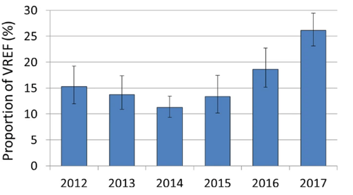
Figure 2 shows confidence intervals for each year that the proportion of vancomycin-resistant Enterococcus faecium isolates were reported. What can you say about the confidence intervals?
Answer
The confidence intervals appear to be wider in some years than others. For example, 2012, 2015 and 2016 appear to have wider confidence intervals than 2014. This may indicate that the data collected on clinical E. faecium in 2012, 2015 and 2016 was more variable than in 2014. Also, the confidence intervals for some years overlap, while for other years they do not. This may indicate a statistically significant increase in the proportion of vancomycin-resistant E. faecium between some years where the confidence interval bars do not overlap. This is most apparent between the years 2014 and 2017.
1.2.1 Basic descriptive statistics
