

2.1.2 Histograms
Histograms show the distribution of values for a quantitative (continuous) variable. Histograms are useful when there are many observations and you want to understand the overall shape and spread of your data.
The x-axis is marked in the units of measurement for the independent variable (e.g. age, time, MIC, zone diameter). The y-axis is the scale that shows you the number of times (frequency, proportion) the value in an interval occurred.
To create a histogram, you need to first group data from the independent variable into
Example
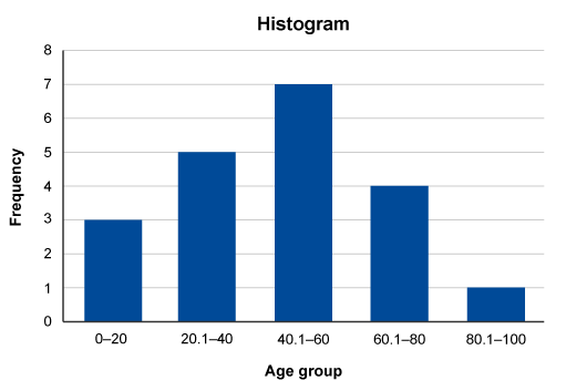
In this example, a series of observations have been recorded in a variable called ‘Age’. To construct the histogram, ‘Age’ is split into five class intervals. Each interval contains the count of occurrences.
| 39 | 41 | 22 | 38 | 46 | 55 | 65 | 78 | 83 | 18 |
| 28 | 54 | 53 | 61 | 10 | 16 | 29 | 58 | 55 | 66 |
| Class interval | Class frequency | Observations |
|---|---|---|
| 0–20 | 3 | 10, 16, 18 |
| 20.1–40 | 5 | 22, 28, 29, 38, 39 |
| 40.1–60 | 7 | 41, 46, 53, 54, 55, 55, 58 |
| 60.1–80 | 4 | 61, 65, 66, 78 |
| 80.1–100 | 1 | 83 |
The histogram is then constructed based on the number of class intervals which are plotted on the x-axis with the y-axis showing the frequency (number) of occurrences in each class interval.
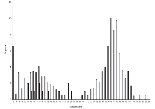
Traditionally, a histogram is drawn with no space between classes to indicate all values of the variable are represented. (This is different from a bar chart, which has space between the classes.) However, sometimes histograms may be drawn with spaces between the classes for greater visual impact. You can see this in Figure 4.
The purpose of the histogram (or, indeed, of any graph) is to help understand the data. When viewing a histogram, look for important features, including the shape and spread of the data and whether there are any deviations (
A histogram can have different shapes: it can be
AMR data often has a bimodal shape because there are often two separate populations of isolates – those that are susceptible and those resistant. Also, AMR data is often skewed. Depending on the population of interest, there might be more isolates that are susceptible than resistant, or vice versa. For example, in secondary care, there may be more isolates tested that are resistant to an antimicrobial agent than isolates that are susceptible because the people who are sampled are more likely to have been treated with antimicrobials and suffered treatment failure. Figure 4 demonstrates a bimodal distribution of zone diameter measurements obtained by testing the susceptibility of Aeromonas salmoncida to oxolinic acid. (Note, the purpose of including Figure 4 in this module is to demonstrate a typical distribution of AMR data. Therefore, it is not necessary to interpret the breakpoints depicted on the graph.)
The strengths and limitations of histograms are listed below:
| Strengths | Limitations |
|---|---|
| Summarise large datasets | Cannot read exact values of each data point from histograms as the data is collapsed into categories |
| Show the relative frequency of occurrences of different data values | Difficult to compare two datasets |
| Demonstrate visually the variation and distribution shape of data, which is useful when determining the statistical approach you may take to explore associations with your data | Can only be used with continuous data |
2.1.1 Designing good graphs
