

2.1.3 Box-and-whisker plot
Another way of displaying information about the spread of data is the
- a central box that spans the quartiles Q1 (lower quartile, 25th percentile) and Q3 (upper quartile, 75th percentile) – (note that the range from Q1 to Q3 is known as the interquartile range (IQR))
- a line in the box that marks the median (50th percentile)
- lines (whiskers) that extend from the box out to either the smallest (minimum) and largest (maximum) observations, excluding outliers, or 1.5 times the interquartile range on each side, also excluding outliers (if it is ambiguous which method is used, it is normally mentioned in the Figure’s legend)
- outliers, which are data values that are far away from other data values. On a boxplot, outliers are identified by a symbol such as a dot or an asterisk.
Boxplots are most beneficial when used for a side-by-side comparison of more than one distribution.
Activity 5: Understanding box-and-whisker plots
Look at the box plot in Figure 5. Can you annotate one of the boxplots to show the five-number summary for a distribution?
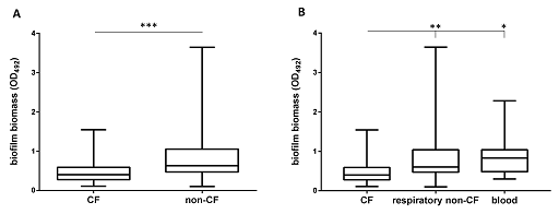
Answer
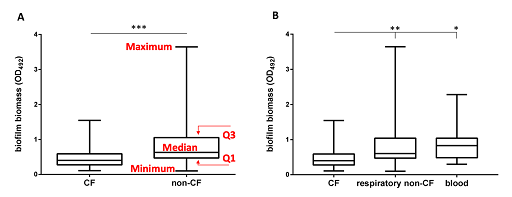
The box extends from the first (Q1) and third (Q3) quartiles. The line in the middle of the box is plotted at the median, while the ends of the whiskers represent the minima and the maxima of all the data. The lines extending from the interquartile range are called
The strengths and limitations of boxplots are listed below:
| Strengths | Limitations |
|---|---|
| Summarise large datasets | Cannot read exact values |
| Summarises the distribution of the data, the symmetry and skewness | Emphasises the tails of the distribution, which are the least certain points in a data set |
| Shows outliers, unlike many other graphs | Doesn’t show many details of the distribution, so need to use in combination with a histogram |
| Compare the distribution of other data sets | |
| Important tool for exploratory data analysis |
2.1.2 Histograms
