2.1.4 Scatter plots
Scatter plots are used when we are interested in the relationship between two different variables. Each point on the graph represents the values of a pair of variables. The value of one variable is plotted on the x-axis, and the value of the other variable is plotted on the y-axis. The variables generally have to be numeric and are commonly continuous, although they may also be discrete.
A scatter plot gives us a good idea of the correlation between the two variables and the nature of that correlation. You can plot several combinations to explore correlations and then investigate these further with more complex statistical analyses. As well as making it easy to identify any general pattern in the relationship between the variables, a scatter plot can help to identify outliers.
The scatter plot in Figure 7 shows the relationship between country-level antimicrobial consumption (x-axis) and resistance to aminopenicillins (y-axis) in European countries in 2015.
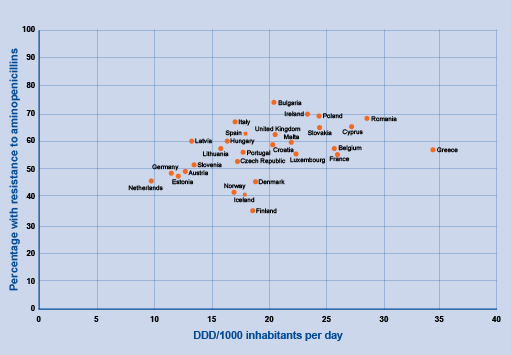
Figure 7 Relationship between penicillin-resistant S. pneumonia and total antimicrobial consumption by country in Europe, 2015. Note that DDD/1000 inhabitants per day is a technical unit of measure of antimicrobial consumption in non-hospital settings. The assumed average maintenance dose per day for a drug used for its main indication in adults
Show description|Hide descriptionScatter plot showing the relationship between percentage aminopenicillin resistance (plotted on the y-axis) and antimicrobial consumption in non-hospital settings (x-axis) for every country in Europe in 2015. The distribution of dots shows a low positive correlation between the prevalence of resistance and antibiotic use.
The relationship between two numeric variables is called correlation. There are three types of correlation (the strength and significance of which should be tested using formal statistical tests):
Positive correlation: as the values of one variable increases, so do the second variable's values. In Figure 7, as antimicrobial consumption increases at the national level, so does resistance to aminopenicillins. Note that this correlation is weak – although the trend is there, there are plenty of countries where it is not the case.
Negative correlation: as the values of one variable increases, the values of the other variable decreases. For example, as antimicrobial consumption increases, antimicrobial susceptibility (the opposite of resistance) decreases.
No correlation: there is no apparent relationship between the variables. For example, some studies have found that patient age is not correlated with AMR for specific antimicrobial classes and/or bacterial species.
The strengths and limitations of scatter plots are listed below:
Table 10 Strengths and limitations of scatter plots| Strengths | Limitations |
|---|
| Helps to identify trends in the data by showing correlations (positive, negative or none) or relationships between two values | For very large datasets, individual data points can overlap. This may make the scatterplot complex and challenging to understand because there may be many data points clustered together. |
| Plot actual values compared to other graph options and identify outliers in the data | Can only be used with continuous variables |
In summary, scatter plots should be used when there are many different data points and you want to highlight similarities in the dataset. This is useful when looking for outliers or for understanding the distribution of your data.