

2.1.5 Bar charts
Bar charts show relationships between different data series that are independent of each other. The most common data displayed in bar charts includes nominal, ordinal, discrete data or variables that can be treated as discrete.
The difference between histograms and bar charts is that histograms show the frequency of a continuous variable, whereas bar charts show the frequency of categorical or discrete data.
There are many bar charts: column (vertical), horizontal (left to right), grouped and stacked.
2.1.5.1 Horizontal and column bar charts
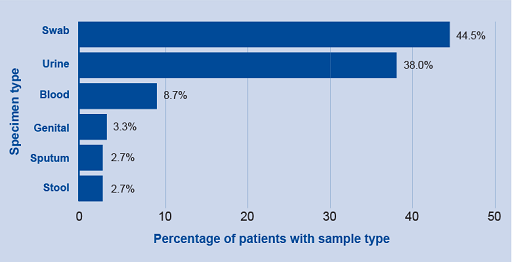
Horizontal and column bar charts are usually interchangeable. However, there are some reasons to choose one over the other. Horizontal charts work better when the labels are long and for data that needs to show ranking from largest to smallest. An example of a horizontal graph can be seen in Figure 8.
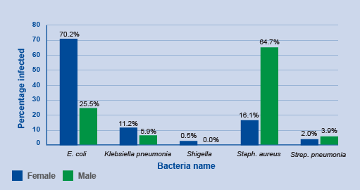
Column charts work better for grouped data and time-series data. Simple column charts compare categories of one variable, while grouped (or clustered) column charts compare categories of two or more variables as shown in Figure 9. The bars within a group adjoin, but there is a space between groups. It is important that the bars are distinctive and described in the legend.
Activity 6: Interpreting bar charts
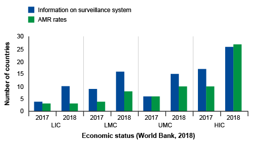
Review Figure 10 and describe what you see, what you think are the key findings and how might you improve the graph.
Answer
In Figure 10, groups of countries are categorised by economic status (low, low-middle, upper-middle, high – this wasn’t made clear in the caption) and year (2017, 2018) on the x-axis, and the number of countries in each category participating in GLASS on the y-axis. Within each group, there are two bars. One bar represents the frequency of countries that report information on their surveillance system, and the other bar represents the frequency of countries that report information on AMR rates in bacteria of interest to GLASS.
The graph shows that, overall, more high-income countries participate in GLASS compared to lower-income countries. Reporting to GLASS increased from 2017 to 2018 for all types of countries. When looking at the bar lengths, it appears there is an approximate doubling in reporting on surveillance systems from 2017 to 2018 for most categories. While the number of countries reporting AMR rates also increased, the increase was not as large when compared to countries reporting on their surveillance systems, other than in high-income countries.
The graph could be improved by reporting the exact frequencies in each bar so that the actual change in reporting rates in each category can be determined. The graph could also be improved by defining the country group acronyms (LIC, LMC, UMC, HIC). Another way to present the data is demonstrate proportional representation in each economic category which can be done by plotting percent on the y-axis rather than the count.
2.1.5.2 Stacked bar chart
In a stacked bar chart, each bar represents a total amount broken down into subsections. The same colour is used for the equivalent subsection in each bar. This allows you to compare both the whole picture and the components of each bar. A 100% component bar chart is a variation of the stacked bar chart, and shows all of the bars at the same height (100%) and the components as percentages of the total. This type of chart is useful for comparing the contribution made by different subgroups within the categories of the main variable.
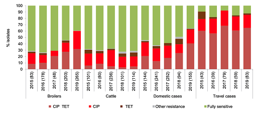
Figure 11 consolidates data into one stacked bar chart making it much clearer to compare the distribution of resistance of Campylobacter jejuni found in chickens, cattle and people in Denmark between 2016 and 2019. The subsections have been ordered so that the largest changes are first and last. This choice of order highlights changes that may be of specific interest when interpreting the graph. The most noticeable feature to compare between different hosts’ susceptibility is the proportion of C. jejuni isolates with resistance to both ciprofloxacin and tetracycline from people returning from travel overseas compared to domestic cases in people, chickens and cattle. Also, unlike what was observed in cattle, resistance to ciprofloxacin and tetracycline in C. jejuni isolated from poultry and from local cases of campylobacteriosis in people appears to have risen over time. However, statistical significance should be tested before making any firm conclusions from this graph.
The strengths and limitations of bar charts are listed below:
| Strengths | Limitations |
|---|---|
| Represent three or more variables on a single chart (unlike a histogram or scatterplot) | May require an additional explanation in text if many groups are compared or using stacked graphs |
| Understood by a wide audience, commonly used, and the scales and bars are easily read | Data can be manipulated or misrepresented – care must be taken when presenting data. For example, if the scale is exaggerated or minimised it can change the impression of the magnitude of differences between categories |
| Useful for showing time trends | Doesn’t show relationships between variables |
2.1.4 Scatter plots
