

2.1.6 Line graphs
Line graphs show trends in data and help explore relationships with time-related variables (such as age or calendar year). They help to determine the relationship between two sets of values, with one variable dependent on the other. The independent time-related variable is plotted on the x-axis and the dependent variable on the y-axis. Several dependent variables can be plotted against one independent variable on the same graph if they have the same units and range.
Line graphs are particularly useful when there are many data points and when you want to compare several trend lines on a single graph.
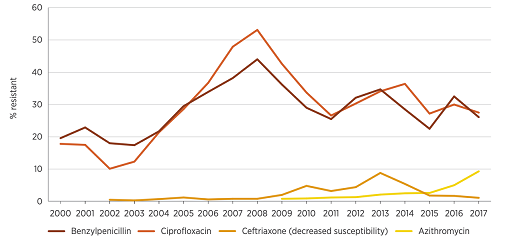
Figure 12 shows data from Australia which reports on trends in resistance and multi-drug resistance patterns to four first-line antimicrobials in Neisseria gonorrhoeae between 2000 and 2017. The graph shows that resistance rates to these antimicrobials have changed in different ways over this time period. Resistance to most antimicrobials was lower in 2017 compared to previous years, except for resistance to azithromycin, which has increased since 2015. This graph raises several questions, one of which is what explains the decrease in benzylpenicillin and ciprofloxacin resistance levels to around 30% after peaking at 45–50% in 2008? Time series data presented in line graphs prompts important questions about the data that allow you to undertake exploratory analyses to look for associations in the data.
The strengths and limitations of line graphs are listed below:
| Strengths | Limitations |
|---|---|
| Simple to read | |
| Show clear patterns in data (visibly show how one variable is affected by another as it changes) | Cannot use a line graph to compare different categories of data (use a bar chart instead) |
| Compare multiple continuous data sets | The scale can change the appearance of the data which can be misleading. Always use the most appropriate scale for both axes when plotting line graphs |
2.1.5 Bar charts
