
Resource 2: Data handling
![]() Background information / subject knowledge for teacher
Background information / subject knowledge for teacher
Data is information. Interpreting data means working out what information is telling you.
Information in newspapers, on television, in books and on the Internet is sometimes shown in charts, tables and graphs.
It is often easier to understand the information like this rather than in writing, but it is important to read all the different parts of the graph or chart.
Charts
The title tells us what the chart is about.
The column headings tell us what data is in each column. For example, in the chart below, the column headings tell us:
- the name of the pupil;
- what colour the pupil’s shoes are;
- how many eyelets the pupil’s pair of shoes has.
You can use the chart to find out information about each pupil by looking at each row in turn. For instance Alice’s shoes are yellow and have 6 eyelets.
Pupils' shoes
| Name | Colour | Number of Eyelets |
|---|---|---|
| Alice | Yellow | 6 |
| Abdul | Red | 14 |
| Rose | Yellow | 0 |
| John | Blue | 0 |
| Justine | Red | 0 |
| Celse | Blue | 6 |
| Stanislas | Silver | 14 |
| Mary | Yellow | 6 |
Graphs
Graphs come in many different styles.
Bar Graph
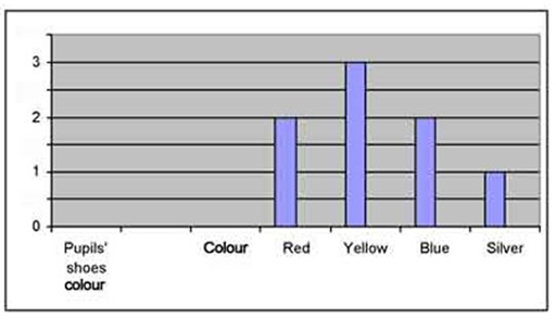
Tip: With any graph, always look carefully at:
- The title
- The scale
- The axis headings
Bar Line Graph
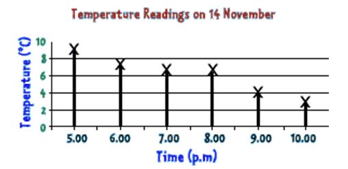
Tip: With any graph, always check the scale. Often each division is worth more than one number.
Line graph
Line graphs are used when there is a continuous variable like time. This can make it easier to look at the shape
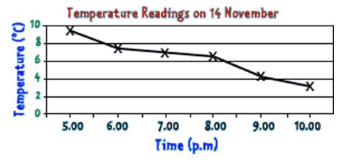
This line graph shows that the temperature is falling each hour.
Pie charts
Pie charts are circular, like a pie! Each section of the pie shows a fraction of a total amount. This Pie Chart shows where 40 people from the UK went on their holiday.
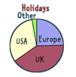
One quarter of the people went to Europe. That means 10 people (40 ÷ 4) people went to Europe.
The UK was the most popular holiday destination.
Can you work out the second most popular?
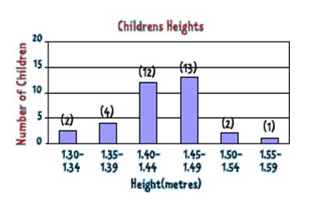
Frequency tables
A frequency table shows information about a set of data. Sometimes there is so much data that the only way to show it all is to put it into groups called intervals.
This graph shows the heights of a class of children. The heights are grouped in equal intervals of 5 cm. This means that 1.30 – 1.34 includes children with heights of 1.30 m, 1.31 m, 1.32 m, 1.33 m and 1.34 m.
How many children are between the heights of 1.45 m and 1.49 m?
Conversion graphs
Conversion graphs are used to change one set of values to another.
This graph converts centimetres to inches. 5 cm is approximately 2 inches.
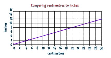
Approximately how many centimetres are equal to 5 inches?
Answers
The second most popular holiday destination is the USA.
There are 13 children between the heights of 1.45 m and 1.49 m.
5 inches is approximately 13 cm.
Adapted from: BBC Schools, Website
Resource 1: Tally chart