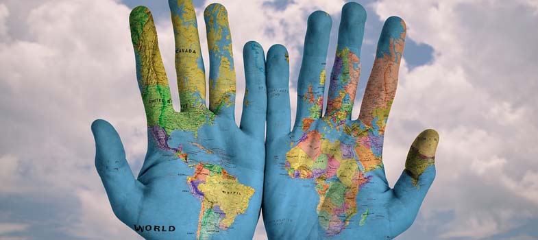
2.5 Variations in death by geography and income
The World Bank classifies economies into four income groupings: low, lower-middle, upper-middle, and high.
For the 2017 fiscal year, the World Bank defines low-income economies as those with a gross national income (GNI) per capita of $1,025 or less. High-income economies have a GNI of $12,476 or more, per capita. The tables below show the low and high income countries, taken from September 2016 data. You can view the data direct from this link.
| Afghanistan | Guinea | Rwanda |
| Benin | Guinea-Bissau | Senegal |
| Burkina | Faso | Haiti |
| Sierra Leone | ||
| Burundi | Korea, Dem. Peoplés Rep. | Somalia |
| Central African Republic | Liberia | South Sudan |
| Chad | Madagascar | Tanzania |
| Comoros | Malawi | Togo |
| Congo, | Dem. | Rep. |
| Mali | Uganda | |
| Eritrea | Mozambique | Zimbabwe |
| Ethiopia | Nepal | |
| Gambia, The | Niger |
| Andorra | Gibraltar | Oman |
| Antigua and Barbuda | Greece | Poland |
| Aruba | Greenland | Portugal |
| Australia | Guam | Puerto Rico |
| Austria | Hong Kong SAR, China | Qatar |
| Bahamas, The | Hungary | San Marino |
| Bahrain | Iceland | Saudi Arabia |
| Barbados | Ireland | Seychelles |
| Belgium | Isle of Man | Singapore |
| Bermuda | Israel | Sint Maarten (Dutch part) |
| British Virgin Islands | Italy | Slovak Republic |
| Brunei Darussalam | Japan | Slovenia |
| Canada | Korea, Rep. Kuwait | Spain |
| Cayman Islands | Latvia | St. Kitts and Nevis |
| Channel Islands | Liechtenstein | St. Martin (French part) |
| Chile | Lithuania | Sweden |
| Croatia | Luxembourg | Switzerland |
| Curaçao | Macao | Taiwan, China |
| Cyprus | SAR, China | Trinidad and Tobago |
| Czech Republic | Malta | Turks and Caicos Islands |
| Denmark | Monaco | United Arab Emirates |
| Estonia | Nauru | United Kingdom |
| Faroe Islands | Netherlands | United States |
| Finland | New Caledonia | Uruguay |
| France | New Zealand | Virgin Islands (U.S.) |
| French Polynesia | Northern Mariana Islands | |
| Germany | Norway |
These classifications of income for economies provides a useful framework for examining patterns at a global scale. You can read more about how the world bank classifies countries here [Tip: hold Ctrl and click a link to open it in a new tab. (Hide tip)] .
Activity 2.3
The WHO uses these income for economies to look at patterns of death between income groups (see below). The graph below shows the top 10 causes of death in low income countries, taken from data by the World Health Organization in 2012.
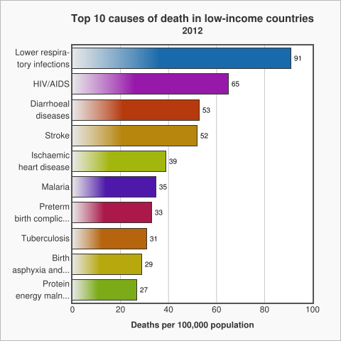
The graph above shows that in low income countries the main causes of death are communicable diseases, diseases that spread from one person to another or from an animal to a person like diarrhoea or malaria.
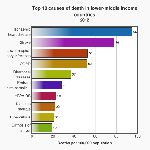
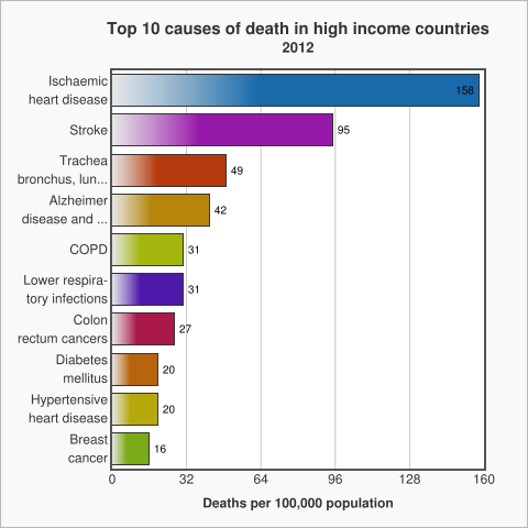
Non Communicable Diseases (NCDs) which are non-infectious or non-transmissible, such as cardiovascular diseases and cancer, move up to the top of the list as the income of countries increases.
Ischemic Heart Disease, is also known as Coronary Artery Disease. It is a condition that affects the supply of blood to the heart.
Reflect on these patterns in relation to your thoughts about the top three causes of death in section 2.2. Your ‘Global Top 10’.
Where do the three causes you identified sit in each of the three tables? Before you move on to the next section you might want to write down what you think the reasons are for the differences and record in your reflective log.
Discussion
So you can see that geography and income play an important role in contextualising death and its causes: income classifications are a useful way to analyse data about death which reveals patterns around the world.
2.4 What is the ‘Global Burden of Disease’?