10.3.1 What data should you analyse?
You should analyse your data in terms of the categories listed in Box 10.1 for each reporting period (monthly or quarterly).
Box 10.1 Data analysis to evaluate performance of immunization programmes
- Compare the percentage immunization coverage rate with the objectives (targets) set for the immunization programme in the annual action plan.
- Compare the percentage immunization coverage rate with the equivalent data for the previous year.
- Compare the percentage immunization coverage rate of different vaccines given at the same time.
- Evaluate whether there is an access problem for the Health Post by calculating the Penta1 to Penta3 dropout rate.
- Evaluate whether there is a utilisation of health services problem for the Health Post by calculating the Penta1 to measles vaccine dropout rate; this also tells you the percentage of fully immunized children compared to the target population.
- Evaluate whether there is a problem in delivering TT+2 (more than two doses of TT vaccine) to pregnant and non-pregnant women of childbearing age.
For continuous self-monitoring at Health Post level, we suggest you use wall charts to record such indicators as actual immunization coverage rates for each quarter of the year, compared with the planned targets for that period (Figure 10.6).

Figure 10.7 illustrates how to enter data into an immunization monitoring chart, in order to assess your monthly progress in meeting a 100% immunization coverage target.
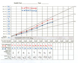
Every Health Post should display a chart like Figure 10.7 where it can be seen by all staff every day. The diagonal line from zero to the top right-hand corner (labelled 100%) shows the ideal rate of progress if every eligible infant is immunized on time.
What is your evaluation of the progress in meeting the Penta1 and Penta3 immunization targets in the (fictional) Health Post in Figure 10.7?
The Health Extension Practitioners have not improved their immunization coverage between January and August. Penta1 coverage has remained at about 85% of the target population, and Penta3 coverage has not exceeded 75%.
Next we discuss how to analyse immunization coverage and dropout data to shed light on what may be causing low coverage and/or high dropout.
10.3 Analysing and interpreting immunization data