Nature & Environment
Reduce e-waste through donating old computer devices
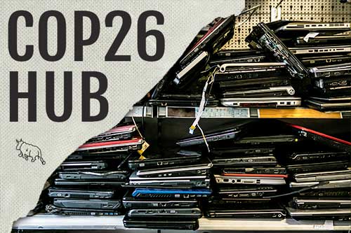
...course, if the computer has been kept unused in storage for some time, this can be longer. Extending an old computer's lifespan through reuse is the best of all the different disposal alternatives for the environment. Consider donating newer equipment to a refurbisher. You may be able to donate equipment directly to a favourite local school or charity. Keep in mind that...