

Session 4 Data analysis: making your data speak and shine
This session was written by Hugo Leal from The University of Cambridge.
It is not just historical documents, such as the Darwin letters, that are being digitised, but our own lives that are subject to a process of datafication (Van Dijck, 2014). The growing ‘digital footprint’ of our digital traces has expanded and, as a result, we are now data producers and data products. Data mining is arguably the most important extractive industry of our time (Zuboff, 2020). Part of this success is predicated on both knowledge (of how to collect and analyse data) and unawareness (that this data is being extracted and used, e.g. for commercial or political purposes).
A skills gap prevents most people from making sense of the digital footprint and, more broadly, digital data. This session is a contribution to closing the skills gap by introducing the essentials of data analysis.
Transcript: Video 4
Hi, I'm Hugo, and today we'll be talking about analysis and visualisation of digital data. In the previous session, we introduced you to the Darwin correspondence project, an archive. And you've seen how our colleagues take your manuscript and produce digital documents that can then be processed again and prepared for visualisation and analysis.
In this video, we'll be using the same digital archive to illustrate how to use a wrangled data set, following the procedures you've learned, to produce meaningful visualisations and analysis. And in this case, our examples scale up and automate the activity you have previously completed. You are to be asked to take the XML and structure it in tab form by extracting the relevant elements, such as sender, receiver, dates, places. And we'll do the same here, but with the entire repository of XML files, each file corresponding to a letter.
After importing the files, we explore the dataset, and form an important structuring operation by looking at the info and choosing which elements to keep. Delete unnecessary and all erroneous information, execute some validation tasks, here harmonising the names of the correspondence across the dataset, and append the information and enrich the dataset, for example, by using the Data Wrangler to convert the date field into a standard machine readable date format.
Finally, we export the dataset, in this case into a CSV file. And we are ready to visualise and analyse the Darwin correspondence. In this case, we'll resort to a well-known predominantly quantitative method of network analysis, complemented by a network visualisation, which lends itself to a more qualitative exploration thus rendering a form of mixed analysis.
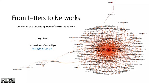
We do this by importing the file into a network analysis and visualisation software. Here we choose the free and open source software, Gephi. And then, using the embedded algorithms and commands to perform some basic operations that will allow us to make sense of this black box here.
Here you can see the full network taking shape, with Darwin at the centre, and we can zoom in on specific years-- here is the network in 1868-- or we can zoom in on specific areas of the network, such as this Alter-Network, which is the pattern of relations between all Darwin's correspondents bar ego, who is Darwin himself. And in this instance, the meaningful result of this analysis and visualisation is the centrality of his wife, Emma Darwin, which could lead us to answer some questions regarding this particular network or raise others. For example, regarding the untold and unaccounted role of women in the history of science.
By the end of this session, you should be able to:
- have a critical understanding about the existing digital divide(s)
- distinguish the different methods to analyse data
- identify the fundamental elements and techniques of quantitative and qualitative analyses
- recognise the importance of mixed methods to overcome the methodological divide.