

2.2 Understanding diagrams
Diagrams, which can be quite complicated, are often used in STM subjects, and it can take time to interpret them. Even so, for some topics, an illustration can clarify the meaning, especially if used alongside the text. In academic text diagrams, illustrations and graphs are often all referred to as ‘figures’ and that is the convention used here. For each figure, the content will be described, to give you a guide to interpreting the diagram.
Figure 2 relates to Example 1 in Activity 2. The geological timescale is divided into eons, which in turn is divided into eras and then periods. To simplify the diagram in Figure 2, most of the technical names for the time intervals have been omitted from this version, which just shows where the Cambrian period fits into the overall scheme.
The oldest (earliest) events are on the left side of the diagram, and the youngest (most recent) events are at the right side of the diagram. The oldest event on this diagram is the formation of the Earth itself. Note that the times are in millions of years.
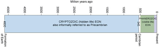
Figure 3 shows magnified photographs of typical fossils and relates to Example 2 in Activity 2. There is a range of sizes but none of them is longer than a few millimetres. It is not always possible to tell whether each fossil is a complete creature, or just part of one. Unlike the previous diagram, there is no written information other than the data of the fossils provided in the caption.
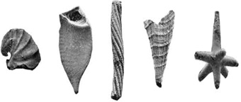
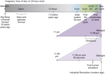
Figure 3 relates to Example 3 in Activity 2. The timeline in Figure 3 shows the oldest events on the left, and the youngest ones on the right. The oldest event in this diagram is the Big Bang, the formation of the Universe. This timeline is labelled with the actual time periods in millions of years (below the line), and the imaginary equivalent if the whole sequence were fitted into 24 hours (above the line). The most recent segment of the timeline (the last ‘hour’) is repeated below at a larger scale, to show more detail, and then the latest segment of that line (the last ‘minute’) is again enlarged below that.
Activity 4 Using information from diagrams
Read Examples 1, 2 and 3 in Activity 2 again, referring to the diagrams in Figures 2, 3 and 4. Make notes about your responses to the following questions:
- How much effect do the illustrations have on your understanding?
- Would you make more sense of the information if it were only in a diagram, or only in words?
- Which do you prefer?
Comment
Some people have a preference for words or illustrations, although the STM subjects use both together. One of the challenges is to interpret the diagrams alongside the text – and there will be opportunities to practise this as you progress through the module. You may also find that sketching your own simple diagrams will help – they do not need to be works of art.