4.1 The rise of antibiotic resistance
By analysing country-specific data, we can build up a picture of antibiotic use and resistance worldwide.
Activity 6 Antibiotic consumption
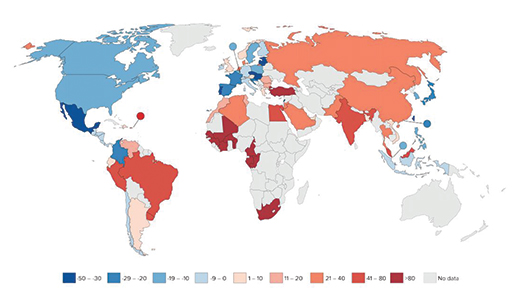
Review Figure 4 which shows country-specific antibiotic consumption data for the period 2000 to 2010.
What trend(s) can you identify?
Discussion
High-income countries, for example in Western Europe and the USA, maintained or even reduced antibiotic consumption between 2000 and 2010. In contrast, antibiotic consumption increased in low and middle income countries (LMICs) such as South Africa and India.
You will explore some of the reasons for the changing patterns of antibiotic use later in the course.
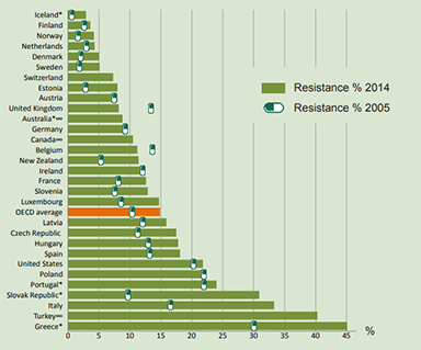
Global levels of antibiotic resistance have similarly increased this century. However, the resistance shown by individual bacterial species to a particular antibiotic can vary considerably between, and even within, countries (Figure 5).