5.1 Drawing line graphs
Drawing a line graph is very similar to drawing a bar chart, and they have many of the same features.
Line graphs need:
- a title
- a label for the vertical axis (e.g. units of currency)
- a numbered scale on the vertical axis
- a label on the horizontal axis (e.g. month) so that it is clear to the reader what they are looking at.
The main difference when drawing a line graph rather than a bar chart, is that rather than a bar, you put a dot or a small cross to represent each piece of information. You then join each dot together with a line. There is significant debate over whether the dots should be joined with a curve or with straight line. Whilst the issue is (believe it or not!) hotly contested, the general consensus seems to be that dots should be joined with straight lines.
Activity 9: Drawing a line graph
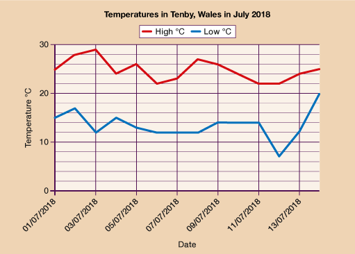
Have a go at drawing a line graph to represent the data below.
The table below shows the temperatures in Tenby during the first two weeks of July 2018.
| Date | Temperature High ˚C | Temperature Low ˚C |
|---|---|---|
| 01/07/2018 | 25 | 15 |
| 02/07/2018 | 28 | 17 |
| 03/07/2018 | 29 | 12 |
| 04/07/2018 | 24 | 15 |
| 05/07/2018 | 26 | 13 |
| 06/07/2018 | 22 | 12 |
| 07/07/2018 | 23 | 12 |
| 08/07/2018 | 27 | 12 |
| 09/07/2018 | 26 | 14 |
| 10/07/2018 | 24 | 14 |
| 11/07/2018 | 22 | 14 |
| 12/07/2018 | 22 | 7 |
| 13/07/2018 | 24 | 12 |
| 14/07/2018 | 25 | 20 |
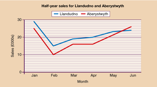
- A clothing store has outlets in Llandudno and Aberystwyth. Use the data in the table below to draw a line graph comparing monthly sales between January and June.
| Month | Jan | Feb | Mar | Apr | May | Jun | |
|---|---|---|---|---|---|---|---|
Sales (£000s)
| Llandudno | 29 | 15 | 19 | 20 | 23 | 24 |
| Aberystwyth | 25 | 10 | 16 | 16 | 21 | 26 | |