
In this article:
Click on a subtitle to jump to content:
- Introduction
- Making comparisons the fair way
- Learning to read charts - bar charts
- The questions that statistics asks
- Learning to read charts - line charts
- Scatter plots over time
- Scatter plots more generally - charting one indicator against another
- Extending the scatter plot - bubble charts
- Three dimensions good, four dimensions better?
- Motion charts
- So where do we go from here?
Introduction
Eurostat, the European Union’s statistics portal, defines development indicators as follows:
“A development indicator is often understood as an easily presented index that represents data on a multi-dimensional concept that is being measured. Indicators are measured for a specific place and time and are typically used to represent, compare and monitor complex development issues such as poverty over time and between countries and regions.Indicators are therefore a key mechanism for measuring progress toward development objectives. To be effective they must communicate useful information - enabling situations to be understood and decisions made. Indicators must be both meaningful - accurately portraying what is happening - and resonant - allowing people to grasp the relevance to their own lives.”
That’s rather a mouthful, but we can break it down:
- “an easily presented index” - that is, a number on some measurement scale;
- “on a multi-dimensional concept that is being measured”: a concept is an idea; the indicator is a measure that can in some way be meaningfully interpreted as a measure of that idea. For example, an indicator that tracks the idea of poverty might be the proportion of families with household income less than a certain amount;
- “a specific place and time”: that is, the measurement applies to a certain place at a certain time. Measurements may change across space and/or time, which allows us to make comparisons across them. Typically, we might compare measures made at different locations at the same time, or at different times for the same location.
When investigating particular sorts of development, we can use indicators to help us keep track of how particular concepts or ideas we associate with different stages of development are progressing.
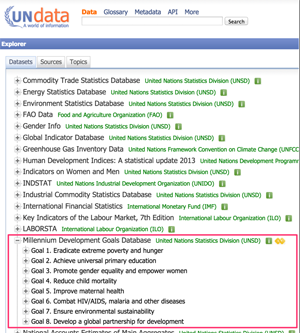 The UN Millennium Goals Database
The United Nations Millennium Development Goals Database contains data relating to a wide range of indicators that were identified as relevant to monitoring progress towards the development goals. In a sense, indicators help us “keep score” or keep track of how a particular country is developing in terms of education, or health. If the “scoring system” is fair, it should also provide us with a means of comparing one country or region with another, even if those countries have different sizes of population or cover different land areas.
Making comparisons the fair way
Making comparisons in a fair way is one of the major aims of statistics. According to Hans Rosling, do you remember what he said about what statistics actually are? “[E]very time you compare one thing to another using numbers, that’s statistics”.
In this course, you be seeing - literally! - how we can use graphical data charts to help us make comparisons in a visual way.
Almost everything we do with data involves comparison – most often between two or more values derived from the data, sometimes between one value derived from the data and some mental reference or standard. The dedication of Richard Hamming’s book on numerical analysis reads “The purpose of computation is insight, not numbers.” We need a book on visual display that at least implies “The purpose of display is comparison (recognition of phenomena), not numbers.”
Tukey, John W. “Data-based graphics: visual display in the decades to come.” Statistical Science 5, no. 3 (1990): 327-339?
When talking about statistics, we’ll find that the same word may often be used in different contexts to mean different things. This is even true of the word statistics itself. For example, there are at least three ways in which we can use the term statistics.
The first is the sense of statistics as numbers - the GDP of a particular country in a particular year, for example, or the size of its population. The second and third senses are related to “doing” statistics: when looking at data in chart, or comparing numbers in a tabulated data set, we are doing statistics in the sense Hans Rosling described. That’s the second sense; from a learning perspective it relates to learning how to read charts and sets of numbers, how to make sense of and discover the stories that are being told by statistics in the first sense. The third sense is concerned with selecting and applying statistical mathematical tests to test our assumptions about, or our reading of, how different numbers or sets of numbers appear to behave. This third sense is the one that most people think of when they say they don’t understand statistics.
One thing we hope you will learn from this collection of articles is how to find reliable statistics of the first sense; how to read them and interpret them (the second sense); and a little bit about how to do some calculations to check your interpretation (the third sense).
We’ll also be focussing on how to use charts more effectively to help you to visually compare one thing with another, that is, to do statistics in the second sense the visual way.
Learning to read charts - bar charts
One of the key assumptions that many people who produce charts make is that there is some “obvious” and unambiguous way of reading them. For many people, the only education they have had in terms of learning to read and “write”, or create, charts came from middle school years. Somehow, we just “know” how to read most charts, or make sense of them, even if they are new to us, don’t we?
For example, how would you read the chart shown below?
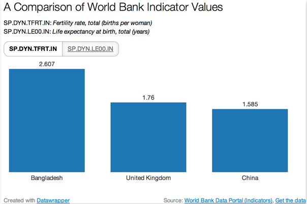
This sort of chart is known as a bar chart. Each bar relates to a different thing, in this case fertility rate in different countries. It was created using a tool called DataWrapper that is used by an increasing number of news organisations across the world to illustrate their online news stories with interactive data charts.
Three different countries are arranged along the horizontal axis in an order that we can specify. For example, we might organise the bars according to the alphabetical ordering of the names of the things they relate to, or we might sort the bars by increasing or decreasing value, as shown above.
The height of each bar is proportional to some measurement or property that we associate with each thing. What the measurement is is described by the label alongside the vertical y-axis. In this particular chart, there is no explicitly shown vertical y-axis. In many cases, a vertical axis will be specified, along with the units that apply to the number scale marked on the axis.
So what does this chart say? How do we read it? The chart shows the fertility rate (SP.DYN.TFRT.IN) in 2005 for three countries - Bangladesh, the United Kingdom and China - according to World Bank data. The rate for each country is indicated above each bar (2.607 for Bangladesh, 1.76 for the United Kingdom and 1.585 for China). The height of the bars is proportional to the value of the indicator. The bars are ordered left to right by decreasing indicator value.
The original chart is actually an interactive chart, developed using datawrapper.de. (You’ll see how to create something like it for yourself later on in this collection of articles).
If you click on the SP.DYNLE00.IN button, you can see the corresponding values for the life expectancy at birth in those countries for 2005. Note how the chart is animated to sort the columns again by value.
This chart is an example of a grouped bar chart. But how can we read it and what can we learn from it?
Q: What comparisons does this form of chart allow us to make? With the data shown, how do the countries compare?
ANS: As well as allowing us to compare values of the same indicator across different countries, we can also use to make a comparison across time for each particular country. (We can also make “crosswise” comparisons of the value in one country at one time with another country at a different time.) For each country, the fertility rate indicator value for the years 1975 and 2005 are shown next to each other. The chart shows that the UK value has remained relatively constant at just under two; the Chinese rate has halved, and is now less than the UK value, and the Bangladeshi value has decreased even more dramatically.
In this chart, the number represented by the height of each bar is not show explicitly but we can get a reasonable estimate of it by imagining a horizontal line drawn across the top of it bar until it intersects with the vertical y-axis, and then reading off the value of the crossing point.
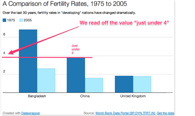
With a more finely calibrated y-axis, or interactive number guides displayed by the chart, we could read off a more precise value. Or, in the interactive chart, we can simply hover over one of the bars and the value will be displayed.
Note that the units are not explicitly given for the y-axis in this chart. Can you think what they might be?
From the chart title, we conclude that the y-axis represents fertility rate. The units of the y-axis are are not clearly stated, but I would assume (possibly incorrectly) that the axis describes the ‘average number of children per woman’ (just what that word “average” actually means we’ll return to later). But why do I assume this? The title talks about a fertility rate, which means the fertility per something. That something is presumably “per woman” (though we do not know if it means “per women who have at least one child” or “calculated over every woman in the country”, that is, simply “per woman”). This ambiguity is obviously not ideal, but it is typical of the sort of thing we see reported every day. One aim of this collection of articles is to help you develop the critical skills that allow you to try to make sense of such numbers as well as working out where the risks lay when making assumptions about them if they are ambiguously or poorly reported.
The questions that statistics asks
At its heart, statistics is concerned with asking the following questions: is this thing the same as another thing, given things vary? Or: is this thing or these things behaving in a particular way, given things vary? Or: how can we (mathematically) describe how this thing is varying, given that it may vary (using two senses of the word vary here)? There is a wide variety of statistical techniques for helping make these decisions, but we will be particularly interested in trying to identify statistical graphics techniques that allow us to make these distinctions in a reliable and not misleading way.
Sometimes, however, our charts may still leave grounds for ambiguous interpretation, at least in a statistically meaningful sense. For example, from the above chart, we might reasonably conclude that the Chinese and Bangladeshi rates really have fallen between 1975 and 2005. But can we make the same claim about the UK values? Did they really fall in any meaningful way between 1975 and 2005?
All measures are subject to some element of noise or error - the difference between a measured value and the actual value. These errors are often introduced as a result of calculating a value based on a sample of a population and then assuming that the same value holds true for the whole population. An important part of statistics is to help us ask questions about whether a perceived difference or trend really is a difference or trend, or whether the differences are just a result of chance. For example, that by chance our sampling of birth rates represented a fair sample, or whether, by chance, the fertility rate values were only measured from a sample of people who had had an unusually large or small number of children.
Throughout this course we will consider several ways in which statistics can help us make sense of whether two things that appear to be the same - or that appear to be different - really are likely to be the same, or different.
Learning to read charts - line charts
The following sort of chart is know as a line chart. As with the interactive bar chart, if you hover over a line at a particular point you should be able to read off the value of the indicator at that point.
Line charts are typically used to show how continuously varying quantities change over time, the steepness (or gradient) of any slope showing how great the rate of change is at that point. Of course, how steep a line is depends on the range of values it covers on the vertical y axis, and the period of time of which it changed as described on the horizontal x-axis, so you need to check that you know what values and units are used to describe the numbers on each of those axes.
Although we only have values for the fertility indicator rate on a year by year basis, if we assume the values change relatively smoothly we can use a line to connect the points. The line provides a visual cue as to how we we think the values might change over time. In the above chart, we see the UK fertility rate seemed to be holding quite steady, and the value for Bangladesh appeared to decrease quite steadily from 1975 (but how was it behaving prior to that, for example between 1950 and 1965?). In China, an initial period of decrease from 1975 to 1980 appears to have been interrupted by a small increase between 1980 and 1985, before the downward trend resumed until 1995, since when the number appears to have held steady at a rate slightly less than the UK rate.
Scatter plots over time
The next sort of chart type we need to consider is known as a scatter plot. In a scatter plot, the horizontal x-axis and vertical y-axis values represent different dimensions of the same thing and a mark is place on a chart to represent that thing - and the x- and y- indicator values associated with it.
For example, the data we used to plot the line chart that showed fertility rate over time can also be used to draw a scatter plot. Rather than using a line a to connect hidden data points, we mark each data point on the chart explicitly.
The following chart can be used to plot life expectancy, or fertility rate, against the year for various countries.
If you hover over the vertical y-axis label you should be able to select fertility rate or life expectancy indicator values for some other countries.
Plotting indicator values across time helps us see how individual values have changed over the years. If you look at the charts for different indicators and countries, you should be able to spot different shapes or patterns in the chart.
For example, where the points start in the bottom left hand corner of the chart and appear to move up to the top right hand corner for increasing time (increasing horizontal x-value), we have an increasing trend over time.
Where the points start at the top left hand corner and appear to work their way down to the bottom right hand corner, this represents a decreasing trend over time: the vertical y-values get smaller as the year on the horizontal x-axis gets larger.
Where the line appears to be relatively flat (that is, where there is little variation in the height of the points) there is no apparent change over time. One thing to be wary of when making this sort of judgement is the range of values depicted on the vertical y-axis. A largely unchanging indicator value may appear to show wide swings in behaviour over time if the range of values (the difference between the largest and the smallest indicator values) is very small and yet fills the whole chart range.
Scatter plots more generally - charting one indicator against another
Scatter plots become even more powerful when we plot two indicator values against each other because they help us see whether any relationships appear to hold between the different indicators.
For example, does the value of one indicator go up (that is, increase) as the value of another indicator increases (a proportional relationship)? Or does the value of one indicator go down (that is, decrease) as the value of another goes up (an inversely proportional relationship). Or maybe there doesn’t appear to be any pattern in the way the numbers behave at all (they are, perhaps, uncorrelated with each other).
Test your understanding
For the scatter plot of the fertility rate against life expectancy for Bangladesh, what sort of relationship appears to hold?
Select the appropriate settings for each of the two chart axes. For example, set the horizontal x-axis to SP.DYN.LE00.IN Bangladesh and the vertical y-axis to SP.DYN.TFRT.IN Bangladesh.
It seems that as the life expectancy increases the fertility rate decreases. Perhaps there is some sort of relationship here?
Now look at how the fertility rate and life expectancy for China compare with each other.
In this case we see that the relationship may not be so straightforward.
Whilst this sort of chart allows us to make a comparison between the values of two different indicators at the same time, it does not straightforwardly tell us what time period each point corresponds to: time is not represented on either axis in this chart.
You can use the following interactive chart to explore the relationship between the fertility rate and life expectancy for several different countries (the UK, Bangladesh and China) using data collected on an annual basis from 1975 to 2005.
Select your own values for each axis by hovering over the axis label and selecting the quantity you wish to represent on that axis.
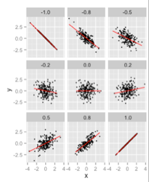
In this chart, we see how a range of x and y values are differently correlated with each other. In the chart in the top left hand corner, there is a very strong negative correlation between the values (as one goes up, the other goes down). In the bottom right corner, we have a strong positive correlation - the numbers going up and down with each other. In the middle we have zero correlation - there is no relationship (other than a random one) between the values. To the left and right of the middle panel, we have weakly correlated values.
Rather than having to plot a chart every time we want to spot a correlation, we can calculate a special sort of number from two data series that tends to indicate how strong the relationship is between paired series. The number is known as a correlation coefficient and it ranges in value from -1 to +1. Sets of numbers that increase in tandem with each other exactly (for example, the correlation of a series of numbers with itself) have a correlation of +1; and two series of numbers that have a purely antagonistic relationship (as one series goes up in value, the other goes down, for example a series of numbers and the same set of numbers as negative numbers) has a value of -1
To account for the fact that different numbers may increase together in different way, statisticians have actually come up with several different ways of calculating correlation coefficients that work in slightly different ways and that may give different values to each other when applied to the same datasets.
As with all statistical measures, however, a large correlation coefficient does not necessarily indicate a strong linear relationship between two sets of numbers. A visual check of how the data correlates using a scatterplot can often provide more context to help you check the interpretation of the correlation coefficient value.
Extending the scatter plot - bubble charts
Scatter plots are an excellent tool for helping us look for relationships between two different data dimensions. But what if we want to tool for patterns in a data set that has three dimensions? A bubble chart extends the notion of scatterplot by associating a third dimension with the size - and more specifically, the area - of each circular marker.
This approach allows us to look for relationships between three variables by comparing not only the perceived shape that the points make on the chart (an upward trend, for example) but also the distribution of different sized markers. For example, if the markers get larger to the right of the chart, it suggests that the indicator they represent is in some way proportional to the value represented by the horizontal x-axis.
Let’s bring in another indicator from the World Bank - the mortality rate under 5 per 1,000 live births (SH.DYN.MORT), defined as follows: “under-five mortality rate is the probability per 1,000 that a newborn baby will die before reaching age five, if subject to current age-specific mortality rates.” This measure can help us identify whether a high fertility rate means we’re likely to get a booming population rate. If the child mortality rate is high, then the number of people living to child-bearing age may not be so high.
To set the area according to an indicator value, we need to click on the settings icon (the gear wheel) and then select the appropriate data item for the Circle area attribute in the Circle Options area.
By setting axis values appropriately, we can see how the life expectancy in China (SP.DYN.LE00.IN on the vertical y-axis) relates to under 5 mortality (SH.DYN.MORT on horizontal x-axis) with the bubble size representing fertility rate. The chart shows how mortality rate and fertility rate are proportional to each other (smaller bubble: lower fertility rate; more to the left: lower under 5s mortality but inversely proportional to the life expectancy. Which is to say, longer life expectancy seems to go hand in hand with lower fertility rates and fewer under 5s deaths per 1000.
The bubble chart is a very powerful chart in that it allows us to look for correlations across three different pairings at the same time. One pair relates to the correlation between x and y values, (does the relationship follow a straight sloping line in either direction, for example); one pair to the bubble size and the x value (do the bubble sizes increase or decrease moving left to right across the chart, for example); and the third pair to the bubble size and the y value (do the bubble sizes increase or decrease moving vertically up or down the chart, for example). A correlation between all three dimensions might be revealed when, for example, the x-y values correlate showing a distinct trend line up and to the left with the bubble sizes also increasing along that perceived line.
Three dimensions good, four dimensions better?
The ability to plot three dimensions on a bubble chart means we can start to look for quite complex relationships within a data set. But how about if we could compare four dimensions at a the same time?
This is certainly possible if we use the colour of each bubble to represent to a fourth dimension.
Note that colour mappings often work best for dimensions that are “categorical” (also referred to as nominal) rather than continuous number ranges, such as the names of things or groups. In this chart, colour is used simply to cue different groupings. However, it is also possible to use colour to represent a continuous range numerical values. This is often done using a single colour (that is, a single hue) with the brightness (value, or tone) of the colour depicting value - for example on a scale of 0..1 dark blue may represent 0 and a light blue may represent 1. Number ranges may also be associated with spectral scales that spread across several hues. For example, a temperature scale showing temperatures from 0ºC and 100ºC may use a “cool” or “cold” blue colour for 0 degrees, a “middling” colour such as yellow for 50 degrees and a “hot” red colour for 100 degrees. One danger associated with such multicoloured scalings is that the colour mapping may be culturally sensitive and not translate well.
Motion charts
The software that Hans uses in many of his presentations, variously known as “the Trendalyser”, motion charts, and “the Gapminder software” can be found on the Gapminder Foundation website: http://www.gapminder.org/ . A downloadable desktop version of the software is also available from the same source. The motion chart adds another dimension to our visualisation, time, which is represented by animating the points.
Unfortunately, the Gapminder software does not currently run on many tablet or handheld devices, so we will be using a different piece of software (that achieves a similar effect). If you can run the Gapminder software, you might prefer to try using that.
You can play the animation by clicking on the play button. You can change the speed of the animation using the slider next to the play button. Hover over a bubble to pop up data relating to that point. To change the variable mappings on the horizontal x and vertical y axes, select the axis label that indicates the current mapping. To change the colour and bubble size mappings, select the vertical bar at the top right of the display. Then for the value you wish to change, select it to raise a pop up menu that allows you to configure the mapping as required.
The key column is the data column that is mapped to the play bar. Typically, this should be set to the column that represents the data the indicator value applies to.
The category column identifies the label that will be displayed for each bubble.
The Gapminder tools work in a very similar way - select the values you want to associate with the x- and y- axes, the bubble size and the bubble colour and hit play to start the animation.
So where do we go from here?
Now we've seen something of what data is available, and how we can start to visualise it, we can start to explore some of the issues surrounding international development, from population growth to GDP, mortality rates to carbon emissions.
So with chart types in mind, and data to find, let's move on to Looking at Population Data
Articles in this collection...
-
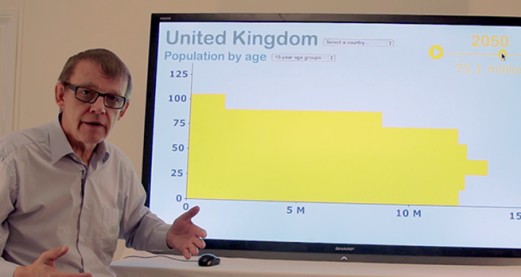
Looking at population data
Watch now to access more details of Looking at population dataTony Hirst and Hans Rosling take us on adventure through population data and what it can tell us.
Level: 3 Advanced
-
How to compare income across countries
Watch now to access more details of How to compare income across countriesWhen we want to compare figures from two different countries, what makes for a fair basis of comparison? Tony Hirst and Hans Rosling explain.
Level: 3 Advanced
Rate and Review
Rate this video
Review this video
Log into OpenLearn to leave reviews and join in the conversation.
Video reviews