
Building number confidence: Graphical data
4. Charts and graphs
While tables provide precise information and values, they can be difficult to interpret at a glance.
Charts, graphs, and pictograms can be more immediately engaging, as they present a visual overview which can quickly help the viewer to:
- identify trends
- compare values
- understand proportions
- recognise patterns and outliers.
Charts summarise data in a simple, visual format, providing a snapshot of data highlights which can be understood by a general audience.
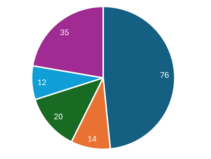
For example in the pie chart below, segment sizes can easily be compared, providing an immediate visual impression of a data set.
Graphs are often aimed at a specific audience, technical or scientific for example, allowing relationships between variables to be studied in more depth.
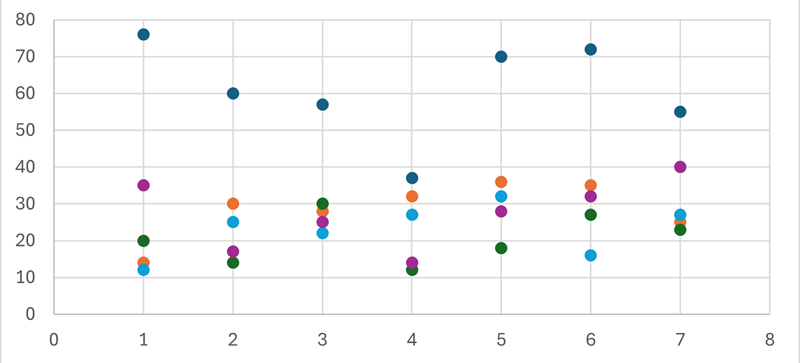
For example, an initial impression of the data plotted in the scatter chart below is not immediately revealing; it requires closer study.
In the following pages we will look at examples of the most common types of charts and graphs.