
Building number confidence: Graphical data
4. Charts and graphs
4.4. Area chart
An area chart is similar to a line chart, but highlights proportions by using colours, or shading, to fill the areas below the lines.
It can be difficult to discern individual values, however, particularly where areas overlap.

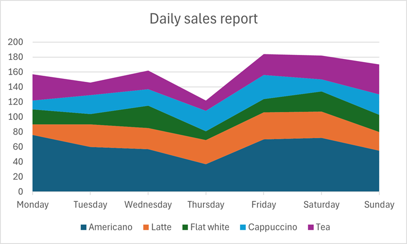
Data from: Daily sales table.
| Americano | Latte | Flat white | Cappuccino | Tea | |
|---|---|---|---|---|---|
| Monday | 76 | 14 | 20 | 12 | 35 |
| Tuesday | 60 | 30 | 14 | 25 | 17 |
| Wednesday | 57 | 28 | 30 | 22 | 25 |
| Thursday | 37 | 32 | 12 | 27 | 14 |
| Friday | 70 | 36 | 18 | 32 | 28 |
| Saturday | 72 | 35 | 27 | 16 | 32 |
| Sunday | 55 | 25 | 23 | 27 | 40 |
A stacked area chart reorders the categories to clearly show the proportion of each to the total value. However this reordering can cause confusion. For example the highest sales (Americano) in our Daily sales report appear at the bottom of the stack, with the lowest (teas) at the top of the stack, which may not seem logical.
As with line charts, a simple area chart can be most useful when used to show relationships, and highlight differences, between one or two data sets
Looking at teas and Americanos only, from the Daily sales report, it is clear that sales of Americanos are at least double those of teas on most days.
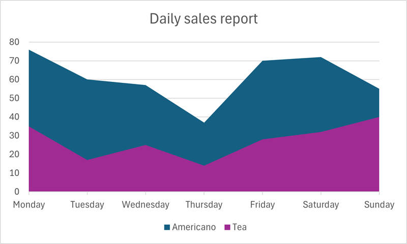
Data check
Looking at the chart above, on what day of the week do the number of teas sold reach a value greater than half of the number of Americanos sold?
On Sunday, the proportion of teas sold is clearly greater than half of the Americano sales. Americano sales are between 50 and 60 on the y axis, and teas are around 40.