
Building number confidence: Graphical data
4. Charts and graphs
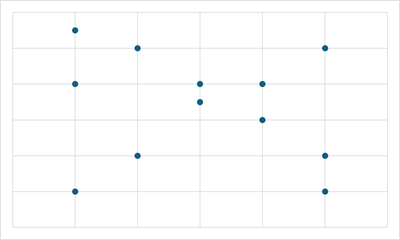
4.6. Scatter chart
Scatter charts plot the x, y coordinates of pairs of variables, providing a visual representation of the data which can be examined for potential relationships.
These charts are aimed at specific audiences - technical or academic for example - and can be difficult to interpret if not in those fields. This section, therefore, provides only a brief overview of the main features.
A scatter chart has been prepared using student test scores, alongside the number of tutorials each student attended. This chart will help the academic team to see if there is a link between the number of tutorials attended and the test results achieved.

Data from: Student Test Results table
| Student | Tutorials attended | Test result |
|---|---|---|
| A | 0 | 50 |
| B | 0 | 60 |
| C | 0 | 80 |
| D | 0 | 55 |
| E | 1 | 50 |
| F | 1 | 55 |
| G | 1 | 65 |
| H | 1 | 60 |
| I | 1 | 70 |
| J | 1 | 75 |
| K | 2 | 60 |
| L | 2 | 80 |
| M | 2 | 71 |
| N | 2 | 75 |
| O | 3 | 80 |
| P | 3 | 85 |
| Q | 3 | 75 |
| R | 3 | 78 |
| S | 4 | 80 |
| T | 4 | 85 |
| U | 4 | 90 |
| V | 5 | 95 |
| W | 5 | 90 |
| X | 5 | 85 |
| Y | 5 | 97 |
The scale on the x-axis (0 to 5), along the bottom of the chart, shows the the number of tutorials attended. The scale on the y-axis shows test scores achieved.
Looking at the chart, the test scores, on the whole, appear to rise with the number of tutorials taken. So we could say that the chart shows a positive relationship, or positive correlation.


Positive correlation
As one variable increases, the other also increases.

Negative correlation
As one variable increases, the other decreases.
No correlation
No relationship is apparent between the variables.