5.7 Comparing art works
One of the most important ways that an art historian can discover more about the relationship between effects, techniques, context and meanings in an art work is to compare it with another art work. For example, a comparison of two works depicting the same subject matter but in different ways might better highlight the effects of the techniques that have been used. This can also reveal much about the way each artist has attempted to convey a possible meaning through their use of form.
Activity 9: Comparing the use of colour in No Woman No Cry and Life
Look at Plates 3 and 7 below and make notes on the differences and similarities in the way that colour is used in each art work.
Plate 3
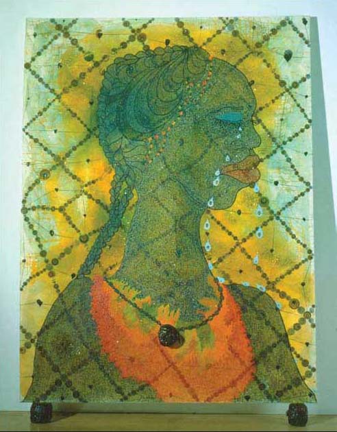
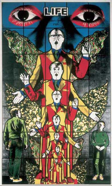
Plate 7
Use the questions in Table 5 (below) to help you with your answer. Don't forget to consider the relationship between techniques and effects in each art work in terms of:
a.the mood conveyed by the colour in the work
b.the possible use of colour to control the way that you read the work.
Your response to this activity will provide further evidence that you can use when planning an interpretation of No Woman No Cry later. You could consider trying either a table or a mind map to structure your notes. A possible table format is provided below.
| Technique: No Woman No Cry | Effect: No Woman No Cry | Technique: Life | Effect: Life | |
|---|---|---|---|---|
| Has a wide or narrow palette of colours been used? | ||||
| Have contrasting colours been placed next to each other? | ||||
| Are there more warm colours than cool colours or vice versa? | ||||
| Would you describe the colours as being bright or dull? Are there more bright colours than dull colours (or vice versa)? | ||||
| Has colour value been used? |
Discussion
How did you get on? To give you an idea of the way in which both mind maps and tables might be used to make comparisons of two art works, I've presented my own, brief, conclusions in both these formats.
| Technique: No Woman No Cry | Effect: No Woman No Cry | Technique: Life | Effect: Life | |
|---|---|---|---|---|
| Has a wide or narrow palette of colours been used? | Quite a restricted palette | Gives a natural feel to the art work. Keeps the spectator focused on the central figure | Fairly restricted palette of more ‘expressive’ colours. Dominance of primary colours | Gives art work a cartoon-like feel and emphasises its artificiality |
| Have contrasting colours been placed next to each other? | Contrast between the blue eye and yellow background | Gives the painting depth and moves the spectator's eye around the composition | Contrasting blue, yellow, red and green hues | Add to the immediate impact of the art work and to its apparent artificiality |
| Are there more warm colours than cool colours or vice versa? | Mainly warm colours are used. The red and yellow around the woman's neck looks particularly warm, even hot | This gives a comforting, positive feel to the work | A combination of warm and cool colours has been used | This gives the art work a balanced feel that is neither warm nor cool overall |
| Would you describe the colours as being bright or dull? Are there more bright colours than dull colours or vice versa? | The colours used are quite bright, especially the yellows, reds and oranges | This gives the art work a positive and warm feel. The bright red on the woman's chest and red lips are focal points to which the spectator's eyes are drawn | Quite bright colours | Adds to the simplistic feel |
| Has colour value been used? | Subtle colour value shading is used depicting the woman's head, neck and body | This helps to model figure, giving it solidity and making it look realistic and natural | Not much colour shading. Value contrast is widespread | This gives the art work quite a flat feel. The value contrast gives the work a cartoon-like feel |