

2.2 The diversity of family life today: activities
The following three activities give you an opportunity to look at data which supports some of these conclusions about diversity in family life. We have chosen three sets of data, the first relates to the increase in lone parents, the second to the increase in births outside marriage and the third to marriage, divorce and remarriage figures. As well as building up your understanding of why family life is more diverse today, these activities will give you a taste of ‘reading’ numerical data.
Activity 2
Look at Table 1, which shows families with lone parents and dependent children as a percentage of all families with dependent children, and answer the following questions.
| Percentages | |||||
|---|---|---|---|---|---|
| 1971 | 1981 | 1991 | 1999 | 2001 | |
| Lone mothers | |||||
| Single | 1 | 2 | 6 | 8 | 9 |
| Widowed | 2 | 2 | 1 | 1 | 1 |
| Divorced | 2 | 4 | 6 | 6 | 6 |
| Separated | 2 | 2 | 4 | 4 | 4 |
| All lone mothers | 7 | 11 | 18 | 20 | 20 |
| Lone fathers | 1 | 2 | 1 | 2 | 2 |
| All lone parents | 8 | 13 | 19 | 22 | 22 |
According to this table the percentage of families headed by lone mothers increased from 7 per cent in 1971 to 20 per cent in 2001. Which category of lone mothers increased the most?
In 2001 the percentage of families headed by lone mothers was 20 per cent. What was the percentage of families headed by lone fathers?
In 1971 8 per cent of families were headed by lone parents. What was the percentage in 2001?
Note: if you have not come across percentage (written as %) before, it is useful to think of it as ‘out of a hundred’.
Answer
Here are the answers:
Single mothers increased the most, from 1 per cent to 9 per cent (that is a change from one in every hundred families in 1971 to nine in every hundred families in 2001).
2 per cent of families were headed by lone fathers.
The percentage in 2001 was 22 per cent.
So, to summarise, this table provides evidence of an increase in lone parents generally but an increase in single mothers particularly.
Some of you may have found this activity easy. But for some of you this may have been the first time you had to read numerical data in this way. It gets much easier with practice. So don't worry if you did not get the right answers this time. But go over the correct answers now to make sure you know how they were arrived at. The key to success is to take it slowly.
Activity 3
Now look at Figure 6 a graph showing births outside marriage as a percentage of all live births. Again, take each question slowly.
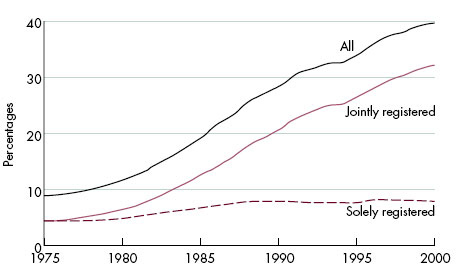
In 1975 just fewer than 10 per cent of all live births were outside marriage. What was the approximate percentage in 2000? (We have asked for the approximate number because although a graph like this gives us a good picture of the changes it is difficult to be precise.)
In 1975, of the 10 per cent of births outside marriage, half were jointly registered (i.e. by both parents) and half were solely registered. Which has increased more since then, jointly or singly registered births?
Answer
Here are the answers:
The percentage in 2000 was approximately 40.
The greatest increase was in jointly registered births.
So, to summarise, this graph provides evidence of the increasing proportion of births to couples rather than to single mothers; but to couples who are not married.
Again many of you will have found this quite an unfamiliar exercise. If you did not get the right answers go back to the graph and follow each curve from the bottom left hand corner.
Activity 4
Finally look at Figure 7 which shows numbers of marriages, divorces and remarriages (in thousands) between 1961 and 1999. This is another way of presenting data in the form of a graph. Answer the questions below.
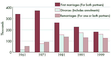
The number of first marriages is shown in the left hand block for each year. Approximately how many first marriages were there in 1961?
What has happened to the number of first marriages since then?
The number of divorces is shown in the middle block. Has the number of divorces increased or decreased since 1961?
Approximately how many remarriages were there in 1999?
Answer
Here are the answers:
Approximately 330 thousand.
After a slight increase in the next decade, it has declined to approximately 180,000 in 1999.
It has increased.
Approximately 110 thousand.
So, to summarise, we have evidence of an increasing divorce rate, although this seems to have levelled off since 1991. More marriages have been remarriages (for one or both partners) and there have been fewer first time marriages.
We hope that these three activities have given you an idea of how tables and graphs can tell you a lot of information quite quickly. In this case they provide evidence of some of the changes in family life during the latter part of the twentieth century. These changes can explain the increased diversity of family life today.