

1 Graphs and charts
At the end of last week you looked at how useful tables are for summarising a lot of data concisely, clearly and accurately. However, sometimes you want to get an overall message across quickly and this may well stay hidden in a table of data. In this situation you can use a graph or a chart instead. Graphs can also be used to explore relationships between sets of data, such as the way in which a sunflower grows over a season.
You have probably seen different types of graphs and charts in your day-to-day life, such as when watching the TV, reading a newspaper or on the internet. Here is a flavour of some you may have encountered.
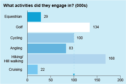
Bar charts
These allow a visual comparison between different categories. For instance, in Figure 1 you can see very quickly that the hiking/hill walking category was the most popular activity, and cruising the least popular.
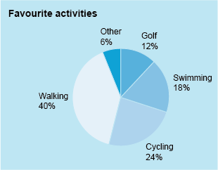
Pie charts
Again, these allow a quick visual comparison between categories but this time using percentages rather than the actual data. This pie chart shows very clearly that walking is the favourite activity.
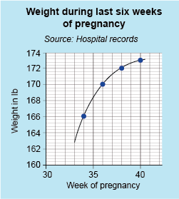
Line graphs
Finally, a line graph, where all the plotted points are joined, can show clear relationships between the plotted data. In this case, the curve shows that the weight (or as it’s properly known, mass!) of a woman increases over the last six weeks of her pregnancy, but that this weight gain slows towards the end. This is shown by the flattening out of the curve in Figure 3.
You may well have come across other charts or graphs, but as these are three of the most common types, bar and pie charts and line graphs will be the focus of this week. To get you started, in the next section you will look at plotting points on a line graph.