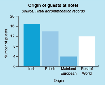
3.1 Drawing a bar chart
The same basic guidelines apply to drawing a bar chart as they do to drawing a line graph. There are a few differences though. So, the steps to follow are:
- Choose an appropriate scale for both axes.
- Label both axes, including a brief description of the data and any units.
- Give your graph a suitable title.
- State the source of data.
- Draw the bars for each category accurately.
Use the skills that you have already gained when drawing a line graph to complete this activity.
Activity 6 Drawing a bar chart
Last week you created the following table showing information about hotel guests:
| Nationality | Child | Adult | Senior | Total |
|---|---|---|---|---|
| Irish | 8 | 5 | 4 | 17 |
| British | 4 | 6 | 4 | 14 |
| Mainland European | 0 | 3 | 1 | 4 |
| Rest of the world | 6 | 4 | 2 | 12 |
| Total | 18 | 18 | 11 | 47 |
Use the table to draw a vertical bar chart that shows the total number of guests in each of the nationality categories. Mark the nationality categories on the horizontal axis and the number of guests on the vertical axis.
Another way of showing data on a bar chart is using a component bar chart, which can give more detail than the basic examples that have already been looked at. This will be the subject of the next section.

