4 Pie charts
Although bar charts are useful to display numbers and percentages, sometimes you might want to stress how different components contribute to the whole. Pie charts are often used when you want to compare different proportions in the data set. The area of each slice (or sector) of the pie chart represents the proportion in that particular category.
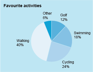
For example, the pie chart in Figure 18 illustrates the favourite type of exercise for a group of people:
This pie chart shows the percentages for each category, so you can read these off directly. Even without the percentages marked, it would be clear that walking was the most popular activity overall as a proportion of the whole group.
Sometimes, however, the percentages are not marked on the chart, so the proportions then have to be roughly estimated by eye. This, of course, is not ideal for all situations when accurate data is required!
The next activity gives you a chance to practise reading a pie chart.
Activity 7 How employees travel to work
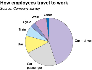
The pie chart in Figure 19 illustrates how employees in a particular company travel to work:
Use Figure 19 to answer the following questions:
(a) Do more people travel to work by bus or by train?
Answer
(a) The slice of the pie representing bus travel is larger than the slice representing train travel, so yes, more people travel by bus than by train.
(b) Would it be correct to say that the number of employees who travel to work as car drivers is about twice the number who travel as car passengers?
Answer
(b) The slice of the pie chart representing car drivers is about twice the size of the slice representing car passengers, so it is correct to say that the number of employees who travel to work as car drivers is about twice the number who travel as car passengers.
(c) Estimate the proportion of employees who travel to work by car, either as the driver or as a passenger.
Answer
(c) The two slices for car drivers and passengers cover about two-thirds of the circle, so about two-thirds of employees travel to work by car, either as the driver or as a passenger.
If necessary – and providing the pie chart has been drawn accurately – you can also work out the percentages by measuring the angle at the centre of the pie for each sector using a protractor. For example, the angle at the centre of the circle for the ‘Car passenger’ category in Activity 7 is about 80º.
Because a complete circle measures 360º, the fraction that this sector represents is , or 22%. So approximately 22% of the employees travel to work as car passengers.
However, as pie charts are often used to give an overall impression rather than detailed information, on many occasions a rough estimate will suffice.
This concludes our look at three different ways of displaying data visually. Before moving on to the last badged quiz for this course though, there are some words of caution for you on reading graphs.


