1.3 Drawing graphs
This experiment requires you to plot your results on a graph. Before we move on to the actual experiment, here is a quick refresher on how to plot line graphs.
Graphs are a great way of presenting numerical data visually; they are used to illustrate clearly the relationship between quantities. There are several different types of graph, but for this course you will only be focussing on how to use a line graph.
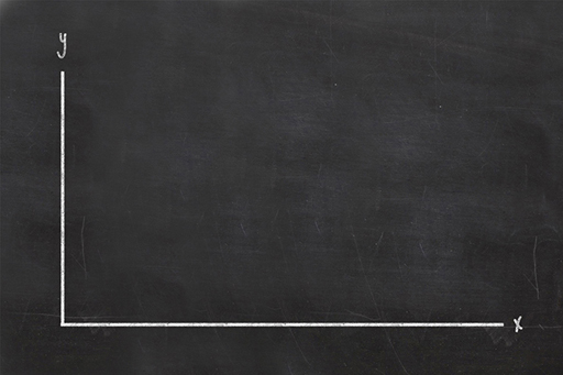
The x-axis and the y-axis
The axes on a graph are your reference lines; they carry the scale of your graph and help you locate where to plot each piece of data. They also tell you what variables your graph is illustrating a relationship between.
Line graphs are commonly used to show data that change over a period of time. A simple line graph is drawn with two axes: an x-axis that is drawn left to right across the page, and a y-axis that is drawn up the page.
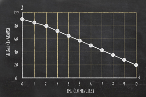
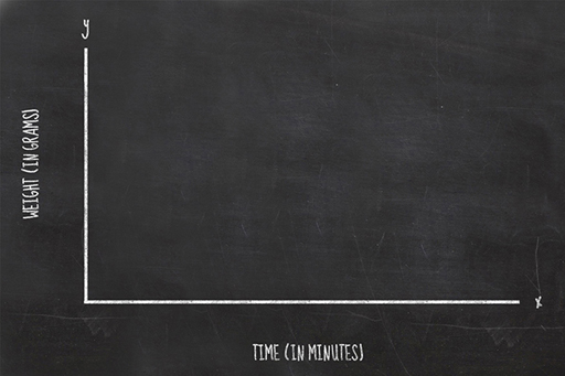
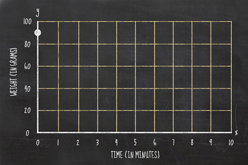
Scientists like consistency and it is standard practice to put the thing you’re measuring on the y-axis. So, as the change in weight of a potato is what you will be measuring in this experiment, this will be the data plotted on your y-axis. Because you are measuring the change in the potato’s weight over time, the time will be the data illustrated by your x-axis. The graph will therefore show the relationship between cooking time and potato weight.
Once you have drawn the axes of your graph, remember to write alongside them both what they represent and the units they are displayed in, i.e., time (in minutes) and weight (in grams).
Setting the scale of your graph
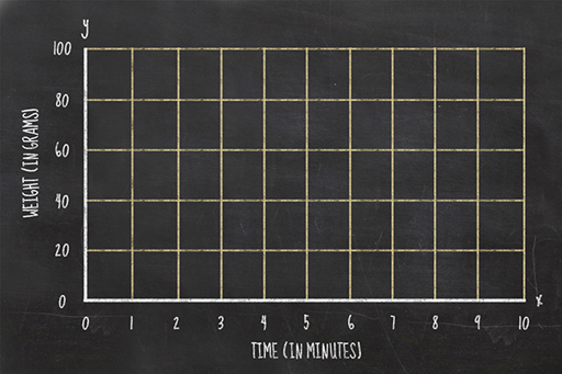
When drawing your axes, you need to number them appropriately for the experiment you are carrying out, so your y-axis should range from zero to a number just a bit larger than the weight of your potato. Your x-axis should be labelled with the number of minutes of cooking time, probably from zero to about 10 to 15 minutes if using a microwave oven, and zero to maybe 100 minutes if you are using a conventional oven.
Plotting your data
When you obtain a measurement, you write down the weight and the cooking time. To plot this on a graph, you need to find where those two values intersect. For example, if your potato weighed 90 grams at zero minutes, then you would plot your first data point as a dot at the intersection between those two lines.
Once you have all your data plotted on a graph you should join the consecutive points with a line.