

4.1.1 Using graphs
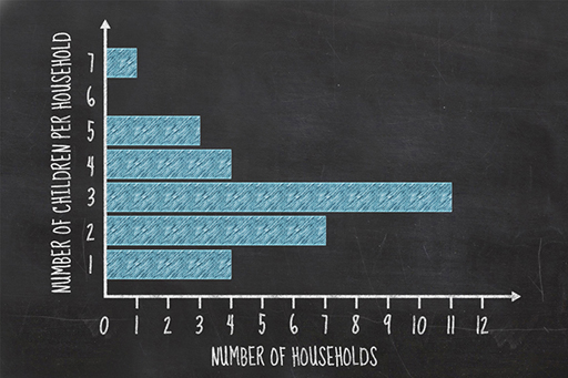
Media graphics and graphs come in many forms. This is a bar chart presenting the absolute numbers of children in families (not fractions or percentages). These charts can be drawn with the bar displayed either horizontally or vertically. When the bar extends horizontally, they may also be known as ‘row charts’ and when the bar extends vertically, they may be known as ‘column’ charts’.
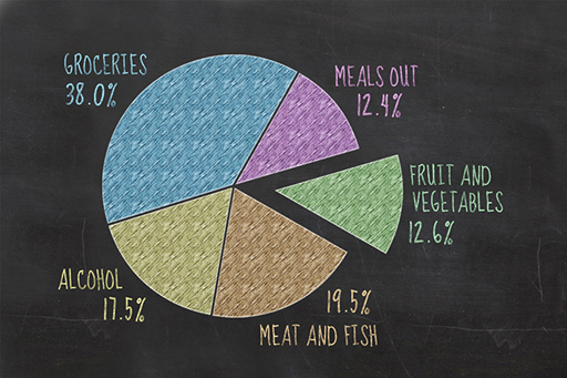
This is another type of graph (a pie chart) commonly used in media, categorising the average family’s expenditure on food and drink. Is it possible to judge whether your own family is similar? What further data do you need to help you do that?
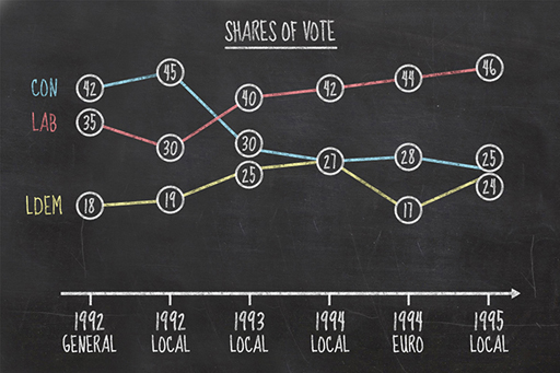
Time series graphs are also commonly used in the media. They can be used to identify a trend, and often imply some outcome in the future. For example, using this graph, who do you think won the UK election in 1997?
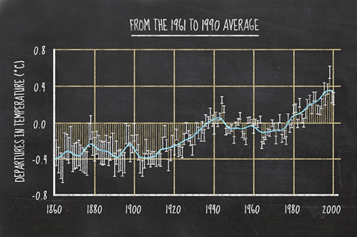
Finally, some graphs cross the boundary between presentations for fellow scientists and those intended for public consumption in the media. The graph shows the range of global average temperature from 1860 to 2000. Why does the graph not extend further back in time than it does? What does the graph show overall? Is the flat zone between 1940 and 1960 important? Is the recent temperature rise faster and sustained? The line appears to flatten in the late 1990s – does this mean that global temperatures have plateaued?
Pay attention to the news today, either on television, in papers or on the internet. How many visual graphical techniques do you notice? Think about whether these are good, bad or even dangerous.