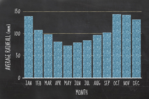
4.3 Types of graph and drawing graphs
Download this video clip.Video player: ou_futurelearn_numbers_vid_1031.mp4
Transcript
Drawing graphs and types of graph
SPEAKER:
Graphs are a simple and effective way of presenting numerical data. Such visual representations enable users to identify patterns easily, and are a powerful tool in illustrating the relationship between two quantities. Today, graphs are used almost everywhere, from news articles to television adverts, and we'll demonstrate how some common graph types are plotted.
Line graphs have two axes, an x-axis, which goes across the page, and a y-axis, which is vertical. These are your reference lines which carry the scale of the graph, and help you to locate where to plot each piece of data. Scientists like consistency, and it's standard practice to put the thing you're measuring on the y-axis.
For example, if you're interested in the amount of rainfall per day for five days, you'd put rainfall on the y-axis, and the number of days on the x-axis, making sure that you include the units that each axis is measured in. You'd plot each piece of data in turn, starting with the day, and then the rainfall. For example, the first point goes at the intersection between day one and 1.5 millimetres of rain, the second, at the intersection between day two and one millimetre of rain, and so on until all the points are in place. And because this is a line graph, consecutive points are then connected with a line.
Bar graphs are similar in their structure, also having an x and a y-axis. Bar graphs are most commonly used to plot the frequency of something in specific categories. If we use the same data as the previous example, the day would be the category, plotted on the x-axis, and the rainfall represents frequency, which is plotted on the y-axis. This time, instead of the point of intersection, each day category has a bar or column, with its height reflecting the rainfall experienced on that day.
The final type of graph, commonly presented in newspapers or during news articles on TV, are pie charts. Like bar graphs, these also use categorical information. They begin with a circle which is then divided into sectors, the size of which represents the relative size of each value. Once complete, your graph would look like this. To calculate the size of each sector, it's easiest to calculate each category's value as a percentage. However, these graphs are more difficult to plot 1 by hand than the other examples, and are often plotted on a computer which works out this step for you.
The graphs you see in magazines, newspapers, or advertisements take many forms. However, they mostly revolve around the three basic graphs you've seen here. Next time you see a graph, think about which graph type it is. Could the information have been presented better in a different graph type?
Interactive feature not available in single page view (see it in standard view).
So, you’ve seen how the same data can be presented using different types of graph, but how will you decide which type of graph to use for a given situation?