

2.2 Infant deaths in 19th-century England
More than 50% of all deaths in England and Wales in the mid-19th century were due to infections, with infants and children at greatest risk, as they still are in many parts of the world today. But in the 19th century, the death rates were far higher than they are currently anywhere in the world. A lot of progress has been made in reducing child deaths from infection, which can be tracked using two internationally recognised measures:
- the infant mortality rate (or IMR), the number of deaths occurring under one year of age per 1000 live births in a population (‘per’ means ‘out of every’, so the IMR tells you how many out of every 1000 live-born babies died in infancy)
- the under-five child mortality rate, the number of deaths before the fifth birthday per 1000 live births in a population.
Note that babies who died before birth (‘stillbirths’) are excluded from both of these mortality rates. In a moment we will look at some infant mortality data from the 19th century, but before we do that it is worth unpacking the term mortality rate.
‘Mortality’ simply means ‘death’, but what does ‘rate’ mean in this context? Just counting the total number of infants or children who died in a particular year or location doesn’t allow you to compare changes over time or between places, because the total number of people in the population fluctuates. If infant deaths go up or down between two years this might simply be because more (or fewer) babies were born in those years, so more (or fewer) babies died. Expressing the number of deaths as a ‘rate per 1000 individuals’ (or per 10 000, per 100 000 or per million – it doesn’t matter as long as you say what the rate refers to) allows meaningful comparisons to be made between different times or places. For example, we can compare the IMR in the 19th century and the IMR today and see how it has changed without having to allow for any difference in the total number of live births in the past and the present.
Figure 2 shows how infant deaths rose and fell between 1855 and 1880 in Stoke-upon-Trent (an English industrial town famous for its pottery factories in the 19th century) and in England and Wales as a whole. Figure 2 is a line graph – a method of presenting numerical data plotted on a grid between vertical and horizontal axes, each marked with a scale; the data points are joined by lines that makes it easy to see ‘at a glance’ how the pattern of values changes from left to right across the graph.
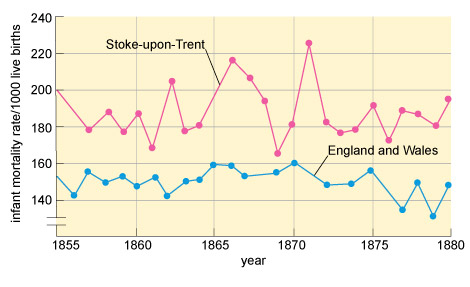
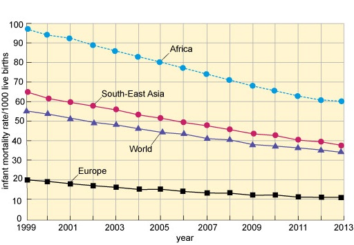
Line graphs are particularly suited to showing time trends (often abbreviated simply to ‘trends’), i.e. changes in a sequence of data during a period of time. There is a convention in graph plotting that if one of the variables is ‘time’, the time scale is plotted on the horizontal axis, as it is in Figure 15. We mentioned that infant mortality rates were much higher in the past than they are today. For comparison, the infant mortality rate has not exceeded 100 infant deaths per 1000 live births anywhere in the world at any time in the 21st century and is falling steadily, as Figure 3 shows.
Although we are rightly appalled by the modern-day loss of infant lives represented in Figure 16, it is hard to imagine that in communities like Stoke-upon-Trent in the 19th century almost a quarter of all babies died before their first birthday. Mortality among older children and adults was also much higher in the 19th century than it is today. We know this because the process of collecting population statistics began in the 19th century, demonstrating that infectious diseases were the major cause of death in England and the rest of the so-called ‘developed’ world until the 1950s, and they remain the major cause in poorer countries today.