

3 Mapping the divisions
The outcomes of the referendum have been powerfully represented in maps. The process of mapping highlights the more complex patterns of the vote.
Three maps are presented in Figure 2. The one in the middle is a relatively familiar image of the UK, with patterns of Leave and Remain highlighted. It simply shows the majority outcome across the different areas, broken down to indicate sub-regional differences (at a Westminster parliamentary constituency level). So, for example, the map shows that despite the overall Remain majority in Northern Ireland, some areas voted Leave; and in Wales, despite the Leave majority, some voted Remain.
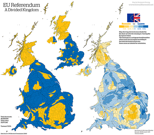
The other two maps on the left and right of Figure 2 take rather different approaches to the geography of the UK, using methods that highlight things quite differently. In them a picture – or cartogram – is constructed based around the size of the electorate, rather than the territory on the ground. What is generated remains recognisable, but it is distorted to reflect the number of registered voters in different areas. It emphasises the ways in which the population is distributed and concentrated. It would be of little help if you wanted to use it to identify the distances between places or to plan a route for travelling from A to B.
The map on the left continues to rely on a simple blue/yellow distinction, with Remain areas identified as yellow and Leave as blue. In other words, it continues to show the majority outcome by constituency. But the one on the right offers a more nuanced picture. It has the same base as a cartogram in which the size of the areas is defined through the number of potential voters, but this time an attempt is made to compare the intensity of the vote – the higher the proportion voting Remain, the deeper the blue; the higher the proportion voting Leave, the brighter the yellow. This makes it easier to see some of the complexities of voting patterns within regions and across national territories.
Activity 2 What the referendum cartograms show
Look closely at the two cartograms in Figure 2. What interpretations can you draw from them?
Feedback
In the cartogram on the left, you may have noticed that the balance between the votes represented by the colours seems much closer, particularly in England. There is more yellow and less blue. Scotland is still clearly Remain. But adjusting for population means that the islands of yellow spread out rather more than they did – there is not only a fairly solid band of yellow around London, but there are significant patches stretching to Bristol, Cardiff and into East Anglia, and also big patches around some of England’s northern cities. Meanwhile, by contrast, Northern Ireland seems to be rather more divided than is reflected in the more traditional map. In Wales, while the footprint of Cardiff becomes bigger, the Remain vote in West Wales finds a less powerful expression in the cartogram than in the more traditional map.
The most significant thing about the cartogram on the right is the way in which the sharpness of the colours fades because of the shading used. There are some areas in which the yellow is strong – there the Remain vote was close to 70%; and similarly in other areas the blue is strong – there the Leave vote was close to 70%. But elsewhere the differentiation is less sharply defined. Even in Scotland the Remain vote is not universally high, and even in the English Midlands and north of England the Leave vote is not universally strong. The UK may be deeply divided, but it may also be misleading to exaggerate the starkness of division, at least in geographical terms.