

2 Every picture tells a story
It can be difficult and confusing to look at a table of rows of numbers and make any meaningful interpretation especially if there are many rows and columns.
Handily, pandas has a method called plot() which will visualise data for us by producing a chart.
Before using the plot() method, the following line of code must be executed (once) which tells Jupyter to display all charts inside this notebook, immediately after each call to plot():
In []:
%matplotlib inline
To plot ‘Max Wind SpeedKm/h ’, it’s as simple as this code:
In []:
london['Max Wind SpeedKm/h'].plot(grid=True)
Out[]:
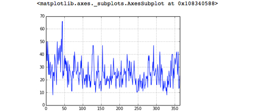
The grid=True argument makes the gridlines (the dotted lines in the image above) appear, which make values easier to read on the chart. The chart comes out a bit small, so you can make it bigger by giving the plot() method some extra information. The figsize units are inches.
In []:
london['Max Wind SpeedKm/h'].plot(grid=True, figsize=(10,5))
Out[]:
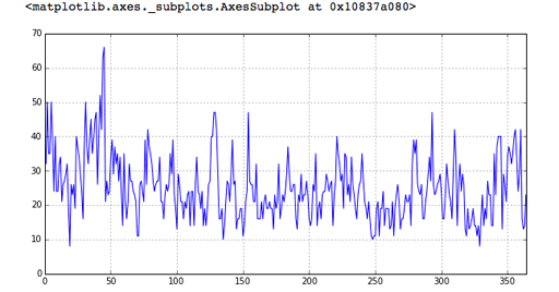
That’s better! The argument given to the plot() method, figsize=(10,5) simply tells plot() that the x-axis should be 10 units wide and the y-axis should be 5 units high. In the above graph the x-axis (the numbers at the bottom) shows the dataframe’s index, so 0 is 1 January and 50 is 18 February.
The y-axis (the numbers on the side) shows the range of wind speed in kilometres per hour. It is clear that the windiest day in 2014 was somewhere in mid-February and the wind reached about 66 kilometers per hour.
By default, the plot() method will try to generate a line, although as you’ll see in a later week, it can produce other chart types too.
Exercise 5 Every picture tells a story
Now try Exercise 5 in the Exercise notebook 2.
If you’re using Anaconda, remember that to open the notebook you’ll need to navigate to the notebook using Jupyter.