

4 Pie charts
Charts are basically maths pictures. There are two types of charts: bar charts, which you’ll look at in the next section, and pie charts.
Pie charts are a clear way of presenting data, but they can be difficult to draw and the calculations involved in creating them can be complicated.
A pie chart is a circle (or ‘pie’) divided in sections (or ‘slices’). The sizes of these sections represent the data. Pie charts must contain both a title and a key that explains what each section means.
Example: Soap operas
How would you present information as a pie chart? Watch the following video to find out.
Transcript
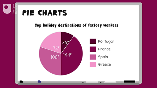
Take a look at this pie chart showing the top holiday destinations for a group of workers in a factory. You’ll see that pie charts must contain both a title and a key, explaining what each segment or colour means.
So when do we use pie charts? It’s usually when we have a few pieces of information about different parts of one whole group the whole pie. It’s a clear way of showing data because you can quickly see what has the biggest or smallest slice of the pie.
In the example, you can see that the most popular holiday destination was France, because this has the biggest slice. The example also notes the size of each segment in degrees. So if you know the number of people the chart is dealing with, you can work out how many went to Spain, Portugal, France and Greece.
Let’s create a pie chart to show you how it’s done. So in a survey, 36 people were asked what their favourite soap opera was. Their responses were as follows: Coronation Street, 18; EastEnders, 9; Hollyoaks, 6; other or none, 3. To draw a pie chart, first you need to work out the size of each section of the circle, or each slice of the pie. To do this, you need to remember that angles are measured in degrees, written like this, and that a circle is divided into 360 degrees.
In this example, we’re told that 36 people were surveyed. So you need to work out how many degrees of your circle one person makes. If 360 degrees (the total number of degrees in a circle) is equivalent to 36 people (the total number of people surveyed), this means that one person equals 360 divided by 36, which equals 10. So every 10 degrees of the pie represents one person. You can then work out what the size of each slice or category should be.
So for Coronation Street, 18 people times 10 degrees equals 180 degrees. EastEnders, 9 people times 10 degrees equals 90 degrees. For Hollyoaks, 6 people times 10 degrees equals 60 degrees. And other/none, 3 people times 10 degrees equals 30 degrees. You can now start to draw your pie chart.
First, you need to draw a circle. The best way to do this is with a compass. If you don’t have a compass, drawing around a circular object or using a double protractor will be fine but you will need to find out the centre of the circle, which you might be able to guess. Next, draw a line from the centre of the circle to the top of the circle. This will be the line that you start drawing your slices from.
Using a protractor, measure each slice one after the other. First, place the protractor on top of the line you’re drawing an angle from. Then, count along the protractor the number of degrees you want your angle to be. Mark this on your circle. Then use the straight side of the protractor to draw a line from the line you started with to the mark you’ve just made. You can also include the degrees.
In this example, you’ll draw a slice that is 180 degrees for Coronation Street. From that line, you’ll draw a slice of 90 degrees for EastEnders. Work through all the data categories until you get to the line you started with.
Colour or shade each slice differently adding a key. Give your pie chart a title. Here is the pie chart for the soap opera data.
Here’s a summary. Find out what the whole of the pie is going to represent. This is the total of your categories added together. Divide 360 (the number of degrees in a circle) by this total to tell you how many degrees one unit of your data makes. Use a calculator if you need to! Multiply the amount for this one unit by the size of each category. This gives the size of what each segment should be in degrees. Draw a circle and draw a line from the middle of the circle to the top. Starting from this line, use a protractor to measure and draw each slice. Label the slices and give your pie chart a title.
Method summary
- Find out what the whole of the ‘pie’ is going to represent – this is the total of your categories added together.
- Divide 360 (the size of a circle in degrees) by this total to tell you what one unit of your data makes. Use a calculator if you need to!
- Multiply the amount for this one unit by the size of each category.
- This gives the size of what each segment should be (in degrees).
- Draw a circle and draw a line from the middle of the circle to the top.
- Starting from this line, use a protractor to measure and draw each slice.
- Label the slices, or use a key to show what each segment represents.
- Give your pie chart a title.
Now try the following activity. If you get stuck, refer to the method summary above, and remember to check your answers once you have completed the questions.
Activity 10: Creating a pie chart
Calculate the answers to the following problems without using a calculator. You may double-check your answers with a calculator if you need to. Remember to check your answers once you have completed the questions.
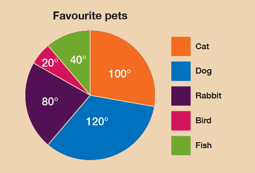
In a survey, 18 people were asked what their favourite pets were. The responses were as follows:
| Pet | Number of people |
|---|---|
| Cat | 5 |
| Dog | 6 |
| Rabbit | 4 |
| Bird | 1 |
| Fish | 2 |
Draw a pie chart to represent this information.
Answer
To find out how many degrees each animal is represented by, you must carry out this calculation:
- 360 ÷ 18 = 20
Therefore, each animal is represented by 20°. We can then calculate the size of each section:
| Pet | Number of people | Angle |
|---|---|---|
| Cat | 5 | 5 × 20° = 100° |
| Dog | 6 | 6 × 20° = 120° |
| Rabbit | 4 | 4 × 20° = 80° |
| Bird | 1 | 1 × 20° = 20° |
| Fish | 2 | 2 × 20° = 40° |
As a check, you can make sure that the degrees for each section add up to 360° in total:
100° + 120° + 80° + 20° + 40° = 360°
From these measurements you should construct a pie chart as follows:
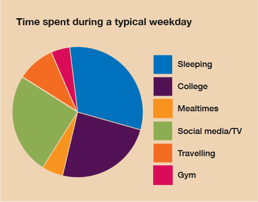
Bill records how he spends his time over a typical day. Draw a pie chart to represent this information:
| Activity | Time spent |
|---|---|
| Sleeping | 8 hours |
| College | 7 hours |
| Eating | 1 hour |
| Social media | 5 hours |
| Travelling | 2 hours |
| Gym | 1 hour |
Answer
The time spent on activities adds up to 24 hours – as you would expect! To find out how many degrees each hour is represented by, you must carry out this calculation:
360 ÷ 24 = 15
Therefore, each hour is represented by 15°. We can then calculate the size of each section:
| Activity | Time spent | Angle |
|---|---|---|
| Sleeping | 8 hours | 8 × 15 = 120 |
| College | 7 hours | 7 × 15 = 105 |
| Eating | 1 hour | 1 × 15 = 15 |
| Social media | 5 hours | 5 × 15 = 75 |
| Travelling | 2 hours | 2 × 15 = 30 |
| Gym | 1 hour | 1 × 15 = 15 |
You can check these figures by making sure that the degrees for each section add up to 360° in total:
120° + 105° + 15° + 75° + 30° + 15 = 360°
Using these values you can now draw your pie chart – don’t forget to add a title and a key. From these measurements your pie chart should look like this:
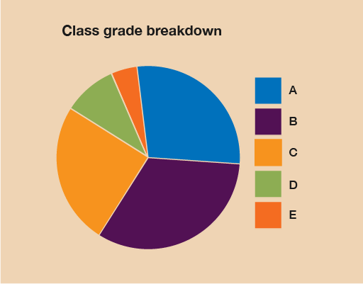
A tutor records the test results for a class:
| Grade | Number of students |
|---|---|
| A | 10 |
| B | 13 |
| C | 7 |
| D | 4 |
| E | 2 |
Draw a pie chart to show the breakdown of results.
Answer
The total number of students is 36. To find out how many degrees each student is represented by, you must carry out this calculation:
360 ÷ 36 = 10
Therefore, each hour is represented by 10°. We can then calculate the size of each section:
| Grade | Number of students | Angle |
|---|---|---|
| A | 10 | 10 × 10 = 100 |
| B | 13 | 13 × 10 = 130 |
| C | 7 | 7 × 10 = 70 |
| D | 4 | 4 × 10 = 40 |
| E | 2 | 2 × 10 = 20 |
Using these values you can now draw your pie chart, which should look like this:
Summary
In this section you have learned about how to present data in pie charts.