

6 Line graphs
Now that you’ve had a look at pie charts and bar charts, let’s take a look at line graphs. These are drawn by marking (or plotting) points and then joining them with a straight line. You might have seen them used in holiday brochures or maybe on the television.
Hint: It is best to use graph or squared paper when drawing line graphs because it makes it easier to plot the points.
Example: The estate agent
How would you present information as a line graph? Watch the following video to find out.
Transcript
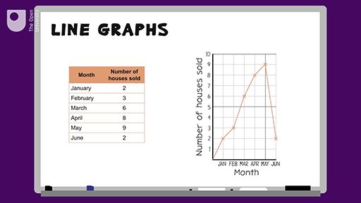
Here is a table showing the number of houses sold by an estate agent over a six-month period. How could you represent this information as a line graph?
To draw this in a graph, you need to first draw the axes. The months go on the bottom (horizontal) axis, and the house sales go up the left-hand side on the vertical axis.
Next, we need to decide on how we divide up these axes. There are six months, so there will be six marks on the horizontal axis. The highest number of house sales was 9, so the vertical axis will go from 0 to 10.
Now we can begin to mark our points. Starting with the first row of the table, you go up the line marked January, and then when you get to the line going across marked 2, you make a small cross. You then do this for the other points. Finally, you join the points using a ruler, and add your title.
Here’s a summary. To draw a line graph, you need to draw the horizontal and vertical axes and label them. Divide these axes into suitable scales to do this, you need to look at the data and find out what the smallest and largest numbers are. Plot the points from your data using a pencil to make small crosses. Join the points using a ruler, and give your graph a title.
Method summary
To draw a line graph you need to:
- draw the horizontal and vertical axes, and label them
- divide these axes into suitable scales – to do this, you need to look at the data and find out what the smallest and largest numbers are
- plot the points from your data, using a pencil to make small crosses
- join the points using a ruler
- give your graph a title.
Now try the following activity. Remember to check your answers once you have completed the questions.
Activity 13: Creating a line graph
Line graphs are often used in holiday brochures to show temperatures or hours of sunshine at a particular resort.
The following table shows the hours of sunshine at a holiday resort. Draw a line graph using the data from the table and then answer the questions below.
| Month | Hours of sunshine |
|---|---|
| May | 6 |
| June | 7 |
| July | 8 |
| August | 9 |
| September | 8 |
| October | 7 |
- Which month was the sunniest?
- Which month had the least sunshine?
Answer
When drawing your line graph you should:
- draw the horizontal axis, labelling it ‘Months’, and the vertical axis, labelling it ‘Hours of sunshine’
- divide these axes into suitable scales – your smallest and largest numbers are 6 and 9, so your scale could be one square for one hour
- plot the points from your data, using a pencil and make small crosses
- join the points using a ruler
- give your graph a title such as ‘Hours of sunshine at a holiday resort over a six-month period’.
The finished line graph should look something like this:
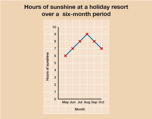
In answer to the questions:
- August is the sunniest month.
- May is the least sunniest month.
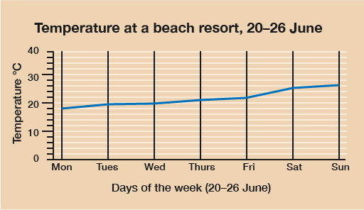
Look at the following line graph. Sometimes it makes sense to create a graph in landscape rather than portrait.
Summary
In this section you have learned about how to present data in line graphs.