7 Choosing the best way to present your data
You have looked at several ways of presenting data, but how do you select the best one to use?
- Tables can be used to organise complicated data. They are useful if you need to look up information.
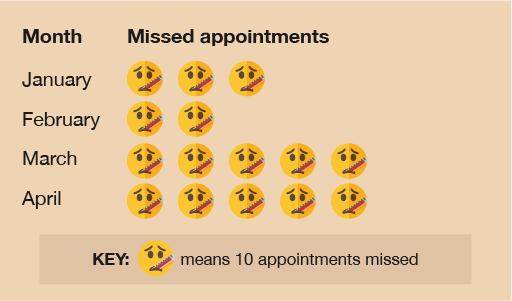
- Pictograms are a good way of displaying data in an accessible, ‘fun’ way. They are good at showing simple data. However, a picture key can make it difficult to be accurate when the key is used to represent larger values: if the following figure represents 50 ... ... what does this figure represent? It could be 35, but it could also be 34, 36 or 37, etc.
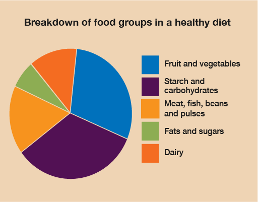
- Pie charts show the breakdown of different parts of a whole data set. Each segment represents a percentage or proportion of the whole amount. Pie charts are good for showing which parts take up the largest or smallest part of the pie. They are not so good when there isn’t much difference between the values, as it can be difficult to see small variations.
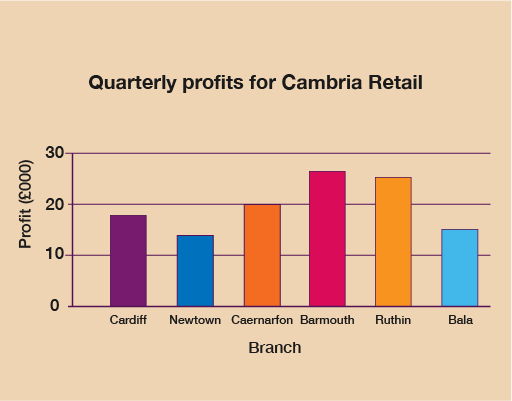
- Bar charts are great for comparing discrete data.
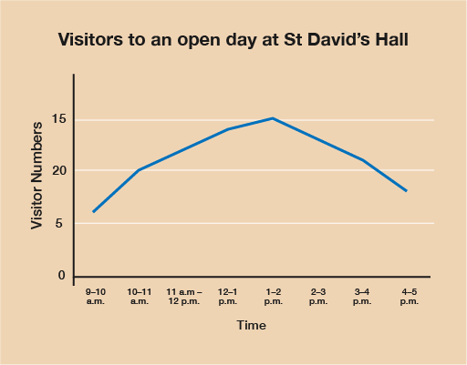
- Line graphs are often used to show changes or trends in data over time.
Activity 14: Choosing how to display data
Select the best way to display the following sets of data:
- The number of visitors to an exhibition over a day.
- The breakdown of each food group that makes up a healthy diet.
- The profit made by different branches of a shop over three months.
- The number of patients who missed GP appointments over six months in a GP surgery waiting room.
Answer
- A line graph would be suitable because it would show the change in visitor numbers over the day.
- A pie chart would show the proportion of each food group compared to the others.
- A bar chart would allow comparison of profits at the different branches.
- A pictogram would make the results accessible and easy to read.
Self-check: always remember the following statements
Before moving on, you need to make sure you are able to collect, organise and show data in the forms of tables, diagrams, charts and graphs. Ask yourself the following questions:
- When I draw tables, diagrams, charts and graphs, is my data displayed clearly so that the information is easy to understand?
- Do I always include titles, scales, labels and keys when they are needed?
- Have I chosen the most appropriate way of presenting my data?
If you are not sure about these points, show your work to someone else and ask if they understand the data.


