

2 Tally charts, frequency tables and data collection sheets
Have you ever been stopped in the street or whilst out shopping and asked about your choice of mobile phone company or to sample some food or drink and give your preference on which is your favourite? If you have, chances are, the person who was conducting the survey was using a tally chart to collect the data.
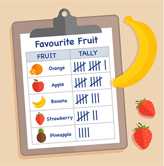
Tally charts are convenient for this type of survey because you can note down the data as you go. Once all the data has been collected it can be counted up easily because, as shown in the picture above, every fifth piece of data for a choice is marked as a diagonal line. This allows you to count up quickly in fives to get the total. A frequency or total column can then be filled out to make the data easier to work with.
Take a look at the example below:
| Method of Travel | Tally | Frequency |
|---|---|---|
| Walk | 9 | |
| Bike | 3 | |
| Car | 6 | |
| Bus | 12 | |
| TOTAL | 30 |
You can see each category and its total clearly. Whilst this is a very simple example it demonstrates the purpose of a tally chart well. A tally chart may often be turned into a bar chart for a more visual representation of the data but they are useful for the actual data collection.
You can also use a tally chart for collecting grouped data. If for example, you want to survey the ages of clients or customers, you would not ask for each person’s individual age, you would ask them to record which age group they came within. If you want to set yourself up a tally chart for this data it might look similar to the below:
| Age | Tally | Frequency |
|---|---|---|
| 0–9 | ||
| 10–19 | ||
| 20–29 | ||
| 30–39 | ||
| 40–49 | ||
| 50–59 | ||
| 60–69 | ||
| 70+ |
Note that the age groups do not overlap; a common mistake would be to make the groups 0–10, 10–20 and so on. This is incorrect because if you were aged 10, you would not know which group you should place yourself in.
A more complex example of a tally chart can be seen below. In this example you can see that the information that has been collected is split into more than one category. These are sometimes called data summary sheets or data collection tables. It doesn’t matter where each category is placed on the chart as long as all aspects are included.
| fewer than 6 trips | 6 trips or more | |||
|---|---|---|---|---|
| under 26 years | 26 years and over | under 26 years | 26 years and over | |
| male | (0) | |||
| female | (0) | |||
If you want to design a data collection or data summary sheet, you first need to know which categories of information you are looking for. Let’s take a look at an example of how you might do this.
Imagine you work in a hotel and want to gather some data on your guests. You want to know the following information:
- rating given by the guest: excellent, good, or poor
- length of stay: under 5 days, or 5 days or more
- location: from the UK, or from abroad.
A data summary sheet for this information could look like this:
| Stayed for under 5 days | Stayed for 5 days or more | |||||
|---|---|---|---|---|---|---|
| Excellent | Good | Poor | Excellent | Good | Poor | |
| From the UK | ||||||
| From abroad | ||||||
Have a go at the activity below and try creating a data collection sheet for yourself.
Activity 2: Data collection
You work at a community centre and want to gather some data on the people who use your services. You would like to know the following information:
- whether they are male or female
- if they use the centre during the day or during the evening
- which age category they are in: 0–25, 26–50, 51+.
Design a suitable data collection sheet to gather the information.
Answer
Your chart should look something like the example below. You may have chosen to put the categories in different rows and columns, which is perfectly fine. As long as all the options are covered your data collection sheet will be correct.
| Daytime Visitor | Evening Visitor | |||||
|---|---|---|---|---|---|---|
| 0–25 | 26–50 | 51+ | 0–25 | 26–50 | 51+ | |
| Male | ||||||
| Female | ||||||
Now that you know the different ways in which you can collect your data, it’s time to look at how you can put this information into various charts and graphs.
Summary
In this section you have:
- explored the differences between tally charts, frequency tables and data collection sheets and understood their usefulness in data collection.