

3.2 Interpreting bar charts
If you see a bar chart that is showing you information, it’s useful to know how to interpret the information given. The most important thing you need to read to understand a bar chart correctly is the scale on the vertical axis.
As you know from drawing bar charts yourself, the numbers on the vertical axis can go up in steps of any size. You therefore need to work out what each of the smaller divisions is worth before you can use the information. The best way for you to learn is to practise looking at, and reading from, different bar charts.
Have a go at the activity below and see how you get on.
Activity 4: Interpreting bar charts
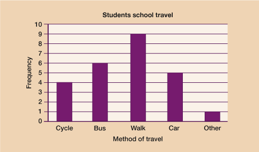
- Shannon asked some students how they travelled to school. She drew this bar chart to show the results.
- a.Which method of travel was used most by the students?
- b.How many more students walked to school than cycled to school?
- c.How many students did Shannon ask in total?
Answer
- a.Walking was the most used method of travel
- b.Students who walked = 9. Students who cycled = 4.
To find out how many more you do 9 – 4 = 5 more students walked than cycled.
- c.To work out the total number of students asked you need to add the amount shown by each bar together:
- 4 + 6 + 9 + 5 + 1 = 25 students in total.
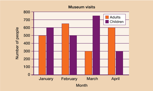
- The bar chart shows the number of adults and the number of children going to a museum each month from January to April.
- a.How many adults went to the museum in March?
- b.How many more children than adults went to the museum in the 4 months from January to April?
Answer
- a.The key shows that adults are represented by the white bar. In March, 300 adults went to the museum.
- b.To find out how many more children than adults went, you need to add up the total for the adults and the total for the children and then find the difference. The scale on the side goes up in 100s therefore the middle of each is 50.
Adults: 500 + 650 + 300 + 600 = 2050
Children: 600 + 500 + 750 + 300 = 2150
Difference: 2150 – 2050 = 100 more children went than adults.
- 90 cat owners were asked to write down the brand of cat food their cats liked best.
The bar chart shows information about the results.
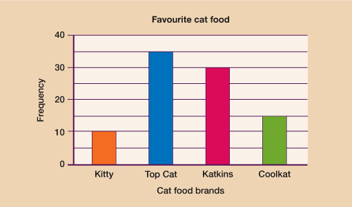
- This statement was in the magazine:
- 1 out of 6 cats like Coolkat best
- Is this statement correct? Explain your answer.
Answer
- You need to know both the total that liked Coolkat and the total number of cats. The scale goes up in 10s so halfway between each numbered division is worth 5.
The total who liked Coolkat is 15.
In the question it tells you that 90 cat owners were surveyed so therefore 15 out of 90 liked Coolkat best.
Simplifying this fraction:
= =
- Yes, the statement is correct.
You should now be feeling confident with both drawing and interpreting bar charts so it’s time to move on to look at another type of chart – pie charts.
Summary
In this section you have learned:
- to interpret the information shown on a bar chart
- about single and dual bar charts and practised using them to represent data.