

5 Line graphs
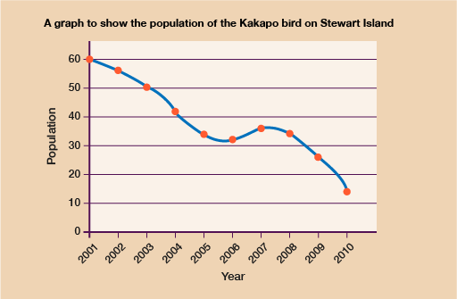
Line graphs are a very useful way to spot patterns or trends over time. The example below shows the population over a number of years of a rare type of bird on a small island. Just from looking at the graph we can see that the population of birds is going down over time, with a brief period between 2006 and 2007 where there was a slight rise.
If you were looking at how to increase the numbers of these birds, you would look more closely at what happened over those years and see what circumstances might have helped the population grow. Once you had discovered this, you could try to replicate it over coming years to try and increase the population.
Now that you understand how useful line graphs can be and how they can be used, next you’ll learn how to draw and interpret them.