5.1 Drawing line graphs
Drawing a line graph is very similar to drawing a bar chart, and they have many of the same features.
Line graphs need:
a title
a title for each axis
a numbered scale on the vertical axis
labels on the horizontal axis (in the example in Figure 15; 2001, 2002 etc.) so that it is clear to the reader what they are looking at.
The main difference when drawing a line graph rather than a bar chart, is that rather than a bar, you put a dot or a small cross to represent each piece of information. You then join each dot together with a line. There is significant debate over whether the dots should be joined with a curve (as in the example in Figure 15) or with straight line. Whilst the issue is (believe it or not!) hotly contested, the general consensus seems to be that dots should be joined with straight lines.
Activity 7: Drawing a line graph
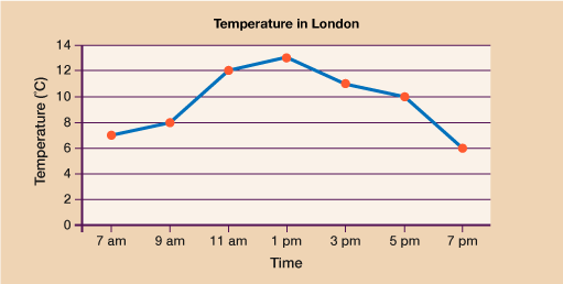
Have a go a drawing a line graph to represent the data below.
The table below shows the temperature in London on one day in October.
| Time | 7 am | 9 am | 11 am | 1 pm | 3 pm | 5 pm | 7 pm |
|---|---|---|---|---|---|---|---|
| Temperature (˚C) | 7˚ | 8˚ | 12˚ | 13˚ | 11˚ | 10˚ | 6˚ |