

3 Bar charts
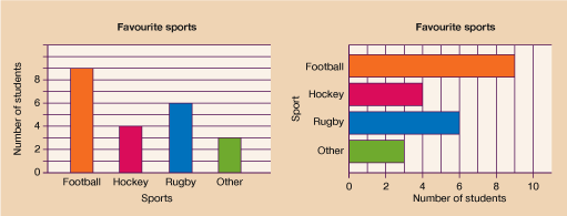
There are two main types of bar charts (also known as bar graphs) – single and dual. The most common type is a single bar chart. These bar charts use vertical or horizontal bars to display data as seen below.
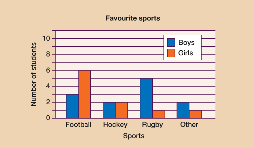
A comparative bar chart (also known as a dual bar chart) shows a comparison between two or more sets of data. Whilst the chart below shows the favourite sports of a group of students, it further breaks down the data and gives a comparison between boys and girls; there are two bars for each sport. Depending on the type of data you are collecting, you could have more than two bars under each category.
Looking at the example comparative bar chart below, we can see that 6 girls said their favourite sport was football compared to only 3 boys.
A third way of presenting data is a component bar chart. Instead of using separate bars, all the data is represented in a single bar. Each component, or part, of the bar is coloured differently. A key is again needed to show what each colour represents. Look at the example below:
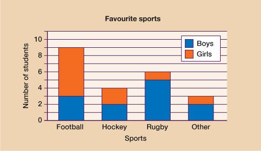
A component bar chart is useful for displaying data where we want to see the overall total together with a breakdown. In the chart above, we can easily see that in total 9 students said that football was their favourite sport. However, we can also see the data broken down to show us that 3 boys and 6 girls said that football was their favourite sport.