

3.5 Plasticity
Plasticity refers to the fact that information in digital form is easy to re-form and reorganise. It can be edited and processed almost endlessly – think of editing digital photographs in Photoshop. In addition, changes are quick and easy, and can be undone. If you don’t like a modification, you can simply discard it – and the cost is insignificant.
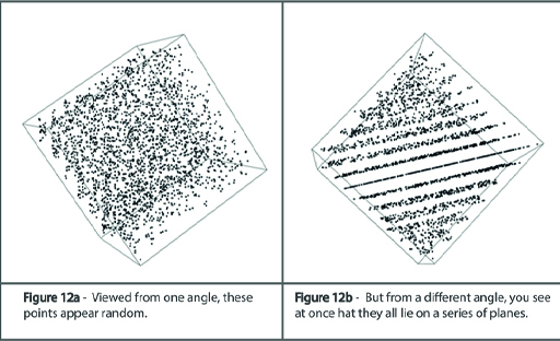
Identical information can be presented in many different views. This allows us to discover new facts from old data, and to communicate important insights to other people by means of infographics.
To illustrate how a different viewpoint may suddenly reveal something you hadn’t suspected before, consider Figure 12.
Activity 4 The power of infographics
Watch the following video of Dave McCandless talking about how infographics help make sense of information.
Transcript: Video 1
Can infographics contribute to critical thinking?
Discussion
Infographics are a tool that can help us deal with information overload by compressing a mass of detail into a picture that can be grasped quickly and easily. Once the information is captured as an infographic, new perspectives can emerge. Infographics can be made interactive, so that people can explore the data for themselves.
Near the end of the video, McCandless presents an infographic that represents ideas rather than data, and compares how left-wing thinkers and right-wing thinkers visualise society. Producing this infographic made him recognise the perspective of people at the other end of the political spectrum from him, because not doing so would have led to a biased graphic.
This might remind you a little of the pros and cons technique: the structure of what we are producing forces us to be more objective and analytical. This suggests that infographics may indeed contribute to critical thinking.