

4.5 Create and share your own graph
As a scientist, it is important both to be able to present numbers clearly and in a way which emphasises the significant results, and to interpret graphs to extract the essential data. This week, you’ve concentrated on how science numbers are presented, focusing on bar graphs, pie charts and line graphs. In this section, you should take the opportunity to make your own graphs. You will have the opportunity to share and discuss them in the next section.
Activity 4.1 Your own graph
Part 1 Creating your graph
Download the Rainfall data [Tip: hold Ctrl and click a link to open it in a new tab. (Hide tip)] and the Instructions for Infogr.am.
Use the data to plot different kinds of rainfall graphs for a range of countries over the period 1990–2009. Think carefully about which type of graph will best demonstrate your results.
We recommend that you use infogr.am, which is designed for creating interactive infographics. It is a quick and easy tool for plotting colourful and varied graphs and charts which can then be saved and shared with others. The site is free to use – you do not need to register for any paid-for premium account.
If you prefer you may also plot your graphs by hand or by using a program like Excel or Google Sheets and share a photo via social media (don’t forget to use the course hashtag #OLSciNum).
Discussion
We plotted the rainfall in Spain and Australia, because both are relatively dry but in opposite hemispheres of the world, so would they have similar or different patterns?
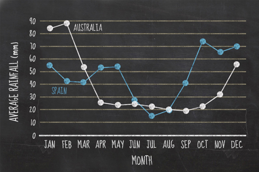
In fact, as you can see from the plot, both countries are dry and wet in the same annual pattern despite being in different hemispheres. While Spain had the pattern we expected, dry in summer and wet in winter, Australia appears to be dry in the winter and wet in the summer.
Part 2 Sharing your graph
Share the graph you created, either as a link to an infogr.am or a link to an image shared via social media or via an image hosting site.
Do the countries you are comparing have similar rainfall or are they very different? What time of year would you choose to visit those countries?