

5.2 Interpreting line graphs
Interpreting line graphs is also very similar to the way you interpret bar charts; it’s just about using the scales shown on the graph to find out information. Given that you’ve already learned and practised interpreting bar charts, you can jump straight into an activity on interpreting line graphs.
Activity 8: A population line graph
- The graph shows information about the population of a village in thousands.
- a.What was the population of the village in 1991?
- b.What was the increase in population from 1981 to 2011?
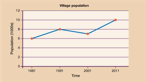
Answer
- a.In 1991 the population was 8000.
- b.In 1981 the population was 6000, in 2011 the population was 10,000.
This is an increase of 10,000 − 6000 = 4000.
- Beth recorded the temperature, in degrees (°C), inside her greenhouse every hour on one day.
The graph shows information about her results.
- a.What was the temperature at 3 pm?
- b.Describe the change in temperature from 12 noon to 4 pm.
- c.For how many hours was the temperature in the green house above 23˚C.
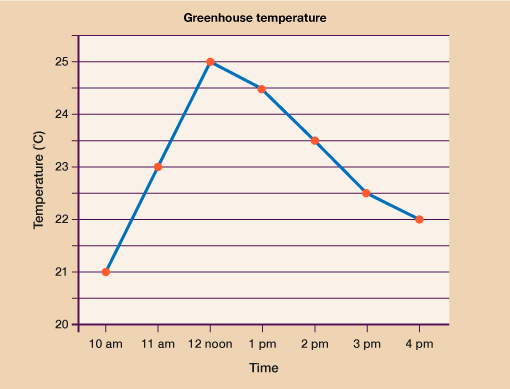
Answer
- a.At 3 pm the temperature was 22.5˚C.
- b.From 12 noon to 4 pm the temperature is dropping. It drops from its highest at 25˚C to 22˚C at 4 pm.
- c.The temperature hit 23˚C at 11 am and remained at or above this temperature until 2:30 pm.
This is a period of 3 and a half hours.
How did you get on? Hopefully you were able to answer all the questions without too much difficulty. As long as you have worked out the scale correctly and read the question carefully, there’s nothing too tricky involved.
You have now covered each drawing and interpreted each different type of chart and graph so it’s time to move on to look at other uses for data: averages and range.
Summary
In this section you have learned:
- which types of data can be suitably represented by a line graph and which are best suited to other types of charts.
- how to interpret the information shown on a line graph
- how to draw an accurate line graph for a given set of data.